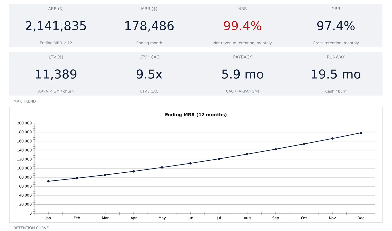
A SaaS metrics spreadsheet starts with one MRR waterfall and derives everything else from it: net and gross revenue retention, cohort curves, unit economics, and how many months of cash are left. This walkthrough follows a worked example that grows from $65,000 to $178,486 of MRR in twelve months, posts 99.4 percent NRR against 97.4 percent GRR, and burns $38,470 a month against 19.5 months of runway. Our SaaS Metrics & Financial Model spreadsheet template ($59) is a ready-made version of that structure for Excel and Google Sheets.
Ask a founder what their SaaS business made last month and the answer is usually one number. Ask how that number got there and the answer takes a paragraph, because monthly recurring revenue is never a single quantity. It is last month’s base, plus what new customers brought, plus what existing customers added, minus what downgrades took away, minus what cancellations took away. Five figures produce the one that gets reported, and every interesting question about a subscription business is a question about the four underneath.
Billing software shows the top-line number. Getting at the composition, and then at what it implies about retention, unit economics, and how long the cash lasts, is structural work. A spreadsheet handles it well, because the arithmetic stays visible and every rate is a cell somebody chose.
Everything below is worked through our SaaS Metrics & Financial Model Spreadsheet Template ($59), a ready-made version of this structure for Excel and Google Sheets. Its sample file models a company growing MRR from $65,000 to $178,486 over twelve months while burning $38,470 a month, and the dashboard opens on a warning rather than a checkmark. Growing fast and retaining slightly under 100 percent are not contradictory states, and a model that hides one behind the other is worth less than the hour it takes to fill in.
What a SaaS metrics spreadsheet has to hold
Underneath the charts, a subscription model carries only four kinds of information:
- Movement. How MRR changed month to month, split into new business, expansion, contraction, and churn. This is the raw material for everything on the revenue side.
- Retention history. What happened to each month’s intake of customers as time passed, which is a different question from what happened to revenue in aggregate.
- Unit economics. What an average account is worth, what it costs to win, and how long the payback takes.
- Spending and cash. What the operating budget consumes against gross profit, and how many months of runway the bank balance represents.
The template gives each of these its own sheet. MRR Movement, Cohorts, Unit Economics, and Spending hold the work, Settings holds the business name, currency, and cash balance, a Dashboard sits on top, and a How to Use sheet carries the definitions. Seven sheets, and across all of them the sample file has 72 typed numbers. Everything else that shows a figure is a formula, and each of those cells carries a validation guard. Typing over one raises a prompt reading “This cell contains a formula that keeps your totals correct. Typing here replaces it. Overwrite anyway?” instead of taking the number without comment.
Start with the MRR waterfall and three movement rates
The MRR Movement sheet opens with three percentages, and they drive most of the workbook.
Expansion sits at 2.0 percent in the sample, MRR added when existing accounts upgrade or add seats. Contraction sits at 0.8 percent, MRR lost when accounts downgrade but stay. Revenue churn sits at 1.8 percent, MRR lost when accounts cancel outright. Each rate applies to that month’s starting MRR, so all three scale with the base rather than staying flat in dollars.
Splitting contraction from churn is the detail most hand-built trackers skip, and it costs them the diagnosis. A month where MRR shrinks tells you nothing on its own. A month where MRR shrinks because contraction doubled while cancellations held steady is a pricing or packaging story. The same shrink driven by cancellations is a different story with different owners.
Below the rates, the twelve-month waterfall does the arithmetic. Six rows, one column per month, plus a Total column:
| Line | How it works | Sample year |
|---|---|---|
| Starting MRR | January is typed, every later month pulls the prior ending MRR | $65,000 in January |
| + New MRR | Typed, one figure per month | $121,400 total |
| + Expansion | Starting MRR × 2.0% | $26,379 total |
| - Contraction | Starting MRR × 0.8% | $10,552 total |
| - Revenue churn | Starting MRR × 1.8% | $23,741 total |
| Ending MRR | Starting + new + expansion - contraction - churn | $178,486 in December |
Beyond the three rates, thirteen numbers are typed here: January’s starting MRR and one new-MRR figure per month, running from $6,500 in January to $13,600 in December. Everything else chains. February’s starting MRR is January’s ending MRR, and so on down the year, which is why changing the January figure moves all twelve columns at once.
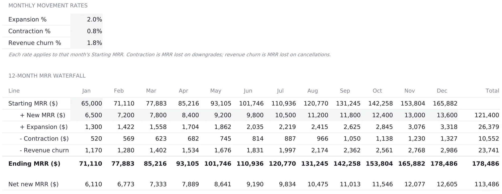
A Net new MRR row closes the sheet, adding the four movement lines without the base: $6,110 in January rising to $12,605 in December, $113,486 for the year. That total is exactly the distance from January’s $65,000 to December’s $178,486, which is the check that tells you the waterfall ties out.
The Total column repays a second look. Gross additions across the year come to $147,779, new business plus expansion together, and losses come to $34,293. A little under a quarter of everything the company added was consumed by downgrades and cancellations before it reached the ending balance, a ratio that is invisible in the dashboard’s MRR trend line, which climbs smoothly all year.
NRR and GRR fall out of the same waterfall rows
The two retention tiles on the dashboard are not separate inputs. Both read the waterfall.
Net revenue retention takes the year’s starting MRR, adds the year’s expansion, subtracts contraction and churn, and divides by starting MRR. In the sample that lands at 99.4 percent. Gross retention runs the same division with expansion left out, giving 97.4 percent. That version carries a ceiling net retention does not have: with nothing in the formula that adds, it cannot pass 100 percent.
Because all three movement rates are constant percentages of starting MRR here, both figures collapse to arithmetic on the rates themselves. NRR is 1 plus 2.0 minus 0.8 minus 1.8 percent, GRR is 1 minus 0.8 minus 1.8 percent, and the 2.0-point gap between them is the expansion rate exactly. That identity is a useful sanity check on any retention number, because net and gross retention sitting further apart than the expansion a business books means something is being counted twice.
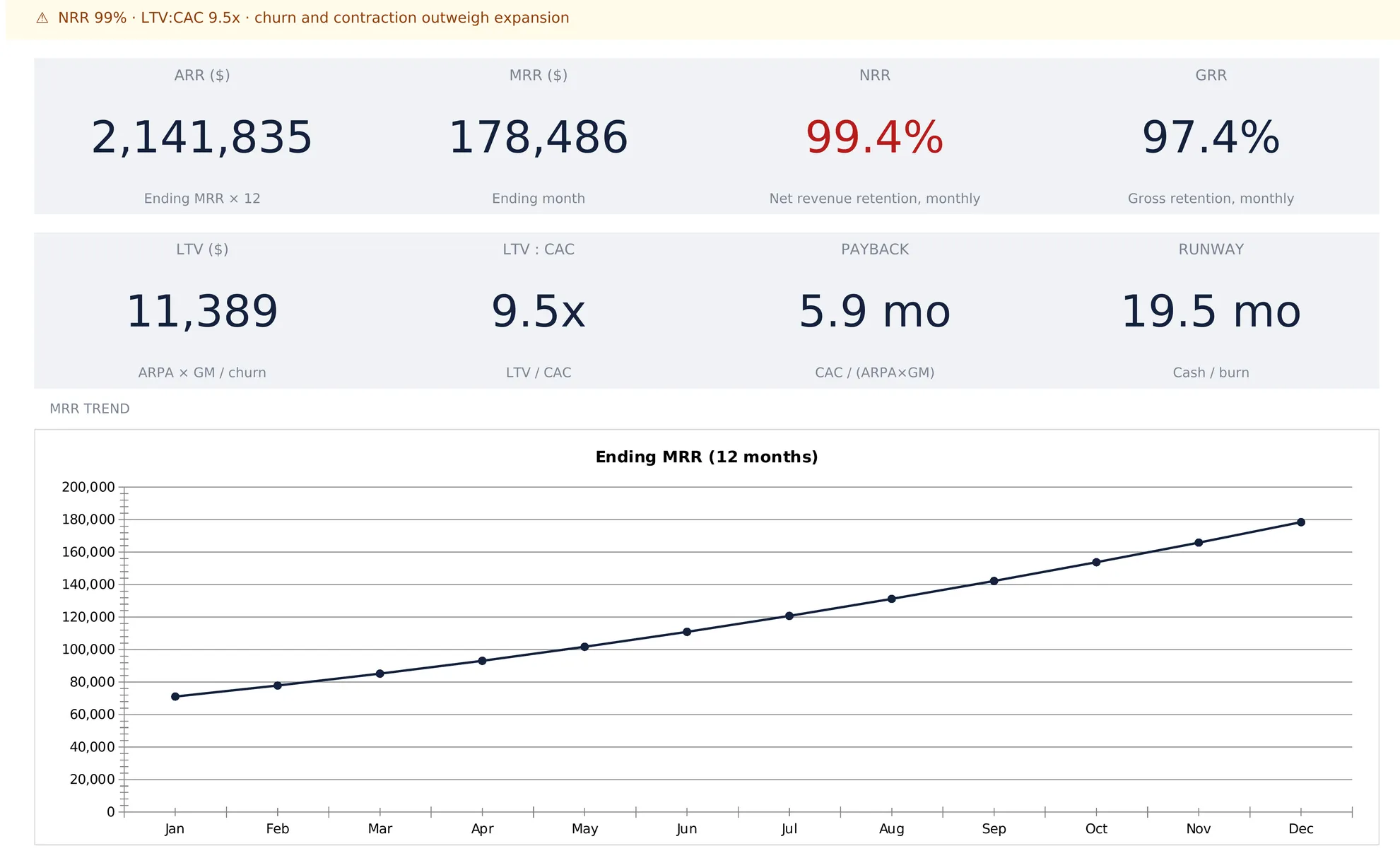
The 100 percent line is the one the workbook flags. At exactly 100 percent NRR, the existing base is flat before a single new customer signs, and growth comes entirely from new business. Below it, expansion is not covering what downgrades and cancellations take away. The sample sits at 99.4 percent, just under. That is why the dashboard banner opens amber with a warning icon and the sentence “NRR 99% · LTV:CAC 9.5x · churn and contraction outweigh expansion” rather than the green checkmark version. The banner rounds to whole percent while the tile below it carries a decimal, so the two read 99 and 99.4 on the same screen.
Cohort retention answers what the waterfall cannot
The waterfall is aggregate. It knows 1.8 percent of MRR cancelled in March, and it has no idea whether those cancellations were customers who joined last month or customers who had been paying for two years. That distinction is what the Cohorts sheet exists for.
The sheet is a retention triangle: one row per monthly cohort, a size column, then seven columns running M0 to M6. Every cell is typed, because this is observed history rather than a projection. The sample fills six rows.
| Cohort | Size | M1 | M3 | M6 |
|---|---|---|---|---|
| Jan | 32 | 92.0% | 82.0% | 74.0% |
| Feb | 38 | 93.0% | 83.0% | 75.0% |
| Mar | 42 | 91.0% | 81.0% | 73.0% |
| Apr | 46 | 94.0% | 84.0% | 76.0% |
| May | 52 | 93.0% | 83.0% | 74.0% |
| Jun | 58 | 94.0% | 85.0% | 77.0% |
| Weighted avg | 268 | 93.0% | 83.2% | 75.0% |
The bottom row weights by cohort size rather than treating a 32-customer January the same as a 58-customer June, and it counts only the cohorts that have a figure in that column. A cohort three months old contributes to M0 through M3 and is left out of M4 onward. Without that behavior, every new cohort added to the triangle would drag the six-month average toward zero, and the curve would appear to collapse every time the business grew. The grid holds twelve cohort rows, so the six empty ones below June are skipped entirely until somebody fills them.
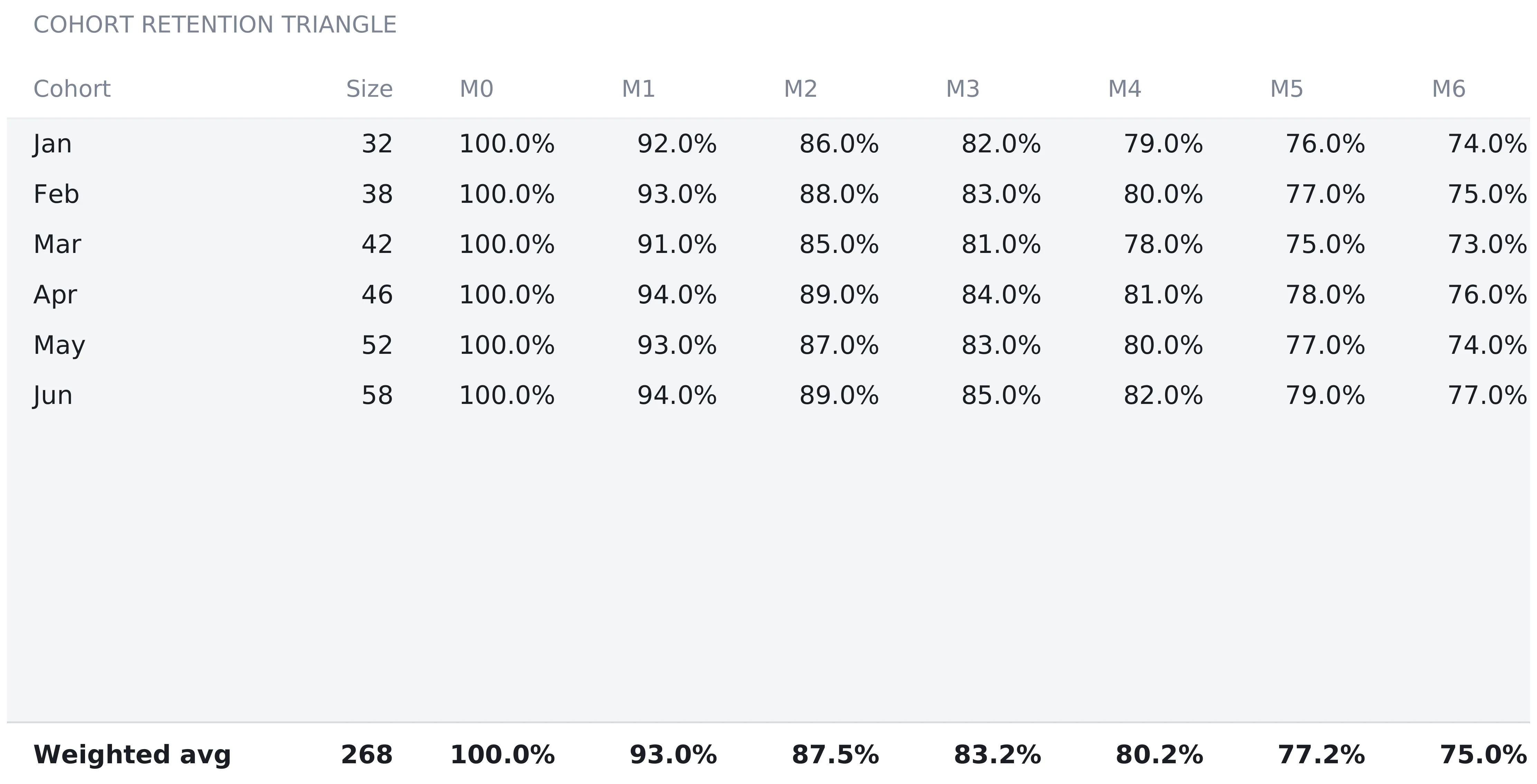
Read down the M6 column and the spread is four points, from 73 percent for the March cohort to 77 percent for June. Read across a row and the shape is the familiar one, a steep first month then a flattening curve. The dashboard plots the weighted average row as its retention curve, so the chart shows the composite rather than any single cohort.
One thing worth knowing about this sheet: it is not wired to the MRR waterfall. Both sets of figures are typed, and nothing in the file forces them to agree. Compound the 1.8 percent monthly logo churn from Unit Economics out six months and roughly 90 percent of a cohort would still be active, while the observed triangle says 75.0 percent. That is the gap between an assumption and a history, and the workbook shows both rather than reconciling them for you.
Unit economics: four inputs, three answers
The Unit Economics sheet is the smallest in the file and carries some of its heaviest numbers. Four typed cells: ARPA of $250 a month, gross margin of 82 percent, monthly logo churn of 1.8 percent, and CAC of $1,200.
From those, three computed rows:
- LTV = ARPA × gross margin ÷ churn = $250 × 82% ÷ 1.8% = $11,389
- LTV:CAC = LTV ÷ CAC = 9.5x
- CAC payback = CAC ÷ (ARPA × gross margin) = $1,200 ÷ $205 = 5.9 months
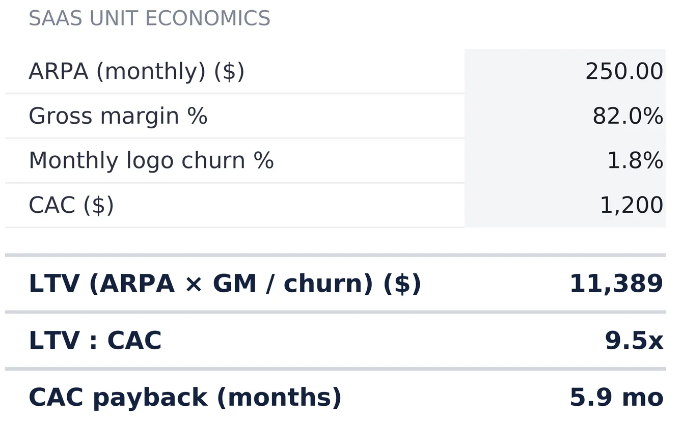
Two design choices shape what these numbers mean. Gross margin sits inside the LTV formula, so LTV is gross profit from an average account rather than revenue from it. The same account at a 50 percent margin would carry an LTV of $6,944 on identical pricing and churn. The divisor is logo churn rather than the revenue churn rate from the waterfall, and the How to Use sheet flags the distinction in one line: revenue churn is MRR lost, logo churn is customers lost, and they are separate inputs.
That division is where LTV becomes sensitive. One over 1.8 percent is about 56 months, so the formula quietly assumes an average account pays for close to five years. Move churn to 3 percent and LTV falls to $6,833 without touching price or margin, which is more movement than any other single cell in the file produces.
CAC payback is the more grounded of the three, because it involves no assumption about the future at all: a cost divided by a monthly gross profit, $1,200 against $205. Each ratio reads n/a rather than an error when its divisor is blank or zero, so a half-filled file stays readable while the rest of the numbers go in.
Spending, burn, and how long the cash lasts
The Spending sheet turns the revenue side into an operating picture. It opens with a revenue base of $1,318,955, computed as the sum of each month’s starting MRR across the twelve columns of the waterfall. That treats each month’s revenue as the MRR the company started the month with, so the base excludes December’s growth and comes out well below the $2,141,835 ARR run rate on the dashboard.
Operating costs are then entered as percentages of that base rather than as amounts, six rows available and three filled in the sample:
| Line | % of revenue | Period amount |
|---|---|---|
| Sales & marketing | 50.0% | $659,478 |
| Research & development | 45.0% | $593,530 |
| General & administrative | 22.0% | $290,170 |
| Total opex | 117.0% | $1,543,178 |
Percentages rather than dollars is what makes this sheet useful for a growing company. A budget typed as amounts goes stale the month revenue moves, while a budget typed as ratios rescales itself. The total row adds the percentages as well as the money, so 117 percent shows up as a figure on the page rather than as something to work out.
Below the opex block, three rows finish the job. Gross profit is revenue times the 82 percent margin from Unit Economics, $1,081,543. Average monthly burn is total opex minus gross profit divided by twelve, $38,470. Runway is cash on hand divided by burn, and with $750,000 on the Settings sheet that gives 19.5 months.
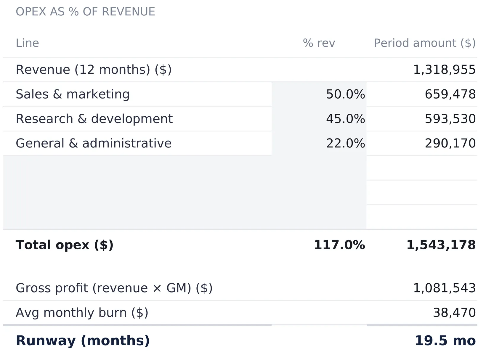
The burn figure has one clean explanation, and the sheet makes it visible: 117 percent of revenue going out against 82 percent coming in as gross profit. The two meet when opex reaches 82 percent of revenue, and every point of difference between those ratios is burn. Runway reads n/a rather than a number when there is no burn at all, which is the correct answer to “how long can this last” for a business that is not losing money.
Settings holds three cells, one of them load-bearing
The Settings sheet is short. A business name, which appears under the title on every sheet. A currency symbol chosen from a dropdown of 35 options, which relabels every money header and KPI tile across the workbook. It relabels only, with no conversion of the underlying numbers. And cash on hand, $750,000 in the sample, which exists for exactly one reason: it is the numerator of the runway calculation.
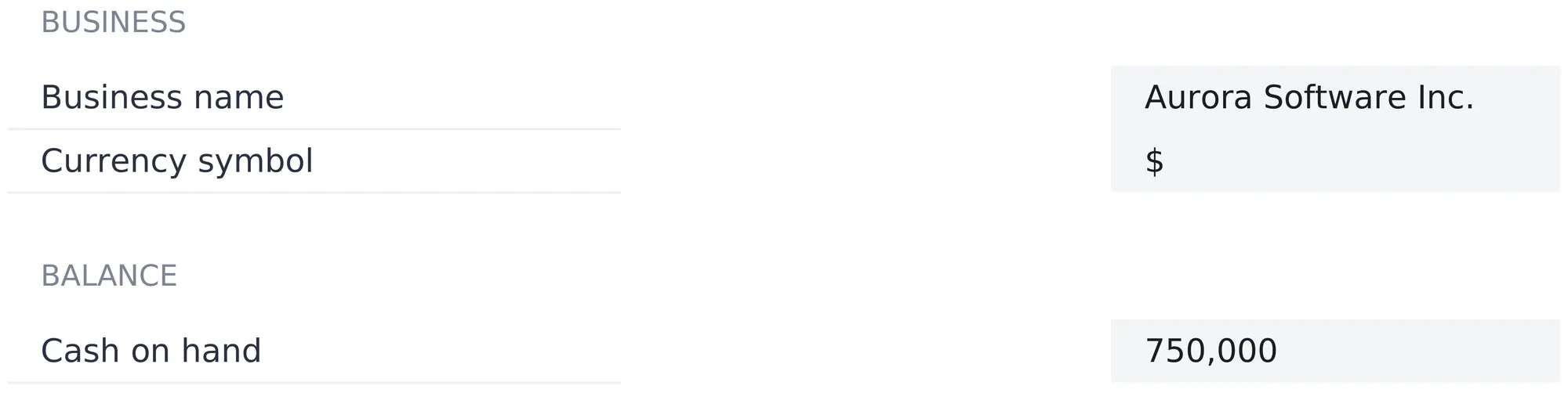
Keeping the cash balance on Settings rather than on Spending is a small thing that matters in practice. Burn is a modelled figure built from ratios, while the bank balance is a fact read off a statement, and separating the two makes it obvious which of the runway inputs is which.
The dashboard: eight tiles and one sentence
With the four working sheets filled, the Dashboard states the position. A banner across the top compresses the year into a sentence, and it has three states rather than two. There is a prompt to enter a starting MRR when the waterfall is empty, an amber warning when NRR is below 100 percent, and a green checkmark when it is at or above.
| Tile | Sample value | Source |
|---|---|---|
| ARR | $2,141,835 | December ending MRR × 12 |
| MRR | $178,486 | December ending MRR |
| NRR | 99.4% | Waterfall, expansion included |
| GRR | 97.4% | Waterfall, expansion excluded |
| LTV | $11,389 | ARPA × GM ÷ churn |
| LTV:CAC | 9.5x | LTV ÷ CAC |
| Payback | 5.9 mo | CAC ÷ (ARPA × GM) |
| Runway | 19.5 mo | Cash ÷ burn |
Two of the tiles carry threshold rules of their own. NRR is flagged when it falls below 100 percent, and LTV:CAC is flagged when it falls below 1.0x, the point at which an account returns exactly what it cost to win. Every ratio tile also has a rule that mutes it when the figure reads n/a, so an unfinished file looks unfinished rather than looking wrong.
Below the tiles sit two line charts, one plotting twelve months of ending MRR and one plotting the weighted average cohort row from M0 to M6. Their source data sits in a small block at the bottom of the Dashboard that mirrors those cells, which is what lets both charts redraw the moment anything upstream changes.
The interesting part of this dashboard is the disagreement between its rows. The top row describes a company approaching $2.1 million of ARR after nearly tripling MRR in a year. The bottom row describes retention slightly under water, an LTV resting on a five-year lifetime assumption, and 19.5 months of cash. Both are true, both come from the same 72 typed numbers, and neither is a verdict. What the layout does is make it awkward to read one row without the other.
What a month of tracking involves
Most of the 72 typed numbers go in once. A month after that adds one new-MRR figure to the waterfall, one row to the cohort triangle for the customers who just joined, and one more retention figure in each existing cohort’s next M column. Cash on hand on the Settings sheet gets refreshed from the bank balance. Everything else recalculates, including both charts.
The judgement calls sit in the rates rather than the entries. Expansion, contraction, and revenue churn are typed constants applied to every month, so they hold only until real movement drifts away from them. The same is true of ARPA, gross margin, logo churn, and CAC on Unit Economics, plus the three opex ratios on Spending. Some teams revisit those cells quarterly rather than monthly, on the grounds that a rate that moves every month makes two dashboards hard to read against each other.
The edges of this model
Every model has edges, and these are the ones here. The file connects to nothing, so each month’s new MRR is a typed figure rather than a feed from a billing system. Analytics products wired into the billing system produce these numbers without anybody touching a cell, and a typed file cannot match that. It works in aggregate MRR only, with no split between monthly and annual plans, no plan-tier breakdown, and no way to see which accounts sit behind the contraction row. The cohort triangle stops at M6 and twelve rows, the spending model applies flat percentages to a single revenue base with no headcount plan behind the ratios, and everything is pre-tax.
One more limitation sits outside the file. The movement rates, the churn assumption, and the CAC figure are all estimates sourced somewhere else. The workbook computes an LTV to the dollar whether CAC came from a fully loaded finance calculation or from a rough division of last quarter’s marketing spend, because it cannot tell the two apart. Two months are comparable only to the extent the figures behind them were sourced the same way.
Excel or Google Sheets for SaaS metrics
The template is an .xlsx file built on plain formulas, with no macros and no add-ons, so it behaves identically in Microsoft Excel and in Google Sheets after upload. SaaS numbers tend to travel, which makes that portability practical rather than cosmetic. Google Sheets suits sharing a live model by link with a co-founder, a board member, or an investor who wants to see which rates were assumed. Excel suits keeping a local file and a history of monthly snapshots on one machine. Either platform can hold the structure above, bought or hand-built.
Which spreadsheet template fits which job
- SaaS Metrics & Financial Model Spreadsheet Template ($59) holds everything walked through above: the MRR waterfall, NRR and GRR, the cohort triangle, unit economics, and burn against runway, for one subscription business.
- Startup Financial Model Spreadsheet Template ($59) answers the questions that sit around this one rather than inside it, with funding rounds, a hiring plan, 24-month burn and runway, and a simplified cap table.
- KPI Dashboard Spreadsheet Template ($39) is the general scoreboard version, with twelve months of actuals and targets per KPI and a composite score, for metrics that are not revenue.
- The SaaS Founder Bundle packages this model with the KPI Dashboard and 5-Year Financial Projections for $89, against $147 bought separately.
Related
- How to Build a Startup Financial Model in a Spreadsheet - the funding, hiring, and cap table side of the same company
- How to Forecast Cash Flow for a Small Business - the cash side of the same picture, month by month
- Financial Runway Calculator: How Long Could Your Money Last? - the same cash-divided-by-burn arithmetic applied to a household
- Google Sheets vs Excel for Business Cash Flow - which platform fits which kind of business
Frequently asked questions
What is the difference between NRR and GRR?
Both divide the same starting MRR, but they count different things above the line. Net revenue retention adds expansion back in, so it answers what the existing customer base is worth this month compared to last. Gross retention leaves expansion out entirely, so it answers what that base holds on its own and can never exceed 100 percent. In the sample file the two read 99.4 percent and 97.4 percent, and the gap between them is exactly the 2.0 percent expansion rate.
Is ARR just MRR multiplied by 12?
In this model, yes, and the label says so. The ARR tile reads December ending MRR times twelve, which is $2,141,835 in the sample. That is a run rate taken at a point in time rather than money already collected. The Spending sheet carries a separate revenue figure, $1,318,955, built by summing each month's starting MRR across the year. Both are correct and they measure different things, which is why the workbook shows them on different sheets.
What is the difference between revenue churn and logo churn?
Revenue churn is MRR lost when accounts cancel, and it sits on the MRR Movement sheet at 1.8 percent of starting MRR. Logo churn is customers lost, and it sits on the Unit Economics sheet as the divisor in the LTV formula. They are separate entry cells that happen to both read 1.8 percent in the sample. The two diverge whenever the accounts leaving are not average-sized: where the losses are mostly small accounts, logo churn runs above revenue churn, and where a few large accounts leave, it runs below.
How does the model calculate LTV?
LTV is ARPA multiplied by gross margin, divided by monthly logo churn: $250 times 82 percent divided by 1.8 percent gives $11,389. It is a gross-profit figure rather than a revenue figure, and the division by churn carries an implied average lifetime of about 56 months. The formula reads n/a rather than an error when churn is zero, because dividing by nothing has no answer.
Does the model handle annual contracts or prepaid plans?
The waterfall works in monthly recurring revenue, so an annual contract is entered as its monthly equivalent rather than as a cash receipt in the month it was invoiced. That keeps MRR, NRR, and the retention figures consistent, and it means the file does not describe when the cash arrives. The runway figure on the Spending sheet is driven by cash on hand typed into Settings, a figure read off a bank statement rather than derived from the revenue rows, so prepaid cash sits there rather than in MRR.
About this article
Every figure, sheet name, formula, and feature description verified against the published SaaS Metrics & Financial Model Pro workbook (the exact file customers download). Last reviewed August 2026.