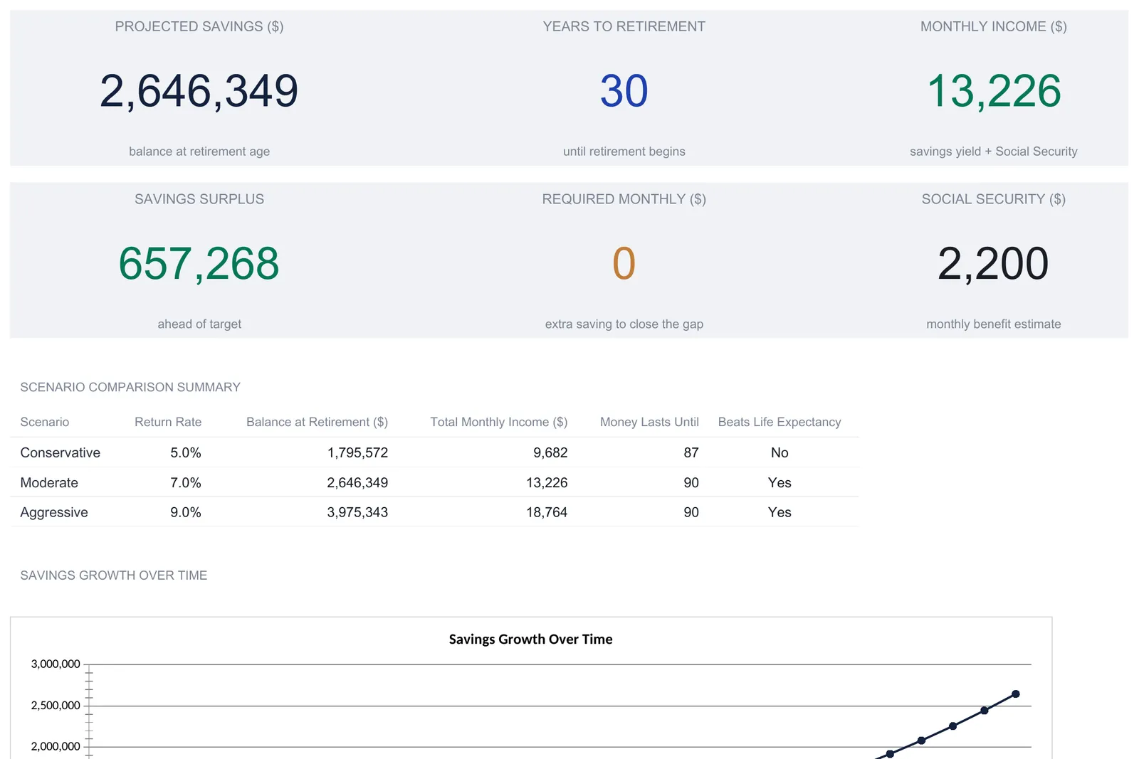
A retirement calculator spreadsheet turns a short list of assumptions into a full projection: year-by-year growth to retirement, a drawdown table through life expectancy, side-by-side return scenarios, and a two-way sensitivity grid. This walkthrough follows the structure using the workbook's sample inputs, a 35-year-old saving $1,200 a month with $85,000 already invested, which the sheet projects to a $2,646,349 balance at 65 under a 7% return. Our Retirement Calculator Ultimate ($29) ships the whole model ready-made for Excel and Google Sheets.
A retirement projection asks a harder question than a savings balance does. A bank app can tell you what you have today. It cannot tell you what that balance becomes after thirty more years of contributions and compounding, whether it covers the income you want once you stop working, or how long it lasts if markets are kinder or harsher than you assumed. Those are the questions a retirement calculator spreadsheet exists to answer, and it answers them from a surprisingly short list of inputs.
The structure comes down to four moving parts: a single set of assumptions, an accumulation table that grows those assumptions year by year up to retirement, a drawdown table that spends the balance back down through retirement, and a pair of comparison views that show how sensitive the whole thing is to the numbers you cannot know in advance. The examples below come from our Retirement Calculator Ultimate Spreadsheet Template ($29), which ships the entire model ready-made for Excel and Google Sheets. Everything here is reproducible by hand, and every figure quoted is the workbook’s own sample output.
One point matters before any of the numbers. The return rates, inflation estimate, contribution amounts, and Social Security figure are editable sample inputs, not forecasts. The balances and income figures the sheet produces are arithmetic run forward from whatever you type, so they are projections rather than promised outcomes, and none of this is a recommendation on how much to save or when to retire. Where the topic edges into planning decisions, a financial professional is the right person to weigh in.
What a retirement calculator spreadsheet has to hold
Strip away the projections and there are only four kinds of thing in the file:
- Assumptions. The inputs that describe you and your expectations: age, retirement age, life expectancy, current savings, monthly contribution, salary and employer match, expected returns, inflation, and the income you want in retirement.
- Accumulation. A year-by-year table that carries today’s savings forward to your retirement age, adding contributions, employer match, and compounding along the way.
- Drawdown. A second year-by-year table that starts at the retirement balance and spends it down through life expectancy, adjusting withdrawals for inflation and offsetting them with Social Security.
- Comparison. Views that vary the numbers you cannot pin down. One compares three return scenarios; another is a two-way grid of contribution against return rate.
The Ultimate workbook gives each of these its own sheet, named Assumptions, Growth Projection, Withdrawal Phase, Scenario Comparison, and Sensitivity Analysis, with a Dashboard on top that reads all of them and a How to Use sheet carrying the instructions. Six working sheets, no macros, and everything formula-driven. The natural order to work in runs from the assumptions outward, so that is the order below.
Start with the inputs: the Assumptions sheet
Every other sheet reads from Assumptions, so it comes first. The inputs are grouped into four blocks, and the tinted cells are the only ones you ever type into.
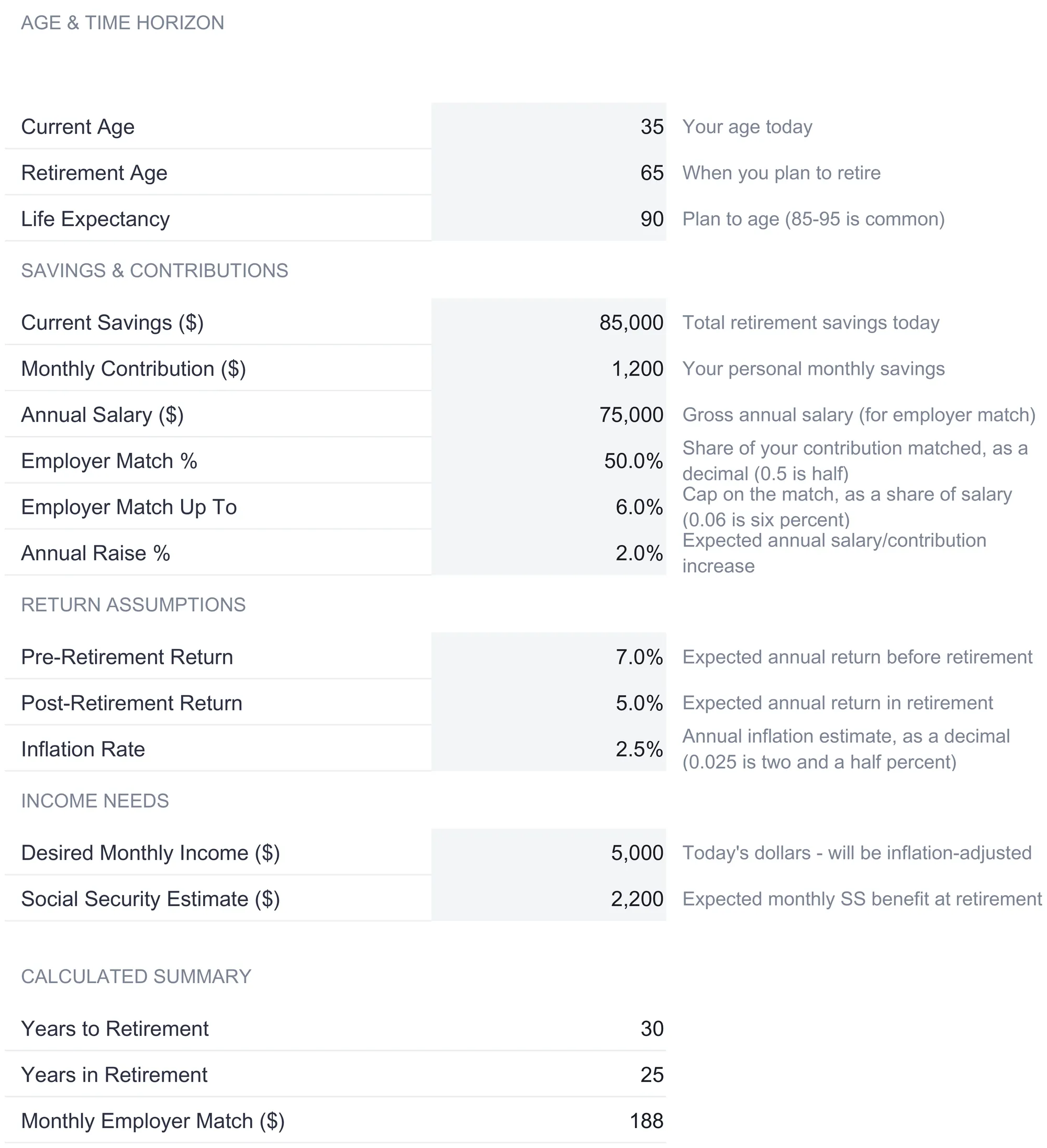
Age and time horizon. Current age, retirement age, and life expectancy. The sample uses 35, 65, and 90. From these the sheet derives two spans it uses everywhere else: years to retirement (30) and years in retirement (25).
Savings and contributions. Current savings of $85,000, a monthly contribution of $1,200, an annual salary of $75,000, and the employer match terms. The match here is 50% of what you put in, capped at 6% of salary, with a 2% annual raise applied to both salary and contributions over time.
Return assumptions. Three rates, and the split between the first two is the point. The pre-retirement return of 7% compounds your savings while you are still working. The post-retirement return of 5% is the gentler rate applied once you retire, reflecting a portfolio often shifted toward steadier holdings. Inflation sits at 2.5%.
Income needs. The desired monthly income is $5,000, entered in today’s dollars because the sheet inflates it for you, and the Social Security estimate is $2,200 a month at retirement.
Below the inputs, a calculated summary previews a few derived figures so you can sanity-check the setup before moving on. The monthly employer match works out to $188, which is half of the $375 monthly cap (6% of a $75,000 salary is $4,500 a year, or $375 a month, matched at 50%). Add that to the $1,200 you contribute and the total monthly saving is $1,388. The summary also shows the headline it all builds toward: a projected balance at retirement of $2,646,349.
That $2,646,349 is worth pausing on, because the sheet computes it two ways on purpose. Here on the Assumptions sheet it is a single closed-form formula, correct for any horizon. On the Growth Projection sheet it is the last row of a year-by-year walk. Both are designed to agree, and in the sample they do. The closed-form version is what the dashboard shows as the headline, so it stays right even for horizons longer than the visible table can display.
Grow it forward: the Growth Projection sheet
The Growth Projection sheet is the accumulation phase written out one year at a time, from your current age to retirement. Nothing on it is typed; every cell is a formula driven by the Assumptions sheet. Each row carries seven columns: age, calendar year, the annual contribution, the employer match, the beginning balance, the investment returns earned that year, and the ending balance that becomes the next year’s opening figure.
One row makes the mechanics concrete. In the first year the sample saver is 35, contributes $14,400 for the year ($1,200 times twelve), and receives $2,250 in employer match. The balance opens at $85,000. The investment return for the year is $6,533, and here is the detail worth copying: it is not simply 7% of the opening balance. The sheet uses a mid-year convention, applying the year’s return to the opening balance plus half of that year’s contributions and match, on the reasoning that money paid in across the year is only invested for part of it. So the return is 7% of ($85,000 + $7,200 + $1,125), which is 7% of $93,325, or $6,533. The ending balance is $85,000 + $14,400 + $2,250 + $6,533, which comes to $108,183. That figure opens the next row.
From there the pattern repeats, with one twist: the contribution and match grow by the 2% annual raise each year, so the amount saved climbs from $14,400 in year one toward $25,572 by the final year. Compounding does the rest of the work. By age 50 the ending balance has passed $795,000; by age 58 it is over $1.6 million; and the thirtieth year lands on the $2,646,349 that the dashboard reports. The compounding effect that drives this is the same one the SEC’s Investor.gov compound interest calculator illustrates, where growth accelerates as returns are earned on prior returns rather than on contributions alone.
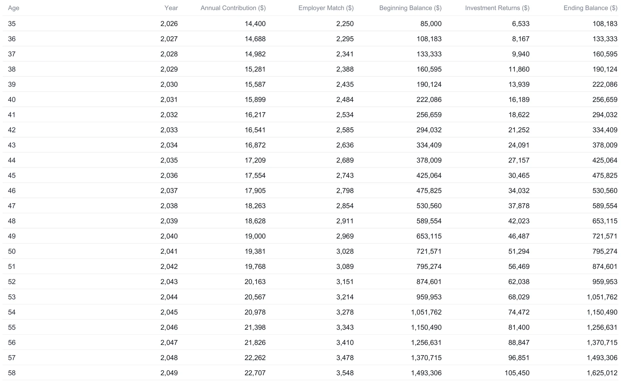
The image above shows the table through age 58; the full sheet continues to the retirement age. Two design details are worth carrying into any hand-built version. Rows past your retirement age stay blank rather than filling with meaningless numbers, so the table ends exactly where your horizon does. And because the dashboard’s headline balance comes from the closed-form formula rather than this table, the projection is still correct for someone forty-five years from retirement, even though the year-by-year view only spans thirty rows.
Compare the rates you cannot know: the Scenario Comparison sheet
The single most consequential number in any retirement projection is the return you assume, and it is precisely the number nobody can promise. The Scenario Comparison sheet handles that honestly by running the same saver under three different accumulation returns side by side.
The three columns are Conservative at 5% (described as bonds-tilted), Moderate at 7% (a balanced portfolio, and the rate that matches the main dashboard), and Aggressive at 9% (equity-heavy). Each rate is a tinted cell you can change. Every other assumption, meaning contributions, salary, inflation, and life expectancy, stays fixed across the three, so the columns isolate the effect of the return alone.
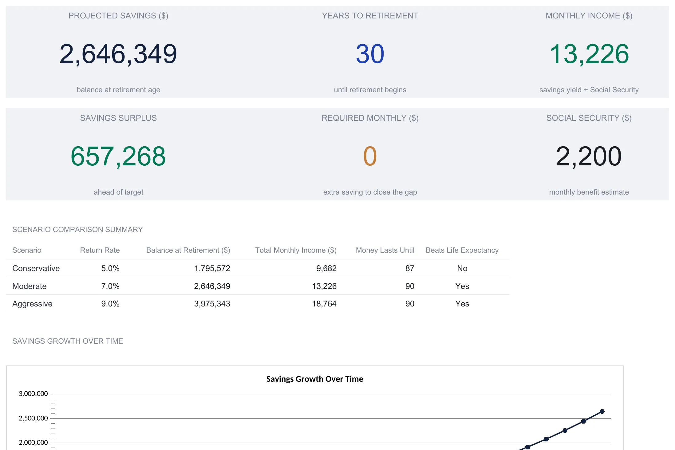
The spread is large. The Conservative column projects a $1,795,572 balance at retirement, the Moderate column $2,646,349, and the Aggressive column $3,975,343. That top figure is more than double the bottom one, from a four-percentage-point difference in an assumed rate. The sheet then translates each balance into monthly income (the portfolio’s yield at the post-retirement return, plus Social Security) and reports how long the money lasts. Conservative delivers $9,682 a month and the portfolio is projected to run dry at age 87, three years short of the planned life expectancy of 90, so its “Funds Beyond Life Expectancy?” line reads No. Moderate and Aggressive both reach 90 with the answer Yes.
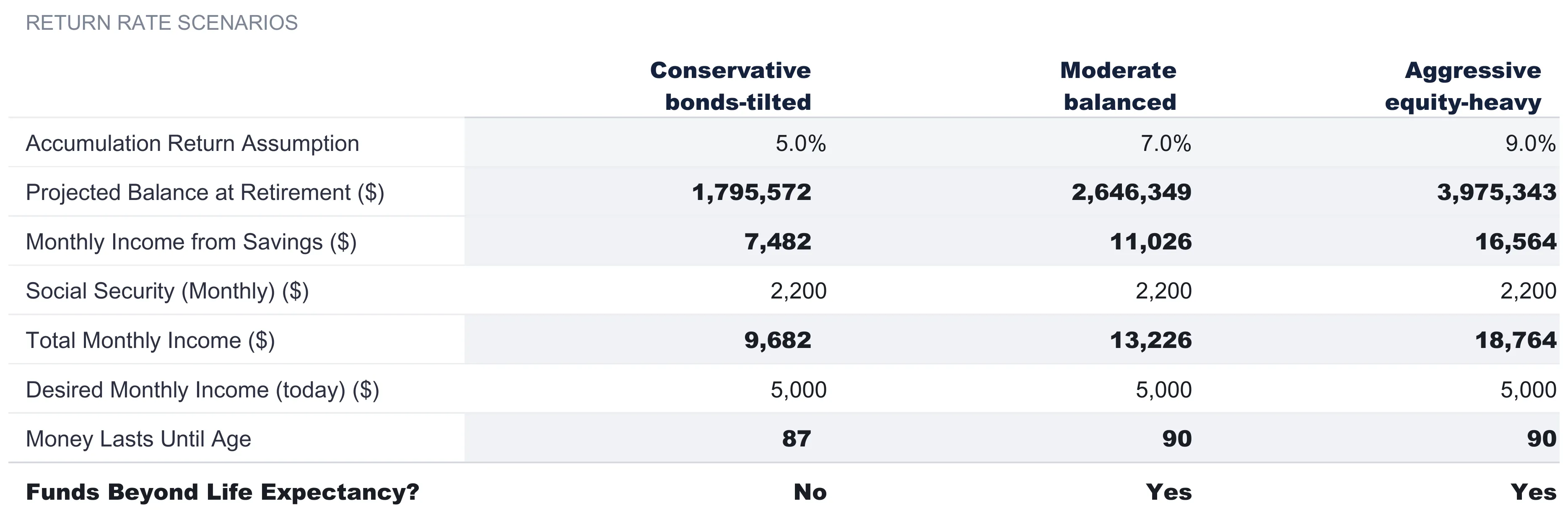
One subtlety keeps the sheet consistent. The rate in each column applies only to the accumulation phase. The drawdown that decides how long the money lasts still uses the single post-retirement return from the Assumptions sheet, so all three scenarios answer the longevity question the same way and differ only in the balance they start retirement with. This is why the Moderate column matches the dashboard exactly: its 7% is the sample’s pre-retirement return.
Test two levers at once: the Sensitivity Analysis sheet
Scenario Comparison varies one input. The Sensitivity Analysis sheet varies two, laying out a pair of grids with monthly contribution down the rows and annual return across the columns. It answers the planning question that a single projection cannot: if I saved a little more, or if returns came in a point lower, where would I land?
The first grid is projected retirement balance. Contributions run from $500 to $3,000 a month down the side, returns from 4% to 10% across the top, and every intersection is the balance that combination produces. The sample’s own case, $1,200 a month at 7%, sits in the middle of the grid at $2,646,349, exactly matching the dashboard, which is a useful way to confirm you are reading it correctly. From there the grid shows the trade in both directions. Holding the return at 7%, lifting the monthly contribution from $1,200 to $2,000 moves the projected balance from $2,646,349 to $3,799,102. Holding contributions at $1,200 and dropping the return from 7% to 5% pulls it down to $1,795,572. The corners span an enormous range, from $878,218 at the low end ($500 a month at 4%) to $9,333,984 at the high end ($3,000 a month at 10%).
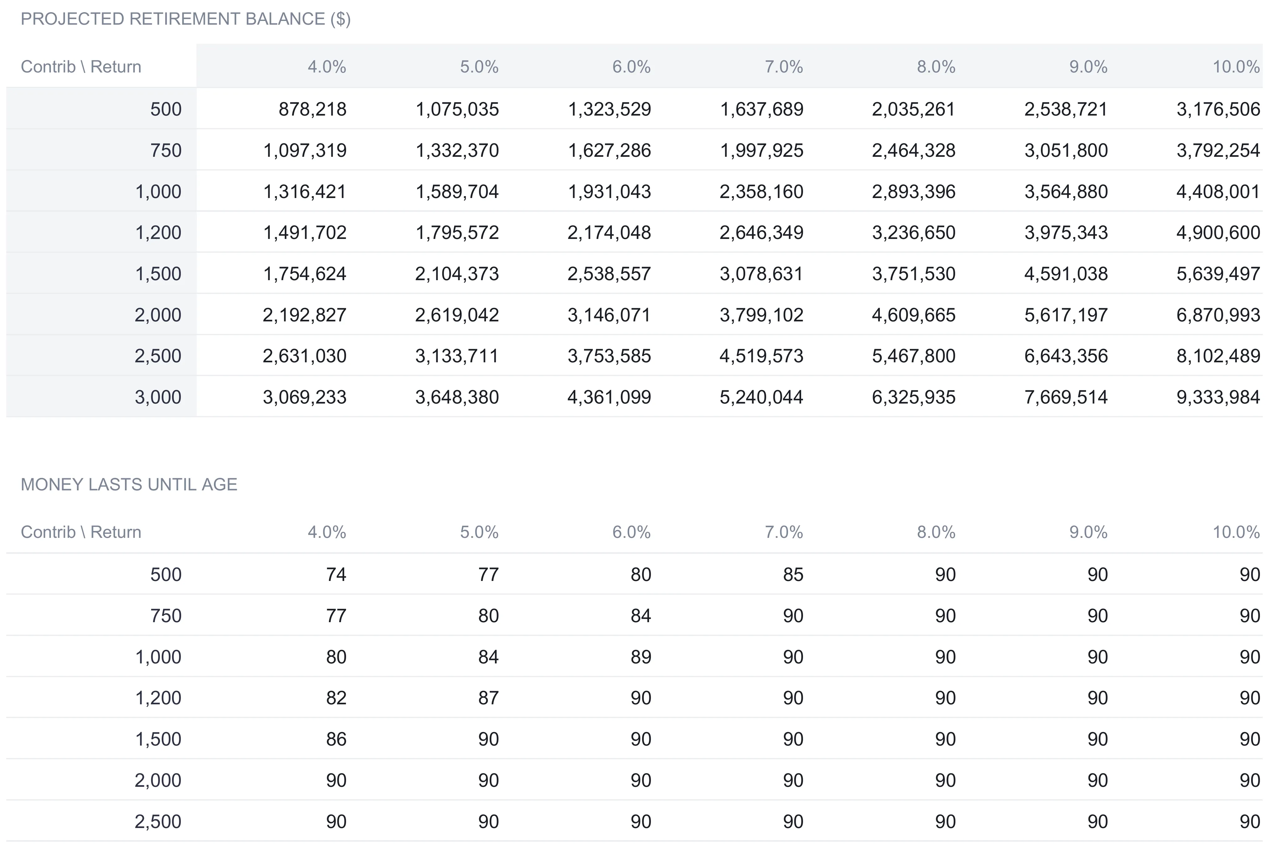
The second grid, below the first, reframes the same axes around longevity: money lasts until age. Here the numbers cluster near the top because the planning horizon caps at the life expectancy of 90. A saver putting away $500 a month at a 4% return sees the portfolio last only to age 74, but push either lever and the figure climbs quickly to the 90 cap. The image above shows the second grid down to the $2,500 contribution row; the full sheet includes the $3,000 row as well. The tinted contribution and return cells sit around the first grid and the second grid follows them, so neither is a fixed illustration. Change a contribution or a return value and both surfaces recalculate around it.
Spend it back down: the Withdrawal Phase sheet
Accumulation is only half of a retirement plan. The Withdrawal Phase sheet takes the balance at retirement and runs the drawdown forward, year by year, from retirement age to life expectancy. Its job is to answer the question the accumulation table cannot: does the money last?
Each row shows the age, year, beginning balance, the inflation-adjusted withdrawal, the investment return earned on what remains, and the ending balance. The withdrawal figure is where the inflation adjustment lands. The $5,000 desired monthly income was entered in today’s dollars, so the sheet grows it by 2.5% inflation for every year between now and each retirement year, then subtracts the annual Social Security benefit, because Social Security covers part of the need directly. In the first year of retirement that produces a withdrawal of about $99,454: the $5,000 monthly target, compounded up over thirty years of inflation to roughly $10,488 a month, annualized, and reduced by the $26,400 a year of Social Security. That withdrawal keeps rising each year the table runs, since inflation never stops compounding.
The return each year uses the same mid-year convention as the accumulation table, applying the 5% post-retirement rate to the balance after half the year’s withdrawal is taken out. In the sample’s first retirement year the portfolio opens at $2,646,349, pays out $99,454, earns $129,831, and closes higher than it opened, at $2,676,726. That is not a quirk. Early in retirement the 5% return on a large balance outpaces the withdrawal, so the balance drifts up for a while before the rising withdrawals eventually turn it down. By the sample’s late eighties the balance is still well over $2 million, which is why the Moderate scenario reports funds lasting through life expectancy.
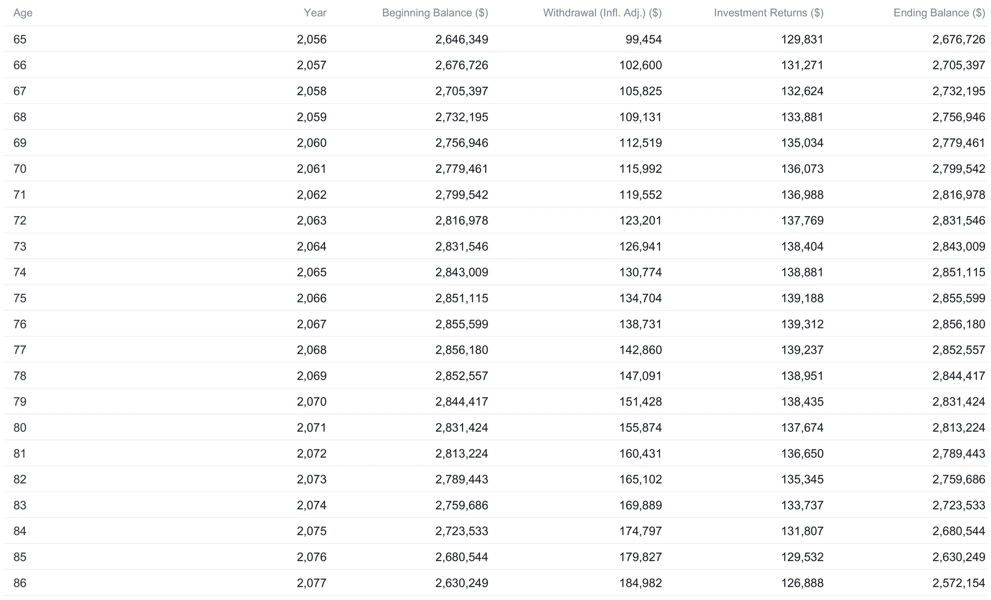
The image shows the table through age 86; it continues to life expectancy. One rule keeps the drawdown honest: if a year’s ending balance would go below zero, the sheet floors it at zero, and a zero ending balance is the signal that funds ran out before that age. In the Conservative scenario, where the retirement balance starts lower, that is what drives the “money lasts until 87” result. The sample’s Moderate case never hits it.
The dashboard: six numbers that summarize the plan
With the Assumptions filled in, the Dashboard reads every sheet and reduces the whole projection to six headline figures.
| Metric | Sample value | What it means |
|---|---|---|
| Projected Savings | $2,646,349 | Balance at retirement age, from the closed-form formula |
| Years to Retirement | 30 | Retirement age minus current age |
| Monthly Income | $13,226 | Portfolio yield at the post-retirement return, plus Social Security |
| Savings Surplus | $657,268 | How far the projected balance sits above or below the required nest egg the sheet derives from the inputs |
| Required Monthly | $0 | Extra monthly saving the sheet estimates to close a gap |
| Social Security | $2,200 | The monthly benefit estimate from Assumptions |
The Monthly Income figure of $13,226 is the projected balance earning the 5% post-retirement return, divided by twelve, plus the $2,200 Social Security benefit. The Savings Surplus compares the projected balance against the nest egg the sheet calculates would be needed to fund the inflation-adjusted income target, and reports the difference. The target itself follows the same logic as the withdrawal table. The $5,000 monthly goal is inflated over the 30 years to retirement and reduced by Social Security, and the resulting annual gap is divided by the post-retirement return to find the balance that would generate it. That works out to roughly $1.99 million, and because the projection reaches $2,646,349, the surplus is the difference of about $657,268, which the dashboard labels “ahead of target.” That label is why Required Monthly reads $0: the sheet estimates no additional saving is needed to reach the stated income under these assumptions. Had the inputs produced a shortfall instead, the status line would flip to a savings gap and Required Monthly would show the extra monthly amount it estimates would close it.
Below the tiles, the dashboard repeats the three-scenario summary and plots two charts: a line of the balance growing from age 36 to 65, and a bar chart comparing the Conservative, Moderate, and Aggressive balances at retirement. The line makes the acceleration of compounding visible, curving upward as the later years add far more than the early ones. None of these outputs is a verdict on whether the plan is right for anyone; they are the arithmetic of the inputs, and the inputs are yours to change.
The metrics in plain terms
A few of the figures carry meaning that is easy to lose in the jargon.
Mid-year convention is the modeling choice behind the investment-return column on both tables. Rather than pretend a whole year’s contributions were invested on January 1, the sheet credits returns on half of the year’s inflows. It is a standard convention that keeps the growth figure from overstating a single year.
Real versus nominal dollars is why the desired income is entered in today’s money. A $5,000 monthly lifestyle today needs far more nominal dollars in thirty years to buy the same things, and the withdrawal table does that inflation math so you can think in numbers you recognize.
Longevity risk is the plain-English name for what the “money lasts until age” figure measures. It is the risk of outliving the portfolio, and the sensitivity grid exists largely to show how contributions and returns move that date. Because the two grids share the same axes, reading them together shows the trade directly: the combinations that build the largest balance are also the ones that push the depletion age out to the planning cap, so a single change to a contribution or a return rate ripples through both the accumulation and the drawdown sides of the plan at once.
What the workbook does not model is worth stating too, and it says so on its own instructions: taxes, sequence-of-returns risk (the danger of a bad market run early in retirement), and healthcare costs are outside its scope, and it uses constant average returns rather than the year-to-year swings of real markets. Those gaps are exactly the territory where a financial professional adds what a spreadsheet cannot.
Excel or Google Sheets for a retirement projection
The template is an .xlsx file built on ordinary formulas, with no macros and no add-ons, so it runs the same way in Microsoft Excel and in Google Sheets after upload, and in LibreOffice Calc as well. Google Sheets suits anyone who wants the file synced across devices and open from a browser; Excel suits those who prefer a local copy and heavy recalculation on the desktop. The closed-form dashboard formula, the two projection tables, and both sensitivity grids behave identically across all three, because none of them relies on anything platform-specific. A currency selector on the dashboard relabels every money column and KPI across the workbook, though it changes only the label and does not convert the underlying numbers.
Which retirement template fits
- Retirement Calculator Ultimate Spreadsheet Template ($29) is the workbook this walkthrough follows: the Assumptions inputs, the Growth Projection and Withdrawal Phase tables, the Scenario Comparison and Sensitivity Analysis views, and the six-metric dashboard. It is the top of a three-tier family. The free Retirement Calculator is one working sheet with five inputs and four results, including the future value at retirement, and the Essentials version ($19) adds a dashboard and a year-by-year projection table, before the Ultimate tier adds the scenario and sensitivity sheets and a dedicated drawdown table running to life expectancy.
- FIRE Calculator Ultimate Spreadsheet Template ($29) answers a different question from the same family. Where the retirement calculator projects a balance at a fixed retirement age, the FIRE calculator works backward from a target and models financial independence and early-retirement paths, including a Coast FIRE view. It suits savers focused on reaching independence sooner rather than planning around a conventional retirement age.
Related
- Retirement Calculator: Planning for the Future - a broader introduction to what a retirement calculator estimates and why
- Retirement Template vs Retirement Calculator - when a full planning template fits better than a single calculator
- Retirement Withdrawal Calculator Spreadsheet - a closer look at the drawdown side of the picture
- Google Sheets vs Excel for Retirement Planning - how the two platforms compare for this kind of model
Frequently asked questions
What is the difference between the pre-retirement and post-retirement return?
They are two separate assumptions on the Assumptions sheet. The pre-retirement return (7% in the sample) compounds your savings during the accumulation years and drives the Growth Projection table. The post-retirement return (5% in the sample) is the gentler rate applied once you stop contributing and start drawing down, and it drives the Withdrawal Phase. Splitting them lets the model reflect a portfolio that is often shifted toward steadier assets in retirement, without forcing one rate to do both jobs.
Why does the dashboard balance not match the last row of the Growth Projection table?
They are computed two different ways and are designed to agree. The Growth Projection table walks year by year and can only show up to 30 rows, so it ends where the visible horizon does. The dashboard's Projected Savings is a closed-form formula on the Assumptions sheet that is correct for any horizon, which is why the workbook uses it as the headline figure. In the sample both land on $2,646,349 at age 65.
Does the withdrawal table account for inflation?
Yes. The desired monthly income is entered in today's dollars on the Assumptions sheet, and the Withdrawal Phase grows that figure by the inflation rate for every year between now and each retirement year before subtracting Social Security. In the sample a $5,000 monthly target becomes a first-year withdrawal of about $99,454 after 30 years of 2.5% inflation and the annual Social Security offset. The figure keeps rising each year the table runs.
What does 'Money Lasts Until Age' capping at 90 mean?
The sample sets life expectancy to 90, and the model reports how long the portfolio funds the planned withdrawals, capped at that life expectancy. A value of 90 means the money was not projected to run out within the planning horizon under those inputs. The Conservative scenario shows 87, meaning that at a 5% return the sample portfolio was projected to be exhausted three years before life expectancy. These are projections from the entered assumptions, not guarantees.
Can I change the return and inflation rates myself?
Yes. Every tinted cell on the Assumptions sheet is an input, including the pre-retirement return, post-retirement return, and inflation rate, and the Sensitivity Analysis sheet carries tinted contribution and return axes around its first grid, which the second grid follows. Changing any of them recalculates every sheet. The sample rates of 7%, 5%, and 2.5% are the workbook's starting values, not recommendations, and real-world returns vary year to year rather than arriving as a constant average.
Sources
- Compound Interest Calculator - U.S. Securities and Exchange Commission (Investor.gov)
About this article
Sheets, inputs, formulas, figures and screenshots checked on 2026-09-10 against the shipped Retirement Calculator Ultimate workbook (Dashboard, Assumptions, Growth Projection, Withdrawal Phase, Scenario Comparison, Sensitivity Analysis and How to Use), and the tier comparison against the shipped Free and Essentials Retirement Calculator workbooks. Compound growth reference checked against the live Investor.gov (SEC) compound interest calculator page at writing time. Last reviewed September 2026.