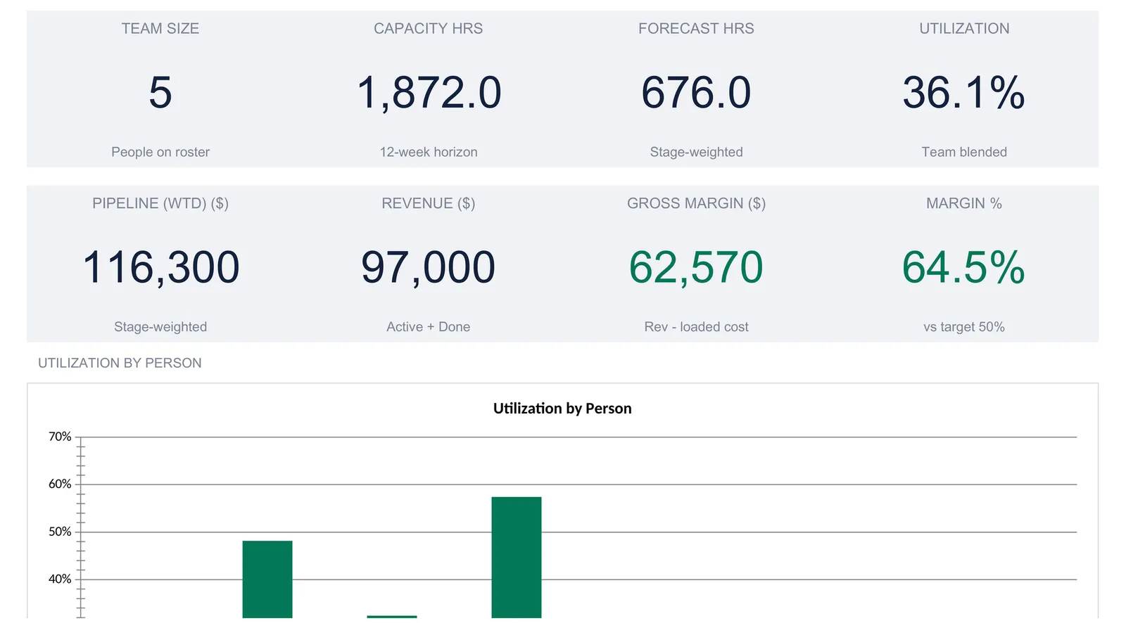
Agency capacity planning is a matching problem: the hours a small team can bill against the hours the pipeline will demand, person by person. This walkthrough builds the calculation the way the template does it, from a roster of five people with 156 billable hours a week, through a stage-weighted pipeline worth 116,300, to per-person utilization that runs from 0 to 57 percent and a 36.1 percent team blend read against an 85 percent hiring trigger. Our Tiny Agency Capacity Spreadsheet Template ($39) ships the whole thing ready for Excel and Google Sheets.
A one-person consultancy has one calendar to watch. A four-person agency has four, plus a pipeline of work that has to be matched against all of them at once, and the matching is where small firms quietly come undone. Take on the wrong project in a busy fortnight and someone works nights; turn away the right one because the calendar looked full when it was not, and a month of revenue walks out the door. Most owners of a small agency can tell you roughly how busy the team feels. Far fewer can tell you that the designer is running at 32 percent while the project manager is at 57, or that the pipeline is worth 116,300 once you stop counting long-shot leads at full value. The difference between the feeling and the figure is structure, and a spreadsheet holds it well.
That structure is really a matching problem with a few moving parts: who can do the work and how much of it, what work is coming and how live each piece is, how those two meet on each person’s calendar, and what margin the delivered work throws off. The examples below come from our Tiny Agency Capacity Spreadsheet Template ($39), which ships the whole calculation ready-made for Excel and Google Sheets. The layout is reproducible by hand if you would rather build your own.
What an agency capacity spreadsheet has to hold
Strip the problem to its parts and there are six, each with its own sheet in the template:
- The rules. A handful of settings that shape every calculation: the currency, how far ahead to look, and the two utilization lines and the margin target the workbook measures against.
- The team. Who is on the roster, how many hours a week each can bill, what they cost, and what they charge.
- The pipeline. Every project in play, its stage, its value, its forecast hours, and the person carrying it.
- Per-person utilization. How the pipeline’s hours land on each individual calendar over the horizon, and whether that leaves each person over-loaded, under-loaded, or on track.
- Revenue and margin. What the work actually being delivered brings in, what it costs to deliver, and the gross margin between them.
- The dashboard. Eight headline numbers, two charts, and a one-line status that reads team utilization against the hiring trigger.
The workbook gives each of these its own sheet (Settings, Team, Pipeline, Utilization, and Forecast) with a Dashboard on top that reads all of them and a How to Use sheet carrying the instructions. Seven sheets in all. The walkthrough below follows the order the numbers flow rather than the tab order: set the rules, list the team, log the pipeline, read each person’s load, total the margin, then let the dashboard summarize. The sample workbook is filled for a fictional shop called Aurora Agency, and every figure that follows is read straight from it.
Set the rules: the Settings sheet
Six inputs on the Settings sheet govern everything downstream, so they come first. Three sit under a Business heading and three under Targets.
Agency name and currency. The sample reads Aurora Agency, which appears as a heading on the Dashboard and on each of the five working sheets, and a currency symbol, the dollar in the sample, chosen from a dropdown of 35 options that runs from the euro and pound through to the rupee, real, and dirham. Choosing a symbol relabels every money column and KPI header across the workbook. It relabels only, with no conversion of the underlying numbers, so switching to the euro leaves 116,300 reading as 116,300 with a new symbol in front.
Forecast horizon. The sample looks 12 weeks ahead. This one number turns weekly capacity into a total: a 36-hour week over a 12-week horizon is 432 capacity hours, and the whole utilization calculation scales with it. Shorten the horizon and every capacity figure shrinks in step.
The two utilization lines and the margin target. Three benchmarks sit under a Targets heading. The utilization hiring trigger, 85 percent in the sample, is the team-wide utilization the firm treats as too thin to absorb more work. The under-utilized line, 70 percent, is the level below which a person is flagged as carrying slack. Between the two, work is judged on track. The target gross margin, 50 percent, is the benchmark the dashboard’s margin tile is colored against. The on-sheet note is careful to add that the margin target drives nothing else in the workbook; it is a coloring threshold, not an input to any calculation.
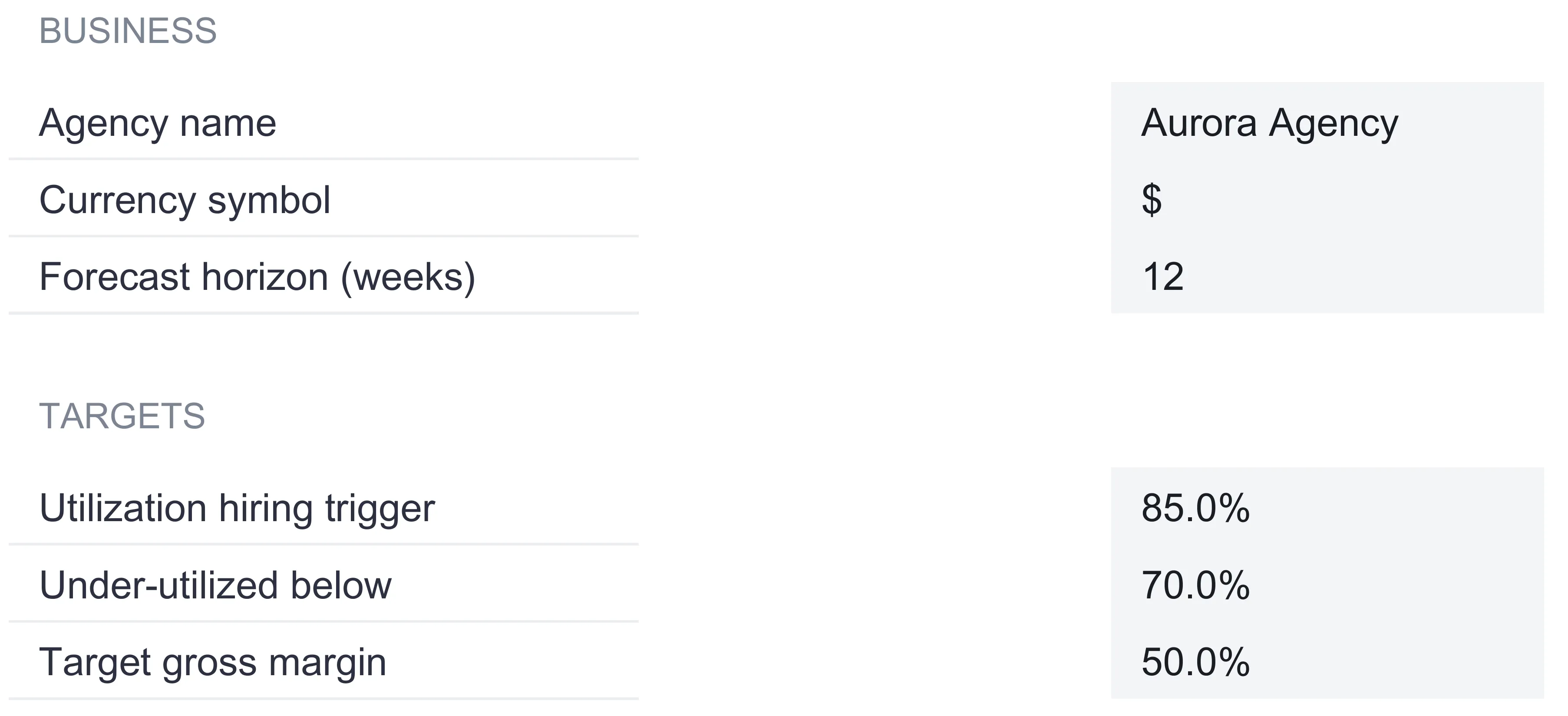
The reason these live on their own sheet, rather than being typed into the formulas that use them, is that they are the levers. Move the horizon from 12 weeks to 8, or the hiring trigger from 85 to 90 percent, and the dashboard rereads the whole team against the new rule without a single other cell being touched.
List who can do the work: the Team sheet
The Team sheet is the roster, and it is the supply side of the whole model. Each person gets a row with a name, a role, a weekly billable capacity, a bill rate, a cost rate, and a status. The sample carries five people:
| Name | Role | Capacity h/wk | Bill / hr ($) | Cost / hr ($) | Status |
|---|---|---|---|---|---|
| Founder | Lead strategy | 28 | 200 | 0 | FTE |
| Senior | Senior consultant | 36 | 165 | 75 | FTE |
| Designer | Design lead | 36 | 150 | 65 | FTE |
| PM | Project manager | 36 | 140 | 55 | FTE |
| Contractor | Engineer (part-time) | 20 | 175 | 110 | Contractor |
| Total capacity / week | 156 | ||||
| Of which FTE | 136 |
Two totals sit below the list. Total capacity per week sums the roster to 156 hours, and the of-which-FTE line uses the status column to pull out the 136 hours carried by full-time staff, leaving the 20 contractor hours to one side. That subtotal is the whole job of the status column: every other calculation in the workbook, from utilization to loaded cost, reads a contractor’s hours and rates exactly the way it reads an employee’s.
The distinction the sheet draws is between the bill rate and the cost rate. The bill rate is simply what the client pays for an hour of that person’s time. The cost rate is loaded cost, and the on-sheet note spells out what that means: salary, benefits, and tax for a full-time employee, or the contract rate for a contractor. The founder’s cost rate is zero in the sample, which the note explains as the common case of a founder who is not paid a salary and instead takes profit. The contractor, at 110 an hour of cost against a 175 bill rate, is the thinnest margin on the roster, which is exactly the sort of thing the sheet is built to make visible rather than hide.
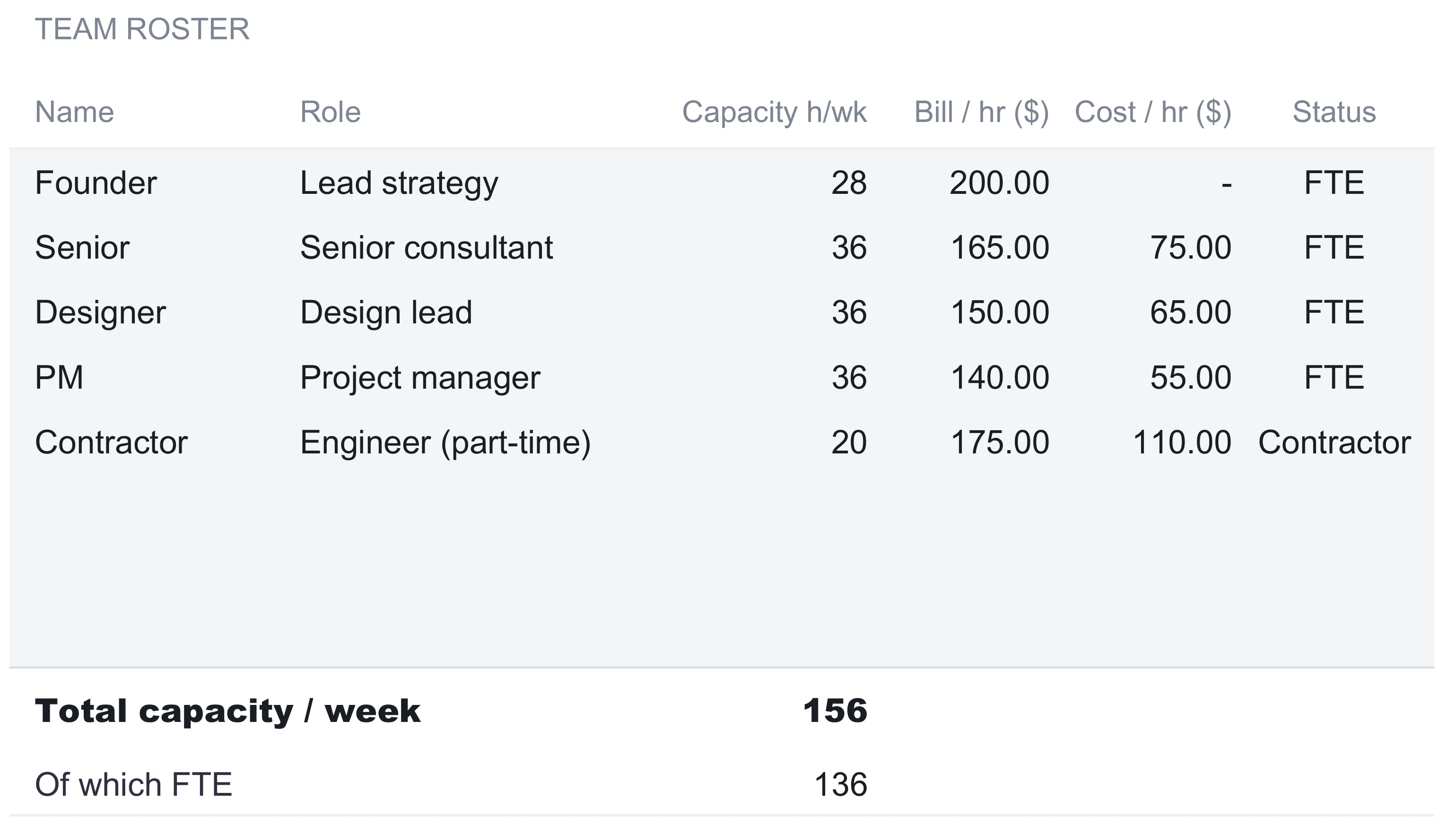
The roster holds eight rows, and the sample fills five. The last three are blank, and the on-sheet note points out that they already sit inside every total, the Utilization sheet, and the dashboard chart, so naming a sixth person on the first free row folds them into the whole model with no formula to drag and no range to extend. For a firm the template is built for, two to five people with room to grow, that headroom covers a hire or two before the file needs any structural change.
Log the work in sight: the Pipeline sheet
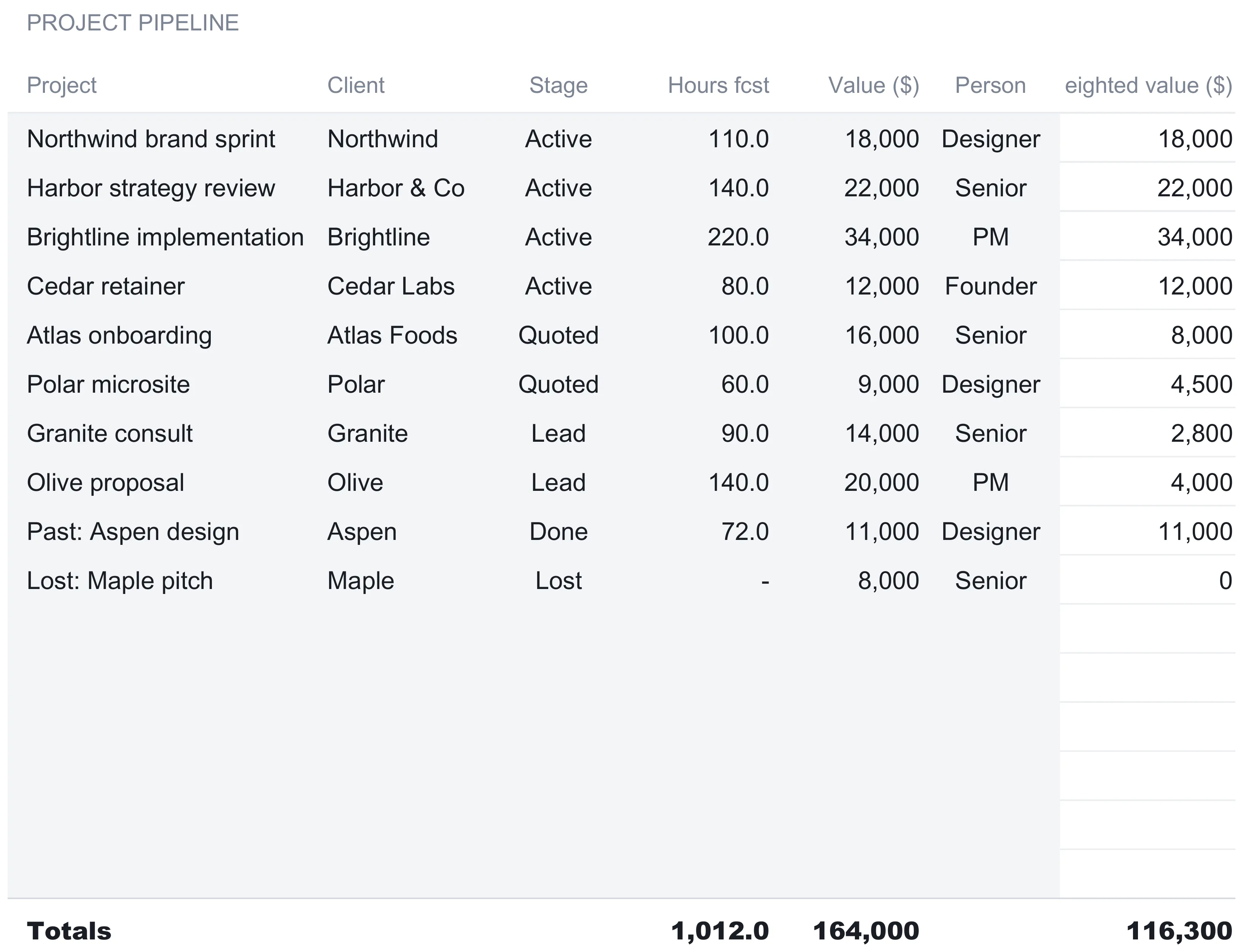
The Pipeline sheet is the demand side, and it is where the weighted-pipeline idea lives. Each row is a project with a name, a client, a stage, a forecast hour count, a value, and an assigned person. A seventh column, weighted value, is computed. The sample carries ten projects:
| Project | Client | Stage | Hours fcst | Value ($) | Person | Weighted value ($) |
|---|---|---|---|---|---|---|
| Northwind brand sprint | Northwind | Active | 110 | 18,000 | Designer | 18,000 |
| Harbor strategy review | Harbor & Co | Active | 140 | 22,000 | Senior | 22,000 |
| Brightline implementation | Brightline | Active | 220 | 34,000 | PM | 34,000 |
| Cedar retainer | Cedar Labs | Active | 80 | 12,000 | Founder | 12,000 |
| Atlas onboarding | Atlas Foods | Quoted | 100 | 16,000 | Senior | 8,000 |
| Polar microsite | Polar | Quoted | 60 | 9,000 | Designer | 4,500 |
| Granite consult | Granite | Lead | 90 | 14,000 | Senior | 2,800 |
| Olive proposal | Olive | Lead | 140 | 20,000 | PM | 4,000 |
| Past: Aspen design | Aspen | Done | 72 | 11,000 | Designer | 11,000 |
| Lost: Maple pitch | Maple | Lost | 0 | 8,000 | Senior | 0 |
| Totals | 1,012 | 164,000 | 116,300 |
The weighted value column is the point of the sheet. A project’s face value is discounted by how live it is, so a pipeline stuffed with hopeful leads is never mistaken for booked work. The stage weights sit in a small table below the list, and each stage carries two of them:
| Stage | Value weight | Hours weight |
|---|---|---|
| Lead | 0.2 | 0.2 |
| Quoted | 0.5 | 0.5 |
| Active | 1 | 1 |
| Done | 1 | 0 |
| Lost | 0 | 0 |
Weighted value is value times the stage’s value weight. The Granite consult, a 14,000 lead, counts at 20 percent for 2,800. The Atlas onboarding, a 16,000 quote, counts at half for 8,000. Every active project counts in full, and the lost Maple pitch counts at nothing. Add the ten weighted figures and the pipeline is worth 116,300, against a face value of 164,000. That gap of nearly 48,000 is the difference between what the firm hopes to win and what a stage-weighted read says the pipeline is actually worth today.
The second weight, the hours weight, answers a different question, and this is the detail worth copying into any hand-built version. Value weight decides how much of a deal’s money to count. Hours weight decides how much of its forecast hours is still to be delivered inside the horizon, which is what actually consumes a person’s time. For Leads, Quoted, and Active work the two weights match, because a live project’s money and its remaining effort scale together. They split on Done. The on-sheet note puts it plainly: a finished project still counts its full value, because the money was earned, but its hours weight drops to zero, because the delivery is over and takes no more capacity. The lost Maple pitch, meanwhile, counts zero on both, since it neither earns money nor needs work.
The stage and person fields are dropdowns, so a project moves from Lead to Quoted to Active by picking from a list rather than retyping, and its weighted value and its claim on someone’s calendar both update the moment the stage changes. The pipeline holds sixteen rows; the sample fills ten, and the six blank rows are pre-wired into every total and both dashboard charts the same way the roster’s spare rows are.
Read each person’s load: the Utilization sheet
The Utilization sheet is where supply meets demand. It mirrors the roster row for row and, for each person over the horizon, works out three numbers and a status:
| Name | Capacity hrs | Forecast hrs | Utilization | Status |
|---|---|---|---|---|
| Founder | 336.0 | 80.0 | 23.8% | Under |
| Senior | 432.0 | 208.0 | 48.1% | Under |
| Designer | 432.0 | 140.0 | 32.4% | Under |
| PM | 432.0 | 248.0 | 57.4% | Under |
| Contractor | 240.0 | 0.0 | 0.0% | Under |
| Team total | 1,872.0 | 676.0 | 36.1% |
Capacity hours is each person’s weekly capacity from the Team sheet times the 12-week horizon, so the 36-hour-a-week roles land at 432 and the 28-hour founder at 336. Forecast hours is the demand side, and it is the stage-weighted forward work assigned to that person. This is where the hours weight from the pipeline does its job: each project’s forecast hours are scaled by its stage’s hours weight, then summed by the person carrying it.
The senior consultant’s row makes the mechanism concrete. The senior is assigned four projects: the Harbor strategy review (140 hours, Active), the Atlas onboarding (100 hours, Quoted), the Granite consult (90 hours, Lead), and the lost Maple pitch (0 hours, Lost). Weighting each by its hours weight gives 140 times 1, plus 100 times 0.5, plus 90 times 0.2, plus 0, which is 140 plus 50 plus 18, for 208 forecast hours. Against 432 capacity hours that is 48.1 percent utilization. The status column then reads the figure against the two Settings lines: above the 85 percent hiring trigger it reads Over, below the 70 percent line it reads Under, and in between it reads On. At 48.1 percent the senior reads Under, as does every person in this sample.

The team total row sums both columns, 1,872 capacity hours against 676 forecast hours, and divides them for a blended 36.1 percent. That single figure is the one the dashboard banner watches. Reading down the individual rows tells a story the blend hides: the PM is the busiest at 57.4 percent, the founder and contractor the quietest, and the whole team sits well under the trigger. A spreadsheet that only tracked a team-wide average would miss that the load is lumpy, and lumpiness is what turns into someone’s weekend.
Recognized revenue and margin: the Forecast sheet
Utilization is about hours. The Forecast sheet is about money, and it deliberately counts a narrower slice of the pipeline. Its headline block is titled recognized revenue and margin, and the on-sheet note draws the line clearly: only Active and Done projects count toward revenue, loaded cost, and margin. Leads, Quoted work, and Lost deals are all excluded, because a firm has not earned money on work it has not started or has lost.
| Line | Sample value ($) | What it is |
|---|---|---|
| Revenue (Active + Done) | 97,000 | Value of active and finished projects |
| Loaded cost | 34,430 | Delivery hours times each person’s cost rate |
| Gross margin | 62,570 | Revenue minus loaded cost |
| Gross margin % | 64.5% | Margin as a share of revenue |
Revenue sums the value of the five active and done projects: the four active ones (18,000, 22,000, 34,000, and 12,000) plus the done Aspen design at 11,000, for 97,000. Loaded cost is where the cost rates from the Team sheet earn their place. For each recognized project it takes the full forecast hours, not the stage-weighted hours, and multiplies by the assigned person’s cost rate. The note is explicit that this uses full hours rather than weighted ones, because active and done work is being delivered in full, not partially. Northwind’s 110 designer hours at a 65 cost rate is 7,150; Harbor’s 140 senior hours at 75 is 10,500; Brightline’s 220 PM hours at 55 is 12,100; Cedar’s 80 founder hours cost nothing at a zero cost rate; and Aspen’s 72 designer hours at 65 is 4,680. Together that is 34,430. Gross margin is the 97,000 revenue less that 34,430 cost, or 62,570, which is 64.5 percent of revenue.
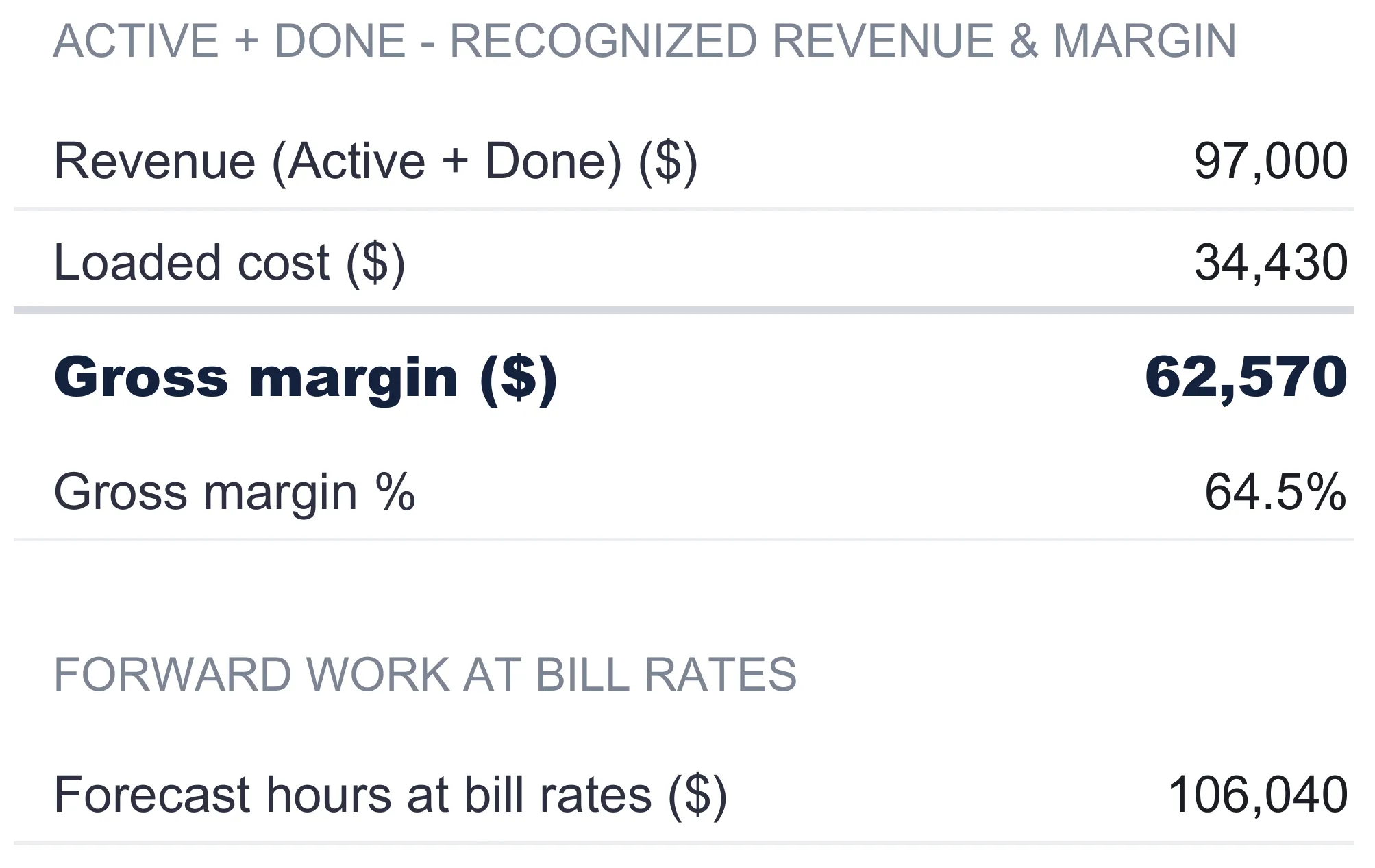
Below the margin block sits a second figure under a forward-work heading: forecast hours at bill rates, 106,040 in the sample. This one values the stage-weighted forward hours from the Utilization sheet at each person’s bill rate rather than cost rate. The note is careful to say what it is and is not: it is not revenue, it is what those forward hours are worth at the firm’s own rates, a sense of the earning power sitting in the weighted pipeline. Keeping it separate from recognized revenue is the same discipline the whole workbook runs on, never letting a hopeful number and a booked number share a cell.
The dashboard: eight numbers, two charts, and a status line
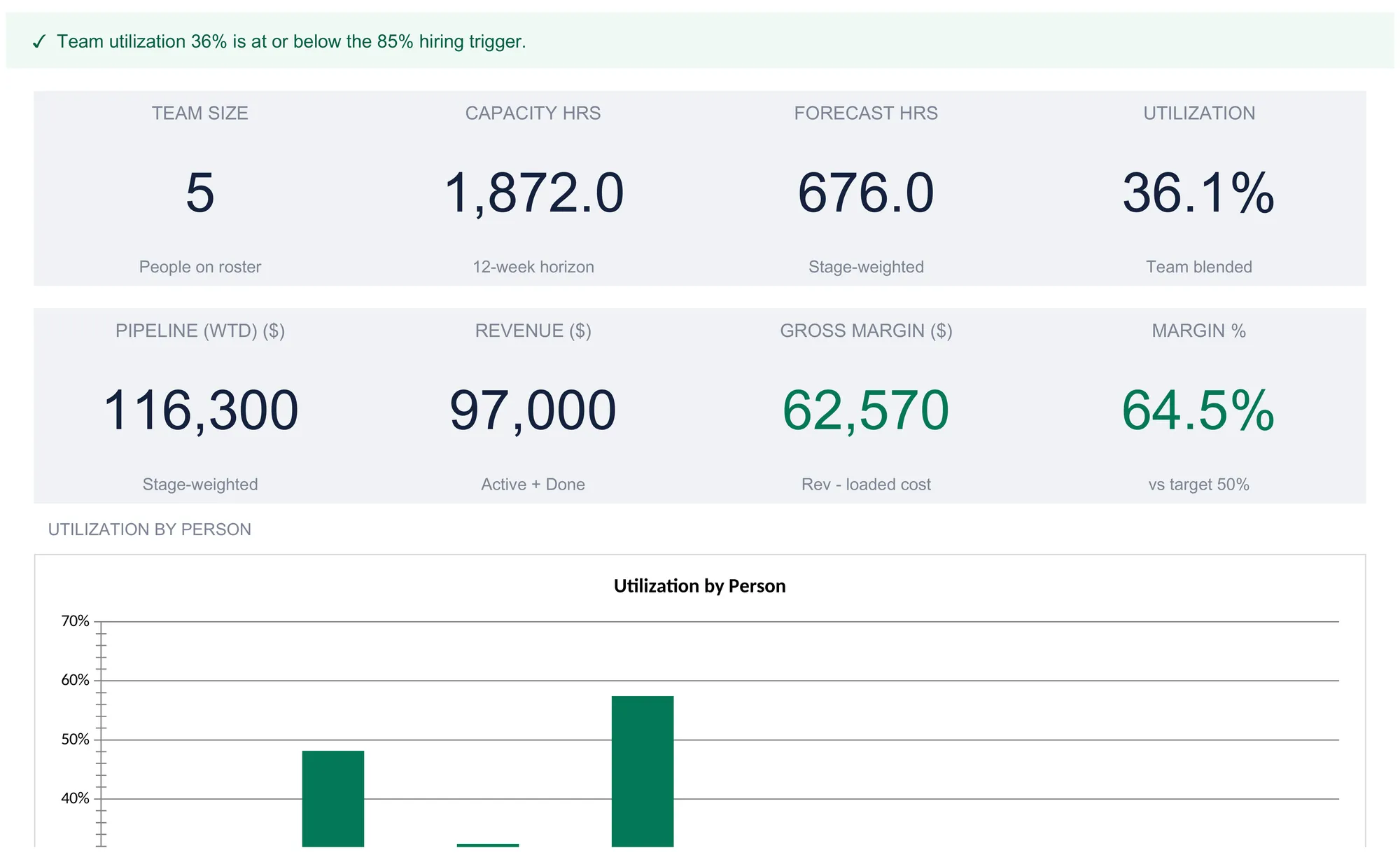
With the input sheets filled, the Dashboard reads across them and reports the firm on one screen. A banner across the top restates the horizon and currency, and a status line below it delivers the verdict in a single sentence. In the sample it reads, with a check mark, that team utilization 36 percent is at or below the 85 percent hiring trigger. The logic behind that sentence is simple and worth stating plainly: it compares the blended utilization from the Utilization sheet to the hiring trigger from Settings and reports which side of the line the team is on. Cross above the trigger and the same banner flips to a warning that utilization is above it. The workbook computes and flags the comparison; the threshold and the response are the owner’s to set.
Below the banner sit eight KPI tiles:
| Tile | Sample value | What it is |
|---|---|---|
| Team size | 5 | People named on the roster |
| Capacity hrs | 1,872.0 | Roster capacity over the 12-week horizon |
| Forecast hrs | 676.0 | Stage-weighted forward hours, all people |
| Utilization | 36.1% | Team blended, forecast ÷ capacity |
| Pipeline (wtd) | 116,300 | Stage-weighted pipeline value |
| Revenue | 97,000 | Active + Done project value |
| Gross margin | 62,570 | Revenue minus loaded cost |
| Margin % | 64.5% | Gross margin as a share of revenue |
Only the margin percentage tile carries a running comparison, labeled against the 50 percent target from Settings, and it takes color from whether the figure clears that benchmark. At 64.5 percent against a 50 percent target, it reads comfortably ahead. Beneath the tiles, two charts turn the tables into pictures. One plots utilization by person, so the gap between the busy PM and the idle contractor is visible at a glance. The other plots the weighted pipeline value by stage, one column per stage, setting the 86,000 of active work beside the 12,500 quoted, the 6,800 in leads, and the 11,000 done. The dashboard render above is cropped to the banner, the tiles, and the very top of the first chart, so only the leading edge of the utilization bars shows in the image; the full charts sit further down the sheet in the file itself.
Utilization, weighted pipeline, and gross margin together
The number no single calendar shows is the pairing at the center of the dashboard: a team billing at 36 percent of capacity that is still throwing off a 64.5 percent gross margin on the work it delivers. Three figures carry the plan, and each answers a different question. The weighted pipeline, 116,300 against 164,000 at face value, says how much real work is coming once long-shot leads are discounted to 20 percent and quotes to 50. Utilization, 676 of 1,872 hours, says whether the team has the time to do it, and reading down the rows rather than the 36.1 percent blend is what shows the load is lumpy, from the contractor’s 0 percent to the PM’s 57.4. Gross margin, 62,570, says whether the delivered work pays after the loaded cost of the people delivering it, and it moves with who does the work: the founder’s zero cost rate on the 12,000 Cedar retainer lifts the blend, while the contractor carries no active or done project in this sample and so does not touch it at all. A capacity plan that watched only one of the three would answer a third of the question, so a small firm needs all three rather than the one that feels most urgent.
Where the roster meets employment status
The Team sheet’s status column, marking each person FTE or Contractor, is not only a cost-accounting convenience. In the US the line between an employee and an independent contractor is a legal one with tax consequences on both sides, and it shapes what the cost rate should even contain. The IRS guide on whether a worker is an independent contractor or an employee explains that the distinction turns on common-law rules across behavioral control, financial control, and the type of relationship. No single factor decides it. The Small Business Administration’s guide to hiring and managing employees walks through the payroll, tax, and required-benefit obligations that attach once someone is an employee rather than a contractor. None of that changes the arithmetic in this workbook, which takes a cost rate as a given and works out margin from it. It is the reason the cost rate for a full-time role carries benefits and tax while a contractor’s carries only the contract price. Getting that classification right for a specific person is a matter for a professional rather than a spreadsheet.
Excel or Google Sheets for capacity planning
The template is an .xlsx file built entirely on ordinary formulas, with no macros and no add-ons, so it behaves identically in Microsoft Excel and in Google Sheets after an upload. Google Sheets suits an owner who wants to move a project from Quoted to Active from a phone between meetings and keep the file in a browser the whole team can see; Excel suits one who prefers a local file on the desktop. Because the whole thing is plain arithmetic across seven sheets, the per-person utilization, the weighted pipeline, and the gross-margin block all recalculate the same way in either program, and the structure described here is equally buildable by hand in both.
Which template fits which firm
- Tiny Agency Capacity Spreadsheet Template ($39) is the workbook this walkthrough follows: the roster, the weighted pipeline, the per-person utilization, the recognized-revenue margin block, and the eight-tile dashboard, built for a two-to-five-person services firm that is billing other people’s time as well as its own.
- Solo Consultant Rate & Capacity Spreadsheet Template ($29) is the one-person version of the same backbone. It works a revenue goal back through a single capacity model to a required hourly, day, and retainer rate, with a service-mix planner and a Lean, Base, and Stretch scenario compare. Where the agency template splits capacity across a team and asks who is loaded, the solo template keeps every assumption on one desk and asks what to charge. The rate calculation it walks through is the natural starting point before a practice grows past one person.
The two share the same idea, capacity feeding a plan, but the agency version adds the two things a team introduces that a solo desk never faces: per-person load and a pipeline weighted by how likely each deal is to land.
Related
- How to Calculate a Consulting Rate in a Spreadsheet - the solo-desk sibling, working a revenue goal back to an hourly, day, and retainer rate
- How to Track Business Taxes in a Spreadsheet - the tax view a small firm files from once the year is delivered
- Cash Flow Forecast Template for Business - the money-in, money-out view that sits alongside a capacity plan
Frequently asked questions
How is per-person utilization calculated in an agency capacity spreadsheet?
Utilization is forecast hours divided by capacity hours, worked out one person at a time. Capacity hours is each person's weekly billable capacity multiplied by the forecast horizon, so a 36-hour-a-week designer over a 12-week horizon has 432 capacity hours. Forecast hours is the demand headed their way, each assigned project's forecast hours scaled by how live it is, summed by person. In the sample the senior consultant carries 208 forecast hours against 432 of capacity, which is 48.1 percent utilization.
What is a weighted pipeline and how do the stage weights work?
A weighted pipeline discounts each deal by how likely it is, so a full pipeline is not mistaken for booked work. Every project sits at a stage, and each stage carries a value weight: Lead counts at 20 percent, Quoted at 50 percent, Active and Done at 100 percent, and Lost at zero. A 20,000 lead therefore adds 4,000 to the weighted figure while a 20,000 active project adds the full amount. The sample pipeline is worth 164,000 at face value and 116,300 once every deal is weighted by its stage.
Why does each stage have two weights, one for value and one for hours?
Money and capacity behave differently as a project moves through the pipeline, so the template keeps a separate weight for each. The value weight decides how much of a deal's revenue to count toward the weighted pipeline. The hours weight decides how much of its forecast hours still has to be delivered inside the horizon, which is what consumes a person's capacity. They part ways on Done work: its value weight is 100 percent because the money was earned, but its hours weight is zero because the delivery is finished and takes no more time.
Does the tiny agency capacity spreadsheet tell you when to hire?
No. It computes team-wide utilization and compares it to a hiring trigger you set yourself, 85 percent in the sample, then flags whether the blend sits above or below that line. The dashboard banner reads either that utilization is at or below the trigger, or that it is above it. The number and the threshold are both yours, and the workbook reports the comparison as a fact rather than recommending any action from it.
How many people can the template track, and does it work in Excel and Google Sheets?
The roster holds eight rows, five filled in the sample and three left blank and pre-wired, which fits the two-to-five-person firm the template is built for with room to grow. The file is an ordinary .xlsx built on plain formulas with no macros, so it behaves the same in Microsoft Excel and in Google Sheets after an upload, and the structure is equally buildable by hand in either.
Sources
- Independent contractor (self-employed) or employee? - Internal Revenue Service
- Manage your business: Hire and manage employees - U.S. Small Business Administration
About this article
Sheets, inputs, formulas, and every worked figure re-checked on 2026-09-10 against the shipped Tiny Agency Capacity workbook (Dashboard, Team, Pipeline, Utilization, Forecast, Settings, How to Use) and the screenshots used in this article. Worker-classification context checked against the live IRS independent-contractor page and the SBA hire-and-manage-employees guide at writing time. Last reviewed September 2026.