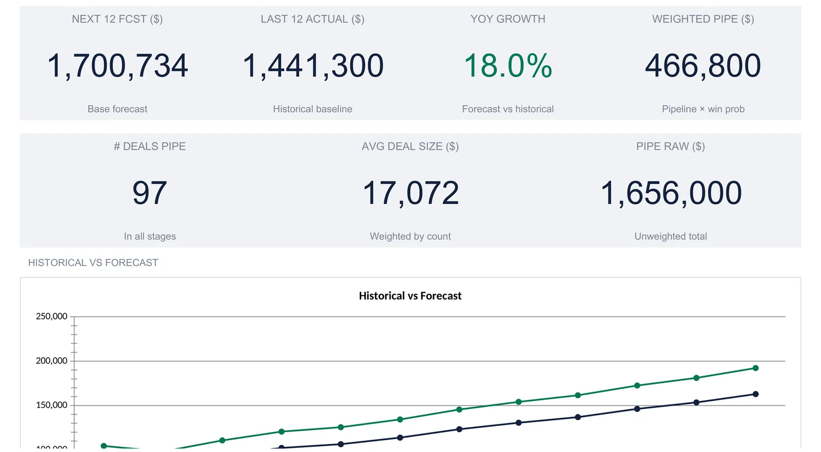
A sales forecasting spreadsheet grows your last 12 months of actual sales forward by a single growth rate, one month at a time, so the shape of the year carries into the forecast instead of being flattened into an average. Alongside it sits a weighted pipeline view that reads open deals by stage. This walkthrough builds the whole structure from a worked example: 1,441,300 in trailing sales grown 18 percent to a 1,700,734 base forecast, low and high bands of 1,445,624 and 1,955,844, and a 97-deal pipeline worth 466,800 weighted. Our Sales Forecasting Spreadsheet Template ($29) ships it ready-made for Excel and Google Sheets.
Most businesses already know what they sold last year. The harder question is what the next twelve months look like, and the gap between those two is a forecast. A sales forecast does not need to be a black box or a piece of dedicated software. At its core it is a small set of decisions applied consistently to numbers you already have, which is exactly the kind of work a spreadsheet does well.
This walkthrough builds a full sales forecast from the ground up using our Sales Forecasting Spreadsheet Template ($29), which ships the structure ready-made for Excel and Google Sheets. Every figure below comes from the real workbook, a sample built around a subscription business called Aurora Cloud Inc. The layout is reproducible by hand if you would rather assemble your own, and the point of reading it either way is to see exactly how a base forecast, a set of scenario bands, and a weighted pipeline fit together.
What a sales forecasting spreadsheet actually holds
Strip away the terminology and a sales forecast rests on four kinds of data:
- A few forecasting assumptions. The growth rate you expect to carry forward and the width of the uncertainty around it. These are the only real judgment calls, and keeping them in one place means the whole forecast moves when you change your mind.
- Your recent history. The last twelve months of actual sales, broken out by product line. This is the baseline the forecast grows from, so nothing downstream is more important than getting it right.
- The open pipeline. The deals currently in play, grouped by stage, each stage carrying a count, a typical deal size, and a probability of closing.
- The derived outputs. The month-by-month forecast, the low and high scenarios around it, the weighted pipeline value, and the headline numbers on the dashboard. None of these are typed; every one is a formula reading the three inputs above.
The template gives each of these its own sheet. The workbook opens on a Dashboard, then carries a Historical sheet, a Pipeline sheet, a Forecast sheet, and a Settings sheet, with a How to Use sheet holding the instructions. The order to fill them in runs the other way from the tab order, starting at Settings and ending at the Dashboard, because each sheet feeds the next.
Start with the assumptions: the Settings sheet
Two numbers on the Settings sheet drive the entire forecast, so they come first even though the sheet sits near the end of the workbook.
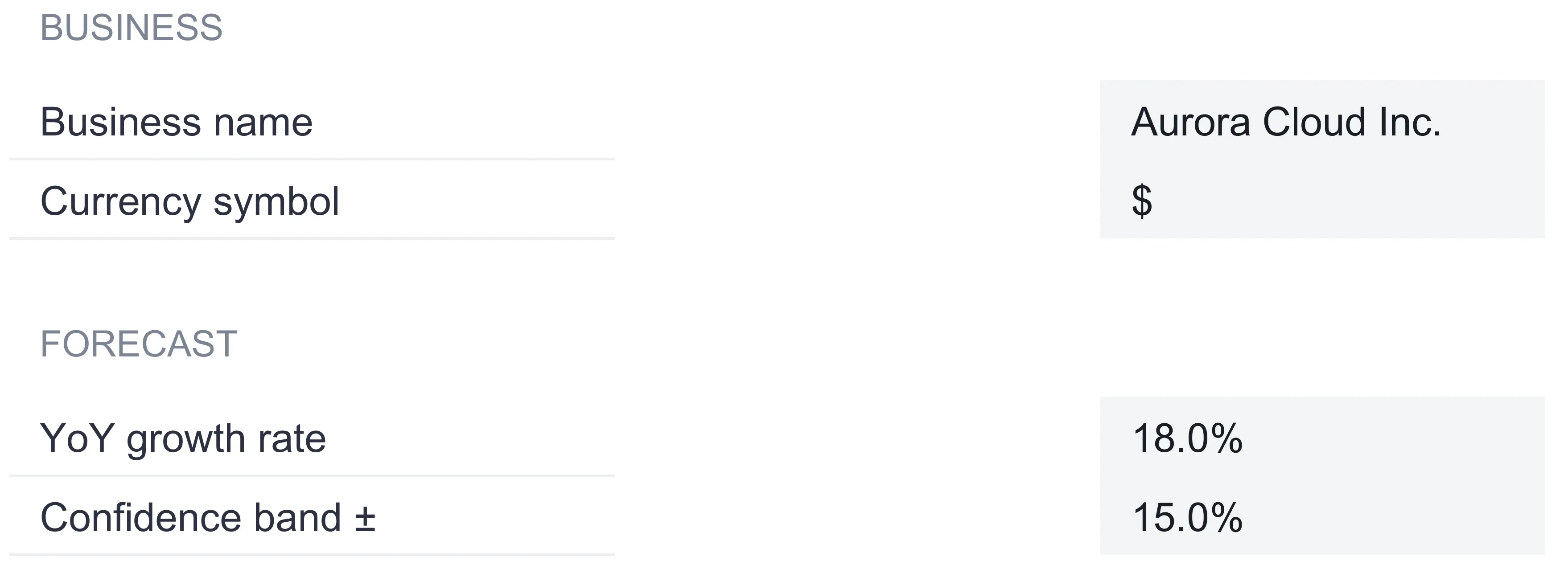
YoY growth rate. This is the single rate every historical month is grown by. The sample uses 18 percent. It is deliberately one number rather than a per-product or per-month grid, which keeps the forecast honest and legible: a reader can see the assumption in one cell and trace its effect everywhere else. A business expecting different momentum would change this one figure and watch every forecast month, band, and total re-settle around it. The cost of that simplicity is real: one rate cannot grow a fast-moving product line and a flat one at different speeds, so a business whose lines diverge sharply is approximating when it applies a single figure to all of them.
Confidence band. This is the width of the uncertainty around the base forecast, 15 percent in the sample. It does not change the base figure at all. Instead it sets how far the low and high scenarios sit on either side, which is what turns a single forecast line into a range. More on that when the scenarios appear on the Forecast sheet.
The sheet also holds the business name, which flows into the header of the Dashboard, Historical, Pipeline, and Forecast sheets, and a currency selector offering 35 symbols from the dollar and euro through to the rupee, real, and dirham. Choosing a symbol relabels every money column and KPI header across the workbook. It is worth stressing what the How to Use sheet spells out: the currency choice relabels only. It does not convert any of the underlying numbers, so switching from the dollar to the euro leaves the figures untouched and simply changes the sign in front of them.
Lay down the baseline: the Historical sheet
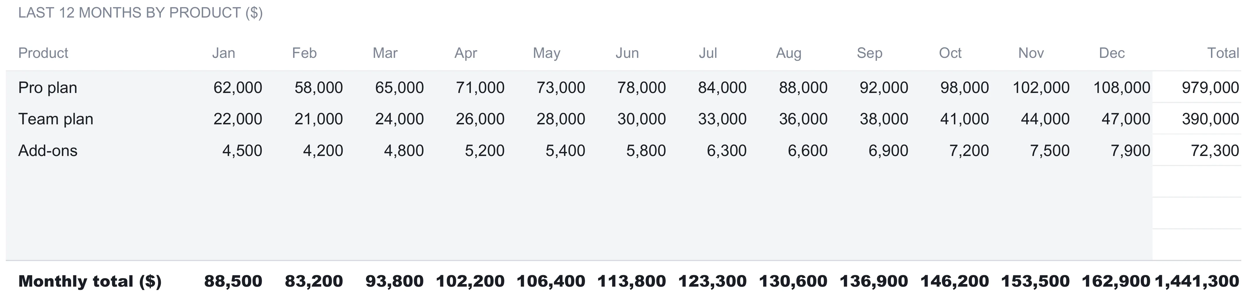
The forecast is only ever as good as the history it grows from, and that history lives on the Historical sheet. This is where the last twelve months of actual sales get typed in, one row per product line and one column per calendar month from January through December.
The sample carries three product rows. A Pro plan runs from 62,000 in January up to 108,000 in December, totalling 979,000 for the year. A Team plan runs from 22,000 to 47,000 for a 390,000 total. An Add-ons line runs from 4,500 to 7,900 and totals 72,300. Each of those row totals is a formula summing the twelve monthly cells, and the sheet only computes a total for a row that has been given a name, so the spare rows stay blank rather than showing a stray zero.
Below the product rows sits a Monthly total line that adds up every product for each month: 88,500 in January, 83,200 in February, on up to 162,900 in December. The far corner of that row carries the figure the whole forecast leans on, the trailing-twelve-month total of 1,441,300. That single number is the historical baseline, and it reappears on the dashboard as the “last 12 actual” tile.
Two structural details are worth copying into any hand-built version:
The forecast reads these exact rows. The product names and monthly figures on the Historical sheet are the direct source for the Forecast sheet, cell for cell. Nothing is retyped, so the two sheets cannot drift apart. Spreadsheets that go wrong tend to go wrong precisely at that seam, when a number is updated in one place and left stale in another.
Spare rows are pre-wired. The sheet ships with three filled product rows and three blank ones beneath them, and those blanks already carry the total formula and already sit inside the monthly sums. Naming a fourth product on the first free row pulls it straight into the monthly totals, the forecast, and the dashboard, with no formula to drag down and no range to extend.
Read the deals in play: the Pipeline sheet
The Historical sheet looks backward. The Pipeline sheet looks at what is open right now, and it is a genuinely separate view rather than an input to the forecast. Where the forecast asks “what does the trend project?”, the pipeline asks “what are the current open deals statistically worth?”
Deals are grouped by stage, and each stage carries three typed numbers: how many deals sit in it, the average deal size there, and the probability that a deal at that stage eventually closes. The sample runs five stages down a familiar funnel:
| Stage | # deals | Avg size ($) | Win prob | Weighted value ($) |
|---|---|---|---|---|
| Lead | 48 | 12,000 | 5% | 28,800 |
| Qualified | 26 | 18,000 | 20% | 93,600 |
| Proposal | 14 | 24,000 | 40% | 134,400 |
| Negotiation | 6 | 32,000 | 70% | 134,400 |
| Verbal commit | 3 | 28,000 | 90% | 75,600 |
| Total | 97 | 466,800 |
The weighted value in the last column is the heart of the sheet. For each stage it is the deal count multiplied by the average size multiplied by the win probability. The Lead row shows the logic plainly: 48 deals at 12,000 each is a lot of raw value, but at a 5 percent chance of closing it contributes only 28,800 in weighted terms. The Negotiation row is the mirror image, just 6 deals but at 70 percent probability, and it weighs in at the same 134,400 as the far larger Proposal stage. That is the whole point of weighting: a deal is worth its size scaled by its odds, not its size alone.
At the foot of the sheet, two totals summarise the funnel. There are 97 open deals across all stages, and their combined weighted value is 466,800. Both figures flow straight to the dashboard, and as on the Historical sheet, three spare stage rows stand ready so that naming a new stage folds it into the total, the KPIs, and the funnel chart automatically.
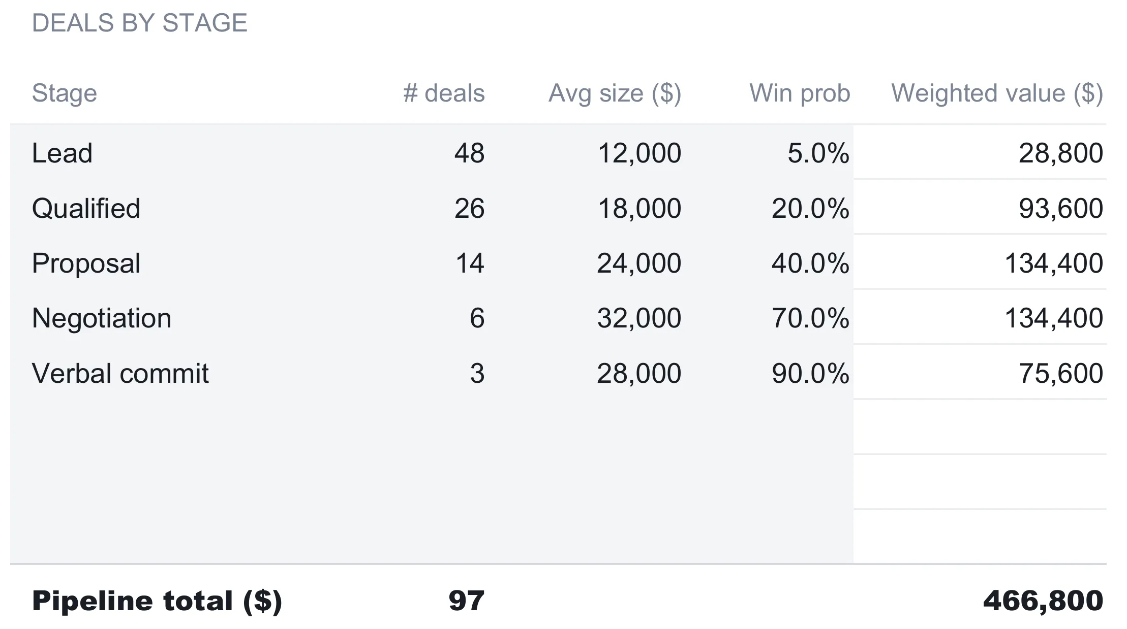
Win probability is the piece that makes the pipeline more than a wish list, and it is worth reading in plain terms. It is the share of deals at a given stage that historically go on to close, expressed as a percentage. Early stages carry low probabilities because most leads never become customers, and the figures climb as deals advance: a lead at 5 percent, a qualified opportunity at 20 percent, a proposal at 40 percent, a negotiation at 70 percent, and a verbal commit at 90 percent in the sample. Multiplying each stage’s raw value by its probability discounts the crowded, uncertain top of the funnel and gives full weight to the handful of nearly-closed deals at the bottom. That is also why the deal count and the money part company down the funnel: 48 leads sit at the wide mouth and only 3 verbal commits sit at the neck, while the weighted values in between follow the odds rather than the headcount, peaking in the middle of the funnel at Proposal and Negotiation.
Keeping the pipeline out of the forecast total is a deliberate design choice worth understanding. Past months and open deals are two different populations. Folding a speculative pipeline into a history-based forecast would double-count the momentum that the growth rate already captures, and it would tie a twelve-month projection to whatever happens to be open on the day you look. The template shows both numbers side by side and lets a reader hold them as two answers rather than blending them into one.
Grow the baseline forward: the Forecast sheet
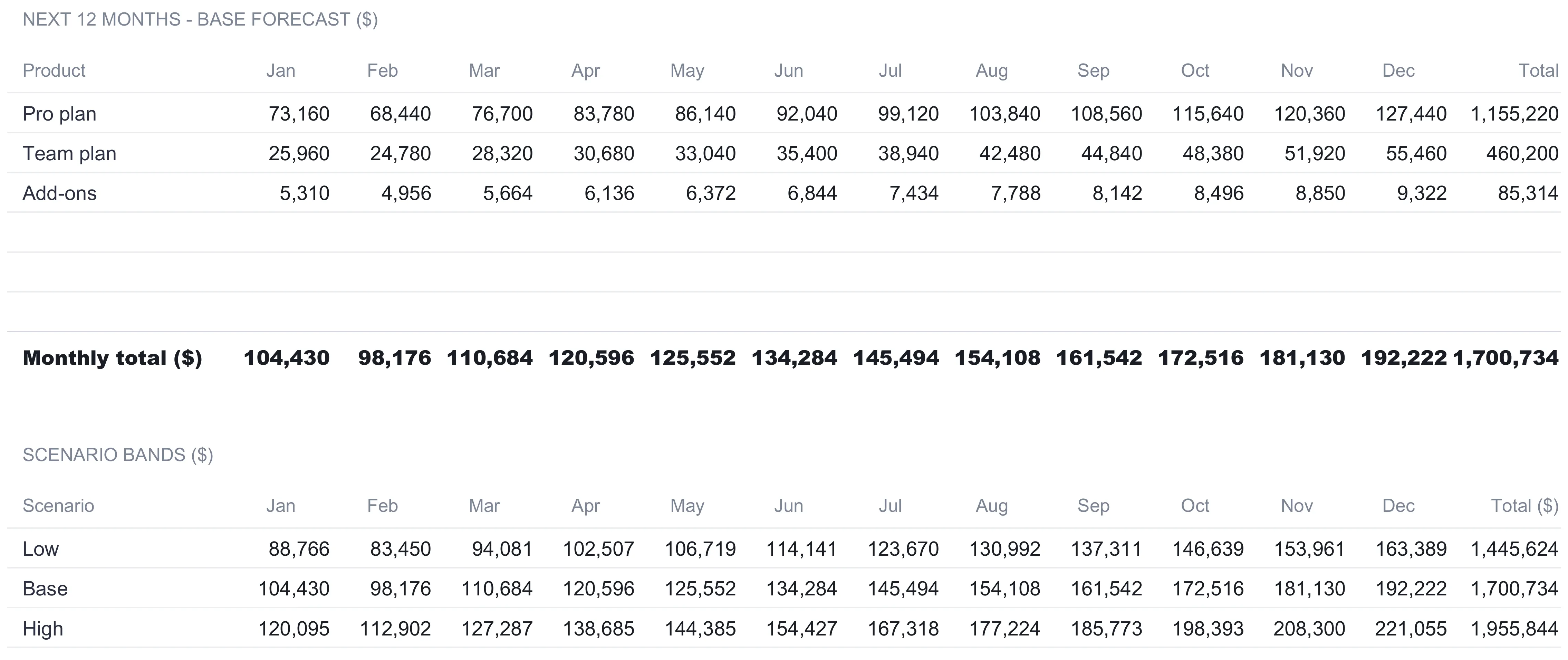
With the assumptions set and the history and pipeline entered, the Forecast sheet does the actual projecting, and it does it with a single idea applied twelve times. Each forecast month equals that same month last year multiplied by one plus the growth rate. There is no trend line to fit and no moving average to tune. January’s Pro plan of 62,000 grows by 18 percent to 73,160, and December’s 108,000 becomes 127,440. The same multiplication runs across every product and every month.
Growing each month on its own, rather than spreading one annual number evenly, is what preserves the shape of the year. The How to Use sheet puts it well: a busy autumn stays a busy autumn instead of being averaged away. In the sample the monthly totals climb from 104,430 in January to 192,222 in December, tracing the same upward season the history showed, just lifted 18 percent. Add the twelve months together and the base forecast totals 1,700,734, which is precisely 1,441,300 grown by 18 percent.
Beneath the product grid, the sheet turns that single line into a range using the confidence band from Settings. This is the Scenario Bands block, and it holds three rows. The Base row is the forecast as calculated. The Low row multiplies each base month by one minus the band, and the High row multiplies by one plus the band. At a 15 percent band the year lands at a 1,445,624 low, the 1,700,734 base, and a 1,955,844 high. The band does not predict anything new; it draws a symmetric spread around the base so the forecast is read as a range rather than a false point of precision.
Because the growth rate and the band both live on Settings, the entire Forecast sheet is downstream of two cells. Changing the growth rate rewrites every base figure and every band. Changing the band rewrites the low and high edges while leaving the base still. That is the advantage of routing every calculation through named assumptions rather than typing forecast numbers directly: the model stays a model, and every output can be traced back to a decision you can see.
The dashboard: seven numbers and a verdict
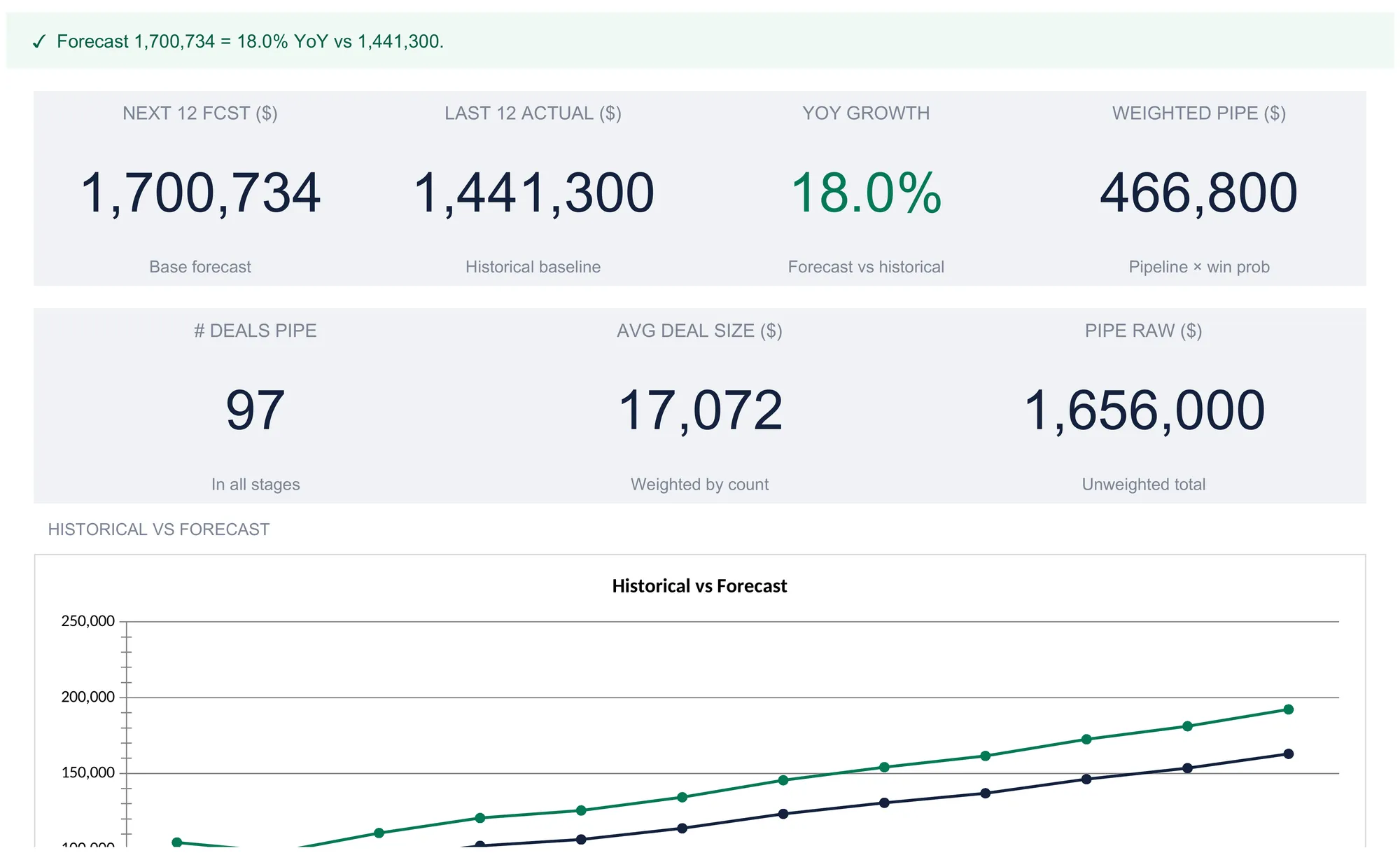
With the three input sheets filled, the dashboard reads the whole picture off them and presents seven headline figures. A status line across the top states the year in a sentence, reading in the sample “Forecast 1,700,734 = 18.0% YoY vs 1,441,300.” and flipping to a prompt to add history if the baseline is missing.
| Metric | Sample value | What it means |
|---|---|---|
| Next 12 forecast | 1,700,734 | The base forecast, the sum of every grown month |
| Last 12 actual | 1,441,300 | The historical baseline it grew from |
| YoY growth | 18.0% | Forecast against history, (forecast minus actual) over actual |
| Weighted pipeline | 466,800 | The pipeline’s total weighted value |
| # deals pipe | 97 | Open deals across all stages |
| Avg deal size | 17,072 | Raw pipeline value divided by deal count |
| Pipe raw | 1,656,000 | Every stage’s count times size, before weighting |
Two of these deserve a plain-terms read because they carry a little arithmetic. The year-over-year growth tile is the forecast measured against the history, computed as the forecast minus the actual, divided by the actual. Here that is 259,434 over 1,441,300, which rounds to 18 percent, matching the growth assumption exactly because the whole forecast was built from it. When there is no history to divide by, this tile reads N/A rather than showing a misleading figure.
The average deal size tile is weighted by count, and the two pipeline totals sitting next to it show how. The raw pipeline of 1,656,000 is every stage’s deal count times its average size, added up with no probabilities involved. Divide that by the 97 open deals and you get roughly 17,072, a blended average across the whole funnel. It is not the size of any one deal; stages holding more deals pull the blend toward their own size, which is why it lands between the 12,000 Leads and the 32,000 Negotiations.
Below the tiles the dashboard carries two charts. A Historical vs Forecast line chart plots the trailing year against the projected year so the 18 percent lift is visible as two rising curves rather than a pair of totals, and a chart titled Pipeline Funnel (weighted) carries one column per stage, plotting the weighted value from Lead through to Verbal commit. The forecast line is the number a raw sales report never quite gives you: last year’s actuals and next year’s projection on one screen, with the growth between them named.
A worked example from one month to the whole year
It helps to trace a single thread from a typed cell all the way to the dashboard. Take January.
On the Historical sheet, January’s three products read 62,000, 22,000, and 4,500, which the monthly total row adds to 88,500. On the Forecast sheet, each of those is grown by 18 percent, giving 73,160, 25,960, and 5,310, and their total is 104,430. The Scenario Bands then flex that January base: 88,766 at the low edge and 120,095 at the high. Repeat that for all twelve months and the columns sum to the headline trio, a 1,445,624 low, a 1,700,734 base, and a 1,955,844 high.
The pipeline runs on its own track. The 97 open deals carry a raw value of 1,656,000, which weighted by each stage’s win probability comes down to 466,800. That 466,800 is what the current funnel is statistically worth today, a figure the template shows beside the forecast without mixing the two. One reads the trend of a business with a track record; the other reads the deals on the table right now. Seeing them together, rather than collapsed into a single optimistic total, is much of the reason to build the forecast this way at all.
Adapting the forecast to your own numbers
The sample runs on a three-product subscription business, but nothing in the structure is tied to that shape, and swapping in a different business is mostly a matter of retyping the tinted cells. The How to Use sheet marks those tinted cells as the only ones meant to be edited; everything else is a formula that reads them.
Three habits keep the adaptation clean. First, the product rows on the Historical sheet are the master list, and the Forecast sheet mirrors them by reference, so a product is renamed once and the change propagates. A services firm might replace Pro plan, Team plan, and Add-ons with retainer, project, and hourly lines and leave every formula alone. Second, the spare rows already carry their formulas, so a fourth product or a sixth stage joins the model the instant it is named, with no range to extend. Third, the pipeline stages are just labels, so a business that runs a different sales process can rename Lead through Verbal commit to match its own funnel and keep the weighted-value logic intact.
The forecasting assumptions are similarly light to change. Because the growth rate and the confidence band each live in a single cell on Settings, testing a more cautious or more aggressive year is a one-cell edit that ripples through every forecast month, both scenario edges, the dashboard tiles, and the charts at once, with no rebuilding and no risk of an output drifting out of step with its input.
Where a sales forecast fits in the wider plan
A forecast rarely stands alone. The U.S. Small Business Administration lists a “prospective financial outlook” among the core pieces of a business plan, describing it as forecasted income statements, balance sheets, and cash flow statements alongside the written plan itself. A sales forecast is the top line those other statements build on: revenue is the first row of an income statement and the first driver of a cash flow projection, so a defensible sales number feeds everything that follows.
It also pairs naturally with the question a forecast does not answer, which is how much you need to sell to cover your costs. A forecast projects the revenue you expect; a break-even analysis works out the revenue you require. Reading them together frames the forecast against a floor, and our Break-Even Analysis Spreadsheet Template ($29) handles that second calculation with the same one-file, no-macros approach, working out the sales volume at which total cost and total revenue meet.
Excel or Google Sheets for a sales forecast
The template is a plain .xlsx workbook with no macros and no add-ons, so it behaves identically in Microsoft Excel and in Google Sheets once uploaded. Every piece described here, the growth and confidence inputs, the month-by-month multiplication, the weighted pipeline, and the dashboard tiles, is ordinary spreadsheet arithmetic that both applications run the same way. Google Sheets suits a team that wants the forecast open in a browser and shared by link; Excel suits anyone who prefers a local file. The choice is about where the workbook lives, not about what it can calculate, and the whole structure is equally buildable by hand in either.
Which template fits the job
- Sales Forecasting Spreadsheet Template ($29) is the workbook this walkthrough follows: the growth and confidence assumptions on Settings, the twelve-month history by product, the weighted pipeline by stage, the base forecast with low and high bands, and the seven-metric dashboard, ready for a single business in Excel or Google Sheets.
- Break-Even Analysis Spreadsheet Template ($29) answers the companion question the forecast leaves open, the sales volume at which a business covers its fixed and variable costs, using contribution margin rather than a growth rate.
Related
- How to Build a Profit and Loss Statement in a Spreadsheet - where a revenue forecast becomes the top line of a full income statement
- How to Calculate a Break-Even Point in a Spreadsheet - the revenue floor that a forecast is worth reading against
- How to Track SaaS Metrics in a Spreadsheet - the recurring-revenue view for a subscription business like the sample here
Frequently asked questions
What is the difference between a base forecast and the weighted pipeline?
They answer different questions from different data. The base forecast reads your own history: it takes each of the last 12 months and grows it by one rate, so it projects the trend of a business that already has a track record. The weighted pipeline reads open deals instead, multiplying each stage's deal count by its average size and its win probability. Because the pipeline looks at deals not yet closed rather than months already booked, the template keeps it as a separate view rather than feeding it into the forecast total.
How does the confidence band create the low and high scenarios?
One percentage on the Settings sheet, the confidence band, flexes the base figure both ways. With a 15 percent band, the low scenario is the base month multiplied by 0.85 and the high scenario is the base multiplied by 1.15. In the worked example that turns a 1,700,734 base into a 1,445,624 low and a 1,955,844 high. The band is a spread around the same forecast, not a separate calculation, so widening or narrowing it moves both edges symmetrically.
Why grow each month separately instead of using one annual number?
Growing month by month keeps the seasonal shape of the year. Each forecast month equals that same month last year multiplied by one plus the growth rate, so a busy December stays proportionally busier than a quiet February instead of being averaged into a flat monthly figure. The annual total comes out the same either way, but the month-by-month version produces a forecast curve you can compare against actuals as the year unfolds.
What does average deal size weighted by count mean?
The dashboard divides the raw pipeline value by the total number of open deals. Raw pipeline is every stage's deal count times its average size added together, 1,656,000 in the sample, and dividing that by 97 deals gives about 17,072. It is called weighted by count because stages holding more deals pull the average toward their own deal size. It is a blended figure across the whole funnel, not the size of any single deal.
Can this forecast a business with no sales history yet?
The base forecast needs a baseline to grow from, so with the Historical sheet empty the dashboard shows a prompt to add the last 12 months and the year-over-year figure reads N/A rather than a number. A pre-revenue business could still use the Pipeline sheet on its own, since that reads open deals rather than past months, but the growth-based forecast only produces figures once at least one product row of history is filled in.
Does the spreadsheet work in both Excel and Google Sheets?
Yes. It is an .xlsx file built on ordinary formulas with no macros and no add-ons, so it opens in Microsoft Excel and runs the same way in Google Sheets after an upload. The currency dropdown, the growth and confidence inputs, and every total behave identically in both. The choice between them is about where you prefer to keep the file rather than any difference in what it calculates.
Sources
- Write your business plan - U.S. Small Business Administration
About this article
Every figure, sheet name, column, formula, and feature description checked on 2026-09-10 against the shipped Sales Forecasting Pro workbook (Dashboard, Historical, Pipeline, Forecast, Settings and How to Use sheets, plus both dashboard charts) - the exact file customers download. The financial-projections reference was checked against the live U.S. Small Business Administration business-plan page at writing time. Last reviewed September 2026.