A profit and loss statement stacks revenue down through COGS, operating expenses, tax, and net income. This walkthrough builds one as a planning tool: a 12-month forecast, monthly actuals entered against it, a variance sheet that flags where plan and reality diverge, and three scenarios. It follows a worked example that forecasts $768,181 in revenue and $194,138 in net income, then lands $1,156 behind plan on net income while beating the top line. Our Profit & Loss Statement Spreadsheet Template ($29) ships the whole structure for Excel and Google Sheets.
Most small businesses can tell you what landed in the bank last month. Far fewer can tell you whether that number was ahead of plan or behind it, and fewer still can say which line moved. A profit and loss statement is the report that answers those questions, but a P&L built once at year-end only tells you what already happened. Built as a living document, with a plan you set in advance and actual results recorded against it, it turns into something you can steer by.
That is the difference this walkthrough is about. It builds a profit and loss statement as a forward-looking instrument: a twelve-month forecast, monthly actuals entered against that plan, a variance view that flags where the two diverge, and a set of scenarios that stress-test the year before it happens. The examples come from our Profit & Loss Statement Spreadsheet Template ($29), which ships the whole structure ready-made for Excel and Google Sheets. The layout is reproducible by hand if you would rather build your own.
What a profit and loss statement actually is
Strip away the accounting vocabulary and a P&L is one long subtraction. It starts with everything the business earned and works down, taking out one kind of cost at a time, until what remains is the profit that was kept. The order of those subtractions is the whole point, because each intermediate total answers a different question.
The stack goes like this. Revenue is what the business sold. Subtract cost of goods sold, the direct cost of delivering that revenue, and you reach gross profit, which shows how much the product itself earns before any overhead. Subtract operating expenses, the overhead that keeps the lights on whether or not you sell anything, and you reach operating income, which shows whether the core business is profitable on its own. Add any other income and subtract any other expenses that sit outside operations, such as interest, apply income tax, and what is left at the very bottom is net income: the profit the business kept.
A P&L statement and an income statement are the same report under two names. This template uses the P&L label throughout, and it lays the stack out as twelve monthly columns plus an annual total, so you can read both the shape of the year and the single full-year figure from one sheet.
Set the ground rules: the Settings sheet
A handful of inputs govern every calculation in the workbook, so they live together on the Settings sheet and are entered once.
Business name and fiscal year. The sample carries “Business Name Inc.” and fiscal year 2026. Both feed the header that runs across the top of every sheet, so the report is labeled consistently wherever you look.
Currency symbol. A single dropdown sets the symbol shown on every money column header and KPI label across the workbook. The sample uses the dollar sign. Changing it relabels the display only; it does not convert any of the underlying numbers, so the figures stay exactly as typed.
Effective tax rate. One rate, 25 percent in the sample, applied to positive income before tax. The rule attached to it matters: when pretax income for a month is negative, the formula sets tax to zero rather than producing a negative figure. A loss month does not invent a refund inside the sheet.
Scenario assumptions. Three columns, labeled Best, Expected, and Worst, hold the percentage swings the Scenarios sheet later applies to revenue, COGS, and operating expenses. In the sample, the best case lifts revenue 10 percent and trims both cost lines 5 percent, the expected case holds everything flat, and the worst case cuts revenue 15 percent while pushing COGS up 10 percent and operating expenses up 5 percent. These are the only places those swings are defined.
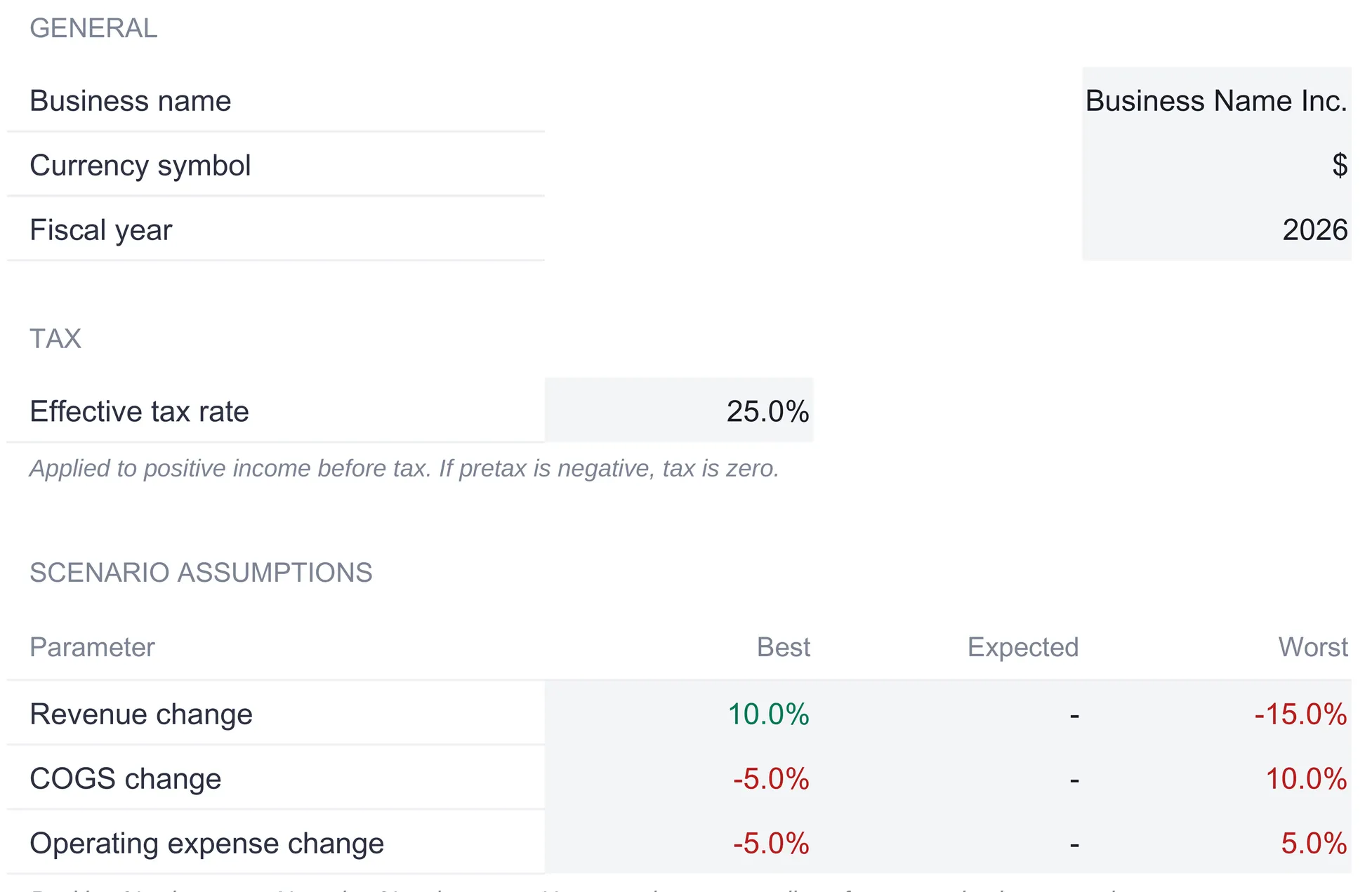
The sheet also spells out that category names are renamed directly on the Forecast and Actual sheets, and that each section there ships two blank rows inside its subtotal for categories you add. That is the whole configuration step, and the built-in guidance puts it at about fifteen minutes done once.
Build the plan: the Forecast sheet
The Forecast sheet is where the year gets planned, one month at a time, and it is the sheet that defines the shape of the whole P&L. Every other sheet in the workbook reads its structure from here.
It follows the P&L stack top to bottom. The Revenue section in the sample carries four lines: Subscription revenue, Services revenue, Setup fees, and Other revenue. Their monthly figures sum across to an annual column and down to a Total revenue row of $768,181 for the year, climbing from $50,000 in January to $77,869 in December. Below that, Cost of goods sold lists Hosting and infrastructure, Direct labor (delivery), Third-party software, and Payment processing, totaling $155,800. Subtracting COGS from revenue gives a Gross profit of $612,381, and the sheet shows the gross margin beside it, holding around 79 to 80 percent every month and landing at 79.7 percent for the year.
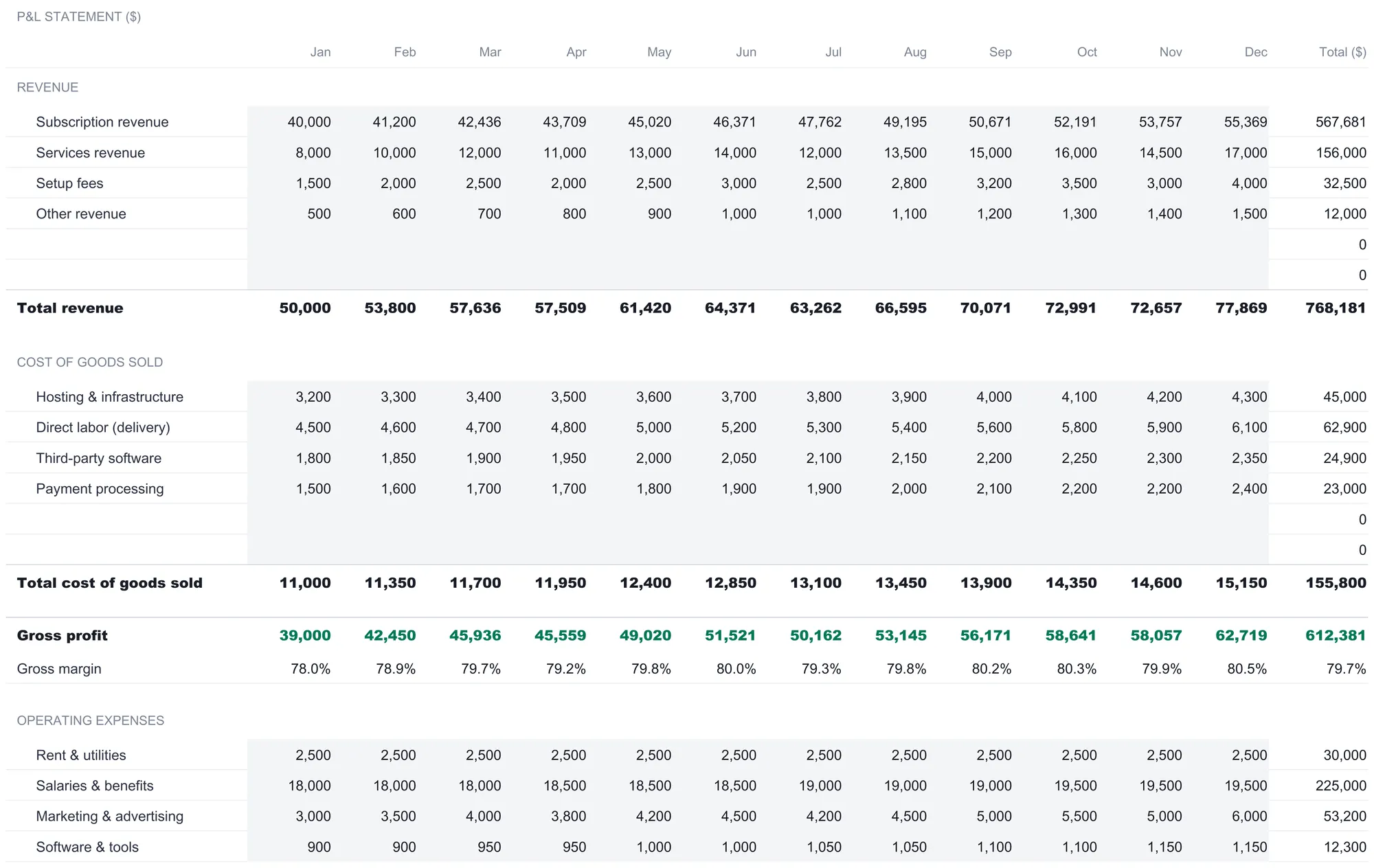
The Operating expenses section is the longest, nine lines in the sample: Rent and utilities, Salaries and benefits, Marketing and advertising, Software and tools, Insurance, Travel and entertainment, Office supplies, Professional fees, and Other operating expenses. Salaries and benefits dominate at $225,000 of the $347,650 operating total. Gross profit minus operating expenses gives Operating income of $264,731, a 34.5 percent operating margin.
Two smaller sections finish the stack. Other income holds Interest income of $3,720 for the year, and Other expenses holds Interest expense of $9,600. Operating income plus other income minus other expenses is Income before tax, $258,851 in the plan. The 25 percent rate takes $64,713, and Net income settles at $194,138, a net margin of 25.3 percent. Every one of those totals is a formula; the only cells you type are the monthly category figures in the tinted rows.
A design detail worth copying into any hand-built version: each section carries two spare rows already sitting inside its subtotal. The Forecast image shows them as blank lines that still contribute a zero to the total. Adding a category is a matter of naming the next free row and filling in its months, with no formula to extend and no total to repoint.
A worked month, line by line
The annual figures are easier to trust once you have watched a single month move through the stack. Take January from the forecast.
Revenue for the month totals $50,000, the sum of $40,000 subscription, $8,000 services, $1,500 setup fees, and $500 other. Cost of goods sold totals $11,000, so gross profit is $39,000, a 78.0 percent gross margin, the lowest month of the year because January carries the year’s smallest revenue against fairly fixed direct costs. Operating expenses for January come to $26,250, which leaves operating income of $12,750. Interest income adds $200 and interest expense takes $800, so income before tax is $12,150. Tax at 25 percent is $3,037.50, and January net income lands at $9,112.50.
That single column is the entire report in miniature, and the same arithmetic runs down all twelve months and across into the annual total. Nothing about the month is special; it is the stack applied once, which is usually enough to make the annual figures read as sums rather than magic.
COGS or operating expense: which bucket a cost belongs in
The forecast splits costs into two sections, and where a cost lands changes the story the P&L tells, so the split is worth getting right. Cost of goods sold is the cost that moves with delivery: it exists because you sold something, and it would shrink if sales did. In the sample that is hosting, the direct labor of delivering the service, third-party software baked into the product, and payment processing. Operating expenses are the overhead that arrives on a schedule regardless of sales: rent, salaries, marketing, insurance, the office. Rent is $2,500 every month in the plan whether revenue is $50,000 or $77,869.
The reason the distinction matters is that gross profit, the first subtotal, only subtracts COGS. Misfiling a fixed overhead cost as COGS would dent gross margin and make the product look more expensive to deliver than it is; misfiling a delivery cost as overhead would flatter gross margin and hide it in operating income instead. The template does not police the choice for you, but by giving each kind of cost its own section and its own subtotal, it makes a miscategorized line easy to spot when the margins move in a way the business did not.
Record what happened: the Actual sheet
The Actual sheet mirrors the Forecast sheet row for row, the same sections, the same category names, the same twelve-month grid. The difference is what goes in it: real results, entered as each month closes, rather than a plan set in advance. Because the layout matches exactly, a figure on Actual always lines up with its counterpart on Forecast, which is what makes the comparison on the next sheet possible.
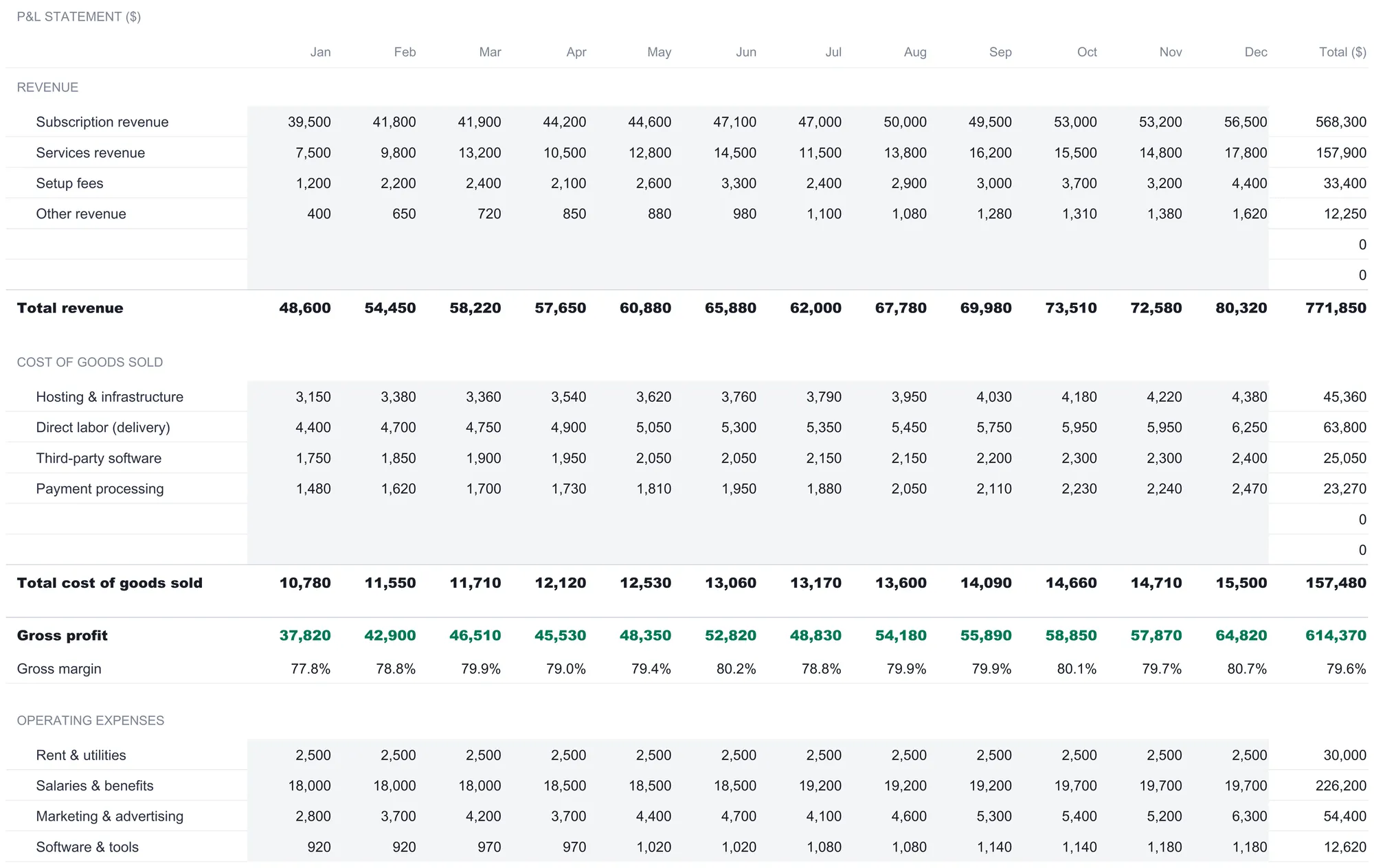
In the sample, the year has been fully recorded, and the actuals tell a more interesting story than the plan did. Total revenue came in at $771,850, a little ahead of the $768,181 forecast. But total cost of goods sold ran to $157,480 against $155,800 planned, and operating expenses reached $351,160 against $347,650. Operating income landed at $263,210, slightly under the $264,731 plan, and net income finished at $192,982.50, a 25.0 percent net margin. The business beat its revenue target and still missed its profit target, because costs crept up faster than sales did. A P&L that only showed the top line would have called this a good year. Read all the way down, it is a near miss.
Compare plan to reality: the Variance sheet
The Variance sheet is where the forecast and the actuals are set side by side so the gaps become the subject rather than a thing you have to eyeball across two tabs. It opens with an alert banner that states the bottom line in one sentence. With the sample fully recorded, it reads that the business is running behind plan, net income $1,156 short of forecast, a difference of 0.6 percent.
Three summary tiles sit below the banner. Months recorded shows 12 of 12. Average forecast accuracy shows 96.7 percent, computed across the completed months as one minus the total absolute variance divided by the total absolute forecast, which rewards a plan whose monthly misses stay small in either direction. Cumulative net variance shows the running dollar gap, negative $1,156 here, with a subtitle confirming the business is running behind forecast. A net income trend chart then plots forecast against actual month by month, the two lines tracking closely and crossing back and forth, which is the visual signature of an accurate plan.
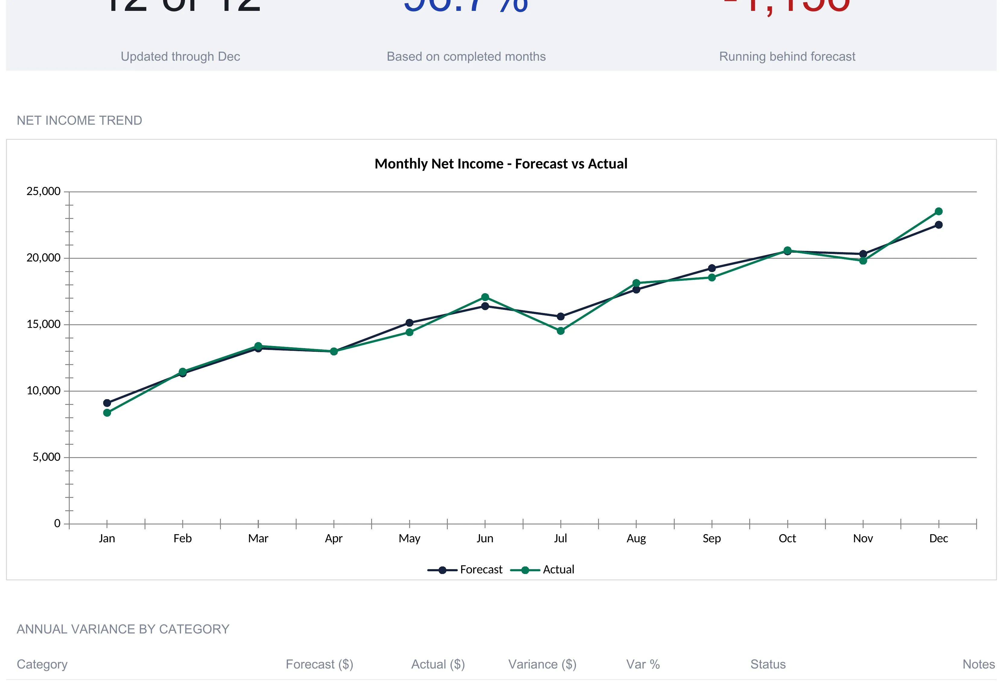
Below the chart, an Annual variance by category table breaks the gap down line by line, with columns for Forecast, Actual, Variance, variance percent, a Status flag, and a Notes column left open for you to record why a number came in off plan. This is where the year’s story becomes legible. Total revenue shows a favorable variance of $3,669, marked Over plan. But Total COGS is $1,680 over, Total operating expenses are $3,510 over budget, and so operating income comes in $1,521 under and net income $1,156 under. The table also carries a reminder that the sign convention differs by section: for expense lines a positive variance means over budget, while for revenue lines a positive variance means over plan. A month by month net income table underneath repeats the comparison per month, flagging each as Above plan, Below plan, or On plan, so a single soft month stands out from a run of strong ones.
Nothing on the Variance sheet is typed except the notes. Every number is pulled from Forecast and Actual, which is why a category you add on those two sheets shows up here on its own.
Stress-test the year: the Scenarios sheet
A forecast is a single guess about a year that has not happened. The Scenarios sheet takes that guess and bends it three ways, so the plan is bracketed by a plausible range rather than standing alone.
It lays out three cards side by side. Each applies the percentage swings from the Settings sheet to the forecast’s revenue, COGS, and operating expenses, then recomputes the stack all the way down to net income and net margin. The Best case lifts revenue 10 percent and cuts both cost lines 5 percent, which turns the $768,181 plan into $844,999 of revenue and $270,631 of net income, a 32.0 percent margin. The Expected case holds every assumption flat, so it reproduces the forecast exactly: $768,181 of revenue and $194,138 of net income at 25.3 percent. The Worst case cuts revenue 15 percent while raising COGS 10 percent and operating expenses 5 percent, which drops revenue to $652,954 and net income to $82,996, a 12.7 percent margin.
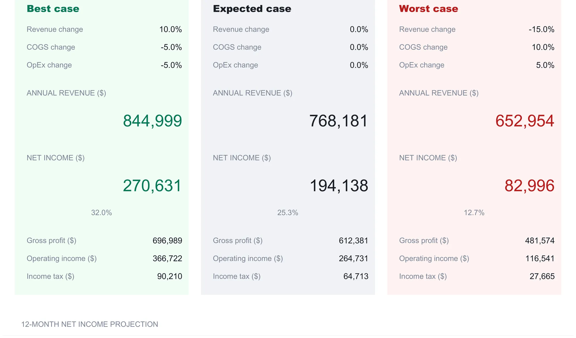
Each card also carries the gross profit, operating income, and income tax that produced its net income, so you can see which lever did the work. The worst case is instructive: revenue falls the most in dollar terms, but because the cost lines move against you at the same time, operating income collapses from $264,731 to $116,541, far more than revenue alone would suggest. That compounding is exactly what a scenario view is for. Two rules keep the comparison clean, both noted on the sheet: other income and other expenses stay constant across all three cases so the operating swings show through, and income tax still applies only to positive pretax income. Below the cards, a twelve-month net income projection charts all three paths across the year.
The dashboard: the year on one screen
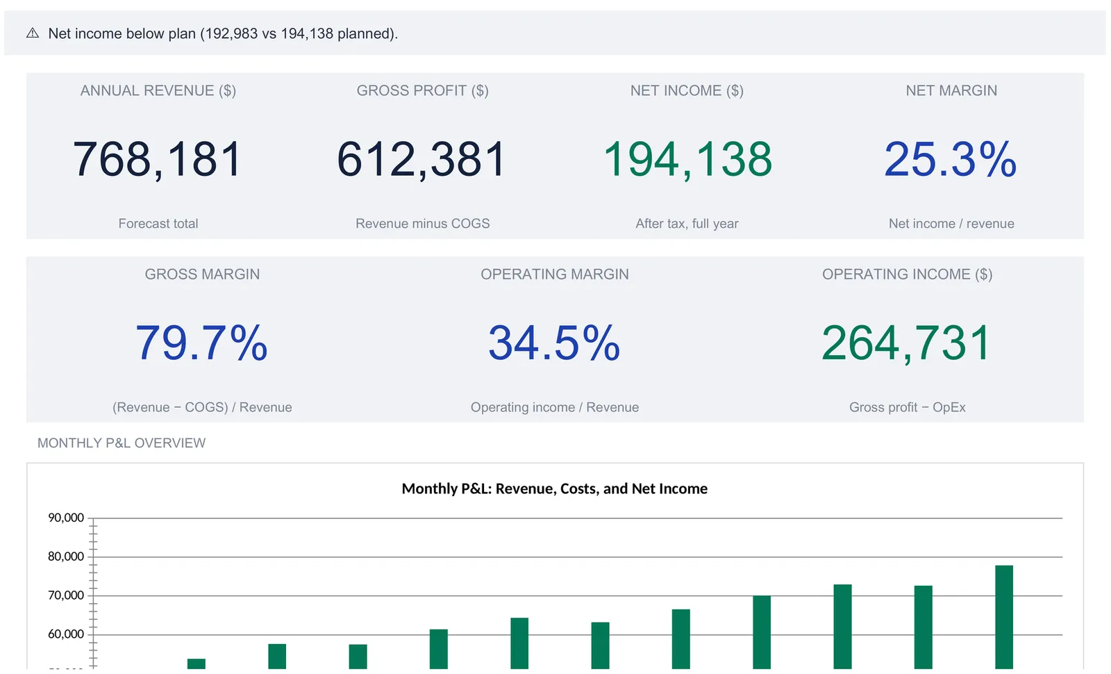
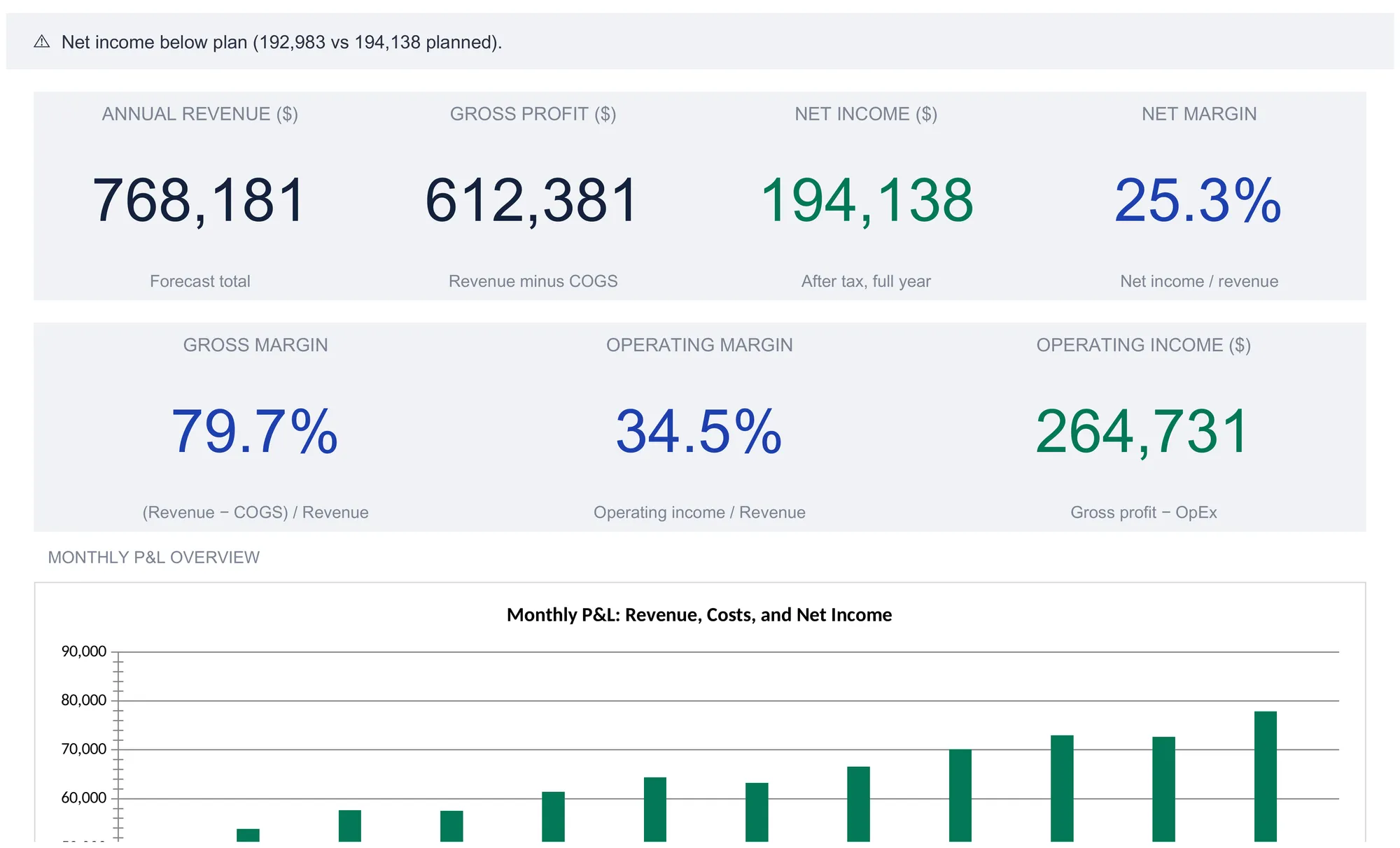
With Settings, Forecast, and Actual filled, the Dashboard reduces the whole year to a screen you can read at a glance. An alert banner at the top states the plan-versus-actual verdict in a sentence; in the sample it reads that net income came in below plan, 192,983 against 194,138 planned. It flips to a positive message when actuals reach or beat the plan, so the file tells you where you stand the moment it opens.
Seven KPI tiles carry the headline numbers, each labeled with how it is derived:
| Tile | Sample value | What it means |
|---|---|---|
| Annual revenue | 768,181 | Forecast total for the year |
| Gross profit | 612,381 | Revenue minus COGS |
| Net income | 194,138 | Profit kept after tax, full year |
| Net margin | 25.3% | Net income divided by revenue |
| Gross margin | 79.7% | (Revenue minus COGS) divided by revenue |
| Operating margin | 34.5% | Operating income divided by revenue |
| Operating income | 264,731 | Gross profit minus operating expenses |
The KPI tiles track the forecast, so they read as the plan for the year, while the banner is what surfaces the gap against actuals. Below the tiles, a monthly P&L overview chart plots the shape of the year, and further down the sheet the workbook carries a monthly summary table and an annual expense breakdown that splits the year into COGS, operating expenses, other expenses, income tax, and the net income kept. The gallery render above stops at the top of the monthly chart, so the summary table and expense breakdown sit below the visible crop.
Gross, operating, and net margin in plain terms
The dashboard leans on three margins, and all three are the same net-income-style division applied at different points in the stack. Each strips out one more layer of cost, so reading them together tells you where the money goes.
Gross margin (612,381 divided by 768,181, or 79.7 percent) is what is left after the direct cost of delivery, before any overhead. A high gross margin, as here, is the signature of a business whose product is cheap to deliver relative to what it charges.
Operating margin (264,731 divided by 768,181, or 34.5 percent) is what is left after overhead too, so it measures the core business on its own, before interest and tax. The drop from 79.7 to 34.5 percent is the cost of running the company, most of it salaries.
Net margin (194,138 divided by 768,181, or 25.3 percent) is the bottom line as a share of the top line, after every cost including tax. It answers the plainest question a P&L can: of each dollar sold, how many cents were kept. Watching all three fall from gross to operating to net is a quick read on where a business spends, and comparing them month to month or plan to actual is where a spreadsheet earns its keep.
Where a P&L sits at tax time
A profit and loss statement and a tax return are close cousins, because both walk from revenue down through categorized costs to a profit figure. For a US sole proprietor, that walk is Schedule C (Form 1040), which reports profit or loss from a business and lines up income against categorized expenses in much the same order a P&L does. IRS Publication 334, the Tax Guide for Small Business, covers how sole proprietors figure business income and expenses in more detail. A P&L kept current through the year, with income and each expense category already totaled, turns filing from a reconstruction into a copy job, though the tax categories and the accounting categories are not always a perfect match and a tax professional can confirm how a specific business should map one to the other.
Worth keeping in mind that a P&L answers only half of the financial-statement picture. It shows flow across a period, what came in and went out, but not what the business owns and owes at a point in time. That second view is the job of a Balance Sheet Spreadsheet Template ($29), which lays out assets, liabilities, and equity as a snapshot; the net income this P&L produces is the figure that flows into retained earnings there. The two reports are built to be read together.
Excel or Google Sheets for a P&L statement
The template is an .xlsx file built on plain formulas, with no macros and no add-ons, so it behaves the same in Microsoft Excel and in Google Sheets after an upload. Google Sheets suits an owner who wants the P&L reachable from any browser and easy to share with an accountant; Excel suits one who prefers a local file and heavier spreadsheets. The forecast, actuals, variance, and scenarios all run on standard functions, so nothing in the structure described here depends on the platform, and a version built by hand works equally well in either.
Which template fits
- Profit & Loss Statement Spreadsheet Template ($29) is the workbook this walkthrough follows: a twelve-month forecast, monthly actuals, a variance sheet, three scenarios, and the dashboard, ready to plan and track a full year of profit and loss.
- Balance Sheet Spreadsheet Template ($29) is its companion for the other financial statement, the point-in-time view of assets, liabilities, and equity that a P&L does not show.
Related
- How to Do Bookkeeping in a Spreadsheet - the transaction ledger that records the raw entries a P&L summarizes
- How to Build 5-Year Financial Projections in a Spreadsheet - the multi-year cousin of this single-year forecast
- Cash Flow Forecast Template for Business - the timing view of money in and out, which profit alone does not capture
Frequently asked questions
What is the difference between a profit and loss statement and an income statement?
They are two names for the same report. Both stack revenue at the top, subtract cost of goods sold to reach gross profit, subtract operating expenses to reach operating income, then apply other income, other expenses, and tax to reach net income at the bottom. Accountants tend to say income statement, small business owners tend to say P&L, and this template uses the P&L label on its sheets.
How is a P&L statement different from a balance sheet?
A P&L covers a span of time and shows flow: what came in and what went out across the year. A balance sheet is a snapshot at a single date and shows position: what the business owns, what it owes, and the equity left over. Net income from the P&L feeds retained earnings on the balance sheet, so the two connect, but they answer different questions.
Does this template pull numbers from my accounting software?
No. Each month you type category totals into the Actual sheet, the same rows the Forecast sheet already lists. There is no bank feed and no import. That keeps every figure and formula visible and editable, and it means monthly totals are entered by hand rather than arriving on their own from a connected ledger.
How does the template calculate income tax?
One effective tax rate on the Settings sheet, 25 percent in the sample, is applied to positive income before tax. When pretax income is negative, the formula sets tax to zero rather than generating a negative number, so a loss month does not manufacture a tax refund inside the sheet. It is a single flat rate, not a bracket schedule.
Can I add my own revenue and expense categories?
Yes. Each section on the Forecast and Actual sheets ships two blank rows inside its subtotal, so a new category name and its twelve monthly figures fall straight into the totals. Because the Variance sheet reads the category labels and numbers from Forecast and Actual, a category you add there appears on the variance comparison on its own.
Sources
- About Schedule C (Form 1040), Profit or Loss from Business (Sole Proprietorship) - Internal Revenue Service
- About Publication 334, Tax Guide for Small Business - Internal Revenue Service
About this article
Every figure, column name, formula, and feature description verified against the published Profit & Loss Statement Pro workbook (the exact file customers download). Schedule C and Publication 334 references checked against the live IRS pages at writing time. Last reviewed September 2026.