
Most budgeting apps lose the user by month three: industry data puts day-30 retention for finance apps at roughly 7 to 15 percent and day-90 well under 10 percent. The causes are structural rather than personal, covering notification fatigue, bank-sync breakage, silent miscategorization, lost context, and subscription drag. For people who keep churning through apps, a spreadsheet tends to last longer because it does not fight you when you ignore it for a week.
A budgeting app on your phone today has roughly a one-in-ten chance of being open by month three. That’s the median number across the AppsFlyer app retention benchmarks and the Adjust Mobile App Trends finance-vertical breakdowns. The cliff is real, and the reasons people fall off it are less talked about than they should be.
This is an opinion piece. We sell spreadsheet templates, so take it with that grain of salt. But the retention data is independent, and the structural reasons for the drop-off matter regardless of what you end up using.
The budgeting app retention curve nobody mentions in the App Store description
The shape of finance-app retention has been understood for years. AppsFlyer’s published retention benchmarks put the category at:
| Metric | Median | Top quartile |
|---|---|---|
| Day-1 retention | 28% | 35-45% |
| Day-7 retention | 12% | 18-25% |
| Day-30 retention | 7% | 10-15% |
| Day-90 retention | <5% (typical) | 8-12% |
Source: AppsFlyer aggregated finance-vertical benchmarks, as compiled in the UXCam 2026 mobile retention report. Adjust’s 2026 trends report shows similar shape, with day-30 finance retention near 11.6% for traditional banking apps and as low as 4-7% for newer personal finance tools.
Two clarifications before the objections.
These are average installs, including drive-by downloads. Power users stick around. YNAB, for example, reports something like 75% twelve-month retention among paying subscribers - among the strongest in the category. The category-wide curve is dragged down by the long tail of downloads that don’t convert.
But “doesn’t convert” is the point. The funnel from install to month-three habit is brutal. The people who churn out usually didn’t decide that budgeting was bad - they decided that this app was bad, then tried another. A whole subgenre of articles exists around Mint replacements and the Quicken Simplifi sunset, built on the same churn pattern.
The structural reasons that explain most of it sit below.
Notification fatigue stops being useful in week six
The pitch for budgeting-app notifications is that they create awareness. “You’ve spent $312 on dining this month, your limit is $400.” Useful information at first - probably for the first month, possibly the second.
Then a peculiar thing happens. The notifications keep arriving, but the user stops reading them. Notifications are most effective when they’re rare and surprising. Budgeting alerts, by design, are frequent and predictable. By month two, “you’ve reached 75% of Dining” lands the same way as “your phone storage is low” - dismissed, swiped, forgotten.
Worse, the notifications create an illusion of awareness. The user feels on top of the budget because the app is telling them about it. They open the actual dashboard less often. When they finally check at month three, the numbers don’t match their assumptions, because a notification stream is not the same as a weekly review.
A user with a $400 dining cap receives ten “approaching limit” notifications across a month. Each one feels like an alert. Cumulatively, they spent $487, $87 over, and didn’t internalize it because no single ping looked alarming. Friction-free delivery erased the cognitive moment that overspending used to create.
Notifications are an open-loop intervention. They tell you something; they don’t ask you to do anything. A weekly spreadsheet review is a closed loop - you sit down, look at the rows, and the visual contrast forces a decision.
Sync breaks, and sync is the entire promise
Bank sync is the headline feature of every modern budgeting app. Plaid sits between roughly 12,000 financial institutions and most of the apps people install. When it works, it’s magic. When it breaks, and it does break, the app’s value proposition collapses.
A few realities of bank sync that users discover only after the honeymoon:
- Multi-factor authentication challenges cause silent disconnections. The user reauthenticates, then forgets to reauthenticate again next month.
- Some banks rotate their authentication endpoints quarterly, causing aggregator-side breakage that takes the app vendor days to fix.
- Smaller credit unions and international banks often aren’t supported, leading to a hybrid manual-plus-sync state that defeats the original convenience pitch.
- When a connection dies, the user often can’t tell if the silence means “no new transactions” or “we stopped pulling them three weeks ago.”
Picture a user with checking, savings, and three credit cards on day one. By day 45 one card has silently disconnected after a quarterly bank security update. They notice in week eight, after the statement arrives with $1,400 in charges that never made it into the budget. They reauthenticate, but the missing weeks need manual reconciliation - and now they’re not sure whether that means typing in 30 transactions or writing the month off as lost data.
That moment is a common quit-trigger. The app was supposed to remove the manual work. The manual work just showed up anyway, compressed into a backlog instead of distributed across the month.
Plaid itself acknowledges connectivity as a churn factor in their B2B marketing - the phrase “every connection live, every customer experience seamless” exists because they know what happens when it isn’t.
Silent miscategorization erodes trust without ever speaking up
AI categorization is the second pillar of modern budgeting apps. A transaction lands, the app guesses a category, the user accepts. After a month of training, accuracy lands in the 85-90% range for most apps. That sounds great.
The 10-15% failure rate is the problem - because it’s silent.
A user reviewing their dining spending sees $487 and thinks they overspent. The actual number was $312 - $175 of “dining” was a Whole Foods grocery run miscategorized because Whole Foods sometimes routes through the same processor as restaurants. They can’t see this without spot-checking individual transactions. They believe a category total that’s off by half.
Take Target. The app auto-categorizes every Target purchase as “Shopping.” Some of those runs were household goods, some were groceries, some were kids’ clothes. The dashboard shows “Shopping: $340” and the user reads it as discretionary. In reality, $180 of that was groceries that should have been compared against the grocery cap. The miscategorization stays invisible until year-end, when the categories no longer reflect anything real.
AI categorization optimizes for plausibility, not auditability. You can’t see why a transaction got the category it did. A spreadsheet with a rules table makes every decision auditable, which is part of why users migrating to Sheets often describe a sense of relief - the categorization is visible.
Context loss: the same transaction means different things
This one is subtler.
“$60 at Target” in March might mean a one-time household purchase. The same “$60 at Target” in April might mean groceries because the user’s regular store was closed. In May, it might be a baby gift for a colleague.
The app sees three identical rows and assigns them to the same category. To the app, you spent $180 at Target on something. To you, those three transactions had nothing to do with each other.
A budget that loses context loses the reason a budget exists. Categories are how a user explains their spending to themselves. When the app collapses three different stories into one number, the budget stops being a story and becomes accounting.
This is also why subscription detection, showcased by Copilot, Rocket Money, and others, is the one AI categorization feature that consistently delivers. Subscriptions are inherently context-free. A $14.99 Netflix charge means the same thing every month. For the rest of spending, context is everything, and only the user has it.
A user reviewing May sees “Restaurants: $284” and accepts it. The story underneath: $185 of that was a parents’ anniversary dinner, half reimbursed by a sibling, leaving roughly $191 in actual personal restaurant spend plus a $93 receivable. The category total is mathematically right and conceptually wrong.
A weekly review with notes preserves the story. Most apps don’t make notes easy; in a spreadsheet you write the name on the row yourself. Three months in, that’s the difference between a budget that reflects your life and one that’s drifted into abstraction.
Subscription drag turns dormant apps into recurring guilt
The final reason is the simplest. Most budgeting apps are subscription products. The fee continues whether you use the app or not.
Pricing roughly looks like this across the category:
| App | Annual cost | Effective $/mo on the annual plan |
|---|---|---|
| YNAB | $109 | ~$9 (monthly subscription is $14.99) |
| Monarch Money | $99 | ~$8 (monthly subscription is $14.99) |
| Copilot Money | $95 | ~$8 (monthly is ~$13) |
| Rocket Money Premium | $48-180 | $4-15 sliding |
| Quicken Simplifi | ~$48 | ~$4 ($3.99/mo billed annually) |
Prices checked against each vendor’s official pricing page: YNAB, Monarch, Copilot, and Quicken Simplifi. Promotional rates change, so treat these as a snapshot.
By the time a user has fallen off the app at month three, they often forget they’re still paying. The Rocket Money irony is famous - the subscription-tracking app frequently shows up on lists of forgotten subscriptions.
When the user finally reviews, two things happen at once. They feel guilty about the spend, and ambivalent about the app because it’s been three months. The path of least resistance is often to renew anyway “because I should be budgeting,” which extends the dormancy by another year.
A user on YNAB’s annual plan ($109/yr) and Monarch’s annual plan ($99/yr) hasn’t opened either app since February. In July, both auto-renew. That’s $208 on apps that haven’t been touched. Over five years at the same cadence, that’s $1,040 versus $29 once for a Monthly Budget Template - a difference of about $1,000 if the spreadsheet replaces both.
The dollar amount isn’t really the point. Subscription billing detaches cost from value - you pay whether you’re getting value or not. A one-time purchase aligns the two: if you don’t open the file, you don’t pay again.
What apps do well
The thesis is structural friction, not “apps are bad.” Apps have a window where they outperform any spreadsheet.
The first 60 days. Sync-driven awareness is genuinely useful before you’ve built category intuition. Seeing transactions appear with categories attached surfaces a spending baseline faster than manual entry would. For new budgeters, that head start can be real value.
Mobile in-the-moment use. Checking a category limit while standing at the checkout works on a phone in a way a spreadsheet doesn’t. If the use case is decision support at point of purchase, the app wins.
Subscription discovery. The one form of AI categorization that earns its keep. Most users find 3-8 forgotten subscriptions in their first month.
For users with 200+ transactions a month. Manual entry at that volume is genuinely costly. Auto-sync earns its fee on volume alone.
For the rest, the path of least resistance after month three is usually one of two things: switch to another app and start the curve over, or move to something that doesn’t punish you for ignoring it.
The hybrid pattern people describe in user threads
A pattern that comes up repeatedly in user threads, and is covered in Why I Switched From Budgeting Apps to Spreadsheets, is the 60-to-90-day handoff.
The shape: people use an app’s free trial or first paid quarter for three things - discovering categories they wouldn’t have built from scratch, running the subscription-detection feature once, and getting a feel for the spending baseline.
Then, around the month-three cliff, they migrate the structure into a spreadsheet. The category insight and the subscription list carry over. The sync goes away; so does the silent degradation when a week gets skipped.
Whether any of that applies to a given reader is a personal call. Some people stay on their app for years and report being happy. The hybrid description is here for readers who keep cycling through apps and assume the problem is them. The retention curve suggests it usually isn’t.
What tends to outlast the apps
For people who keep churning out of apps, here is what looks different about the spreadsheet path:
- No push notifications, so no fatigue to develop.
- No bank connection, so nothing to silently disconnect.
- Categorization is a category you pick yourself from a list you named, so the silent-failure mode doesn’t exist.
- A name you type on every row, so context survives.
- A one-time purchase, so subscription drag can’t accrue.
Trade-offs include: more manual data entry (typically 10-15 minutes a week), no in-pocket mobile experience, no live investment view, and a learning curve in the first session. For users who hate manual entry, none of this will appeal. For users who feel friction with apps but blame themselves, the trade-off math usually points the other way.
Templates that fit this
For readers who land here mid-churn, two starting points worth knowing:
- “I don’t even know where my money goes - I need to see it first.” Monthly Expense Tracker at $19 once. Income in, expenses out, category totals. No planning, no targets.
- “I can see where money goes, I want to set targets and track against them.” Monthly Budget Template at $29 once. Plan-vs-actual, a budget target per category, monthly dashboard. Closest to the structure most app users were already trying to build.
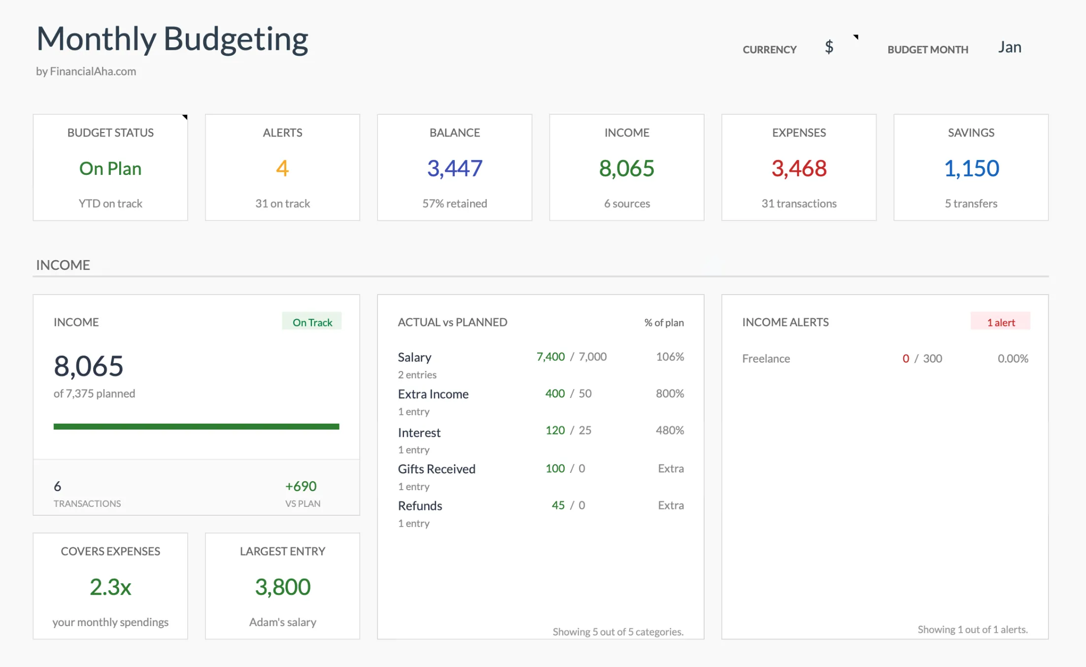
The Monthly Budget Template (Premium tier) dashboard: plan-versus-actual by category, alerts, and monthly totals that update as you enter transactions.
Both are one-time purchases and share the same category structure, so starting with the tracker and adding the budget template later is a straightforward path. The Annual Budget Template covers those same categories across all 12 months, with a plan column and an actual column for each one, plus a year-end goals sheet. It is a separate file rather than a rollup of the monthly one.
Related
- YNAB vs. Spreadsheet Budgeting: Is $109/Year Worth It? - The math on the YNAB subscription versus a one-time template, with the methodology mapped to spreadsheet equivalents.
- Budget Spreadsheets vs. Apps: Which Works Better? - A fair comparison of automation, privacy, and cost tradeoffs for both approaches.
- Copilot Money Alternative: Build the Same Workflow in Google Sheets - A specific app-to-spreadsheet translation for users leaving Copilot.
Frequently asked questions
Is this anti-app?
No. Budgeting apps work well for some users and some seasons of life. The point is the retention curve - most installs don't make it to month 6, and the reasons are structural, not personal failings.
What is the retention data?
AppsFlyer's benchmarks put median day-30 retention for finance apps at roughly 7 percent, with top-quartile apps at 10 to 15 percent. Day-90 retention is typically under 10 percent. Specific numbers vary by app and audience; the shape of the curve is consistent.
Why would a spreadsheet be different?
Spreadsheets do not push notifications, do not break when banks change APIs, and do not silently re-categorize transactions. They demand effort, which sounds like a disadvantage but turns out to drive longer engagement for the people who stick with them.
What if I want sync though?
Sync is a real benefit, especially in the first 60 days when you are building category awareness. Many users do well with sync for the first quarter, then move to a spreadsheet once categories stabilize.
What happens to my data if a budgeting app shuts down?
Mint and Quicken Simplifi both wound down, and users who relied on in-app history had to scramble to export it. Most apps let you download transactions as a CSV, which imports cleanly into a spreadsheet. A file you own does not depend on a vendor staying in business.
Do spreadsheets work on a phone?
The Google Sheets mobile app opens the same file, so you can glance at category totals on a phone. Typing a transaction on a small screen is clunkier than a native app built for it, which is why the point-of-purchase check is one place apps still hold an edge.
Sources
- App Retention Benchmarks - AppsFlyer
- Mobile App Trends - Adjust
- Mobile App Retention Benchmarks by Industry - UXCam
- YNAB Pricing - YNAB
- Monarch Pricing - Monarch
- Copilot Money Pricing - Copilot
- Quicken Simplifi - Quicken
About this article
Retention figures drawn from the linked AppsFlyer, Adjust, and UXCam benchmark reports. App subscription prices checked against each vendor's official pricing page. Template sheets, inputs and outputs checked on 2026-09-10 against the shipped Monthly Budgeting (Summary, Budget Plan, Transactions, Goals, Categories, Setup), Monthly Expense Tracker (Summary, Transactions, Categories) and Annual Budgeting Planner (Summary, Annual Plan, Annual Financial Goals, Categories, Setup) Google Sheets. Last reviewed September 2026.