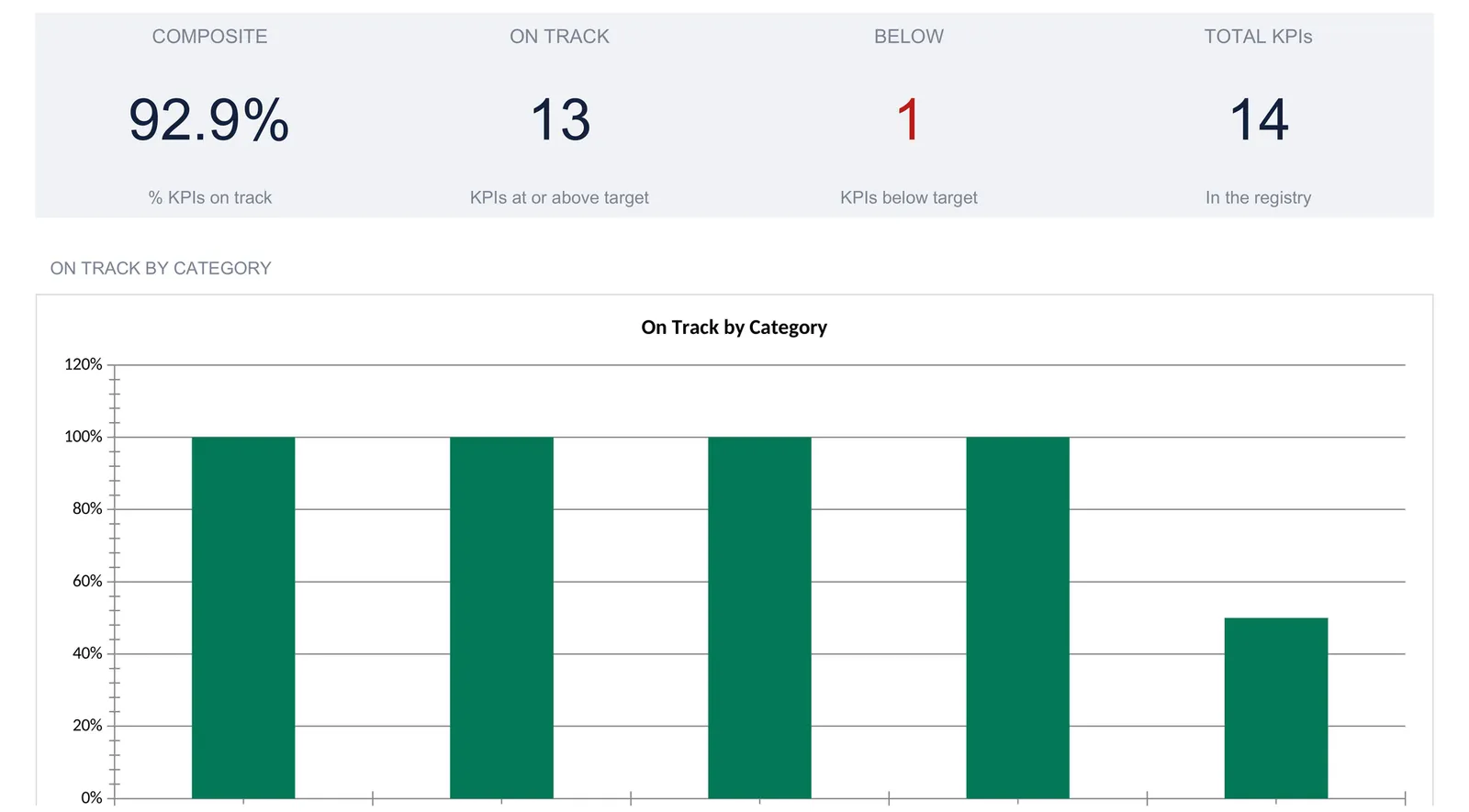
A KPI dashboard turns a scattered set of business metrics into one scoreboard: every KPI lives in a single registry with 12 monthly actuals and 12 monthly targets, and the sheet computes year-to-date attainment, an on-track status, a composite score, and a month-by-month trend from that one place. This walkthrough builds the structure sheet by sheet using a worked example, a 14-KPI SaaS registry that scores 92.9 percent composite with 13 of 14 KPIs on track through nine months. Our KPI Dashboard ($39) ships the same structure ready-made for Excel and Google Sheets.
Most small companies do not lack numbers. They lack a single place to read them. Revenue sits in the accounting tool, new customers in the CRM, uptime in a status page, support response times in the help desk, and burn in a bank export. Each system answers its own question well and none of them answers the only question a founder asks on a Monday morning: are we, on the whole, ahead of plan or behind it? A key performance indicator is a measurable variable used to show whether progress is being made towards a goal, and a KPI dashboard is the one screen where every such variable is measured against its target at the same time.
A spreadsheet is a natural home for that screen, sometimes called a KPI tracker, because the job is almost entirely arithmetic. You type what happened and what you planned, and the sheet does the comparing. The examples below come from our KPI Dashboard Spreadsheet Template ($39), which ships the whole structure ready-made for Excel and Google Sheets. The layout is reproducible by hand if you would rather build your own, and the point of this walkthrough is to show exactly how the pieces fit so that either path is open to you.
What a KPI dashboard has to hold
Strip a business scoreboard down to its parts and there are only four kinds of data:
- The reporting window. Which fiscal year this is, and how far into it you have real numbers. Everything downstream reads only the completed months, so a nine-month view never gets flattered by months that have not happened yet.
- The registry. One row per KPI, each with a name, a category, a unit, a direction, twelve months of actuals, and twelve months of targets. This is the raw material for everything else.
- Derived attainment. For every KPI, the year-to-date actual, the year-to-date target, how the two compare, and whether that counts as on track. These are calculations, not entries.
- The rollups. A composite score, an on-track count, a breakdown by category, and a month-by-month trend. Nothing here is typed either; it all falls out of the registry.
The template gives these their own sheets. Settings holds the window, Metrics holds the registry and the attainment math, Trends holds the month-by-month view, and the Dashboard sits on top with the headline numbers and two charts. A How to Use sheet carries the instructions. The tabs sit in reading order, with the Dashboard first and Settings near the end, but working through them in build order, Settings, then Metrics, then Trends, then Dashboard, is the fastest way to understand why each one exists.
Start with the window: the Settings sheet
Four inputs on the Settings sheet frame everything else, so they come first.
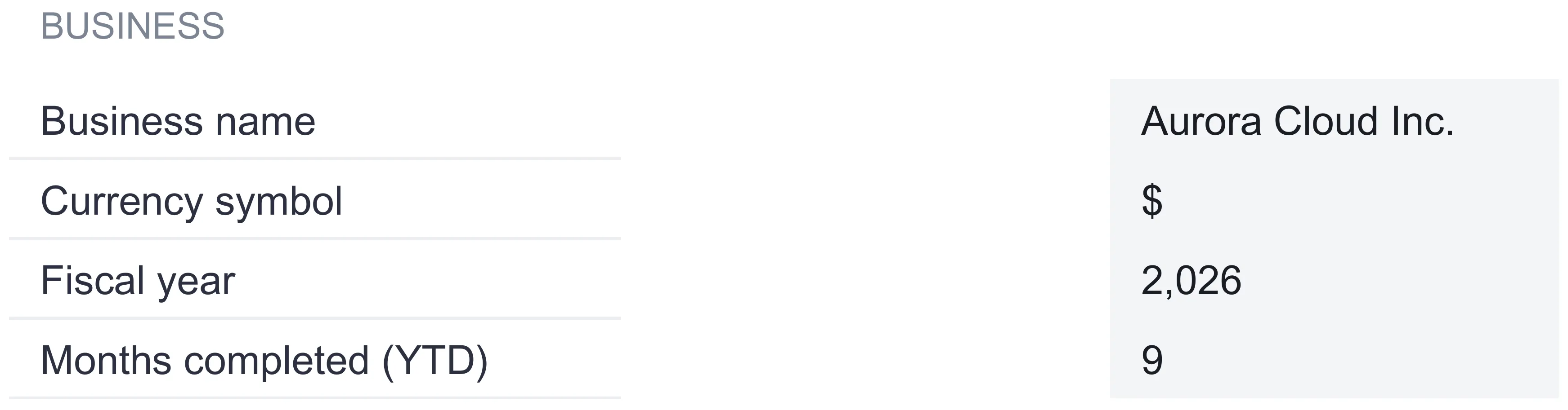
Business name. A label. The sample file uses Aurora Cloud Inc., and that name flows into the title block on the Dashboard, Metrics, Trends, and Settings sheets.
Currency symbol. A dropdown with 35 symbols, from the dollar sign through the euro, pound, yen, rupee, real, and on down the list. Whatever you pick relabels the unit on every money KPI and the header line on each sheet. It relabels only, with no conversion of the numbers, so the figure 714,800 reads as 714,800 whether the symbol in front of it is a dollar sign or a euro sign.
Fiscal year. The year the scoreboard reports on, 2026 in the sample. It appears in the header line that runs across the top of each sheet.
Months completed (YTD). This is the quiet workhorse of the whole model. It says how many months of real data you have, 9 in the sample, and it is the single control that decides how far the year-to-date math reads. Set it to 9 and every attainment figure sums January through September and ignores October, November, and December. Move it to 10 next month and the whole workbook rolls forward, no other edit required.
That last input is worth dwelling on, because it is what stops a KPI dashboard from lying to you mid-year. A naive scoreboard sums a full twelve target cells and compares them to nine months of actuals, and every KPI looks like it is failing by a third. The months-completed control keeps the two sides of every comparison honest: nine months of actuals are always measured against the first nine months of target, never against the annual plan.
Build the registry: the Metrics sheet
The Metrics sheet is where a KPI dashboard is really made. Everything above it is a label or a rollup; this is the one sheet you type into month to month. Each KPI is a single row, and the row has four descriptive cells followed by the monthly numbers.
- Name. What the KPI is called: New customers, MRR, Churn, Uptime.
- Category. The department or function it belongs to. The sample uses five: Sales, Marketing, Customer, Ops, and Finance. Categories are what the rollups group by, so they need to be spelled consistently.
- Unit. A hash for a count, a percent sign for a rate, or the currency symbol for money. Money KPIs pull the symbol straight from Settings, so they follow the currency dropdown automatically.
- Dir. The direction flag, the one small idea that keeps the whole model simple. A 1 means higher is better, so revenue, customers, and uptime want a 1. A -1 means lower is better, so customer acquisition cost, churn, burn, and first-response time want a -1. This one cell is what lets a single formula grade a metric you want to grow and a metric you want to shrink without any special-casing.
After those four come twelve cells of actuals, January through December, and twelve cells of targets over the same months. In the sample, the actuals run through September and the October, November, and December cells sit at zero, which matches the nine completed months on Settings.
To the right of the entry cells, four computed columns turn the raw months into a verdict, and none of them is ever typed:
- YTD Actual sums the actuals for the completed months only. With months-completed set to 9, it adds January through September and stops.
- YTD Target sums the target cells over the same nine months, so the comparison is always like for like.
- Attainment compares the two, and here the direction flag earns its keep. For a higher-is-better KPI it is the actual divided by the target. For a lower-is-better KPI it is the target divided by the actual, which inverts the ratio so that spending less than planned still scores above 100 percent.
- Status reads On track when attainment reaches 100 percent and Below when it does not.
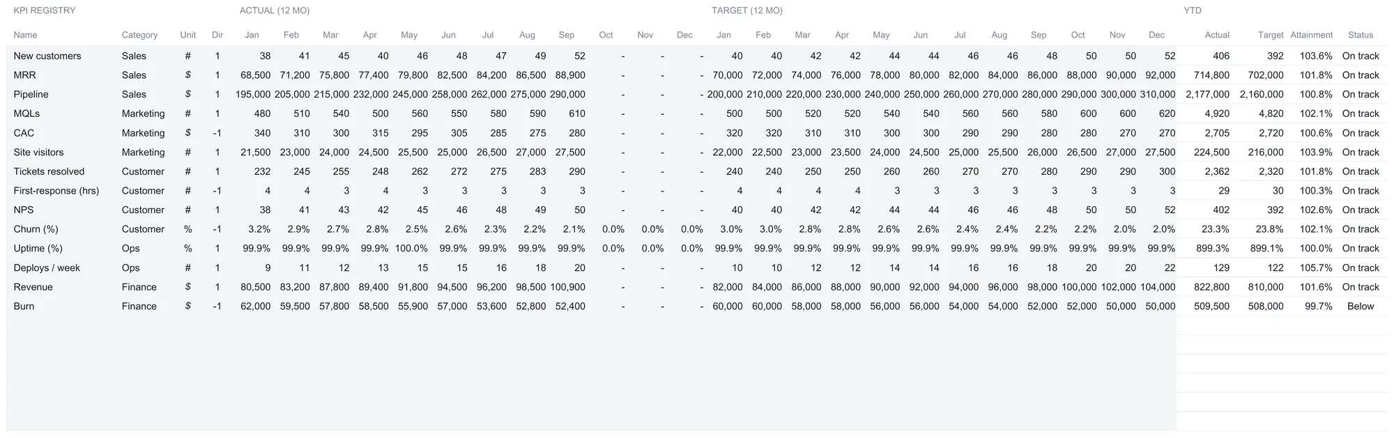
The sample registry holds 14 KPIs across the five categories: New customers, MRR, and Pipeline under Sales; MQLs, CAC, and Site visitors under Marketing; Tickets resolved, First-response hours, NPS, and Churn under Customer; Uptime and Deploys per week under Ops; and Revenue and Burn under Finance. Below them sit 6 blank rows, already wired into every total, chart, and trend, so the file ships ready to hold 20 KPIs and a new one is just a row you fill in.
A worked example, the honest way
Take MRR, the monthly recurring revenue row. Its actuals for the first nine months read 68,500, 71,200, 75,800, 77,400, 79,800, 82,500, 84,200, 86,500, and 88,900. Add those nine and the YTD Actual is 714,800. Its targets over the same months are 70,000, 72,000, 74,000, 76,000, 78,000, 80,000, 82,000, 84,000, and 86,000, which sum to a YTD Target of 702,000. MRR is a higher-is-better metric, so its direction flag is 1 and attainment is 714,800 ÷ 702,000, or 101.8 percent. Above 100, so the status reads On track. Notice that only the first nine target cells count while months-completed is 9. The October, November, and December targets are sitting in the sheet, waiting, and they join the comparison the month those periods are marked complete.
Now take a metric that runs the other way. CAC, customer acquisition cost, is money you want to fall, so its direction flag is -1. Its nine months of actual spend total 2,705 per acquired customer against a budget totalling 2,720. Because the flag is -1, attainment is the target over the actual, 2,720 ÷ 2,705, which is 100.6 percent. Coming in fifteen dollars under budget reads as just above target, exactly as it should. A higher-is-better formula would have flipped that into a below-target reading, and the direction flag is the single cell that prevents the mistake.
The 14 sample KPIs in plain terms
The registry ships filled with a SaaS company’s metrics, and each one is worth knowing in plain language.
Under Sales, New customers counts how many accounts closed in the month, MRR is monthly recurring revenue, and Pipeline is the total value of open deals in progress. Under Marketing, MQLs are marketing-qualified leads, CAC is customer acquisition cost, and Site visitors is traffic to the website. The Customer group covers the post-sale experience. Tickets resolved is support volume closed, First-response is the average hours a customer waits for a first reply, NPS is the net promoter score, and Churn is the percentage of customers lost in the month. Under Ops, Uptime is the share of time the service was available, and Deploys per week counts how often the team shipped code. The Finance pair is Revenue, total income recognized, and Burn, the net cash spent to run the company.
Read the year by month: the Trends sheet
The Metrics sheet answers “how are we doing over the year so far?” The Trends sheet answers a subtler question: “is that a steady story or a lucky one?” It does this by scoring every month on its own.
The sheet holds a table titled KPIs on track by month. The top row is the Composite, and beneath it sit five category rows, one each for Sales, Marketing, Customer, Ops, and Finance. Across the columns run the twelve months plus a year-to-date average. Every cell is a percentage, and it means the share of KPIs that hit their target in that single month. A KPI is scored as meeting a month when its actual reaches that month’s target for a higher-is-better metric, or stays at or under it for a lower-is-better metric. A month with no target set counts as not met rather than being skipped, and any month past the completed window reads zero.
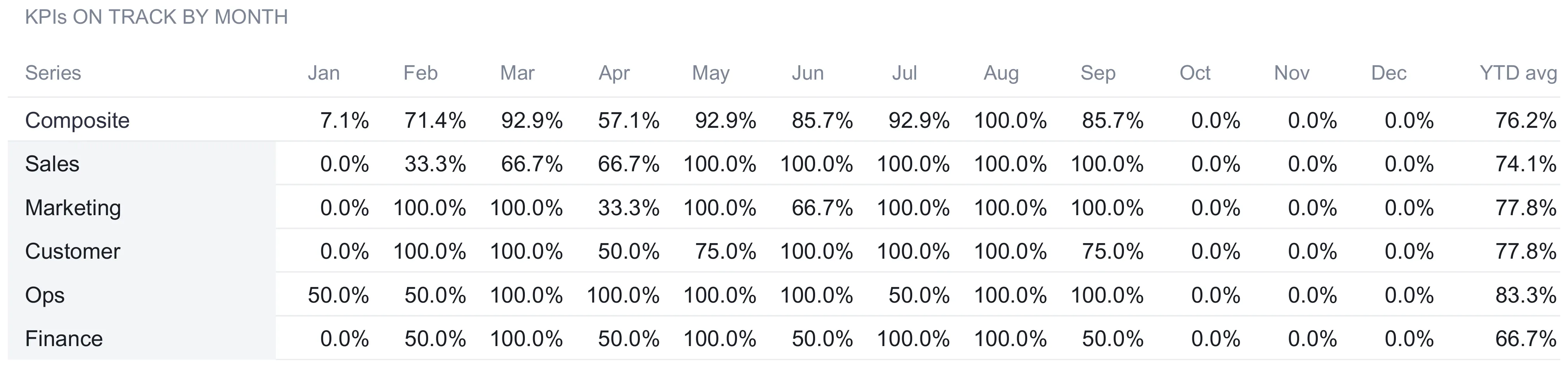
The sample tells a clear story. The composite line opens at 7.1 percent in January, when only one of the 14 KPIs beat its target, jumps to 71.4 percent in February and 92.9 percent in March, then drops back to 57.1 percent in April before running in the eighties and nineties through the summer, touching 100 percent in August and easing to 85.7 percent in September. The year-to-date average of those monthly rates is 76.2 percent. The category rows show where the wobble lives: Ops averages 83.3 percent across the months while Finance averages 66.7 percent, which points a finger at the same Finance KPI that the dashboard flags.
Here is the distinction that makes the Trends sheet worth having. The Metrics sheet said 13 of 14 KPIs are on track year-to-date, a 92.9 percent composite. The Trends sheet says the average monthly hit rate is only 76.2 percent. Both are true, and they are not in conflict. The first counts KPIs whose running nine-month total clears the running target. The second counts, month by month, how often each KPI landed its target on the nose. A KPI can miss its number in March and April and still clear its cumulative target by September, because a strong summer made up the gap. The cumulative view rewards the destination; the monthly view watches the road. A scoreboard that only showed the cumulative number would let a lumpy, volatile year masquerade as a smooth one, and the Trends sheet is the check against that.
The Dashboard: one score and a verdict
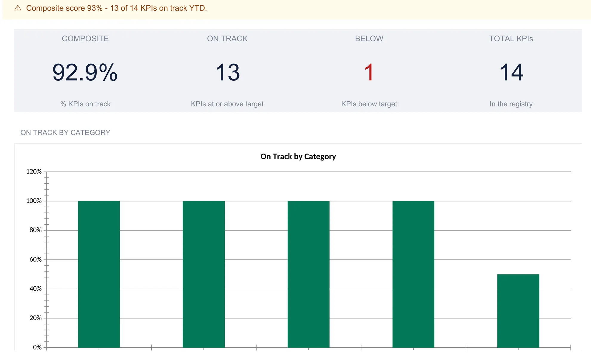
With Settings framed and the registry filled, the Dashboard computes the headline. It carries the business name, a header line reading the fiscal year, the year-to-date window, and the currency, and then a status banner that states the whole year in one sentence. In the sample it reads: composite score 93 percent, 13 of 14 KPIs on track year-to-date. That banner is generated, not typed. It switches to a clean checkmark when every KPI is on track, and it warns you the moment the registry is empty, so the dashboard never sits there looking finished when there is nothing behind it.
Below the banner sit four tiles:
| Tile | Sample value | What it counts |
|---|---|---|
| Composite | 92.9% | Share of registry KPIs on track YTD |
| On track | 13 | KPIs at or above target |
| Below | 1 | KPIs below target |
| Total KPIs | 14 | KPIs in the registry |
The composite of 92.9 percent is simply 13 divided by 14. It is a count, not an average of how far ahead each KPI is, which is a deliberate design choice: one KPI beating its target by fifty percent should not be allowed to paper over another that is quietly failing. Each KPI gets one vote.
Under the tiles, an On track by category bar chart shows where the strength and the softness live. Four categories, Sales, Marketing, Customer, and Ops, stand at 100 percent, and Finance sits at 50 percent, because one of its two KPIs is below target. A composite score trend chart plots the same monthly hit rate the Trends sheet tabulates, so the shape of the year, April dip included, is legible at a glance rather than buried in a row of percentages.
The one KPI dragging the score is Burn, the Finance metric for monthly cash spend. It is a lower-is-better number, so its direction flag is -1, and its nine months of spend total 509,500 against a plan of 508,000. Attainment is 508,000 ÷ 509,500, which is 99.7 percent, just under the line, so its status reads Below. Overspending by 1,500 across nine months is a small miss, but the dashboard surfaces it rather than letting it hide inside a healthy-looking revenue line. That is the entire reason a composite score is worth building: it refuses to let one weak number disappear into a crowd of strong ones.
Excel or Google Sheets for a KPI dashboard
The template is an .xlsx file built on ordinary formulas, with no macros and no add-ons, so it behaves the same in Microsoft Excel and in Google Sheets after an upload. The choice between them is about workflow, not capability. Google Sheets suits a team that wants a shared link, live editing, and comments against a given KPI at month-end. Excel suits an operator who prefers a local file, keeps the numbers off a cloud drive, or already lives in a workbook. Every calculation described here, the year-to-date sums, the direction-aware attainment, the composite, and the trend, is plain spreadsheet arithmetic that runs identically in both. The structure is equally buildable from scratch in either one.
Keeping the scoreboard useful over time
A KPI dashboard earns its keep in the routine, not the setup. Once the registry is built, the monthly job is narrow: type the completed month’s actuals into each KPI’s row, bump the months-completed number on Settings by one, and read the result. Everything else, the attainment, the status, the composite, the category bars, and the trend, updates from those two edits.
A few habits keep it honest. Spelling categories consistently matters, because the rollups group by the exact text in the category cell, so a stray “Marketng” quietly drops a KPI out of its group. Setting the direction flag before typing any numbers avoids a row that reads Below when it is really doing fine. And a month left without a target counts as a miss on the Trends sheet rather than being skipped, so filling in the target row for the whole year keeps the monthly hit rate honest. The discipline is light, and in exchange the file answers the Monday-morning question in a single glance.
The spare rows make the scoreboard something you grow into rather than out of. A company that starts with six or seven KPIs can add the rest as it learns which ones move decisions, and each addition is a filled-in row rather than a rebuild. The registry block itself is fixed at 20 rows, and the composite, the tiles, the category bars, and the trend series all read that block, so passing 20 KPIs means widening those ranges on the Dashboard and Trends sheets as well as copying the computed columns down. Within that block the structure is designed to be lived in for years, not set up once and abandoned.
For the forecasting side of the same picture, where the question shifts from “how did we do against plan?” to “what is the plan going to be?”, a dedicated model does more than a scoreboard can. Our Sales Forecasting Spreadsheet Template ($29) builds a twelve-month forward view by taking each month of your last twelve and applying a growth rate you set, wraps that base in low and high bands, and values open deals as count times average size times win probability. It pairs naturally with the KPI dashboard: the forecast sets the targets, and the dashboard grades the actuals against them.
Which template fits which job
- KPI Dashboard Spreadsheet Template ($39) is the workbook this walkthrough follows: the settings window, the KPI registry with direction-aware attainment, the composite score and category rollups, and the month-by-month trend, ready to track up to 20 metrics across your own categories.
- Sales Forecasting Spreadsheet Template ($29) answers the question that sits upstream of any scoreboard, which is what next year’s numbers should be, and its forecast can seed the targets the dashboard measures against.
Related
- How to Forecast Sales in a Spreadsheet - the pipeline and seasonality model that sets the sales targets a KPI dashboard grades
- How to Track SaaS Metrics in a Spreadsheet - MRR, churn, and the recurring-revenue metrics that feed several rows of this registry
- How to Build a Financial Dashboard in Google Sheets - the money-focused cousin of this scoreboard, built around cash and profit rather than mixed KPIs
Frequently asked questions
How is the composite score calculated?
The composite score on the dashboard is the share of registry KPIs that are on track year-to-date. In the sample it reads 92.9 percent, which is 13 of the 14 KPIs meeting or beating their cumulative target. A KPI counts as on track when its year-to-date attainment reaches 100 percent, so the composite is a simple count of passing KPIs divided by the total in the registry, not an average of how far each one is ahead or behind.
How does it handle metrics where lower is better, like CAC or churn?
Each KPI carries a direction flag in the registry: 1 means higher is better (revenue, customers, uptime) and -1 means lower is better (customer acquisition cost, churn, burn, first-response time). Attainment flips with the flag. For a higher-is-better KPI it is actual divided by target; for a lower-is-better KPI it is target divided by actual, so coming in under budget still reads above 100 percent. The status column applies the same 100 percent threshold either way.
Why is the monthly trend average lower than the composite score?
They measure two different things. The composite score counts KPIs whose cumulative year-to-date figure clears the cumulative target, and the sample lands at 92.9 percent. The Trends sheet instead asks, for each single month, what share of KPIs hit that month's target, then averages those monthly rates, which comes to 76.2 percent in the sample. A KPI can fall short in an individual month and still clear its running total, which is why the month-by-month view reads lower than the cumulative one.
Can I track more than 14 KPIs?
The sample registry fills 14 rows and leaves 6 blank rows already wired into every total, chart, and trend. Typing a name, category, direction, and the monthly figures into a blank row adds that KPI to the scoreboard with no formula work. The registry as shipped holds 20 KPIs in total, and going past that takes more than copying the computed columns into new rows: the Dashboard and Trends formulas read a fixed 20-row block, so those ranges have to be widened as well.
Does changing the currency convert the numbers?
No. The currency selector on Settings offers 35 symbols and relabels every money KPI's unit and the header line on each sheet. It changes the symbol shown, nothing else. The underlying figures stay exactly as typed, so switching from the dollar sign to the euro sign does not apply an exchange rate.
Sources
- Performance indicator - Wikipedia
About this article
Sheets, inputs, formulas, sample figures, and both Dashboard charts checked on 2026-09-10 against the shipped KPI Dashboard workbook (Dashboard, Metrics, Trends, Settings, How to Use tabs), the file customers download. The definition of a key performance indicator checked against the live Wikipedia Performance indicator page at writing time. Last reviewed September 2026.