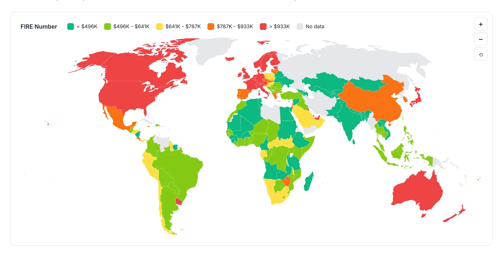
Interactive data tools using government sources - FIRE numbers for 380+ U.S. cities and 170+ countries, generational wealth comparisons, and debt-to-earnings ratios for 188 college majors.
There’s a lot of personal finance content telling you to save more, invest earlier, cut the lattes. Most of it is opinion.
We wanted something different - actual data you can explore. So we built a set of free tools using publicly available government sources: Bureau of Economic Analysis, Federal Reserve, World Bank, and College Scorecard.
No opinions on what you should do with your money. Just numbers, interactive charts, and transparent methodology.
FIRE Number by City - Retirement Costs Across 380+ U.S. Metros
How much do you actually need to retire early? It depends heavily on where you live.
We used BEA Regional Price Parities, the government’s measure of how far a dollar stretches in each metro, to calculate FIRE numbers for every major U.S. metro area. On the standard 4% target, the range runs from about $1.2 million in the cheapest metro, Pine Bluff, Arkansas, to about $1.77 million in the priciest, San Francisco, a gap of more than $560,000. Push to the extremes and the spread widens: a lean target dips below $1 million in Pine Bluff, while a fat FIRE target tops $3.5 million in San Francisco.
The tool includes:
- Sortable data table with all 380+ metros
- Interactive U.S. map visualization
- Custom calculator for your spending level
- Lean, regular, and fat FIRE targets
Want a single number for your own spending rather than a citywide median? The FIRE calculator applies the same 4% math to any annual budget and target withdrawal rate you enter:
FIRE Number by Country - Global Retirement Cost Comparison
Same question, worldwide scope. What does financial independence cost in Portugal vs. Thailand vs. Switzerland?
Using World Bank price level data, we calculated FIRE numbers for 170+ countries. For anyone considering geo-arbitrage, meaning earning in a high-income country and retiring somewhere cheaper, the differences are significant.
We also included context on what these numbers don’t capture: visa requirements, healthcare systems, tax implications. A low cost of living doesn’t help if you can’t legally stay there.
Explore FIRE Number by Country →
Net Worth by Generation - Boomers vs. Gen X vs. Millennials
The “Millennials are broke” vs. “Millennials are doing fine” debate rarely uses actual data. We pulled Federal Reserve Survey of Consumer Finances results from 1989 to 2022 and compared generations at the same ages.
The generational wealth analysis shows:
- Median net worth at ages 35-44 for each generation
- How the 2008 financial crisis affected different age groups
- Recent recovery trends that don’t get much attention
- Interactive calculator to compare your net worth to historical data
Explore Net Worth by Generation →
Student Loan Burden by Major - College Degree ROI Data
Which college degrees pay off fastest? Not in vague terms - in actual debt-to-earnings ratios.
Using College Scorecard data, we calculated how many months of post-graduation earnings it takes to pay off median student debt for 188 majors.
The range is dramatic:
- Computer Engineering: ~3 months of earnings
- Drama and Theater Arts: ~14 months of earnings
The gap is mostly about starting salaries, not debt levels. Most majors carry a similar median loan of around $20K to $25K, but first-year earnings swing by nearly 4x across fields, from roughly $21K at the low end to about $80K at the top.
Explore Student Loan Burden by Major →
Why We Built These Tools
The BEA publishes regional price indices every year. The Fed runs detailed wealth surveys every three years. The Department of Education tracks student outcomes by major. It’s all public data.
But unless you’re a researcher or a journalist on deadline, you’re probably not downloading CSVs from data.gov and running your own analysis.
We figured it was worth making accessible:
- Interactive tables you can sort, filter, and search
- Maps and visualizations that aren’t ugly
- Calculators where you can plug in your own numbers
- Methodology pages explaining exactly how we calculated everything
What This Data Is (and Isn’t)
These tools provide context, not recommendations.
The student loan analysis doesn’t say “don’t major in drama.” The FIRE maps don’t say “move to Arkansas.” That’s not the point.
Knowing that the median 35-year-old has a certain net worth doesn’t tell you what to do. But it’s a reference point. Same with knowing your city’s FIRE number is 40% above the national median, or that your intended major has a 0.8 debt burden ratio.
What you do with that information is up to you.
From a reference point to your own numbers
The data tools stop at the benchmark. To model your own path, the Retirement Financial Planning template takes your annual savings, net returns before and after retirement, and expected inflation, then runs conservative, base, and optimistic scenarios side by side. A milestones section tracks the projected balance against 10, 25, 30, and 33 times annual expenses, and a card on the summary shows the earliest age the base case supports.

To see where you stand today, the Net Worth Tracker logs assets and liabilities in monthly columns you add as you go, charting both over time, and the savings calculator projects how a monthly contribution grows over a chosen number of years.
We’re adding more analyses as interesting datasets become available.
Related
Frequently asked questions
What withdrawal rate do these FIRE numbers assume?
The city and country tools apply a 4% withdrawal rate for lean and regular FIRE targets and a more conservative 3% for fat FIRE. Each number is the portfolio size where those spending levels can be drawn from investments, so the same annual expenses produce a larger target at a lower withdrawal rate. The calculator lets you adjust the spending input to match your own budget.
Why is the cheapest city's FIRE number still over a million dollars?
The U.S. baseline starts from about $48,664 in average annual expenditures for a single-person household in the BLS Consumer Expenditure Survey, rounded up to $60,000 to leave room for healthcare and housing. Even in the lowest-cost metros, funding roughly $48,000 of yearly spending at a 4% withdrawal rate requires around $1.2 million, which is why no metro drops below the seven-figure mark on the regular target.
Does a low FIRE number in another country mean it is easy to retire there?
No. The country tool measures price levels only. It does not account for visa and residency rules, whether you can access the local healthcare system, how foreign income and pensions are taxed, or currency risk. A low cost of living does not help if you cannot legally stay, so the number is a starting reference rather than a plan.
Does the student loan data account for people who did not finish their degree?
The debt-to-earnings ratios use College Scorecard figures for graduates, comparing median debt at completion with median earnings one year out. It does not capture students who borrowed but never completed a program, so it reflects the outcome for those who finished the major rather than everyone who started it.
Sources
- Regional Price Parities by State and Metro Area - U.S. Bureau of Economic Analysis
- Survey of Consumer Finances (SCF) - Federal Reserve Board
- International Comparison Program (Price Level Index) - World Bank
- College Scorecard - U.S. Department of Education
- Consumer Expenditure Surveys - U.S. Bureau of Labor Statistics
About this article
FIRE numbers are calculated from 2023 BEA Regional Price Parities and World Bank price levels; the U.S. baseline is anchored to the BLS Consumer Expenditure Survey. Generational net worth uses the Federal Reserve Survey of Consumer Finances (1989 to 2022); major ROI figures come from the Department of Education College Scorecard. Last reviewed September 2026.