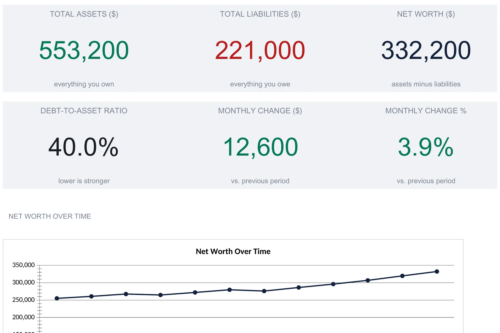
A net worth spreadsheet lists everything you own on one sheet, everything you owe on another, and derives the rest: asset allocation, month-by-month trend, year-over-year growth, and a dashboard. This walkthrough covers the full structure with a worked example, a household at $553,200 in assets, $221,000 in liabilities, and $332,200 net worth. Our Net Worth Tracker Ultimate ($29) ships the same six sheets ready-made for Excel and Google Sheets.
Net worth is one of the shortest numbers in personal finance and one of the most scattered to compute. It is everything you own minus everything you owe, but “everything you own” lives across a checking account, a couple of retirement accounts, a house, and a car, while “everything you owe” sits on a mortgage statement, a student loan portal, and two credit card apps. No single login shows the answer. Adding it up once is a chore. Watching it move over months and years is the part that needs structure, and a spreadsheet handles that structure well.
That structure is really just two lists and the views built on them: a list of assets, a list of liabilities, the allocation a computer can derive from those two lists without another keystroke, and then the monthly trend and the year-over-year comparison, which each take one short set of period totals and calculate the rest. The examples below come from our Net Worth Tracker Ultimate Spreadsheet Template ($29), which ships the whole thing ready-made for Excel and Google Sheets. The layout is reproducible by hand if you would rather build your own net worth spreadsheet from scratch.
What a net worth spreadsheet has to hold
Strip away the account dashboards and there are only two kinds of data you ever type, and two kinds of view built on top of them:
- Assets. Everything you own that holds value, each with a current and a previous figure so change can be measured.
- Liabilities. Everything you owe, again with a current and previous balance.
- Asset allocation. The asset side split into categories, as dollars and as a percentage of the whole.
- Trend over time. A month-by-month snapshot of the balance sheet and a year-over-year comparison of each category.
The tracker gives each of these its own sheet. Assets and Liabilities are where the item-by-item typing happens; Monthly Snapshots and Year-over-Year take a shorter set of typed figures, one period’s totals at a time; Asset Allocation is fully derived, with no input cells at all. A Dashboard sits on top and a How to Use sheet carries the instructions. The order below follows the way a person actually works the file, entering what they own and owe first, then the period totals, then reading the views that assemble themselves.
Start with what you own: the Assets sheet
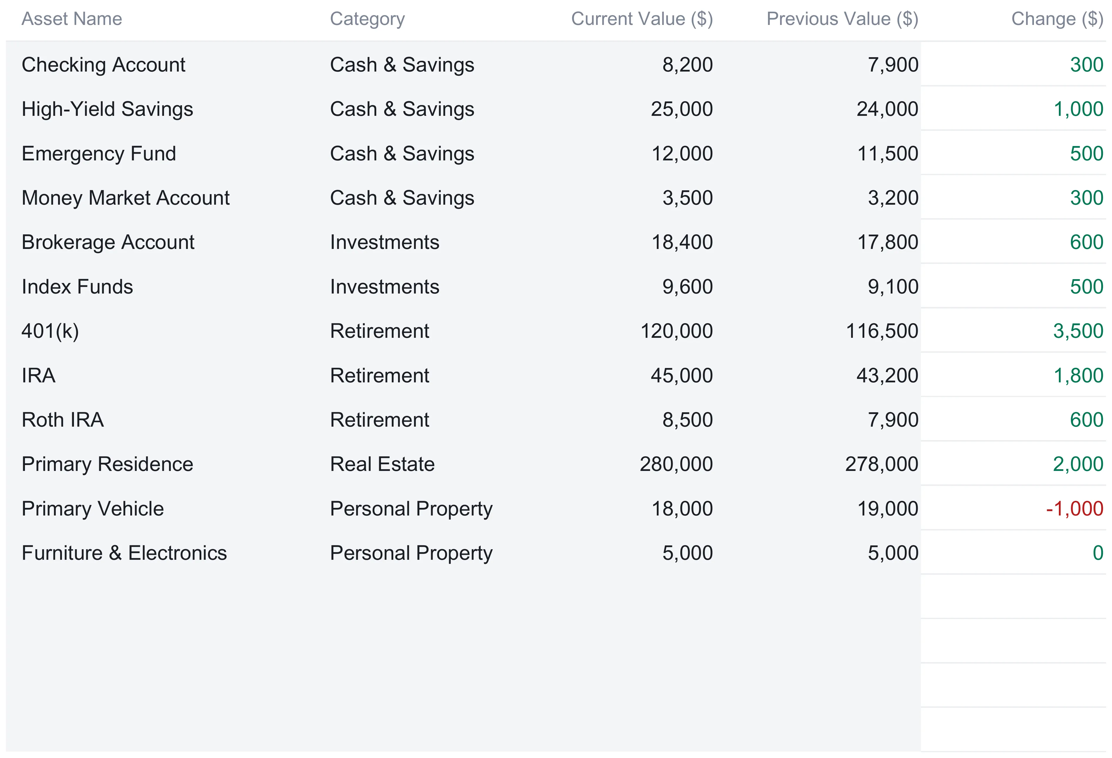
The Assets sheet is the first of the two item-by-item input sheets. It holds up to 30 individual assets, one per row, and each row takes four things: a name, a category chosen from a dropdown, a current value, and a previous value. A fifth column, Change, is a formula and is never typed.
The category dropdown offers five buckets, and every downstream view depends on them being consistent: Cash & Savings, Investments, Retirement, Real Estate, and Personal Property. The sample household fills twelve rows across all five:
| Asset | Category | Current value ($) | Previous value ($) | Change ($) |
|---|---|---|---|---|
| Checking Account | Cash & Savings | 8,200 | 7,900 | 300 |
| High-Yield Savings | Cash & Savings | 25,000 | 24,000 | 1,000 |
| Emergency Fund | Cash & Savings | 12,000 | 11,500 | 500 |
| Money Market Account | Cash & Savings | 3,500 | 3,200 | 300 |
| Brokerage Account | Investments | 18,400 | 17,800 | 600 |
| Index Funds | Investments | 9,600 | 9,100 | 500 |
| 401(k) | Retirement | 120,000 | 116,500 | 3,500 |
| IRA | Retirement | 45,000 | 43,200 | 1,800 |
| Roth IRA | Retirement | 8,500 | 7,900 | 600 |
| Primary Residence | Real Estate | 280,000 | 278,000 | 2,000 |
| Primary Vehicle | Personal Property | 18,000 | 19,000 | -1,000 |
| Furniture & Electronics | Personal Property | 5,000 | 5,000 | 0 |
| Total assets | 553,200 | 543,100 | 10,100 |
The Change column is a single formula, current value minus previous value, and it color-codes itself: a gain shows in green, a loss in red. The primary vehicle is the one red line in the sample, down $1,000 as the car depreciates, while the total assets row climbs from $543,100 to $553,200, a $10,100 gain across the period. Two design choices are worth copying into any hand-built version. The blank rows below the data already carry the Change formula and already sit inside the total, so the next asset goes on the first free row and the workbook updates on its own. And the total is a plain sum of the whole range, so it never falls out of step with the rows above it.
List what you owe: the Liabilities sheet
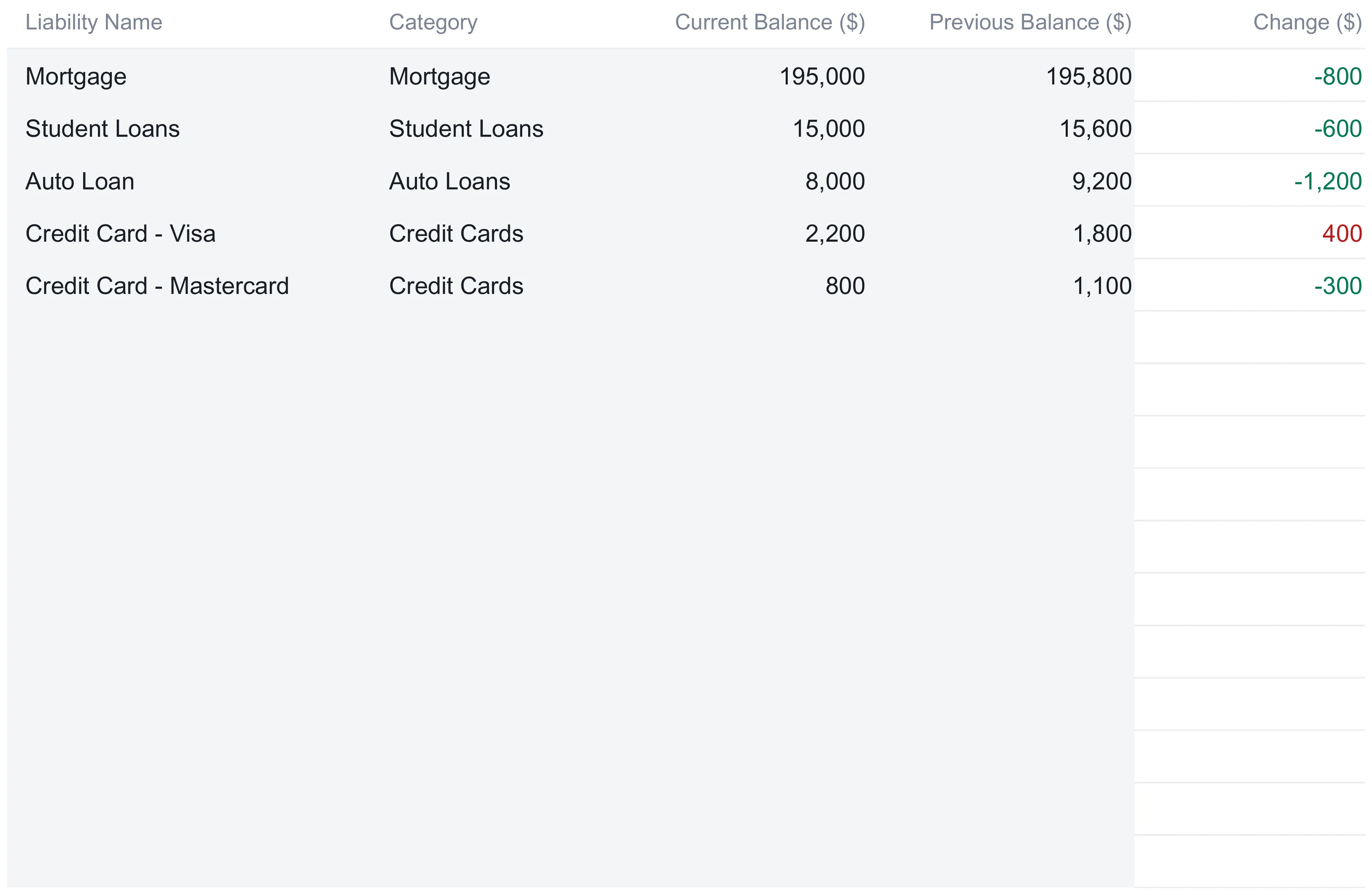
The Liabilities sheet is the mirror image, and the second of the two item-by-item input sheets. It holds up to 20 debts, each with a name, a category, a current balance, and a previous balance, and its own Change column that computes the difference. The five liability categories are Mortgage, Student Loans, Auto Loans, Credit Cards, and Other. The sample lists five debts:
| Liability | Category | Current balance ($) | Previous balance ($) | Change ($) |
|---|---|---|---|---|
| Mortgage | Mortgage | 195,000 | 195,800 | -800 |
| Student Loans | Student Loans | 15,000 | 15,600 | -600 |
| Auto Loan | Auto Loans | 8,000 | 9,200 | -1,200 |
| Credit Card - Visa | Credit Cards | 2,200 | 1,800 | 400 |
| Credit Card - Mastercard | Credit Cards | 800 | 1,100 | -300 |
| Total liabilities | 221,000 | 223,500 | -2,500 |
The color logic flips to match what a falling debt means. On the Liabilities sheet a balance that went down shows in green and a balance that went up shows in red, so the mortgage, student loan, auto loan, and Mastercard all read green while the Visa card, up $400, reads red. Total liabilities fall from $223,500 to $221,000, a $2,500 reduction across the period. This is the counterweight to the Assets sheet, and the reason net worth is a more honest figure than an account balance: the same household holds $553,200 in assets and owes $221,000 against them, and only the difference is genuinely theirs.
With both lists filled, the headline number is just subtraction: $553,200 in assets minus $221,000 in liabilities is a net worth of $332,200. Everything that follows is a different way of reading those same two lists.
The current-and-previous convention that powers every change
The pair of value columns that both input sheets share is what makes the tracker more than a static list. Every asset row and every liability row carries a Current figure and a Previous figure, and every change number anywhere in the workbook is built from the two.
The idea is simple to run. Current value is what the account or the item is worth today. Previous value is what it was worth at your last update, typically a month ago. The Change column subtracts one from the other, and because the same previous figures roll up into the totals, the Dashboard’s monthly-change tiles can compare this period’s net worth against last period’s without any separate bookkeeping. When you sit down to update the file, the rhythm is to move the current figures into the previous column, then type the new current figures over them; the change columns and the monthly tiles recompute the moment you do.
The tracker also leans on color to keep input and output separate, a habit the How to Use sheet spells out. Tinted cells are the ones you fill in, white cells hold formulas and are left alone, green text marks a positive change or a shrinking debt, and red marks a negative change or a growing one. On a busy balance sheet those cues are the difference between updating a number and accidentally overwriting a formula that feeds three other sheets.
See the mix: the Asset Allocation sheet
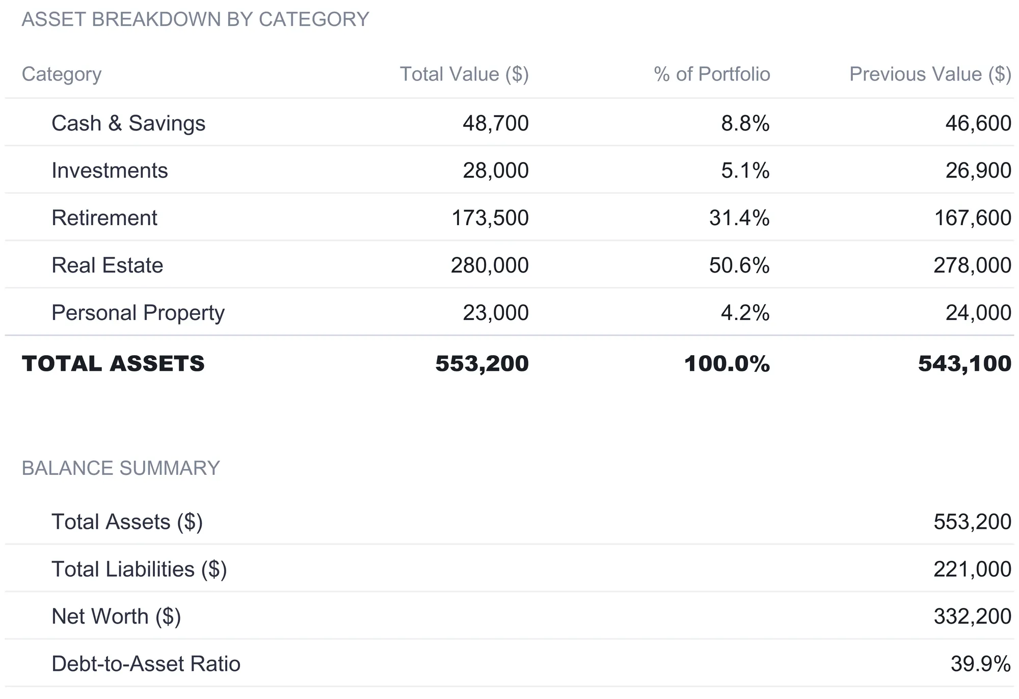
The Asset Allocation sheet is the first fully derived view, and nothing on it is typed. It reads the Assets sheet with a SUMIF for each category, adding up every row that carries a given label, and reports the result three ways: total dollars in the category, its share of the whole portfolio, and the previous-period dollar figure for the same category. Because it pulls live from the Assets sheet, retyping is impossible; the categories can only ever match what you entered.
For the sample the breakdown lands like this:
| Category | Total value ($) | % of portfolio | Previous value ($) |
|---|---|---|---|
| Cash & Savings | 48,700 | 8.8% | 46,600 |
| Investments | 28,000 | 5.1% | 26,900 |
| Retirement | 173,500 | 31.4% | 167,600 |
| Real Estate | 280,000 | 50.6% | 278,000 |
| Personal Property | 23,000 | 4.2% | 24,000 |
| Total assets | 553,200 | 100.0% | 543,100 |
Read down the percentage column and the shape of this particular balance sheet is obvious at a glance: real estate is half the assets at 50.6 percent, retirement is roughly another third at 31.4 percent, and the remaining three categories together make up less than a fifth. That concentration is a fact the raw asset list buries and the allocation view surfaces. The sheet also carries a Balance Summary block at the bottom, repeating total assets ($553,200), total liabilities ($221,000), net worth ($332,200), and the debt-to-asset ratio (39.9 percent) so the whole picture sits on one screen.
Worth being clear about what this view does and does not do. It reports the mix the balance sheet currently has. It does not recommend a mix, set a target, or judge the one shown, and neither does this walkthrough. Whether a given split fits a given household is a question the sheet leaves to the reader.
Track the trend month by month: the Monthly Snapshots sheet
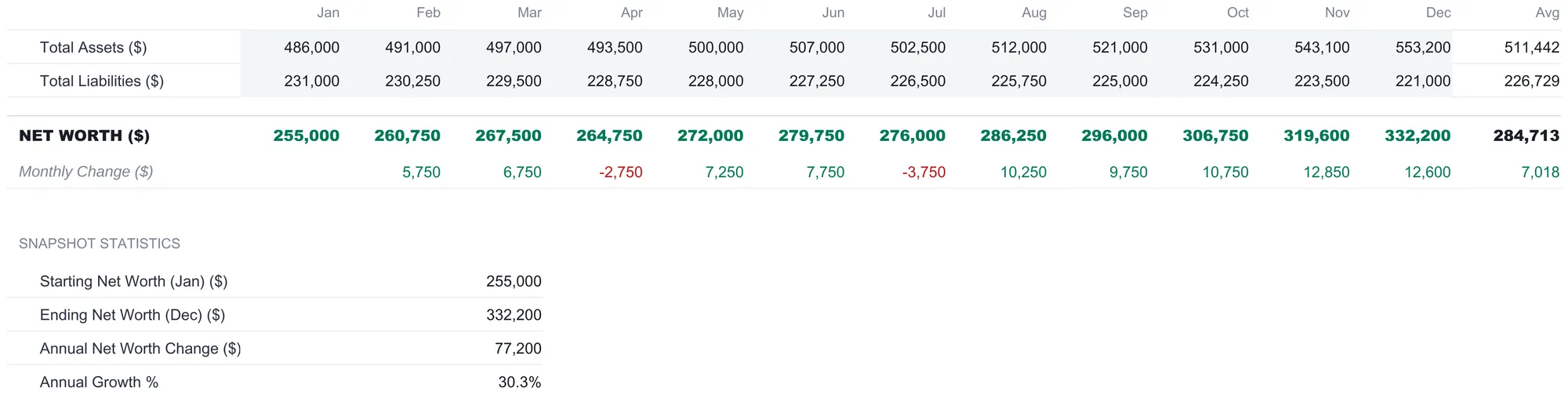
A single net worth figure is a photograph. The Monthly Snapshots sheet turns it into a film. Here you enter two numbers for each of the twelve months, total assets and total liabilities, and the sheet computes net worth, the month-to-month change, and a twelve-month average for every row. Those monthly totals are typed rather than pulled from the Assets and Liabilities sheets, because a month’s totals are a historical record rather than something today’s balance sheet can reconstruct.
In the sample year total assets climb from $486,000 in January to $553,200 in December while total liabilities ease down from $231,000 to $221,000, and net worth is the gap between them each month:
| Jan | Apr | Jul | Oct | Dec | Avg | |
|---|---|---|---|---|---|---|
| Net worth ($) | 255,000 | 264,750 | 276,000 | 306,750 | 332,200 | 284,713 |
| Monthly change ($) | -2,750 | -3,750 | 10,750 | 12,600 | 7,018 |
The Monthly Change row is where the trend earns its keep. Most months are green gains, but two print red: April at -$2,750 and July at -$3,750, the months the balance sheet slipped. A pullback that would vanish inside a year-end summary shows up plainly here, and so does its recovery the following month. The Snapshot Statistics block underneath distills the year to four figures: starting net worth of $255,000 in January, ending net worth of $332,200 in December, an annual change of $77,200, and annual growth of 30.3 percent. The average net worth across the twelve months works out to $284,713 and the average monthly change to $7,018.
Compare the years: the Year-over-Year sheet
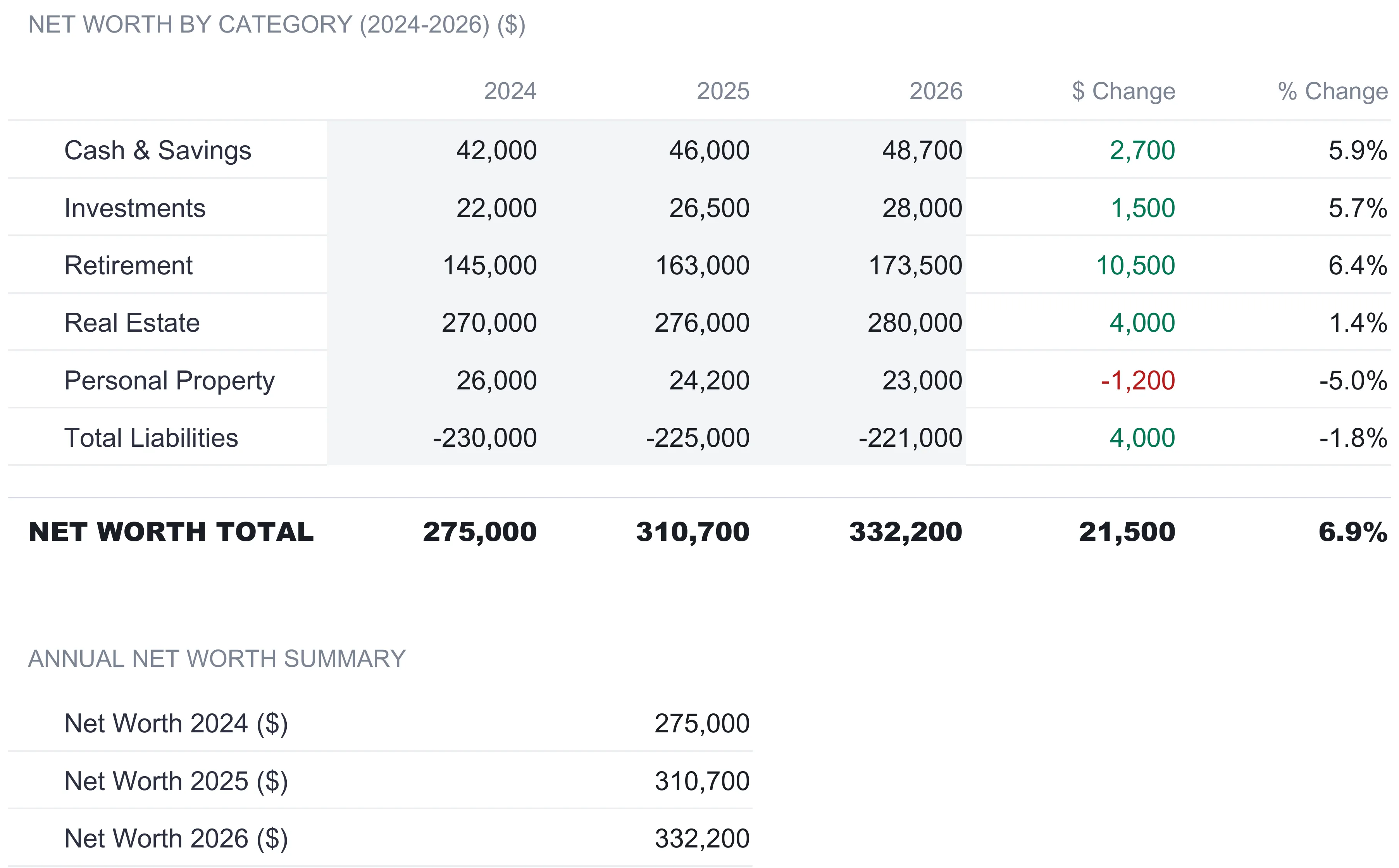
Where the monthly sheet reads a single year in fine grain, the Year-over-Year sheet zooms out to compare whole years side by side. It holds a column for each of 2024, 2025, and 2026, with a row for each of the five asset categories plus a Total Liabilities row entered as a negative. Those year figures are typed into the tinted cells, the same way the monthly totals are, rather than pulled from elsewhere in the file. Two computed columns on the right show the dollar and percentage change from the most recent year to the one before it, and a Net Worth Total row sums each year’s column.
| Category | 2024 ($) | 2025 ($) | 2026 ($) | $ change | % change |
|---|---|---|---|---|---|
| Cash & Savings | 42,000 | 46,000 | 48,700 | 2,700 | 5.9% |
| Investments | 22,000 | 26,500 | 28,000 | 1,500 | 5.7% |
| Retirement | 145,000 | 163,000 | 173,500 | 10,500 | 6.4% |
| Real Estate | 270,000 | 276,000 | 280,000 | 4,000 | 1.4% |
| Personal Property | 26,000 | 24,200 | 23,000 | -1,200 | -5.0% |
| Total Liabilities | -230,000 | -225,000 | -221,000 | 4,000 | -1.8% |
| Net worth total | 275,000 | 310,700 | 332,200 | 21,500 | 6.9% |
Reading across the bottom row, net worth moves from $275,000 in 2024 to $310,700 in 2025 to $332,200 in 2026, a $21,500 or 6.9 percent gain in the latest step. The category rows explain where it came from: retirement did the heaviest lifting at +$10,500, cash and investments each added over a thousand, real estate crept up 1.4 percent, and personal property slipped $1,200 as the car aged. The liabilities row, entered as a negative, shows the debt total shrinking from $225,000 to $221,000. This is the view that separates a good year from a good decade, because it holds several years’ worth of category totals in one place rather than asking you to remember them.
The dashboard: six numbers and a trend line
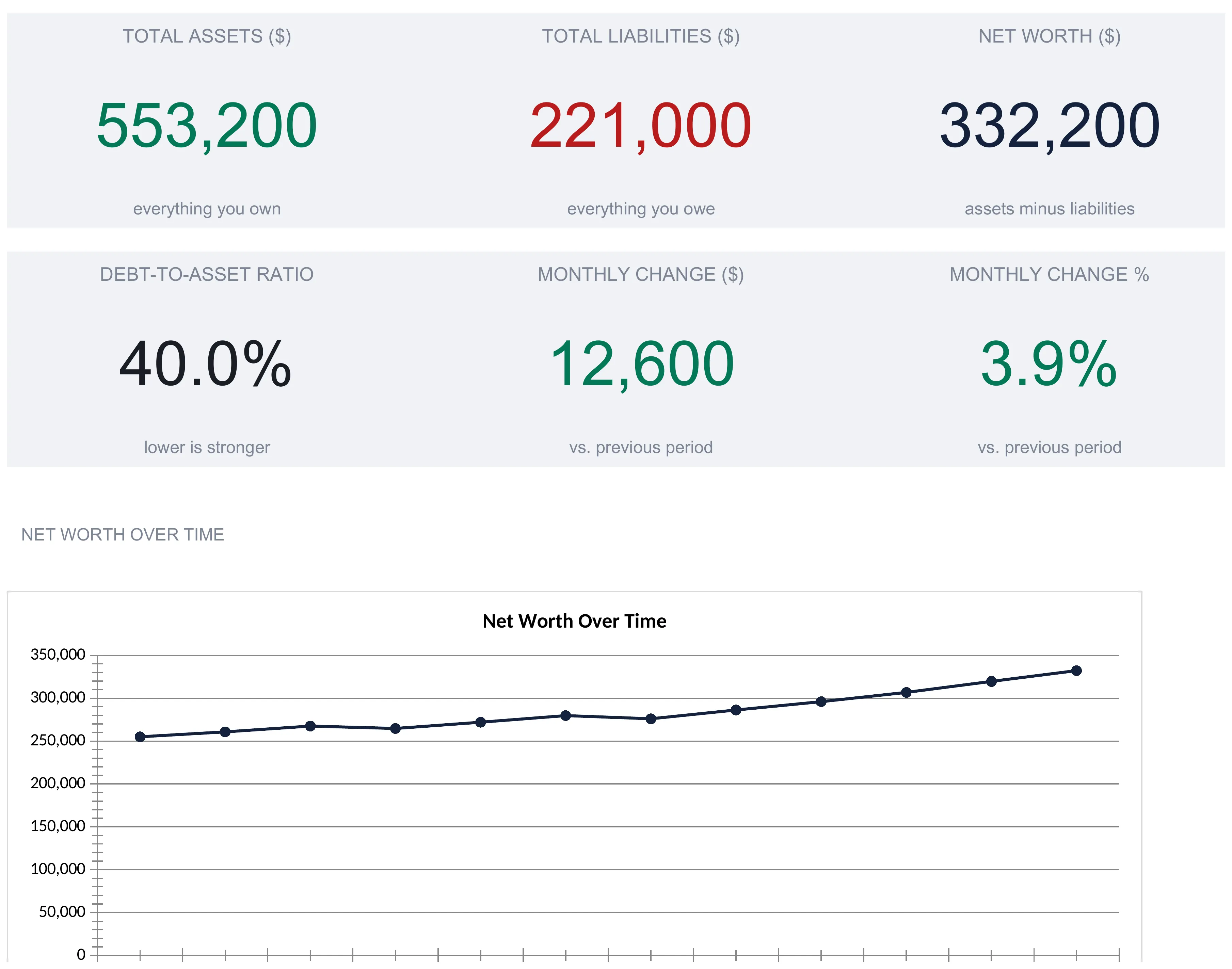
With the input sheets filled, the Dashboard assembles the summary. A top strip carries three tiles pulled straight from the totals: Total Assets ($553,200), Total Liabilities ($221,000), and Net Worth ($332,200), each with a plain caption reading “everything you own,” “everything you owe,” and “assets minus liabilities.” A second strip adds three more:
| Metric | Sample value | How it is derived |
|---|---|---|
| Total assets | $553,200 | Sum of every asset row |
| Total liabilities | $221,000 | Sum of every liability row |
| Net worth | $332,200 | Total assets minus total liabilities |
| Debt-to-asset ratio | 40.0% | Total liabilities ÷ total assets |
| Monthly change ($) | 12,600 | This period’s net worth minus last period’s |
| Monthly change (%) | 3.9% | The dollar change as a share of last period’s net worth |
The two change tiles reach back to the previous-value columns you filled on the Assets and Liabilities sheets. Last period’s net worth was $543,100 in assets minus $223,500 in debts, or $319,600; this period’s is $332,200; the difference of $12,600 is the monthly change in dollars, and dividing it by $319,600 gives the 3.9 percent. Below the tiles sit two charts, a Net Worth Over Time line that traces all twelve monthly snapshots from $255,000 up to $332,200, and a pie chart breaking the assets into their five categories.
One thing the dashboard does not do is fill itself. There is no bank connection, no brokerage sync, and no property-value feed; the tracker is a formula workbook, not an aggregator. Every current and previous figure on the Assets and Liabilities sheets is typed, the monthly snapshots are entered by hand as the year unfolds, and the year-over-year columns take one set of category figures per year. For a household with a dozen accounts that is a few minutes a month, the price of a file whose every calculation is visible and editable and whose data never leaves the machine it lives on. Account-aggregation apps exist precisely to remove that entry step, and the trade is the familiar one: automation on one side, full visibility and control on the other. The Federal Reserve’s Survey of Consumer Finances, which builds its national wealth statistics from exactly this assets-minus-liabilities balance-sheet framing, is a reminder that the two lists are the standard way household net worth is measured, whether by a research program or a spreadsheet on a kitchen table. The CFPB’s Your Money, Your Goals toolkit offers paper worksheets in the same spirit for anyone who wants to sketch the lists before building the file.
Net worth, debt-to-asset ratio, and asset allocation in plain terms
Three of the dashboard figures carry a little jargon, and all three are simple operations on the two lists you typed.
Net worth ($553,200 - $221,000 = $332,200) is what you own outright once debts are subtracted. It is the one figure that treats assets and liabilities together.
Debt-to-asset ratio ($221,000 ÷ $553,200 = 39.9 percent, which the dashboard tile rounds to 40.0 percent) measures how much of the asset base is financed by debt rather than owned free and clear. The tile labels it “lower is stronger” because the ratio falls when debts shrink or assets grow. It describes the balance sheet; it is not a threshold the template asks you to hit.
Asset allocation (real estate 50.6 percent, retirement 31.4 percent, cash 8.8 percent, investments 5.1 percent, personal property 4.2 percent) ignores debt entirely and instead shows how the asset side is distributed. Net worth and allocation are complementary rather than competing: one asks how much you own, the other asks what form it takes.
The three figures move independently, which is why the dashboard shows all of them. Net worth can rise while the debt-to-asset ratio also rises, if assets grow on borrowed money. Allocation can shift dramatically while net worth barely moves, if one category is sold to buy another. A tracker that reported only the headline number would hide those distinctions; showing the components on one screen is what keeps them visible.
Excel or Google Sheets for a net worth tracker
The tracker is an .xlsx file built on ordinary formulas, SUMIF for the allocation, plain subtraction for the changes, and cross-sheet references for the totals, with no macros and no add-ons. That means it runs identically in Microsoft Excel and in Google Sheets after an upload, and the How to Use sheet notes LibreOffice Calc works too. Google Sheets suits anyone who wants the file reachable from a phone when a statement arrives; Excel suits those who prefer a local file on one machine. The structure described here is equally buildable in either, and the currency selector on the Dashboard offers 35 symbols, relabeling every money header across the workbook without converting the underlying numbers.
Which net worth template fits which need
The Net Worth Tracker comes in a tier family, and the same subtraction sits at the center of each; the sheets around it are what differ.
- The free Net Worth Tracker is a single-sheet start for anyone who just wants to list assets and liabilities and see the difference, with no trend history yet.
- The Net Worth Tracker Essentials ($19) adds structure for tracking that difference over time.
- The Net Worth Tracker Ultimate Spreadsheet Template ($29) is the workbook this walkthrough follows: the assets and liabilities sheets, the asset allocation breakdown, monthly snapshots, the year-over-year comparison, and the six-tile dashboard, for up to 30 assets and 20 debts.
A net worth tracker answers “where do I stand today?” A different question, “where am I trying to get to?”, is what the Financial Goal Planner Ultimate Spreadsheet Template ($29) is built around, with its own goals list, priority matrix, and monthly progress tracking. The two sit naturally side by side: one measures the balance sheet you have, the other frames the targets you are working toward.
Related
- Best Free Net Worth Tracker Spreadsheets - a roundup of no-cost options if you want to compare before committing to a paid layout
- Net Worth Tracker Spreadsheets Compared - how the tiers and rival templates stack up feature by feature
- Net Worth Tracker vs Financial Planning - where balance-sheet tracking ends and goal planning begins
- How to Build a Personal Balance Sheet in Google Sheets - the same assets-minus-liabilities structure, built by hand
Frequently asked questions
What is the difference between net worth and asset allocation?
They answer different questions from the same data. Net worth is a single number, total assets minus total liabilities, so it measures how much you own free and clear. Asset allocation ignores debt and instead splits the asset side into categories, showing what share sits in cash, investments, retirement, real estate, and personal property. In the sample workbook net worth is $332,200, while the allocation shows real estate at 50.6 percent of a $553,200 asset base.
How is the debt-to-asset ratio calculated?
It divides total liabilities by total assets. In the sample that is $221,000 divided by $553,200, which the dashboard rounds to 40.0 percent and the allocation summary shows as 39.9 percent. The tile captions it "lower is stronger" because the ratio falls as debts are paid down or assets grow. It is a description of the balance sheet, not a target the template sets for you.
Does the tracker pull my account balances automatically?
No. There is no bank connection or price feed. Every figure in the file is typed in: the current and previous values on the Assets and Liabilities sheets, the monthly totals on Monthly Snapshots, and the category figures for each year on Year-over-Year. What the workbook derives from them, the allocation percentages, the change columns, the dashboard tiles and its two charts, updates on its own. That is the trade a spreadsheet makes: you enter the numbers by hand, and in return every formula is visible and the file stays on your own machine.
What counts as an asset versus a liability?
On the Assets sheet an asset is anything you own that holds value, sorted into Cash & Savings, Investments, Retirement, Real Estate, or Personal Property. On the Liabilities sheet a liability is anything you owe, sorted into Mortgage, Student Loans, Auto Loans, Credit Cards, or Other. A house sits in Real Estate on the asset side at its full value, while the mortgage against it sits in the Mortgage category on the liability side; net worth is what remains once the two are netted.
How many assets and debts can the spreadsheet hold?
The Assets sheet supports up to 30 individual assets and the Liabilities sheet up to 20 individual debts, each row carrying a category dropdown. The sample fills 12 assets and 5 debts and leaves the rest blank; the blank rows already contain the change formula and already sit inside the totals, so adding a line means typing on the next free row rather than extending any range.
Sources
- Survey of Consumer Finances (SCF) - Board of Governors of the Federal Reserve System
- Your Money, Your Goals toolkit - Consumer Financial Protection Bureau
About this article
Template sheets, inputs, formulas and figures checked on 2026-09-10 against the shipped Net Worth Tracker Ultimate workbook (Dashboard, Assets, Liabilities, Monthly Snapshots, Asset Allocation, Year-over-Year, How to Use tabs). Federal Reserve Survey of Consumer Finances and CFPB Your Money, Your Goals references checked against the live pages at writing time. Last reviewed September 2026.