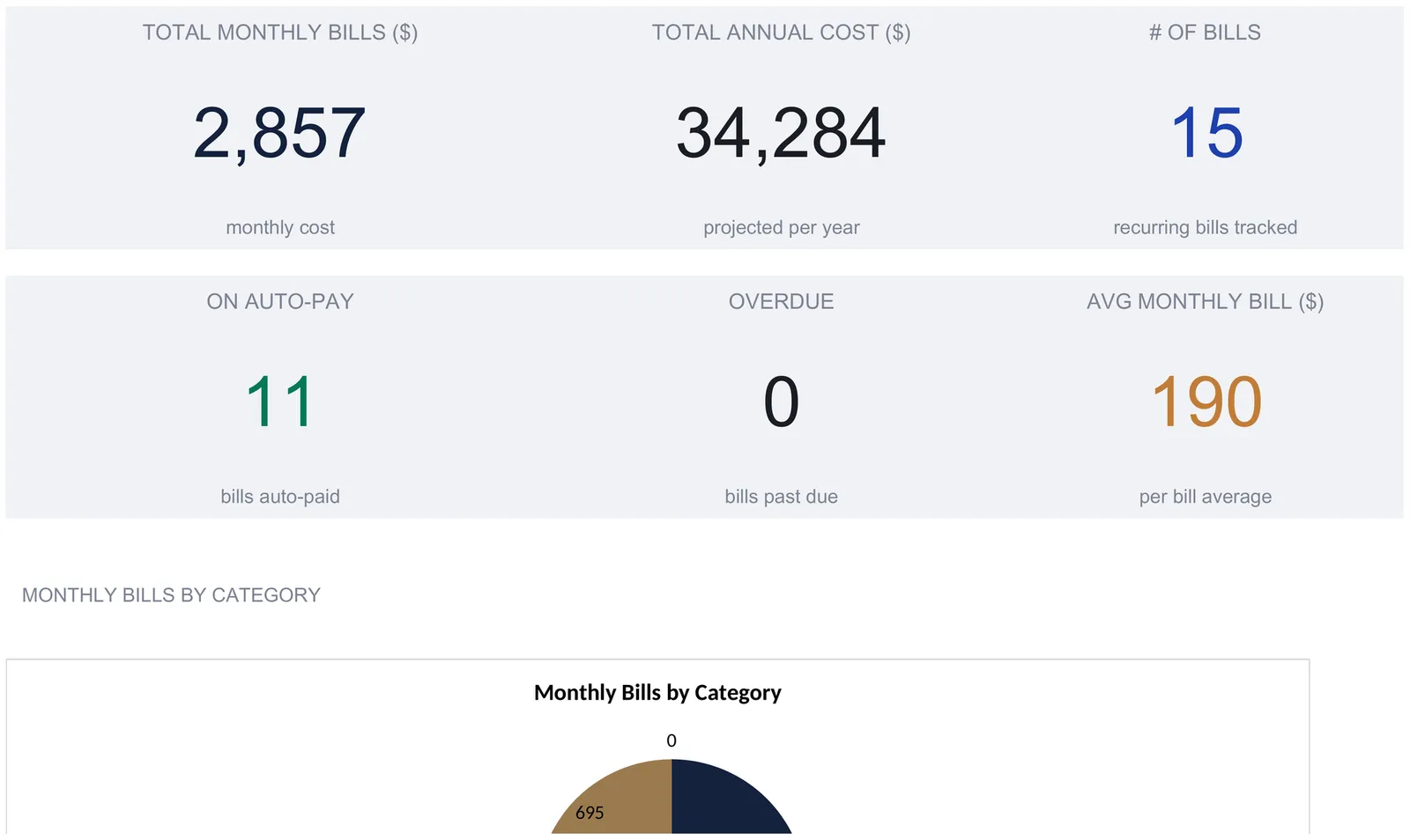
A bill tracker spreadsheet keeps every recurring bill in one list and derives the rest from it: a monthly and annual total, a payment log, a 12-month plan, planned-versus-actual variance, and a running late fee total. This walkthrough covers the full structure with a worked example built on 15 bills, $2,857 a month, $34,284 a year, and $47 in late fees. Our Bill Tracker Ultimate ($29) ships the same structure ready-made for Excel and Google Sheets.
Recurring bills are the quietest part of a household’s money. Rent, insurance, a couple of loans, the utilities, and a fistful of small subscriptions all leave the account on their own dates, in their own amounts, at their own frequencies. Most people can name the big ones from memory and still be surprised by the annual total, because the number that matters is never on any single statement. Add fifteen bills that each look small next to rent and the year runs to five figures. A bill tracker spreadsheet exists to put that whole picture in one place and keep it current with a few cells of typing a month.
The structure is four pieces: a list of the bills themselves, a log of what actually got paid, a month-by-month plan for the year, and the totals and warnings that fall out of them. The examples below come from our Bill Tracker Ultimate Spreadsheet Template ($29), which ships the whole thing ready-made for Excel and Google Sheets. The layout is reproducible by hand if you would rather build your own.
What a bill tracker spreadsheet has to hold
Behind the biller apps and the reminder emails, a bill tracker only needs four kinds of data:
- The bill list. Every recurring obligation, with its category, amount, frequency, due day, auto-pay status, and current state. This is the reference everything else reads.
- The payment log. A dated record of what you actually paid, including any late fee, the method, and a confirmation number. This is the history, separate from the plan.
- The yearly plan. A grid of what each category costs in each of the twelve months, so a quarterly or annual bill can sit in the month it truly lands rather than smeared evenly.
- The derived views. The dashboard totals and the late fee rollup, which read the other sheets and are never typed, plus a planned-versus-actual comparison where the two annual columns are yours to type and the variance calculates from them.
The Bill Tracker gives each of these its own sheet. Bills holds the list, Payment History holds the log, the 12-Month View and the Annual Summary hold the plan, and the Dashboard and Late Fee Tracker present the derived views, with a How to Use sheet carrying the instructions. The work order below follows the way you would actually fill it in.
Start with the list: the Bills sheet
The Bills sheet is the only place a bill gets typed, and it is the sheet that feeds the dashboard. Eight of its columns are entries and one is a formula.
The entry columns are Bill Name, Category, Amount, Frequency, Due Day, Auto-Pay, Status, and Notes. Four of them use dropdowns to keep the data consistent, which is what lets the totals downstream trust the values. Category is one of Housing, Utilities, Insurance, Subscriptions, Loans, or Other. Frequency is Monthly, Quarterly, or Annual. Auto-Pay is Yes or No. Status is Upcoming, Paid, or Overdue.
The one formula column is Monthly Equiv, and it is the quiet workhorse of the whole file:
- A Monthly bill passes through unchanged.
- A Quarterly amount is divided by three.
- An Annual amount is divided by twelve.
That single conversion is what makes a $60 monthly internet bill and a $1,200 annual bill comparable on the same list. The annual bill shows a $100 monthly equivalent (1,200 ÷ 12), so the two lines can be summed without a quarterly figure quietly counting three times its monthly weight. Because of that, the Amount column is deliberately never totalled. Adding a monthly $60 to an annual $1,200 in the same column would be meaningless, so the sheet leaves Amount as a per-charge reference and reads Monthly Equiv for every total, the dashboard, and the chart.
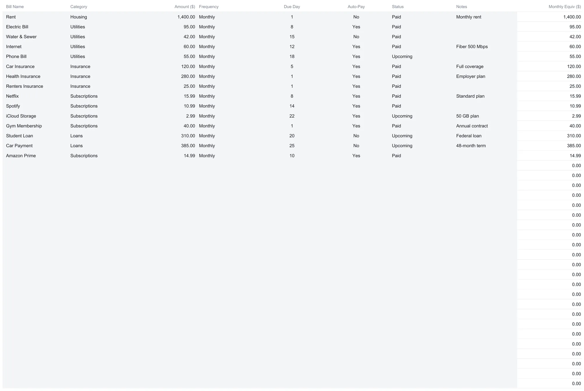
The sample file carries fifteen bills, and they make a recognisable household. Rent at $1,400 is the only Housing line. Utilities gather four bills, an electric bill at $95, water and sewer at $42, internet at $60, and a phone bill at $55, for $252 a month. Insurance holds car, health, and renters cover at $120, $280, and $25, totalling $425. Subscriptions run to five small lines, Netflix at $15.99, Spotify at $10.99, iCloud storage at $2.99, a gym membership at $40, and Amazon Prime at $14.99, which together come to $84.96. Loans cover a student loan at $310 and a car payment at $385, for $695. Every one of these is billed monthly in the sample, so each Monthly Equiv matches its Amount, and the column sums to $2,856.96 a month.
Two design details are worth copying into any hand-built version.
The spare rows are pre-wired. The workbook holds 40 bills, and the empty rows below the last entry already carry the Monthly Equiv formula and already sit inside every total. The next bill goes on the first free row and the whole file updates; there is nothing to drag down. The one caveat, spelled out on the sheet itself, is that rows added below the wired block sit outside every total, so a household with more than 40 bills would extend the formulas rather than type past the edge.
A hand-typed category falls to Other. The dashboard’s money columns and chart carry any category that was typed by hand instead of picked from the dropdown under Other, and the per-category count columns only recognise the six listed names. It is a small thing that keeps the totals adding up, and it is the reason the dropdowns are there.
The frequency conversion is easiest to see with a bill the sample does not have. Suppose a car insurance premium is billed once a quarter at $360. Entered with Frequency set to Quarterly, its Monthly Equiv reads $120 (360 ÷ 3), and it sits on the list next to the monthly bills at that smoothed rate. An annual professional membership of $240 entered as Annual reads $20 a month (240 ÷ 12). Neither ever appears in a $360 or $240 shape on the totals, which is the intended behaviour: the point of the column is a fair monthly weight, so a quarterly charge does not count three times heavier than the monthly line beside it. The trade is that the smoothed figure hides which month the real charge hits, and that is precisely the gap the 12-Month View closes.
Log what you actually paid: the Payment History sheet
The Bills sheet says what a bill is. The Payment History sheet says what happened. Keeping them apart is the habit worth copying, because a plan and a record answer different questions, and a sheet that tries to be both tends to drift.
Six columns log each payment: Date, Bill Name, Amount Paid, Late Fee, Method, and Confirmation #. The sheet holds 100 rows, and the running totals at the bottom cover every row logged, whatever year it falls in.
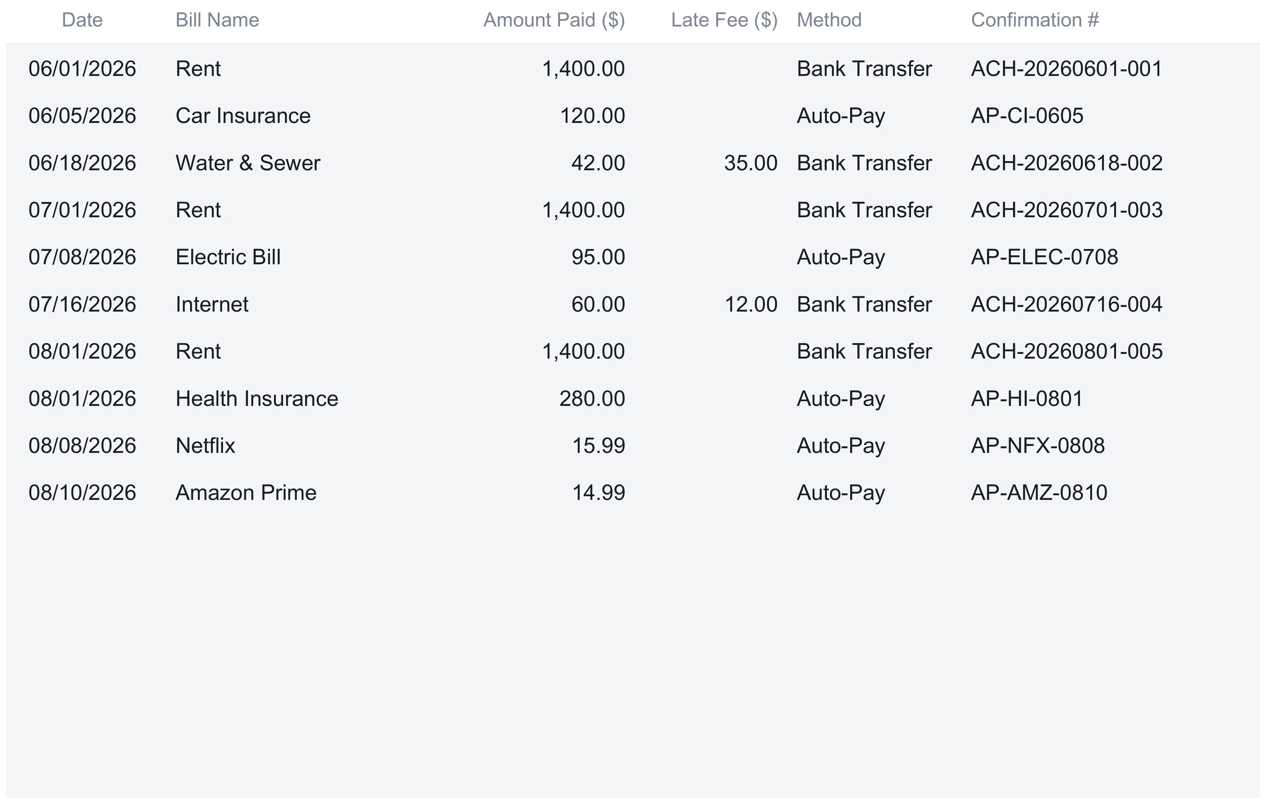
The sample log runs ten payments across June, July, and August 2026. Most are clean: rent by bank transfer at the start of each month, car and health insurance on auto-pay, a scatter of subscriptions. Two rows carry a late fee, and those are the ones that matter later. A water and sewer payment on 18 June came with a $35 late fee, and an internet payment on 16 July came with a $12 one. The Amount Paid column totals $4,827.98 for the logged period, and the Late Fee column totals $47.
The Late Fee column does more than sit in a total. It feeds the Late Fee Tracker sheet directly, so a fee logged here shows up there by month without any further typing. The Confirmation # column looks like housekeeping, but it is the column that turns a spreadsheet into a paper trail. A logged date, amount, method, and confirmation number is a clear record if a charge is ever wrong and needs disputing, which the Consumer Financial Protection Bureau lists among the routine things people take up with a card issuer.
Plan the year month by month: the 12-Month View
A monthly equivalent is honest about the annual size of a bill and silent about its timing. A $1,200 annual insurance premium smooths to $100 a month on the Bills sheet, but it does not actually leave the account in twelve $100 pieces. It lands once. The 12-Month View is where that timing goes back in.
The sheet is a grid: the six categories down the side, the twelve months across the top, and a Total column on the right. It ships seeded from the monthly equivalent of each category on the Bills sheet, so every month starts equal, and then nothing rewrites it. That last point is the design decision that makes the grid useful. Because the seed is never overwritten, you can edit any single cell to reflect what a quarterly or annual bill really costs in the month it lands, and the row totals, the month totals, and the statistics below all recalculate from whatever the grid holds.
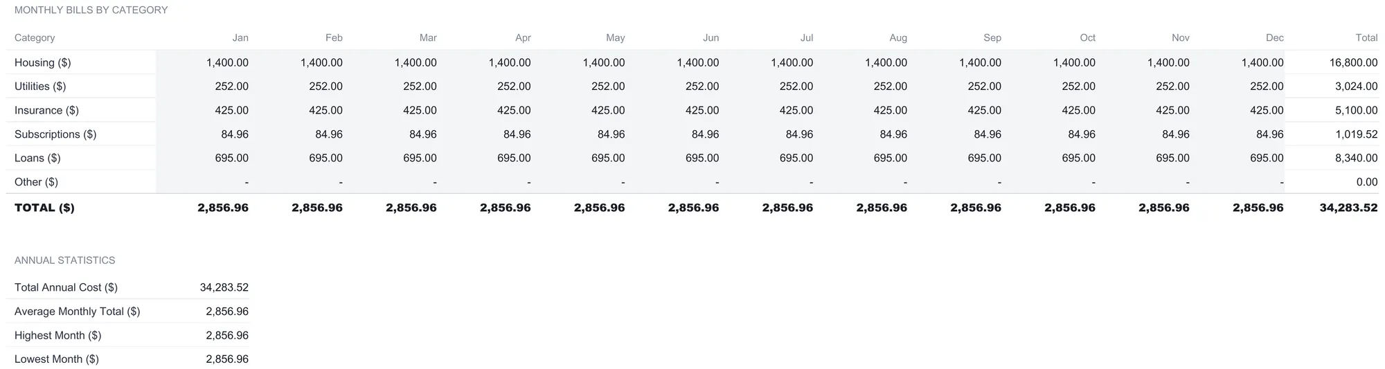
In the sample, the grid is still in its seeded state, so every month reads the same $2,856.96 and the year totals to $34,283.52. The four Annual Statistics below the grid summarise it: a Total Annual Cost of $34,283.52, an Average Monthly Total of $2,856.96, and both a Highest Month and a Lowest Month of $2,856.96. Those two identical extremes are the tell that the grid has not been edited yet; the moment a real annual premium is moved into its true month, the highest and lowest months separate and the shape of the year appears. On a flat seed they sit on top of each other, which is exactly what you would expect.
Compare the plan to reality: the Annual Summary
The 12-Month View plans forward. The Annual Summary looks back at the year and asks a plainer question: did each category cost what it was supposed to?
Five columns answer it. Category, then a Planned annual figure and an Actual annual figure, then a Variance in currency and a Var %. Like the grid, Planned and Actual ship seeded from the Bills sheet at twelve times each category’s monthly equivalent, and neither is rewritten afterwards, so both are yours to type over with real numbers as the year closes. Variance is simply Actual minus Planned, and Var % expresses that as a share of the plan.
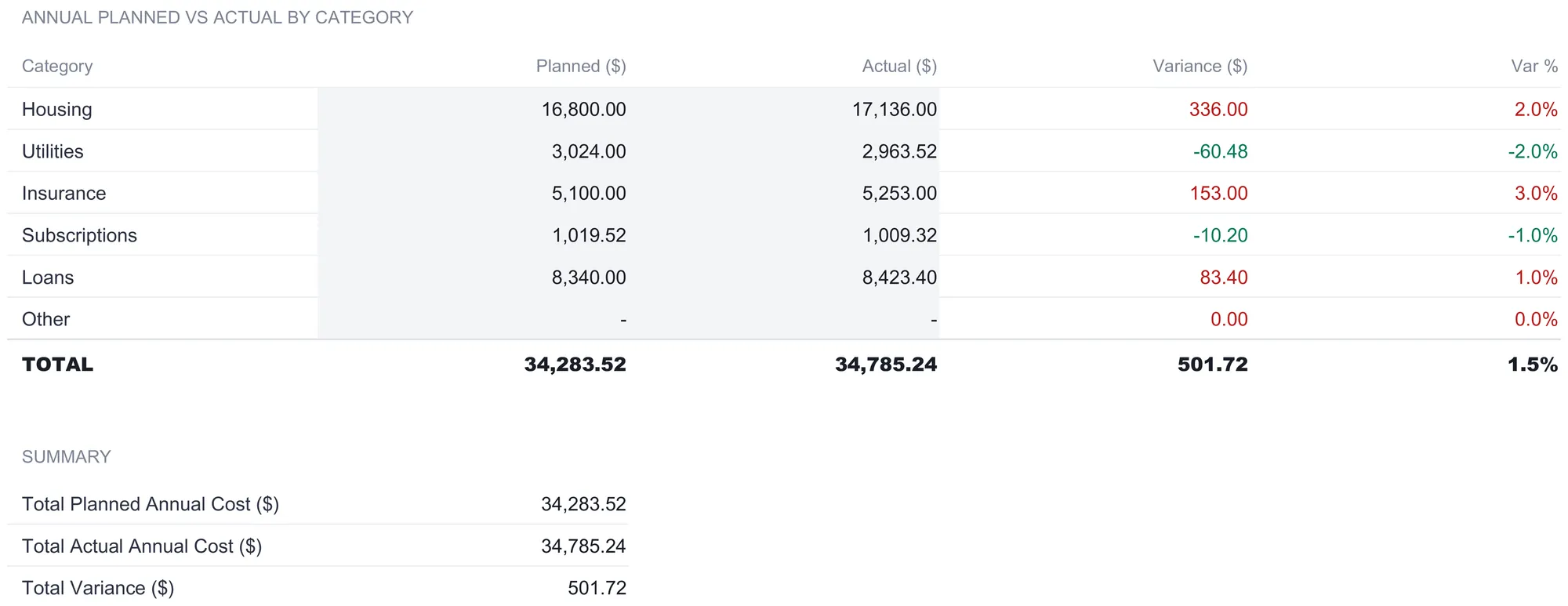
The sample has been filled in with a realistic year. Housing planned $16,800 and came in at $17,136, a $336 overrun at 2 percent. Utilities planned $3,024 and landed at $2,963.52, coming in $60.48 under at minus 2 percent. Insurance ran $153 over at 3 percent, Subscriptions came in $10.20 under, and Loans finished $83.40 over. Across all categories, a planned $34,283.52 met an actual $34,785.24, a total variance of $501.72, or about 1.5 percent over the year. The variance figures are colored, red for a category that ran over its plan and green for one that came in under, so the overruns read at a glance without hunting through the numbers.
That is a small variance for a year of bills, and the value is less in the headline number than in seeing which categories moved. A 1.5 percent overall overrun made of a 3 percent insurance rise and a 2 percent utilities saving is a different year from a flat one, and the category rows are what tell them apart. Because the two columns are yours to type, the sheet also works part-way through a year: enter the planned figures once, then update Actual as each category’s real spend firms up, and the variance recalculates on every edit. Nothing on the sheet forces a particular reading of that gap; it simply totals what happened next to what was expected and colors the difference.
Watch the late fees: the Late Fee Tracker
The Late Fee Tracker is the sheet that totals a cost most people never tally. Every figure on it is read from the Late Fee column of Payment History, matched to the Tracking Year set at the top, which is 2026 in the sample. That year and the targets at the bottom are the only cells you type, so the sheet fills itself as the payment log grows.
The top block breaks late fees down by month across four columns: Late Fees Paid, a Cumulative Total that carries forward, a # Late Payments count, and a Status that reads either “No Late Fees” or “Late Fees Charged”. The sample shows a clean first five months, then $35 in June and $12 in July, the two fees from the payment log. The cumulative total climbs to $47 in July and holds there through December, and the annual total row confirms $47 across 2 late payments. Seeing the running total flatten after July is the point: it is the difference between two isolated slips and a habit forming.
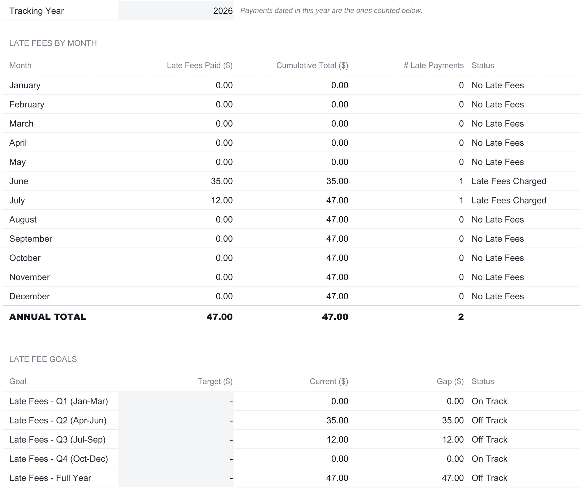
Below the monthly block is a Late Fee Goals section that compares each quarter, and the full year, against a Target you set. The targets ship at zero, which is the strictest possible comparison, so the Gap column shows exactly how much crossed the line. In the sample, Q1 and Q4 sit at zero and read “On Track”, while Q2 shows the $35 gap, Q3 shows $12, and the full-year line shows the whole $47, each marked “Off Track” against a zero target. Because the target is yours, a household that treats an occasional $12 fee as tolerable can raise it and re-read the same sheet against its own line rather than a perfect one. The How to Use sheet notes the common lever here without prescribing it: one way people cut late fees is turning on Auto-Pay for the bills that allow it, which is what the Auto-Pay column on the Bills sheet is there to surface.
The dashboard: six numbers and a category table
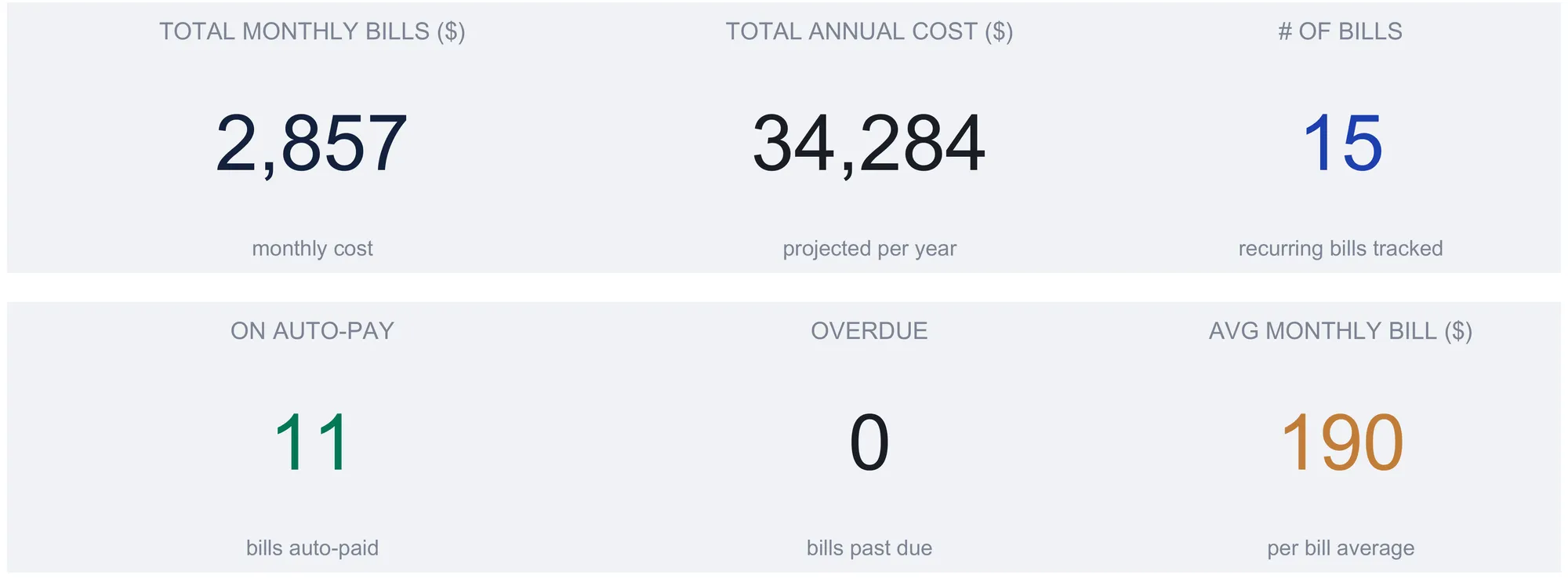
With Bills filled and payments logged, the Dashboard computes the top-line view. Six KPI tiles carry the headline figures, rounded to whole currency for reading at a glance while the Bills sheet keeps the cents.
| Metric | Sample value | How it is derived |
|---|---|---|
| Total Monthly Bills | $2,857 | Sum of every bill’s monthly equivalent |
| Total Annual Cost | $34,284 | Monthly total times 12 |
| # of Bills | 15 | Count of rows with an amount |
| On Auto-Pay | 11 | Count of bills marked Auto-Pay Yes |
| Overdue | 0 | Count of bills with status Overdue |
| Avg Monthly Bill | $190 | Monthly total divided by the bill count |
Below the tiles, a Bill Status by Category table breaks the same data down per category, with a Monthly Total, an Annual Cost, counts of bills, auto-pay lines and overdue lines, and a % of Total share. In the sample, Housing is 49 percent of the monthly outlay on a single bill, Loans are 24.3 percent across two, Insurance is 14.9 percent, Utilities 8.8 percent, and the five Subscriptions together are just 2.97 percent. The six rows always add to the TOTAL row, which reads $2,856.96 a month, $34,283.52 a year, 15 bills, 11 on auto-pay, and none overdue. A pie chart sits between the tiles and that table, plotting the same monthly split by category.
The number that earns the dashboard is the annual cost. No individual statement shows it, and it is almost always larger than the mental estimate, because the small lines that feel trivial each month add up over twelve. In the sample, five subscriptions that look like rounding error at $84.96 a month are still $1,019.52 a year. Seeing the monthly and the annual figure on the same screen is most of the reason to track any of this.
The metrics in plain terms
Four of the derived figures deserve a plain reading, because they are the ones people misread.
Total Monthly Bills is the sum of the monthly equivalents, not the sum of the amounts. It answers “what do the bills cost in an average month” after quarterly and annual charges are smoothed. Total Annual Cost is just that figure times twelve, which is the fastest honest estimate of the year.
Avg Monthly Bill ($2,856.96 ÷ 15 = $190.46 in the sample) is the per-bill average, useful for sizing what a typical line costs. It is dragged upward by rent and down by the small subscriptions, so it describes the middle of a lopsided list rather than any real bill.
% of Total is each category’s share of the monthly outlay, and it is where a bill tracker earns its keep as more than a checklist. A household that assumed subscriptions were the problem can see them at 2.97 percent and housing at 49 percent, and read where the money actually goes rather than where it feels like it goes.
Variance, on the Annual Summary, is Actual minus Planned. A positive variance is an overrun, colored red; a negative one is a saving, colored green. Read alongside Var %, it separates a category that drifted a few dollars from one that moved a real share of its plan.
Where the numbers meet a due date
The Due Day column and the Status dropdown are the spreadsheet’s connection to the calendar, and they are deliberately manual. Due Day is a reference for you and feeds no total; Status is the field you set to Upcoming, Paid, or Overdue as each bill moves through its cycle. That manual step is also the trade a spreadsheet makes against an app. There is no bank connection and no automatic import, so a bill becomes overdue on the sheet only when you mark it, not on its own. In return, every formula is visible and editable, and the file lives on your own machine.
Timing is where late fees are born, and it is worth knowing how the calendar around a bill works. The Consumer Financial Protection Bureau explains that a credit card grace period is the window between the close of a billing cycle and the due date during which a balance paid in full avoids interest, and that issuers are not required to offer one at all. The bureau’s credit cards hub covers the fees and the dispute process that a logged payment history supports. The spreadsheet does not give advice on any of this; it just keeps the dates, amounts, and confirmation numbers in one place so the record is there when a due date or a charge comes into question.
Excel or Google Sheets for a bill tracker
The Bill Tracker is an .xlsx file built on plain formulas, with no macros, no VBA, and no add-ins, so it runs identically in Microsoft Excel and in Google Sheets after an upload, and in LibreOffice Calc as well. Google Sheets suits a household that wants the file on a phone to mark a bill paid on the day, and Excel suits anyone who prefers a local file. The dropdowns, the Monthly Equiv conversion, the SUMIF category totals, and the date-matched late fee rollup all behave the same in either program. The structure described here is equally buildable by hand in both, and the tinted cells mark the ones meant for typing while the white cells hold the formulas that read them.
Which bill tool fits which household
- Bill Tracker Ultimate Spreadsheet Template ($29) is the workbook this walkthrough follows: the bill list, the payment log, the 12-month plan, the planned-versus-actual summary, the late fee tracker, and the six-metric dashboard, wired for up to 40 bills.
- The free Bill Tracker is a single bill list for anyone who wants to start with nothing more than that, and there is a Bill Tracker Essentials ($19) that adds a dashboard between the free list and the full Ultimate file.
- Subscription Tracker Ultimate ($29) goes deep on the one category the bill tracker treats as a single line. Where the Subscriptions row here rolls five services into $84.96, that workbook gives each subscription its own line with a price-history and a cancellation view, which suits a household whose recurring costs are mostly small streaming and app charges rather than a few large bills.
Related
- How to Track Subscriptions and Recurring Expenses - the deeper method behind that single Subscriptions line
- Budgeting Without Linking Your Bank Account - the manual, private approach a spreadsheet takes
- Conditional Formatting for Budget Tracking in Google Sheets - how the red and green variance coloring is built
- Google Sheets vs Excel for Budgeting - the same file, two programs, side by side
Frequently asked questions
What is the difference between the Amount and Monthly Equiv columns?
Amount is what the biller charges each time the bill arrives, at whatever frequency you picked. Monthly Equiv converts that to a monthly figure: a monthly bill passes through unchanged, a quarterly amount is divided by three, and an annual amount is divided by twelve. The Amount column is deliberately never totalled, because quarters and years do not add to months. Every total, the dashboard, and the category chart read the Monthly Equiv column instead.
How many bills can a bill tracker spreadsheet hold?
This workbook is wired for 40 bills. Each of those rows already carries the Monthly Equiv formula and already sits inside the totals and the dashboard, so a new bill goes on the first free row and the whole file updates. Rows added below the last wired one sit outside every total, which is the one thing to watch when a household outgrows the 40 slots.
Does changing the currency convert the bill amounts?
No. The currency selector on the dashboard offers a long list of symbols, and picking one relabels every money column header and KPI label across the workbook. It changes the label only. The underlying numbers are untouched, so it is a display switch rather than an exchange-rate conversion.
Where do the late fee figures come from?
Every number on the Late Fee Tracker is read from the Late Fee column of the Payment History sheet, matched to the tracking year set at the top of the sheet. Log a payment with a late fee and it lands in that month's row, rolls into the cumulative total, and counts toward the quarter and full-year figures automatically. The only cells you type on the tracker are that tracking year and the Targets you choose to compare against.
Can it track quarterly and annual bills, not just monthly ones?
Yes. The Frequency column accepts Monthly, Quarterly, or Annual, and Monthly Equiv smooths each one into a comparable monthly cost so the totals stay honest. Because a smoothed figure hides the month a quarterly or annual bill actually lands, the 12-Month View grid is there to place the real cost in the real month, and it ships seeded from the Bills sheet for you to edit.
Sources
- What is a grace period for a credit card? - Consumer Financial Protection Bureau
- Credit cards - Consumer Financial Protection Bureau
About this article
Sheets, columns, formulas, sample figures, and charts checked on 2026-09-10 against the shipped Bill Tracker Ultimate workbook (Dashboard, Bills, 12-Month View, Payment History, Annual Summary, Late Fee Tracker, How to Use), with the free and Essentials Bill Trackers and the Subscription Tracker Ultimate checked for the tier comparisons. Grace period and credit card fee references checked against the live Consumer Financial Protection Bureau pages at writing time. Last reviewed September 2026.