A zero-based budget spreadsheet assigns every dollar of income to a category until nothing is left unassigned. This walkthrough follows the Ultimate template sheet by sheet: an income sheet that totals $5,200 a month from six sources, a Budget Allocation sheet that hands all $5,200 to 27 categories so the remaining-to-assign figure reads zero, a live spending log of 44 April transactions, a Budget vs Actual variance view, a 12-month history, and a six-card dashboard. The Zero Based Budget Ultimate ($29) ships the whole structure for Excel and Google Sheets.
The idea behind a zero-based budget fits in one sentence: assign every dollar of income to a job until nothing is left unassigned. The arithmetic that keeps it honest, though, does not fit in one sentence. Every time income moves, or a category runs over, or a new expense appears, the whole plan has to be rebalanced so the assignments still add up to exactly the money coming in. General guidance on how to create a budget and stick with it describes the same loop, listing income, sorting spending into categories, and measuring one against the other. That repeated balancing is precisely the kind of work a spreadsheet handles without complaint.
This is a walkthrough of one specific workbook that does it: the Zero Based Budget Ultimate Spreadsheet Template ($29), six working sheets plus a How to Use tab, built for Excel and Google Sheets. Rather than re-argue the method in the abstract, the sections below follow the file in the order a person actually fills it in, from the income sheet that sets the pool of money through to the dashboard that scores the result, using the real numbers the template ships with. If you want the method itself first, the zero-based budgeting template tutorial explains give-every-dollar-a-job before any particular build, and the comparison of 50/30/20 against zero-based budgeting lays out when each approach tends to fit. This article is about the mechanics of this one workbook.
What a zero-based budget spreadsheet has to do
Strip a zero-based budget down and there are only four moving parts, and keeping them cleanly separated is most of what makes the file trustworthy:
- One income figure. Every allocation is measured against total take-home income, so the sum of all income sources is the single number that sets how much there is to assign.
- A full set of allocations. Every dollar handed to a named category, planned before the month starts, with the total constrained to equal income exactly.
- A live record of actual spending. What got spent, logged transaction by transaction, so each category’s plan can be checked against reality.
- A verdict, at two ranges. Whether each category came in over or under this month, and whether the plan balanced to zero month after month across the year.
The template gives each of these its own home. Income lives on the Income sheet. The allocations live on the Budget Allocation sheet, which also carries the zero-based check itself. Actual spending is captured on the Spending Log. The verdict shows up in three places, a category-level variance on the Budget vs Actual sheet, a twelve-month view on the Monthly History sheet, and a single-screen scorecard on the Dashboard. A How to Use sheet carries the instructions. Working through them in that order is the quickest way to see how the pieces connect, so that is the order below.
Set the pool of money: the Income sheet
Because every allocation is measured against income, the income number comes first, and the Income sheet is where it is built up rather than guessed at.
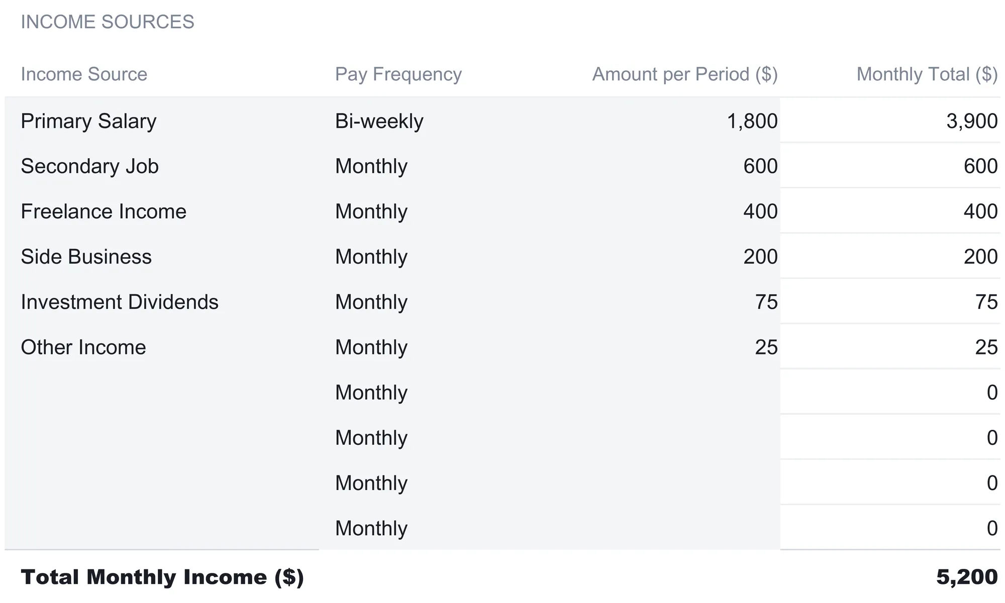
The Income Sources table lists one row per source, and for each it holds the source name, a Pay Frequency, and an Amount per Period. A Monthly Total column then converts every source to a monthly figure, which is the small piece of automation that makes the sheet worth using. The sample fills six sources:
| Income Source | Pay Frequency | Amount per Period ($) | Monthly Total ($) |
|---|---|---|---|
| Primary Salary | Bi-weekly | 1,800 | 3,900 |
| Secondary Job | Monthly | 600 | 600 |
| Freelance Income | Monthly | 400 | 400 |
| Side Business | Monthly | 200 | 200 |
| Investment Dividends | Monthly | 75 | 75 |
| Other Income | Monthly | 25 | 25 |
| Total Monthly Income | 5,200 |
The Primary Salary line is the one that shows why the frequency column matters. It is entered as $1,800 bi-weekly, but the Monthly Total reads $3,900, because a bi-weekly paycheck arrives 26 times a year, and 26 payments of $1,800 spread across 12 months work out to $3,900 a month. The formula behind the column handles each pay schedule the same way: weekly multiplies by 52 and divides by 12, bi-weekly uses 26, semi-monthly counts as twice a month, annual divides a single payment by 12, and monthly passes straight through. A notes block at the bottom of the sheet spells out each of those cadences in words. Entering a paycheck at its real frequency, rather than annualizing by hand, is the kind of small step that quietly goes wrong in a budget built from scratch. A bi-weekly salary is easy to log as if it were monthly, which understates income by two paychecks a year.
The six sources total $5,200 of monthly income, and that figure is the one everything downstream divides and balances against. Four spare rows sit below the filled ones, already carrying the frequency formula, so a seventh or eighth source drops straight in.
Give every dollar a job: the Budget Allocation sheet
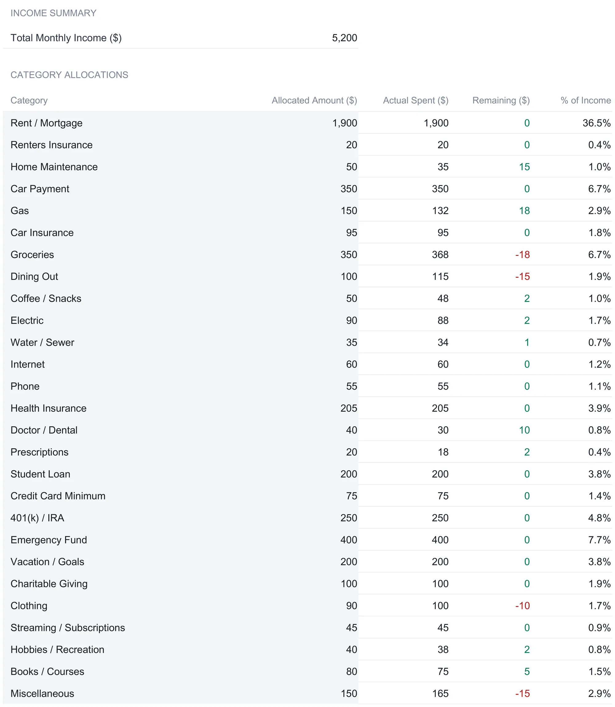
This is the sheet the whole method is named after. An Income Summary line at the top pulls the $5,200 total straight from the Income sheet, and below it the Category Allocations table is where each of those dollars gets assigned. Every row is one category with four values: an Allocated Amount you set, an Actual Spent figure pulled from the Spending Log, a Remaining amount, and that category as a percent of income.
The sample fills 27 categories, running from the fixed bills at the top through to discretionary spending at the bottom. A selection shows the range:
| Category | Allocated ($) | Actual Spent ($) | Remaining ($) | % of Income |
|---|---|---|---|---|
| Rent / Mortgage | 1,900 | 1,900 | 0 | 36.5% |
| Home Maintenance | 50 | 35 | 15 | 1.0% |
| Gas | 150 | 132 | 18 | 2.9% |
| Groceries | 350 | 368 | -18 | 6.7% |
| Dining Out | 100 | 115 | -15 | 1.9% |
| Health Insurance | 205 | 205 | 0 | 3.9% |
| Emergency Fund | 400 | 400 | 0 | 7.7% |
| Clothing | 90 | 100 | -10 | 1.7% |
| Miscellaneous | 150 | 165 | -15 | 2.9% |
Three columns here are worth reading closely, because they are what separate a zero-based budget from a plain expense list.
The Remaining column is Allocated minus Actual, category by category. A positive figure, shown in green, means the category came in under its allocation, like the $15 left in Home Maintenance or the $18 left in Gas. A negative figure, shown in red, means it ran over, like Groceries at $18 past its $350 plan or Dining Out at $15 past its $100. This is a per-category reading, distinct from the zero-based check below, and it is where an overrun in one place becomes visible as the pressure it puts on the rest of the plan.
The percent-of-income column keeps the shape of the budget in view. Rent / Mortgage at $1,900 is 36.5 percent of the $5,200 income, the Emergency Fund allocation is 7.7 percent, and the 401(k) / IRA line is 4.8 percent. Because these are computed against income rather than typed, they move the moment either the allocation or the income changes, so the proportions stay honest.
The Zero-Based Check at the bottom is the constraint that defines the method. A Total Allocated row sums every allocation, and in the sample it lands at exactly $5,200. Directly below, a Remaining to Assign line computes Income minus Total Allocated, which comes to zero, and a status cell reads it in words: ZERO-BASED when the difference is zero, UNDER-ASSIGNED when income is larger than the allocations, and OVER-ASSIGNED when the allocations run past income. Because all $5,200 has been handed out, the status reads ZERO-BASED. That single word is the whole point of the sheet: it is a live confirmation that no dollar is sitting unassigned and none has been assigned twice.
One structural detail on this sheet is worth copying into any hand-built version. The blank rows between the last filled category and the Total Allocated line are not dead space. They already carry the Actual Spent, Remaining, and percent formulas, and they already sit inside the Total Allocated sum and the zero-based check. A new category goes on the first free row and the total, the check, and the Budget vs Actual table pick it up on their own, with no formula to drag down and no sum range to extend. The two dashboard charts are the one exception, since they group the 27 shipped category rows by fixed cell reference. That is the exact spot where a scratch-built budget usually begins to quietly miscount, when a category is added to the list but left outside the total.
Log what really happened: the Spending Log
Allocations are the plan; the Spending Log is the record of the month as it actually went. The Daily Expense Log holds one row per transaction with five columns: Date, Description, Category, Amount, and Payment Method. The sample carries a full month of April 2026 activity, and a handful of rows shows the texture of it:
| Date | Description | Category | Amount ($) | Payment Method |
|---|---|---|---|---|
| 4/1/2026 | Monthly Rent Payment | Rent / Mortgage | 1,900 | Auto Pay |
| 4/1/2026 | Shell Gas Station | Gas | 45 | Credit Card |
| 4/12/2026 | Costco | Groceries | 150 | Credit Card |
| 4/11/2026 | Date Night Dinner | Dining Out | 68.50 | Credit Card |
| 4/1/2026 | Life Insurance Premium | Health Insurance | 25 | Auto Pay |
| 4/1/2026 | Transfer to Emergency Fund | Emergency Fund | 400 | Auto Pay |
The connection back to the Budget Allocation sheet runs entirely through the Category column. Each category’s Actual Spent cell on the allocation sheet is a SUMIF that scans this log and adds every amount tagged with its name. Four separate grocery trips, Whole Foods, Target, Costco, and Trader Joe’s, land in the log as four rows and roll up into the single $368 that appears against Groceries on the allocation sheet. The savings transfers work the same way: the $400 moved to the emergency fund and the $200 sent to the vacation fund are logged as expenses here, because in a zero-based budget money set aside is money with a job, no different mechanically from money spent. Across the whole month the log records 44 transactions totaling $5,201, which is the figure that flows back as total actual spending.
Two rows repay a second look, because they show the categorizing decisions the log leaves to the person filling it in. A Monthly Parking Pass is logged under Gas rather than as its own line, folding parking into the broader transportation bucket, and a Life Insurance Premium is logged under Health Insurance alongside the health premium. Neither is dictated by the workbook. The SUMIF only cares that the text matches a category on the allocation sheet, so where a borderline expense goes is a choice, and the same expense would total somewhere else if it were tagged differently.
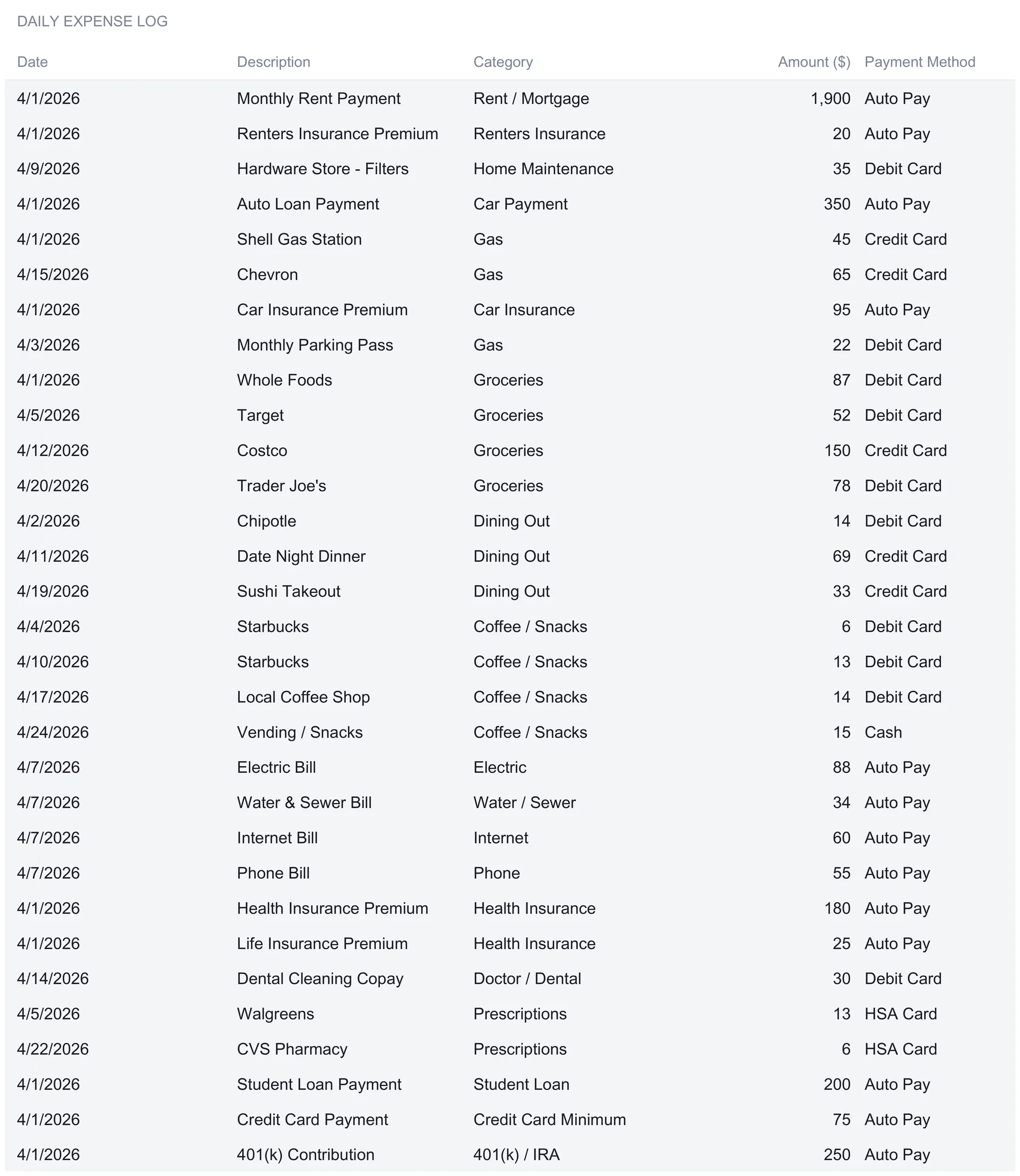
That exact-match requirement is the one piece of discipline the log demands, and it is worth stating plainly because it is the usual failure point. If the log says “Groceries” but the allocation sheet says “Grocery,” the SUMIF returns nothing and the category looks unspent. The workbook keeps the category names consistent in the sample precisely so the lookups resolve, and the Payment Method column, a dropdown offering Debit Card, Credit Card, Cash, Auto Pay, HSA Card, Check, and Other, is there for reference rather than to feed any calculation. The sheet leaves 100 rows for a month of logging, which is the intended reset point: clear the entries and start fresh each new month.
See the drift by category: the Budget vs Actual sheet
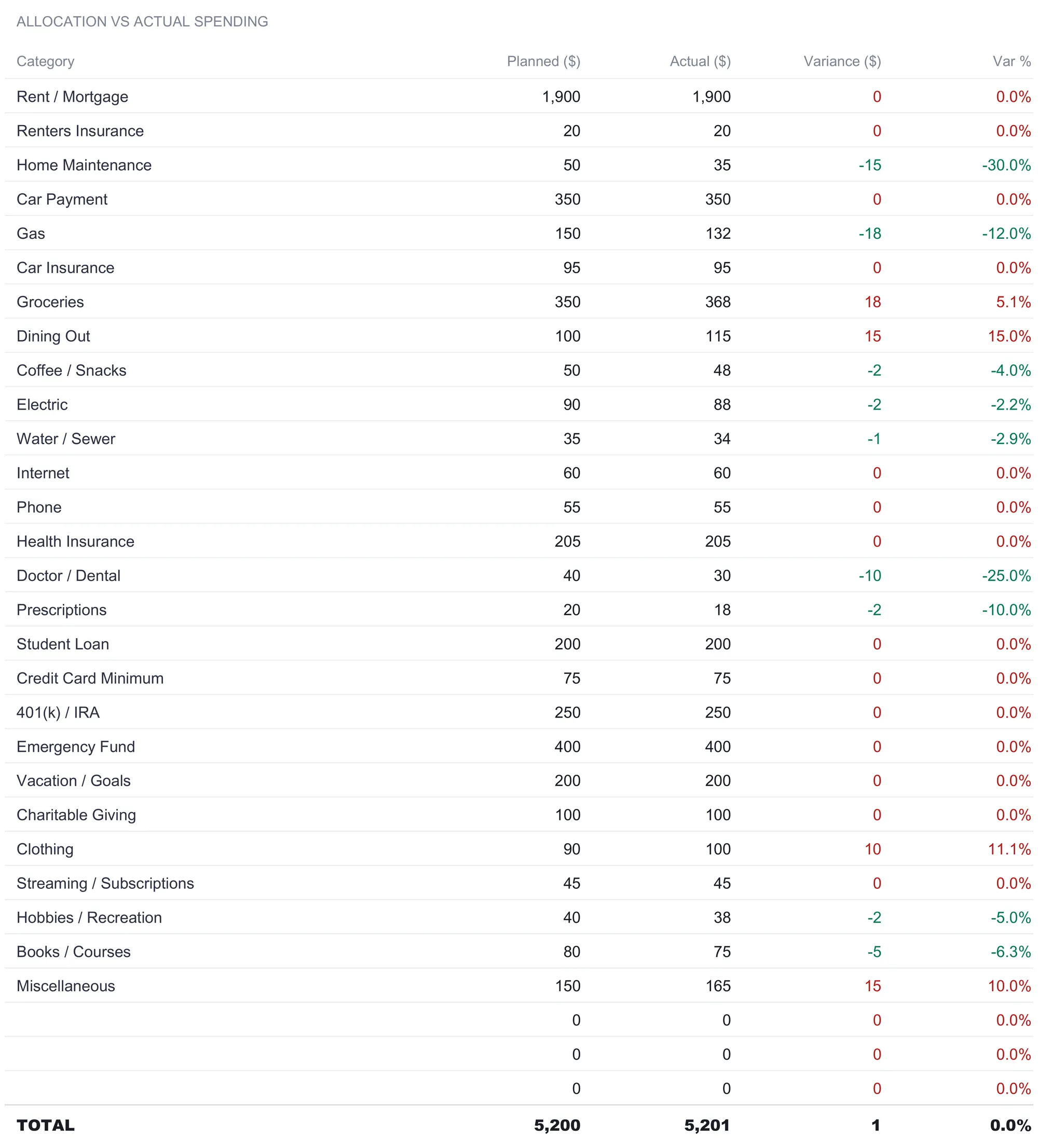
The Budget Allocation sheet already shows a Remaining figure per category, but the Budget vs Actual sheet reframes the same comparison as a variance report, which reads differently and answers a different question. Every category appears with four columns: a Planned amount, an Actual amount, a Variance in dollars, and a percentage variance. Both amount columns pull live from the Budget Allocation sheet, so this view never needs its own data entry.
The key difference from the allocation sheet is the sign convention. Here Variance is Actual minus Planned, so a positive number means the category spent more than planned and a negative number means it spent less, the reverse of the Remaining column’s logic. Groceries, which showed a red -$18 as Remaining, shows a red +$18 as Variance and a 5.1 percent overrun. Home Maintenance, which had $15 Remaining, shows a green -$15 variance and a 30.0 percent underrun. The percentage column is what keeps a small category honest against a large one: a $15 miss on a $50 maintenance plan is 30 percent, a far bigger proportional swing than the same kind of dollars would be against rent.
At the foot of the table a Total row adds it all up: $5,200 planned against $5,201 actual, a variance of $1, which rounds to 0.0 percent. That single dollar is the sample’s way of showing that a budget can balance to zero on paper and still land a hair off in practice, because the individual categories that ran over, Groceries, Dining Out, Clothing, and Miscellaneous, did not exactly cancel the ones that ran under. Below the table the sheet also carries an allocation-status summary and a set of zero-balance milestones that track how consistently the plan has balanced over time, but the variance table is the working heart of the sheet.
Watch the plan hold over a year: the Monthly History sheet
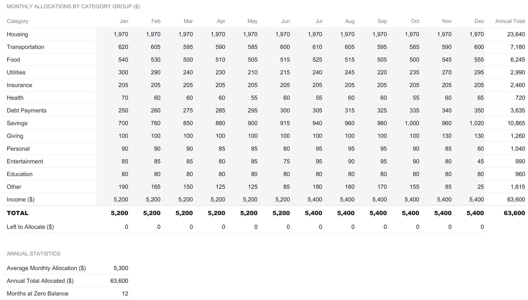
Any one month can balance by luck. The Monthly History sheet is where a zero-based budget stops being a single snapshot and becomes a track record. Instead of the 27 detailed categories, it rolls spending into 13 broader groups, from Housing and Transportation down to Education and Other, and gives each a column for every month from January to December plus an annual total.
The sample fills a full year, and reading down the annual-total column shows where a budget of this size sends its money over twelve months: Housing totals $23,640, Savings totals $10,865, Transportation $7,180, Food $6,245, Debt Payments $3,635, and Utilities $2,990, with the smaller groups trailing down to Education at $960 and Health at $720. Reading across a single group shows movement the month view hides. The Savings row, for instance, climbs from $700 in January to $1,020 in December, while the Other group drifts down from $190 to $25 across the same span. These are the sheet’s own sample allocations, tracked group by group, and they are a separate layer from the single detailed month on the Budget Allocation sheet rather than a summary of it.
Below the group rows, an Income line and a TOTAL line sit side by side, and the relationship between them is the zero-based check applied to every month at once. Income runs at $5,200 for the first half of the year and steps up to $5,400 from July onward, and the TOTAL of allocations matches it in every column, which drives a Left to Allocate row that reads zero straight across all twelve months. An Annual Statistics block underneath states the year in three numbers: an Average Monthly Allocation of $5,300, an Annual Total Allocated of $63,600, and Months at Zero Balance of 12. That last figure is the one the sheet is built to produce, a count of how many months in the year balanced to exactly zero, and in the sample it is every one of them. The $5,300 average is itself a small lesson in reading the sheet: no single month allocated $5,300, but six months at $5,200 and six at $5,400 average to it.
Read the verdict at a glance: the Dashboard
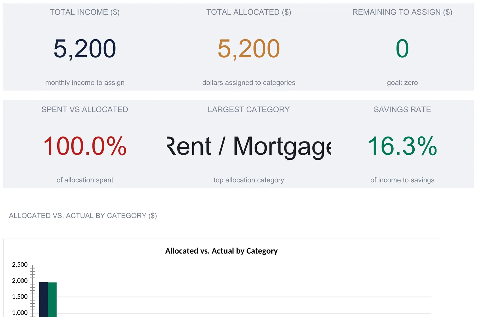
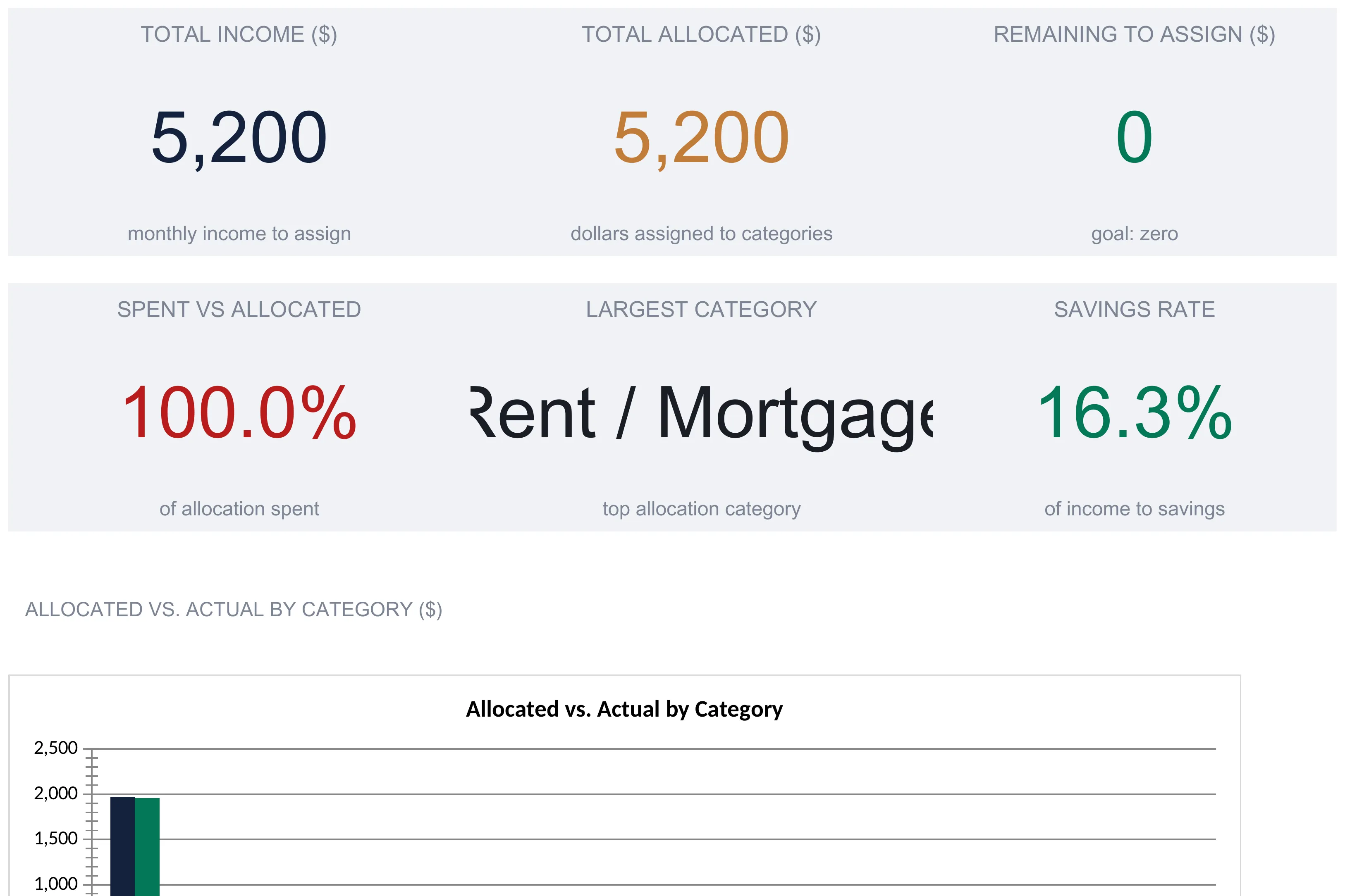
With the Income sheet, the Budget Allocation sheet, and the Spending Log filled, the Dashboard assembles the month into a scorecard without any typing of its own. Six KPI cards run across the top, and together they answer the questions a zero-based budgeter checks first:
| Card | Sample value | What it reports |
|---|---|---|
| Total Income | $5,200 | Monthly income to assign, from the Income sheet |
| Total Allocated | $5,200 | Dollars assigned to categories |
| Remaining to Assign | $0 | Income minus allocated, with the goal of zero |
| Spent vs Allocated | 100.0% | Total actual spending divided by total allocated |
| Largest Category | Rent / Mortgage | The category with the biggest allocation |
| Savings Rate | 16.3% | Savings allocations as a percent of income |
The Remaining to Assign card is the dashboard’s headline, and it is the same zero-based check from the Budget Allocation sheet promoted to the top of the file. When it reads $0, the plan balances; anything else is money still to be assigned or over-assigned. The Spent vs Allocated card, at 100.0 percent, restates how closely the $5,201 spent tracked the $5,200 planned, and it is the ratio behind that $1 total variance. The Savings Rate card is worth a plain definition, since it is a number many people watch when they save and invest: the workbook sums three categories it treats as savings, the 401(k) / IRA at $250, the Emergency Fund at $400, and Vacation / Goals at $200, and divides the $850 total by the $5,200 income to reach 16.3 percent. Every one of these cards is computed; the card is reporting what the allocation cells already say, not prescribing what any of them should be.
Below the cards, two charts finish the sheet. An Allocated vs Actual by Category chart plots the planned and actual bars for each of the 13 category groups side by side, so an overrun or an underrun shows as a visible gap between the two bars rather than a number to hunt for. A Budget Allocation Breakdown pie chart shows how the $5,200 divides across those same groups, with Housing at $1,970 the largest slice and the discretionary groups the thinnest. Neither chart adds new data; both are pictures of the numbers the other sheets already hold, which is the whole design of the dashboard. It reports the month and prescribes nothing about it.
Excel or Google Sheets for a zero-based budget
The workbook is a plain .xlsx built on standard functions, with no macros, no VBA, and no array formulas, so it behaves the same in Microsoft Excel, in Google Sheets after an upload, and in LibreOffice Calc. Google Sheets suits anyone who wants to log a coffee from their phone the moment they buy it and have the emergency-fund line update by the time they get home, while Excel suits those who prefer a local file. The one constraint that holds in every program is the pair of dependencies the file is built on: the cross-sheet references rely on the existing tab names, so renaming the Income or Spending Log sheets breaks the links, and the SUMIF lookups rely on category names matching between the log and the allocation sheet. Renaming a category row is fine as long as it is renamed in both places; renaming a sheet tab is the thing to leave alone.
A currency selector on the Dashboard relabels every money column and KPI across the workbook when changed, offering a long list of symbols from dollars and euros to yen and rupees. It changes the symbol shown and nothing else, with no conversion of the underlying numbers, so it suits a household budgeting in its own currency rather than anyone converting between two.
A worked month, start to finish
Following the sample all the way through shows how six income entries become a balanced, scored budget. Income of $5,200 is built from a $3,900 monthly-equivalent salary and five smaller sources. On the Budget Allocation sheet all $5,200 is handed to 27 categories, from a $1,900 rent line down to a $20 renters-insurance line, until the Remaining to Assign figure hits zero and the check reads ZERO-BASED. Through April, 44 transactions land in the Spending Log and roll up, category by category, into $5,201 of actual spending. The Budget vs Actual sheet scores that against the plan and finds four categories over allocation and a $1 total variance. The Monthly History sheet places this month inside a year that balanced to zero all twelve months, and the Dashboard states the whole thing in six cards and two charts. Every number on the dashboard traces back to the income cells and the two sets of entries, the allocations and the logged transactions. Nothing else was typed.
That traceability is the practical case for building a zero-based budget in a spreadsheet rather than an app. Every total, every variance, and every status word is a formula you can click into and follow back to its source, and every allocation is a cell you can change and watch ripple through the zero-based check. The cost is that nothing arrives on its own. A banking app pulls transactions and guesses a category for each; this workbook expects both the plan and the log to be entered by hand. That manual step is the trade for numbers nobody else has sorted for you and a file that stays on your own machine, which is why an app tends to suit people who want the data to categorize itself and a spreadsheet suits people who want to see and change every calculation.
How this fits the rest of the budgeting tools
- Zero Based Budget Ultimate Spreadsheet Template ($29) is the workbook this walkthrough follows: the income sheet, the allocation sheet with its zero-based check, the live spending log, the budget-versus-actual variance view, the twelve-month history, and the six-card dashboard, ready to use in Excel or Google Sheets. The same template comes in a free version with a single budget sheet for anyone who wants to try the method before committing, and an Essentials version ($19) that sits between the two.
- If assigning a dollar figure to every category feels heavier than you want, the 50 30 20 Budget Ultimate Spreadsheet Template ($29) uses a lighter method, splitting income into three percentage buckets for needs, wants, and savings instead of a full line-by-line allocation. The 50, 30, and 20 figures sit in editable Allocation % cells on its Income & Targets sheet, and the monthly target for each bucket recalculates from whatever split is typed there. The comparison of 50/30/20 against zero-based budgeting walks through which approach tends to suit which situation, and the zero-based budgeting template tutorial covers the method on its own before any particular build.
Frequently asked questions
What does the ZERO-BASED status on the Budget Allocation sheet actually mean?
It is a live check that Income minus Total Allocated equals zero. The sheet reads the $5,200 total from the Income sheet, subtracts the sum of every allocation, and prints ZERO-BASED when the difference is exactly zero, UNDER-ASSIGNED when income is larger, and OVER-ASSIGNED when the allocations exceed income. In the sample all $5,200 is handed out across 27 categories, so the remaining-to-assign figure is zero and the status reads ZERO-BASED. It describes whether the plan balances, not whether your bank account is empty.
How does the Actual Spent column fill itself?
Each category's Actual Spent cell is a SUMIF that scans the Spending Log and adds up every logged amount whose category matches that row's name. Log a $45 Shell gas charge under Gas and the Gas allocation's Actual Spent rises by $45 automatically. The one requirement is an exact text match: the category typed in the log has to read the same as the category on the Budget Allocation sheet, or the SUMIF will not find it.
Can I rename the categories or add my own?
Yes. The category names on the Budget Allocation sheet are ordinary editable cells, and the blank rows beneath the filled ones already carry the Actual Spent, Remaining, and percent-of-income formulas and already sit inside the Total Allocated sum. Type a new category on the first free row and it joins the total, the zero-based check, and the Budget vs Actual table on its own, with no formula to drag down or sum range to widen. The two dashboard charts are the exception, because they group the 27 shipped category rows by fixed cell reference.
Why does the Budget vs Actual total read 5,201 against 5,200 allocated?
The $5,200 is the planned total you assigned on the Budget Allocation sheet. The $5,201 is the sum of what the Spending Log actually recorded, which came in one dollar above plan because a handful of categories ran slightly over and slightly under and did not cancel to the penny. The Variance column shows the $1 gap and the four categories that finished above their allocation, which is exactly the drift the sheet exists to surface.
How is the savings rate on the dashboard calculated?
The dashboard adds the allocations for three categories the workbook treats as savings, the 401(k) / IRA, Emergency Fund, and Vacation / Goals rows, and divides that sum by total monthly income. In the sample that is $250 plus $400 plus $200, or $850, divided by $5,200, which comes to 16.3 percent. It is a description of where the plan sends money, computed from the allocation cells, not a target the workbook sets for you.
Sources
- Budgeting: How to create a budget and stick with it - Consumer Financial Protection Bureau
- Save and Invest - U.S. Securities and Exchange Commission (Investor.gov)
About this article
Sheets, inputs, formulas, chart types, conditional formatting and sample figures checked on 2026-09-10 against the shipped Zero Based Budget Ultimate .xlsx (Dashboard, Income, Budget Allocation, Spending Log, Monthly History, Budget vs Actual, How to Use) and the shipped 50 30 20 Budget Ultimate .xlsx (Income & Targets). Consumer Financial Protection Bureau and Investor.gov references checked against the live pages at writing time. Last reviewed September 2026.