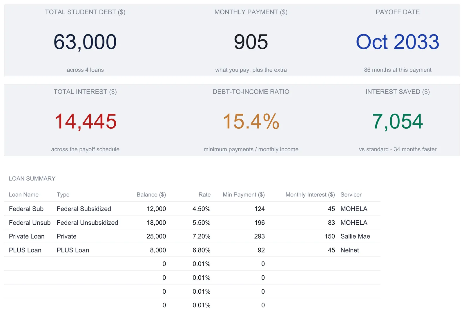
A student loan payoff spreadsheet keeps every loan in one setup sheet and builds the rest from it: a month-by-month avalanche schedule, three repayment timelines side by side, a refinance break-even, and a debt-to-income tracker. This walkthrough follows our Student Loan Payoff Ultimate ($29) using its own sample data, four loans totaling $63,000 that clear in 86 months on a $905 monthly payment, with $14,445 of interest and $7,054 saved against the standard plan. Built on plain formulas for Excel and Google Sheets.
Most borrowers leave school with more than one loan, and the loans rarely match. A federal subsidized loan sits at one rate, an unsubsidized one at another, a private loan usually higher, and a PLUS loan somewhere in between, each with its own servicer and its own minimum payment. A servicer portal can tell you what a single loan costs this month. What it cannot tell you is where an extra $200 does the most good across all of them, how many years the whole stack takes to clear, or what a refinance offer changes once the fee is counted. Those are questions about the loans together, and a spreadsheet answers them well.
The examples below come from our Student Loan Payoff Ultimate Spreadsheet Template ($29), which takes one list of loans and one extra payment and builds the rest from them: a month-by-month payoff schedule, three repayment timelines compared side by side, a refinance break-even, and a debt-to-income tracker. The structure is reproducible by hand if you would rather build your own.
What a student loan payoff spreadsheet has to hold
Strip the problem down and there are only a few kinds of data:
- The loans. For each one: a name, a type, the current balance, the interest rate, and the minimum payment. This is the raw material for everything else.
- Two personal numbers. Annual income, which drives the debt-to-income figure, and the extra monthly payment you can add on top of the minimums.
- A refinance offer, if you are weighing one. A quoted rate, a term, and an origination fee, kept apart from the loans so the comparison is a what-if rather than a change to the plan.
- Derived views. The month-by-month schedule, the repayment comparison, the refinance break-even, and the debt-to-income tracker. These are calculations rather than records, and the few cells you type on them are settings: the two terms on the comparison, the offer on the refinance sheet, and the debt-to-income ceiling.
The template gives each of these its own sheet: Loan Setup for the loans and the two personal numbers, Payoff Schedule for the month-by-month plan, Repayment Comparison and Refinance Analysis for the two what-if views, Income-to-Debt Tracker for the ratio, and a Dashboard on top, with a How to Use sheet carrying the instructions.
Start with the loans: the Loan Setup sheet
Everything downstream reads this one sheet, so it comes first. Two figures at the top set the personal context. Annual income, $55,000 in the sample, feeds the debt-to-income calculation and nothing else. The extra monthly payment, $200 in the sample, is the amount added on top of the minimums, and a note beside the cell states plainly where it goes: to the highest-rate loan first, the avalanche method.
Below that sits the loan table, up to eight rows. Each loan carries a name, a type, the balance, the interest rate, the minimum payment, an optional monthly payment, a computed monthly interest figure, and a servicer. The sample fills four:
| Loan | Type | Balance ($) | Rate | Min payment ($) | Servicer |
|---|---|---|---|---|---|
| Federal Sub | Federal Subsidized | 12,000 | 4.50% | 124 | MOHELA |
| Federal Unsub | Federal Unsubsidized | 18,000 | 5.50% | 196 | MOHELA |
| Private Loan | Private | 25,000 | 7.20% | 293 | Sallie Mae |
| PLUS Loan | PLUS Loan | 8,000 | 6.80% | 92 | Nelnet |
| Totals | 63,000 | 6.15% | 705 |
The monthly interest column is the only formula in the table, balance times rate divided by twelve, so the private loan’s $25,000 at 7.2 percent throws off $150 a month against the subsidized loan’s $45. The totals row sums the balances to $63,000 and the minimums to $705, and reports a weighted average rate of 6.15 percent rather than a plain average, because a blended rate has to lean toward the balances that carry the most money.
Underneath, a small debt-to-income summary divides the total minimum payments by monthly income. Annual income of $55,000 is $4,583 a month, and $705 against that is a 15.4 percent debt-to-income ratio. That single figure travels up to the dashboard and across to its own tracking sheet.
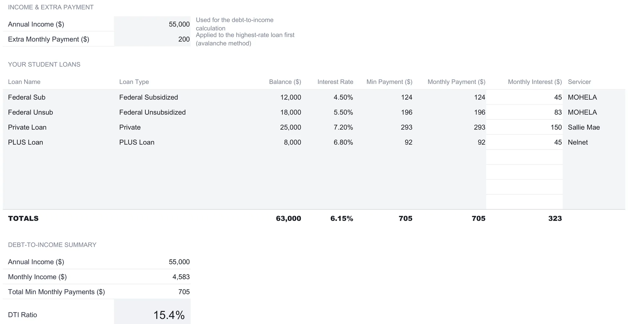
Two design habits are worth copying into any hand-built version. The blank loan rows are already wired into every total and every downstream sheet, so a fifth loan goes on the first free row and the whole workbook updates, with no formula to drag and no range to extend. And a loan is typed exactly once. The dashboard’s loan summary, the payoff schedule’s per-loan columns, and the debt-to-income tracker all point back to these same cells, so they cannot drift apart the way a set of hand-kept summaries does.
The month-by-month plan: the Payoff Schedule
The Payoff Schedule turns the loans into a row per month for up to 240 months, and its header states the rule it follows: the extra $200 a month goes to the highest-rate loan first. Every loan is charged interest and paid at least its minimum each month; the extra rides on top of whichever loan currently carries the highest rate, and when that loan clears, the freed-up payment plus the extra rolls onto the next-highest. That rollover is what makes the avalanche gather speed over time.
The columns read left to right as opening balance, remaining balance, interest paid, principal paid, total payment, cumulative interest, and the extra applied, followed by one balance column per loan so you can watch each debt fall on its own line. One month makes the flow concrete. Month one opens at the full $63,000. Interest for the month is $323, principal is $582, and the total payment is $905, which is the $705 of minimums plus the $200 extra. The remaining balance drops to $62,418 and the next row picks it up.
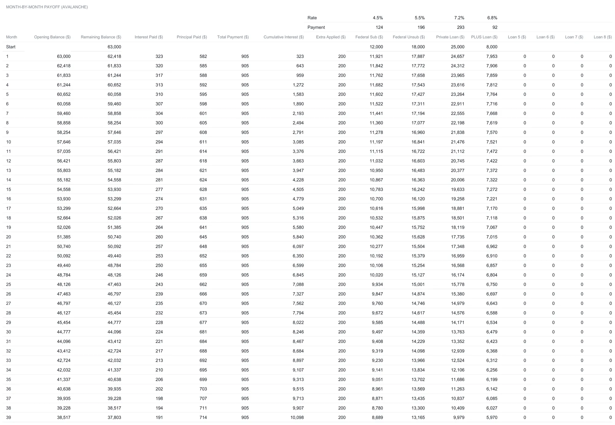
Two of the summary columns are worth reading closely. The extra-applied column shows a flat $200 on every row until the loans start to clear, confirming that the full extra is being put to work each month rather than absorbed into a minimum somewhere. The cumulative-interest column runs the other way, climbing from $323 in month one and slowing as the balances fall, so its final value is the same $14,445 the totals report and the same figure the dashboard shows. Watching it flatten is a plain read on progress: early months are mostly interest, later ones mostly principal, and the crossover is visible without any charting.
Read the per-loan columns down the page and the method shows itself. The private loan starts at $25,000 and falls fastest, from $24,657 after month one toward zero, because it is highest-rate and takes the extra. The $8,000 PLUS loan barely moves early on, paid only its own minimum, and waits its turn. Follow the balances to the bottom and the loans clear in rate order rather than balance order: the 7.2 percent private loan first at month 61, the 6.8 percent PLUS loan at month 69, the 5.5 percent unsubsidized loan at month 81, and the 4.5 percent subsidized loan last at month 86. The totals at the foot of the schedule read $14,445 of interest paid and $77,445 paid in all across the 86 months.
What the schedule does not do is fill itself from a servicer. There is no login and no balance import, so the loans are typed once on Loan Setup and the schedule computes from there. The trade is the familiar one: an app that syncs balances removes the typing but keeps its formulas out of reach, while a spreadsheet keeps every step visible and editable and the file on your own machine.
Three timelines side by side: the Repayment Comparison
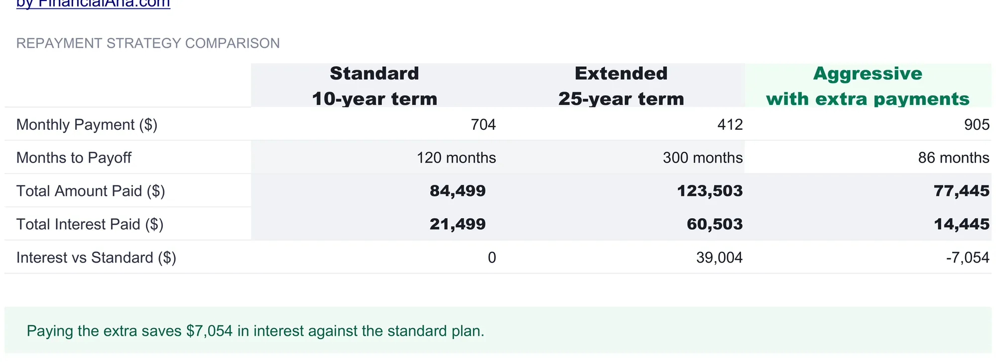
The Repayment Comparison answers a different question from the schedule. Instead of tracking one plan month by month, it stacks three whole strategies in a single table so their totals sit next to each other:
| Standard, 10-year | Extended, 25-year | Aggressive, with extra | |
|---|---|---|---|
| Monthly payment | $704 | $412 | $905 |
| Months to payoff | 120 | 300 | 86 |
| Total amount paid | $84,499 | $123,503 | $77,445 |
| Total interest paid | $21,499 | $60,503 | $14,445 |
| Interest vs standard | $0 | +$39,004 | -$7,054 |
The Standard column is the default ten-year federal repayment, computed as one level payment on the whole balance at the blended rate. The Extended column stretches the same balance over 25 years, which is what drops the monthly payment to $412 and, because interest accrues for far longer, lifts total interest to $60,503. The Aggressive column is not a separate calculation at all: it reads the payments and interest straight off the Payoff Schedule, so it reflects each loan running at its own rate rather than a single blended one, and it lands at the same 86 months and $14,445 the schedule reported.
The row that ties them together is interest versus standard. The extended plan costs $39,004 more in interest than the standard plan, and the aggressive plan costs $7,054 less. A line beneath the table states that comparison in words, that paying the extra saves $7,054 in interest against the standard plan, and a strategy note points out that federal income-driven repayment is a separate option the table does not model. The table lays the tradeoffs out; which timeline fits a given budget is left to the reader.
It is worth being clear about what each column is and is not. The standard and extended figures are textbook amortizations of the whole $63,000 at the blended 6.15 percent rate, so they answer a clean what-if: what one level payment over a fixed term would cost. The aggressive figure is the real plan from the schedule, loan by loan, which is why it comes out lower than a blended calculation would predict, since attacking the 7.2 percent private loan first starves the most expensive interest earliest. The three sit in one table so the tradeoff is visible without the sheet nudging toward any of them. A longer term buys a smaller monthly payment at the price of far more interest, and a shorter, front-loaded plan does the reverse.
Weighing an offer: the Refinance Analysis
Refinancing replaces the current loans with a single new one at a new rate, and whether that helps depends on the rate, the term, and the fee together. The Refinance Analysis keeps the offer in three input cells at the top: an offered rate of 5.2 percent, a term of 120 months, and an origination fee of 1 percent in the sample. Everything below is computed from those three plus the current loans.
The core is a current-versus-refinance table. The current loans carry a 6.15 percent blended rate, a $705 monthly payment, $84,461 paid in total, and $21,461 of interest. The offer at 5.2 percent over the same 120 months works out to a $674 monthly payment, $80,927 paid, and $17,927 of interest. The difference column does the subtraction: the rate falls 0.95 points, the monthly payment drops $31, and both total paid and total interest come down by $3,534.
Then the break-even. Refinancing $63,000 at a 1 percent origination fee costs $630 up front, and the offer saves $31 a month, so the fee takes 21 months to recoup. The sheet spells out the rule behind that number, origination fee divided by monthly saving, and notes that a dash would appear if the offer cost more per month, because then it never recoups at all.
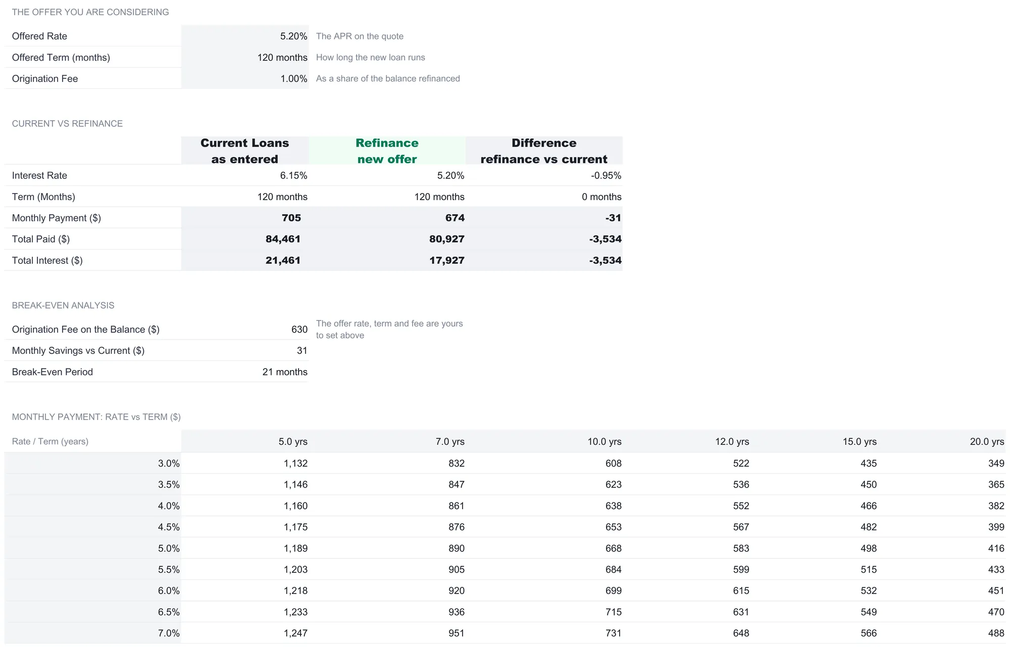
Below the break-even sits a rate-versus-term grid, a small table of the monthly payment on the $63,000 balance for rates from 3 to 7 percent down the side and terms of 5, 7, 10, 12, 15, and 20 years across the top. It shows why a headline rate alone settles nothing: the same 5 percent rate is a $1,189 payment over five years but $668 over ten, and stretching the term to lower the payment is exactly what raises the interest. The sheet’s own worth-knowing notes make the point and add the one that matters most for federal borrowers: refinancing federal loans into a private loan gives up income-driven repayment, Public Service Loan Forgiveness, and federal deferment options. The Consumer Financial Protection Bureau describes income-driven repayment as a plan for federal student loans, so the break-even here is a dollars comparison, not the whole picture. What to do with it is a question for the reader and, for federal loans, for Federal Student Aid and the CFPB’s student loan resources.
Watching the ratio fall: the Income-to-Debt Tracker
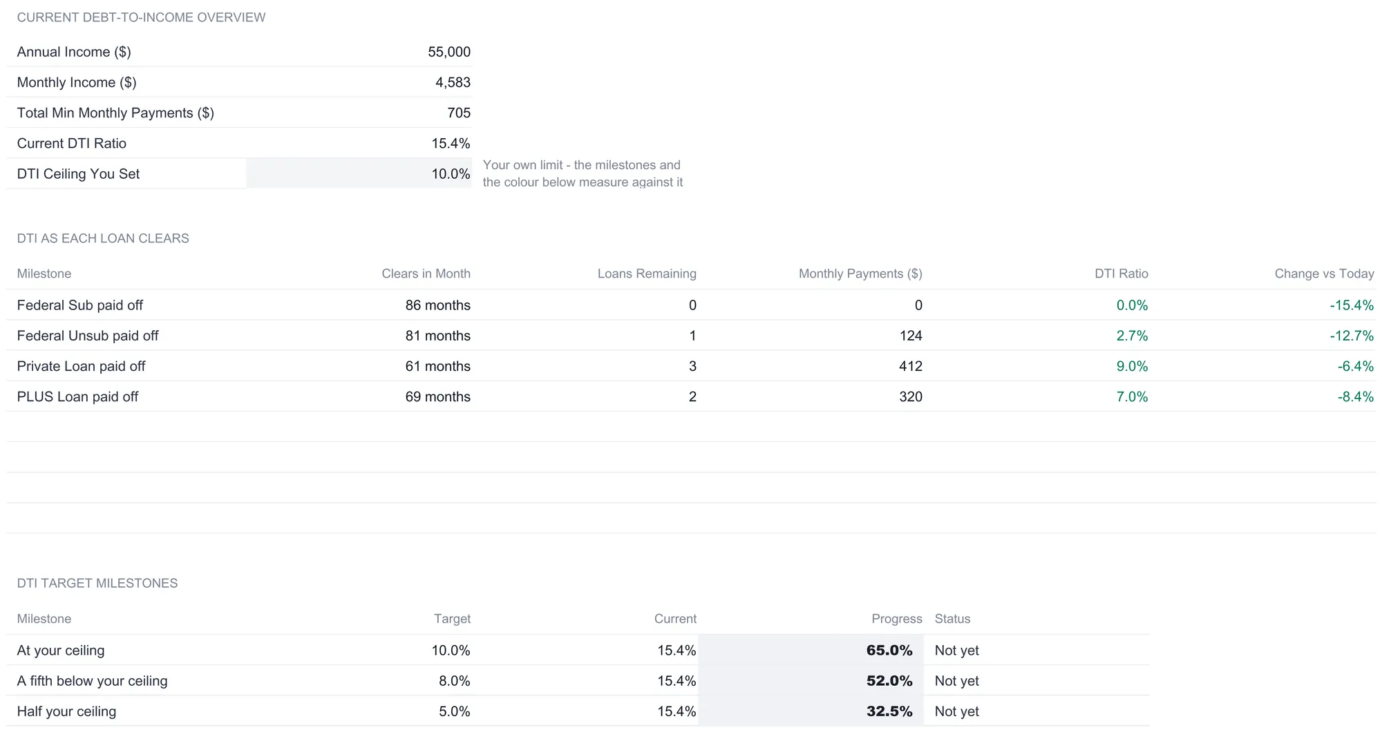
Debt-to-income is the share of monthly income that goes to loan minimums, and lenders look at it when weighing a mortgage or a car loan. The Income-to-Debt Tracker opens with the current figure the rest of the workbook already knows: $4,583 of monthly income, $705 of minimums, a 15.4 percent ratio. Beside it sits one input, a debt-to-income ceiling you set yourself, 10 percent in the sample, with a note that the milestones and colors on the sheet measure against your own limit and that nothing here decides what limit is right for you.
The first table shows the ratio falling as each loan clears. Because a paid-off loan removes its minimum from the numerator, the ratio steps down at every payoff. When the private loan clears the minimums drop to $412 and the ratio is 9.0 percent; by the time the unsubsidized loan clears only $124 of minimums remain and the ratio is 2.7 percent; after the last loan it reaches zero. Each row reads the payoff month straight from the Payoff Schedule, so this view follows the same balances, rates, and extra payment as everything else.
The second table measures the current ratio against three targets: the ceiling you set, a fifth below it, and half of it, which in the sample are 10, 8, and 5 percent. At today’s 15.4 percent all three read “Not yet,” with progress bars of 65, 52, and 32.5 percent toward each. A closing note repeats that income-driven repayment is a separate federal route with its details at studentaid.gov, keeping the sheet’s own measure clearly apart from that program.
The dashboard: six numbers and a chart
With Loan Setup filled and the offer typed in, the dashboard reads the year off the other sheets into six tiles:
| Metric | Sample value | Where it comes from |
|---|---|---|
| Total student debt | $63,000 | Sum of the loan balances, across 4 loans |
| Monthly payment | $905 | Minimums plus the extra payment |
| Payoff date | 86 months out | Months to clear on the Payoff Schedule, counted forward |
| Total interest | $14,445 | Interest total across the payoff schedule |
| Debt-to-income ratio | 15.4% | Minimum payments divided by monthly income |
| Interest saved | $7,054 | Aggressive plan against the standard plan |
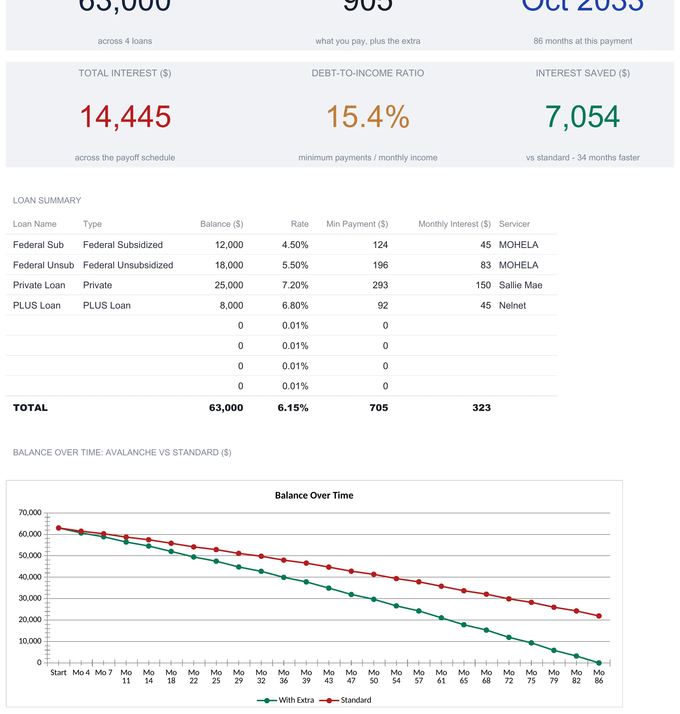
A status line above the tiles states the plan in one sentence, that four loans are tracked with avalanche payoff in 86 months. The payoff date is worth one note: it counts 86 months forward from the month the file is opened, so it reads as roughly October 2033 from the sample’s starting point and shifts as the calendar moves, while the 86-month figure stays fixed to the schedule. The interest-saved tile carries its own comparison, 34 months faster than the standard plan, which is simply the standard plan’s 120 months minus the aggressive plan’s 86.
Beneath the tiles, a loan summary repeats the four loans with their balances, rates, minimums, monthly interest, and servicers, and a chart titled balance over time plots the avalanche plan against the standard plan at 25 points spread evenly across the payoff. The green “with extra” line pulls steadily below the red “standard” line and reaches zero at month 86, well before the standard line has finished its slower descent. That gap, drawn rather than tabulated, is the $7,054 and the 34 months in one picture.
Avalanche, DTI, and break-even in plain terms
Three ideas carry most of the template’s weight, and none of them is complicated once named.
The avalanche method is the rule for where extra money goes: to the highest-rate loan first, then the next-highest as each clears. It targets the most expensive interest before anything else, which is why the sample’s 7.2 percent private loan is retired first even though it is not the smallest balance. Ordering by smallest balance instead is the snowball method, a different rule this template does not run.
Debt-to-income (here 15.4 percent, or $705 of minimums against $4,583 of monthly income) is the share of monthly income committed to loan payments. It falls as loans clear because the numerator shrinks, and the tracker measures it only against a ceiling you choose.
Break-even on a refinance (21 months in the sample) is the up-front origination fee divided by the monthly saving. It answers how long the lower payment takes to pay back the cost of switching, and a refinance that raises the monthly payment has no break-even at all.
Excel or Google Sheets for a student loan payoff plan
The template is an .xlsx file built on plain functions, PMT, NPER, SUMPRODUCT, COUNTIF, and the like, with no macros and no add-ons, so it behaves the same in Microsoft Excel and in Google Sheets after an upload. Google Sheets suits anyone who wants the file on any device and shared from a browser; Excel suits those who prefer a local copy. Either way the loans are typed once and every sheet recalculates, and the structure described here is buildable by hand in both programs.
Which student loan tool fits
- Student Loan Payoff Ultimate Spreadsheet Template ($29) is the workbook this walkthrough follows: up to eight loans on one setup sheet, an avalanche payoff schedule, the three-way repayment comparison, the refinance break-even, and the debt-to-income tracker, with the six-tile dashboard on top. There is also a free Student Loan Payoff template that takes one loan on a single sheet, turning a balance, a rate, and a payment into months to payoff, total paid, and total interest. A Student Loan Payoff Essentials ($19) sits between the two, running one loan with an extra payment through a month-by-month schedule and a dashboard that reports months saved and interest saved.
- Debt Payoff Calculator Ultimate Spreadsheet Template ($29) is the sibling for a mix of debts beyond student loans, credit cards, medical bills, and the rest, where the interesting question is snowball against avalanche against a custom order rather than the refinance and repayment-plan angles specific to student debt.
Related
- Student Loan Payoff Calculator: Find Your Debt-Free Date - the single-loan calculator version of this question, using the Google Sheets PMT and NPER functions
- How to Compare Debt Payoff Strategies in a Spreadsheet - the snowball-versus-avalanche comparison applied to a general mix of debts
- How to Build a Debt Snowball in a Spreadsheet - the smallest-balance-first ordering rule built in the same debt-management family
Frequently asked questions
How does the extra payment get applied across several loans?
The Payoff Schedule uses the avalanche method: every loan gets at least its minimum payment, and the extra monthly amount from Loan Setup goes to the loan with the highest interest rate until that one clears, then rolls onto the next-highest rate. In the sample the extra $200 hits the 7.2 percent private loan first, so it clears at month 61 while the 4.5 percent subsidized loan, paid at its minimum throughout, clears last at month 86.
Does the template tell me whether to refinance?
No. The Refinance Analysis takes an offered rate, term, and origination fee that you type in, then lays your current loans next to that offer and computes the monthly difference, the total interest difference, and a break-even period. The numbers are the output; the decision stays yours. The sheet also flags that refinancing federal loans into a private loan gives up income-driven repayment, Public Service Loan Forgiveness, and federal deferment options. The Consumer Financial Protection Bureau describes income-driven repayment as a plan for federal student loans, based on income and family size.
How many loans can it hold, and what does each one need?
Loan Setup takes up to 8 loans, one per row, with unused rows left blank. The sample fills four. Each loan needs a name, a type, the balance, the interest rate, and the minimum payment, with an optional monthly payment that the schedule uses in place of the minimum wherever it is filled in, plus a servicer label. The dashboard and every other sheet read from these rows, so a loan is only ever typed once.
How is this different from a simple student loan payoff calculator?
A single-answer calculator takes one balance, one rate, and one payment and returns a debt-free date. This template runs several loans at their own rates through a full month-by-month schedule, compares three repayment timelines, weighs a refinance offer against the current loans, and tracks debt-to-income as each loan clears. It is built for a mix of federal and private loans rather than one blended figure.
Does it model income-driven repayment plans?
No. Income-driven repayment (IDR) plans cap federal payments at a share of income and family size, and the template notes they are a separate route with the details at studentaid.gov. What the Income-to-Debt Tracker does is measure your debt-to-income ratio against a ceiling you set yourself, and show that ratio falling as each loan is paid off on the avalanche schedule.
Sources
- Student loans - Consumer Financial Protection Bureau
- What are income-driven repayment (IDR) plans, and how do I qualify? - Consumer Financial Protection Bureau
About this article
Sheets, inputs, outputs, sample figures, and sheet notes checked on 2026-09-10 against the published Student Loan Payoff Ultimate workbook customers download (Dashboard, Loan Setup, Payoff Schedule, Repayment Comparison, Refinance Analysis, Income-to-Debt Tracker, How to Use). The free and Essentials tiers of the same template checked on 2026-09-10 against their own shipped workbooks. The income-driven repayment reference checked on 2026-09-10 against the live Consumer Financial Protection Bureau pages listed in the sources. Last reviewed September 2026.