A 50/30/20 budget spreadsheet turns one income figure into three targets and then measures spending against them. This walkthrough follows the Ultimate template sheet by sheet: an income and targets sheet that turns $5,500 of monthly income into $2,750 needs, $1,650 wants, and $1,100 savings targets, three category sheets that log planned versus actual, a 12-month tracking sheet, and a dashboard that scores the split at 52 percent needs, 33 percent wants, and 15 percent savings. The 50/30/20 Budget Ultimate ($29) ships the whole structure for Excel and Google Sheets.
The appeal of the 50/30/20 rule is that it fits on a napkin. Split after-tax income three ways, sending half to needs, three tenths to wants, and a fifth to savings, and you have a budget. General guidance on how to build a budget and stick with it describes the same loop, setting a plan and then measuring real spending against it. The trouble starts the moment you try to check whether real life matches the napkin. A grocery run, a car insurance bill, a streaming subscription, and a transfer to an emergency fund all have to be sorted into the right bucket and totaled. Each bucket total is then measured against a target that itself moves whenever income changes. That sorting and measuring is exactly the kind of repetitive arithmetic a spreadsheet was built for.
This is a walkthrough of one specific spreadsheet that does it: the 50/30/20 Budget Ultimate Spreadsheet Template ($29), a workbook of six working sheets plus a How to Use tab, built for Excel and Google Sheets. Rather than re-explain the rule in the abstract, the sections below follow the template in the order a person fills it in, from the income sheet that sets the targets through to the dashboard that scores the result, using the real numbers the file ships with. If you would rather understand the method itself before looking at a build, the complete 50/30/20 budgeting guide covers the rule and its history first; this article is about the mechanics of this particular workbook.
What a 50/30/20 spreadsheet has to do
A needs, wants, and savings budget only involves four moving parts, and separating them cleanly is most of what makes the file trustworthy:
- One income figure. Everything downstream is a percentage of after-tax income, so the total take-home number is the single input that sets all three targets.
- Three targets. Fifty, thirty, and twenty percent of that income, expressed both as percentages and as dollar amounts, so a target is something you can compare a real receipt against.
- Three streams of actual spending. What you really spent on needs, on wants, and on savings, category by category, so the buckets can be totaled independently.
- A verdict over time. Whether each bucket came in on target this month, and whether the split is drifting closer to or further from the plan across the year.
The template gives each of these its own home. The income figure and targets live on the Income & Targets sheet. The three spending streams get a sheet each, named Needs (50%), Wants (30%), and Savings (20%). The verdict shows up in two places, a single-month scorecard on the Dashboard and a twelve-month trend on the 12-Month Tracking sheet. A How to Use sheet carries the instructions. Working through them in that order is the fastest way to see how the pieces connect.
Set the targets first: the Income & Targets sheet
Because every target is a percentage of income, the income number comes first, and it is the first thing typed on this sheet.
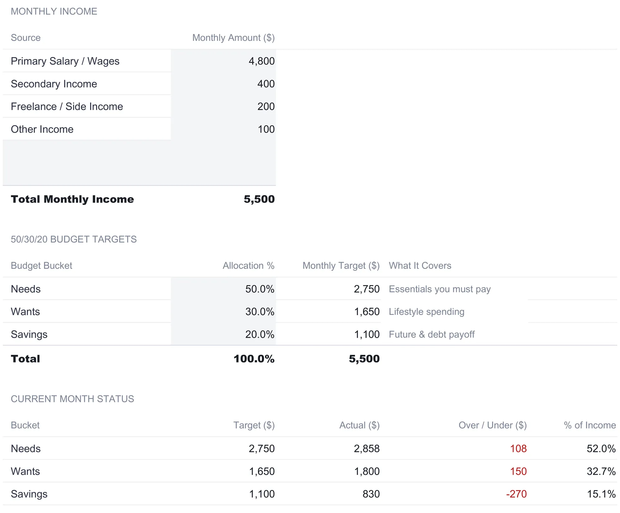
The Monthly Income block lists four sources, and in the sample they read Primary Salary / Wages at $4,800, Secondary Income at $400, Freelance / Side Income at $200, and Other Income at $100. A Total Monthly Income row sums the column to $5,500. Splitting income into named sources rather than entering one lump sum is a small thing that pays off for anyone whose pay is not a single steady salary. A freelance month and a bonus month can be logged where they belong instead of blurred into one figure.
Directly below sits the 50/30/20 Budget Targets table, and this is where the napkin math happens automatically. Three Allocation % cells hold 50 percent, 30 percent, and 20 percent, a Total row confirms they add to 100 percent, and a Monthly Target column multiplies each percentage by the total income. On $5,500 that produces a $2,750 target for needs, $1,650 for wants, and $1,100 for savings. A plain-language What It Covers column labels each bucket, describing needs as the essentials you must pay, wants as lifestyle spending, and savings as future and debt payoff.
Two design choices on this sheet are worth understanding before moving on, because they shape everything else.
The percentages are inputs, not constants. Those three numbers are ordinary cells you can overwrite, and every dollar target, dashboard score, and adherence check reads back to them rather than to a hard-coded figure. What stays fixed is cosmetic: the sheet tab names and the Target labels in each summary block keep the percentages they shipped with, so a file run at 60/20/20 still shows a tab named Needs (50%). Change the split to 60/20/20 for a high-cost-of-living month, or to 50/20/30 to push more toward savings and debt, and the entire file recalculates around the new figures. The rule is the default, not a rigid wall, which matches how the framework is usually described: a starting point people adjust to their own situation.
A Current Month Status table closes the loop. The bottom of the sheet restates each bucket with its target, the actual figure pulled from the corresponding category sheet, the over or under amount, and that bucket as a percent of income. In the sample this shows needs at $2,858 actual against a $2,750 target, wants at $1,800 against $1,650, and savings at $830 against $1,100. Those actual numbers are not typed here; they arrive from the three category sheets, which is where the detailed work happens.
Log essentials: the Needs (50%) sheet
The three category sheets share one layout, so learning the Needs (50%) sheet teaches all three. At the top, a Target Reference line pulls the $2,750 needs target straight from the Income & Targets sheet and labels it as 50 percent of monthly income, so the number you are aiming at is visible on the same screen as the spending you are logging.
Below that, the Needs Spending Variance table is the working area. Each row is one essential category with four values: a Planned amount you set, an Actual amount you record, a Variance in dollars, and a percentage variance. The sample fills eight rows:
| Category | Planned ($) | Actual ($) | Variance ($) | % Var |
|---|---|---|---|---|
| Housing (Rent/Mortgage) | 1,500 | 1,500 | 0 | 0.0% |
| Groceries | 400 | 435 | 35 | 8.8% |
| Utilities | 140 | 158 | 18 | 12.9% |
| Health Insurance | 220 | 220 | 0 | 0.0% |
| Car Insurance | 120 | 120 | 0 | 0.0% |
| Transportation (Gas/Bus) | 160 | 175 | 15 | 9.4% |
| Healthcare / Medical | 80 | 55 | -25 | -31.3% |
| Minimum Debt Payments | 130 | 195 | 65 | 50.0% |
| Total | 2,750 | 2,858 | 108 | 3.9% |
The variance columns are the point of the sheet. Variance in dollars is simply actual minus planned, and the percentage restates that gap relative to what was planned, which keeps a small category honest against a large one. The $65 overrun on minimum debt payments is $65 either way, but at 50 percent of a $130 plan it is a far bigger miss in proportion than the $35 grocery overrun that reads as only 8.8 percent. Color coding reinforces the direction: on the needs and wants sheets, spending more than planned shows red and coming in under shows green, so the single green figure in the sample, the $25 saved on healthcare, stands out against a column of red overruns.
The Total row adds a quiet but important discipline. Planned needs were set at exactly $2,750, matching the 50 percent target, but actual needs landed at $2,858, an overrun of $108, or 3.9 percent above plan. A Summary block at the bottom repeats this as three lines, Total Needs Spending of $2,858, the 50 percent target of $2,750, and an over or under figure of $108, so the bucket-level verdict is stated without anyone reaching for a calculator.
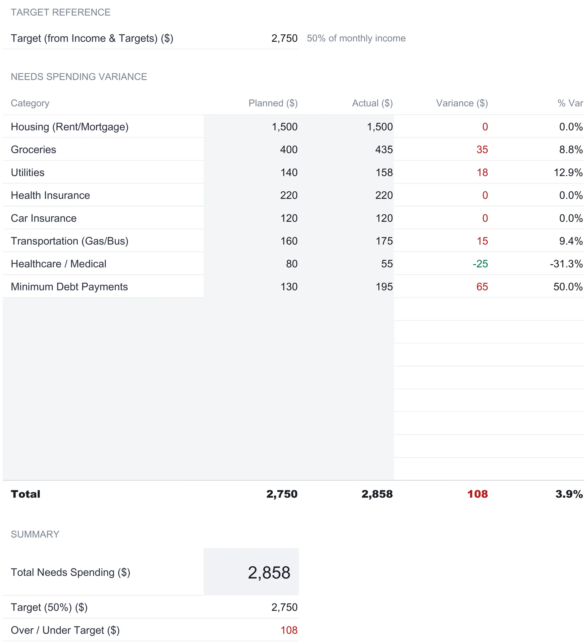
One structural detail carries across all three category sheets and is worth copying into any hand-built version. The blank rows between the last filled category and the Total are not dead space. They already carry the variance formulas and already sit inside the section total, so a new category goes on the first free line and the totals update on their own. There is no formula to drag down and no sum range to extend, which is the exact spot where a hand-built budget usually starts to quietly miscount.
Log lifestyle spending: the Wants (30%) sheet
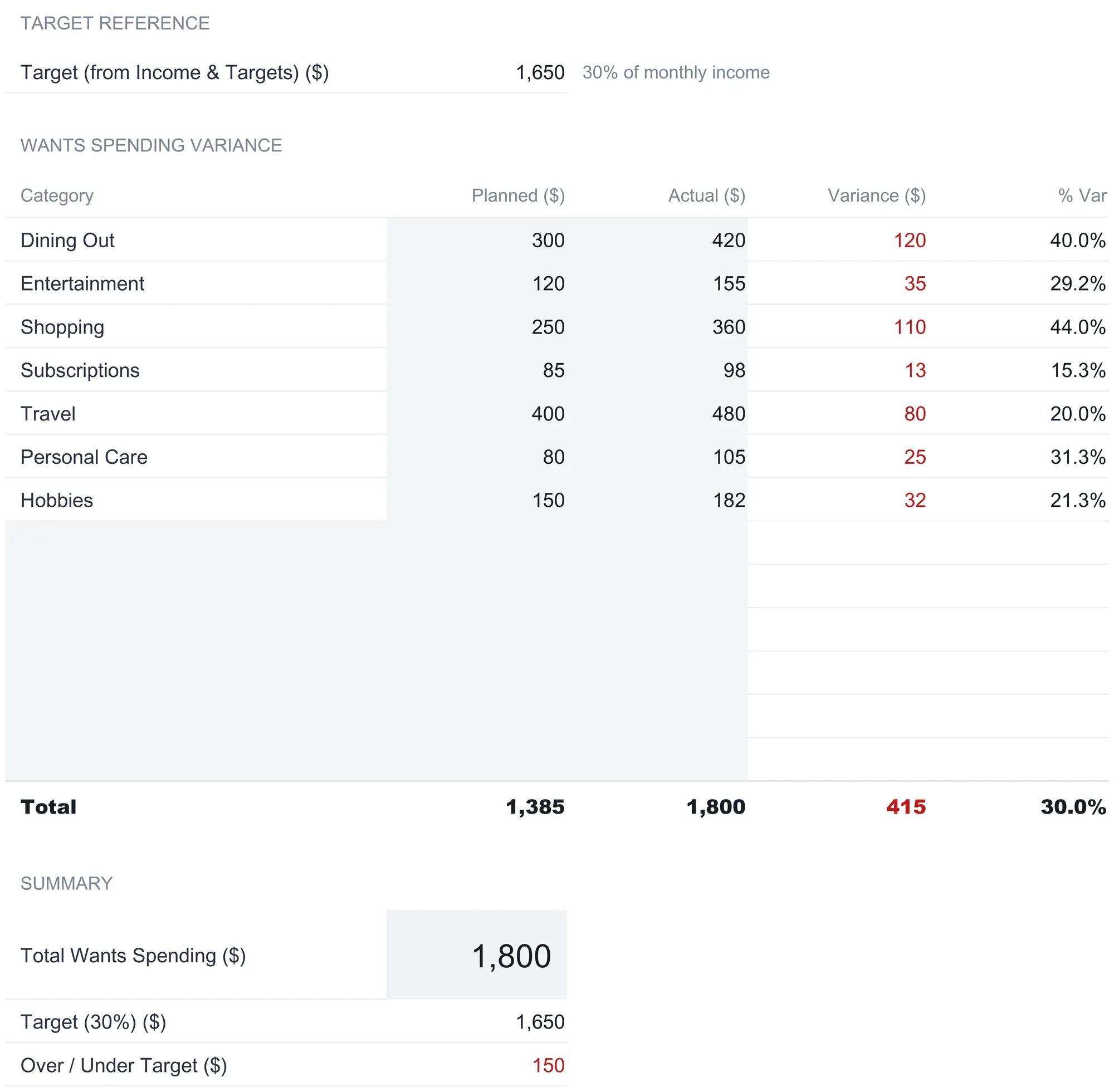
The Wants (30%) sheet is the same machine pointed at discretionary spending. Its Target Reference pulls the $1,650 wants target, labeled as 30 percent of income, and its variance table lists seven lifestyle categories:
| Category | Planned ($) | Actual ($) | Variance ($) | % Var |
|---|---|---|---|---|
| Dining Out | 300 | 420 | 120 | 40.0% |
| Entertainment | 120 | 155 | 35 | 29.2% |
| Shopping | 250 | 360 | 110 | 44.0% |
| Subscriptions | 85 | 98 | 13 | 15.3% |
| Travel | 400 | 480 | 80 | 20.0% |
| Personal Care | 80 | 105 | 25 | 31.3% |
| Hobbies | 150 | 182 | 32 | 21.3% |
| Total | 1,385 | 1,800 | 415 | 30.0% |
This sheet tells a sharper story than needs did. Planned wants add up to $1,385, comfortably under the $1,650 target, yet every category came in over plan and actual wants totaled $1,800. That is $150 above the 30 percent target and $415 above what was planned. Discretionary spending is where budgets often slip, because no single dining-out or shopping decision feels large, and laying the seven categories side by side turns a vague sense of overspending into a specific $415 gap between plan and reality. The Summary block states it plainly: total wants spending of $1,800, a 30 percent target of $1,650, and $150 over.
There is nothing in the workbook that judges any of this. The sheet reports the gap and colors it; what to do about a dining-out habit is left entirely to the person reading it. That restraint is deliberate, and it is the difference between a tool that measures and a tool that lectures.
Track the future: the Savings (20%) sheet
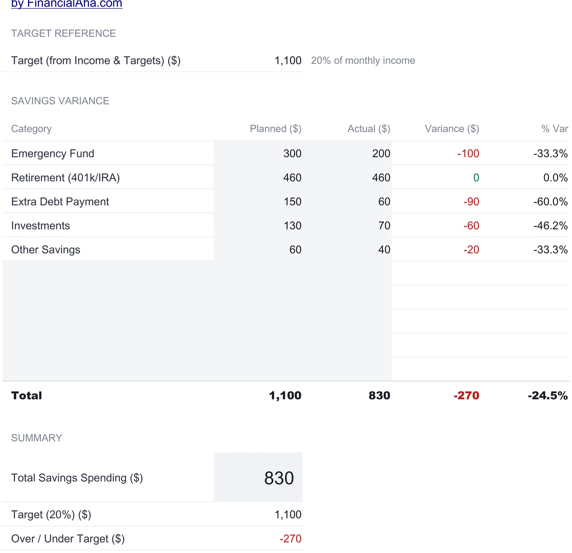
The Savings (20%) sheet looks identical to the other two but inverts one crucial piece of logic, so it repays a close read. Its Target Reference pulls the $1,100 savings target at 20 percent of income, and its table lists five destinations:
| Category | Planned ($) | Actual ($) | Variance ($) | % Var |
|---|---|---|---|---|
| Emergency Fund | 300 | 200 | -100 | -33.3% |
| Retirement (401k/IRA) | 460 | 460 | 0 | 0.0% |
| Extra Debt Payment | 150 | 60 | -90 | -60.0% |
| Investments | 130 | 70 | -60 | -46.2% |
| Other Savings | 60 | 40 | -20 | -33.3% |
| Total | 1,100 | 830 | -270 | -24.5% |
Planned savings totaled the full $1,100, but actual savings came to only $830, a shortfall of $270. Here the color logic flips. On this sheet, saving more than planned is the good direction, so a green variance means money set aside above plan and a red variance means below it. Retirement held exactly to plan, but the emergency fund, extra debt payment, investments, and other savings all came in short, which is what a month looks like when overspending on needs and wants quietly borrows from the savings bucket. The Summary reads total savings of $830, a 20 percent target of $1,100, and $270 under.
Reading the three category sheets together is where the 50/30/20 discipline lives. Needs ran $108 over, wants ran $150 over, and savings ran $270 under, and those figures are related. The savings shortfall is close to the combined overrun on the other two buckets, which is the mechanical way of showing that money not held to plan on essentials and lifestyle is money that never reached the future. No single sheet makes that visible on its own. The three sheets side by side do.
Watch the split over time: the 12-Month Tracking sheet
Any single month can be an anomaly. The 12-Month Tracking sheet is where a budget stops being a snapshot and becomes a trend. It carries three summary blocks, one each for needs, wants, and savings, with a column for every month from January to December plus an average and a total. In the sample, needs totals run from $2,900 in January down to $2,760 in December, summing to $33,898 for the year at an average of $2,825 a month. Wants fall more steeply, from $1,900 in January to $1,570 in December, totaling $20,450 at a $1,704 average. Savings move the other way, climbing from $700 in January to $1,170 in December, totaling $11,640 at a $970 average.
Below the three blocks sits the 50/30/20 Adherence table, which is the analytical heart of the sheet. It holds a Monthly Income row, set to $5,500 across all twelve months in the sample, and then three computed rows that divide each bucket by that income to show what percentage of income the bucket used. Needs percentage eases from 52.7 percent in January to 50.2 percent by December. Wants percentage falls from 34.5 percent to 28.5 percent. Savings percentage climbs from 12.7 percent to 21.3 percent. An average column and a target column sit at the right, so each row can be read against its goal at a glance: needs average 51.4 percent against a 50 percent target, wants average 31.0 percent against 30 percent, and savings average 17.6 percent against 20 percent.
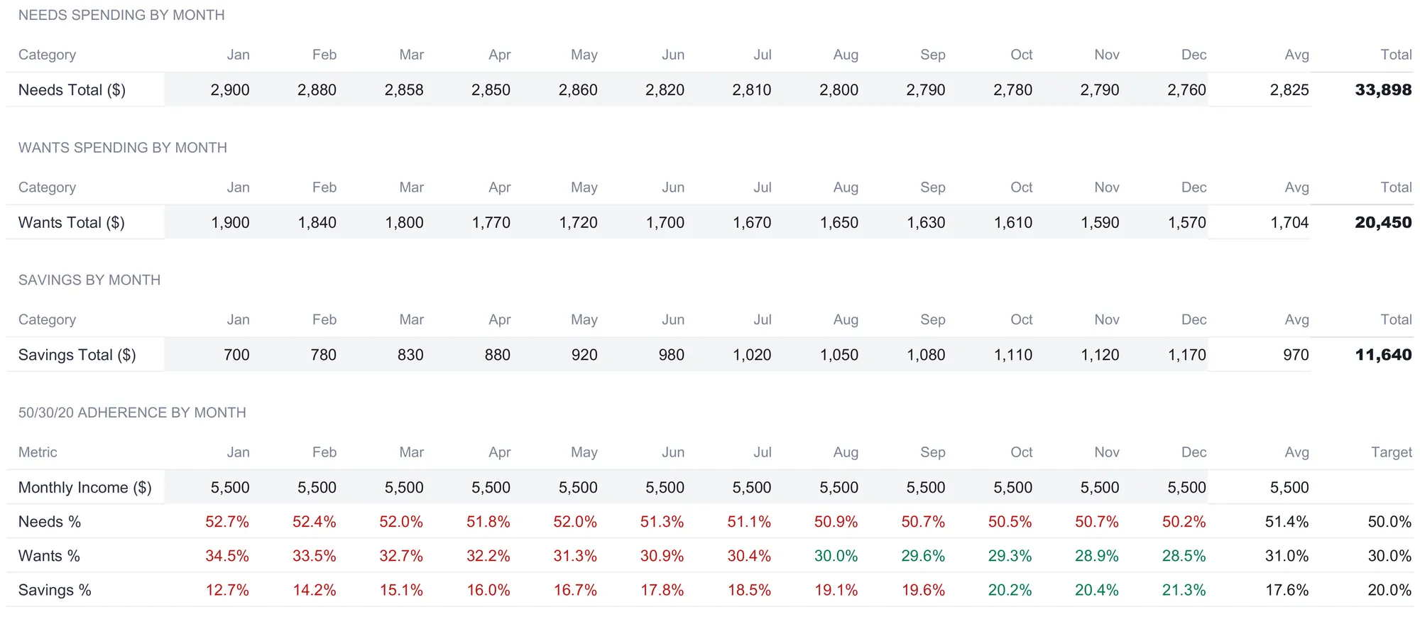
The color coding on this table is what makes the trend legible. Green marks a month at or under target for needs and wants, or at or above target for savings, and red marks the opposite. In the sample the savings row is red for most of the year and turns green only in the final months, crossing the 20 percent line around October at 20.2 percent and holding above it through December. Read top to bottom, the table describes a household slowly pulling its split back into shape: needs and wants both easing toward their ceilings while savings climbs through its floor. That arc is invisible in any one month and obvious across twelve, which is the whole reason the sheet exists. The Monthly Income row is itself editable per month, so a year of variable pay can be recorded honestly rather than forced to a flat figure.
Read the verdict: the Dashboard
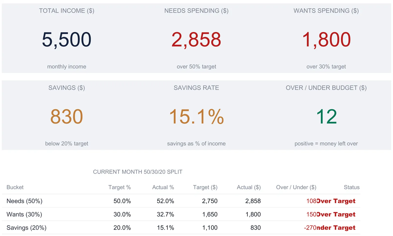
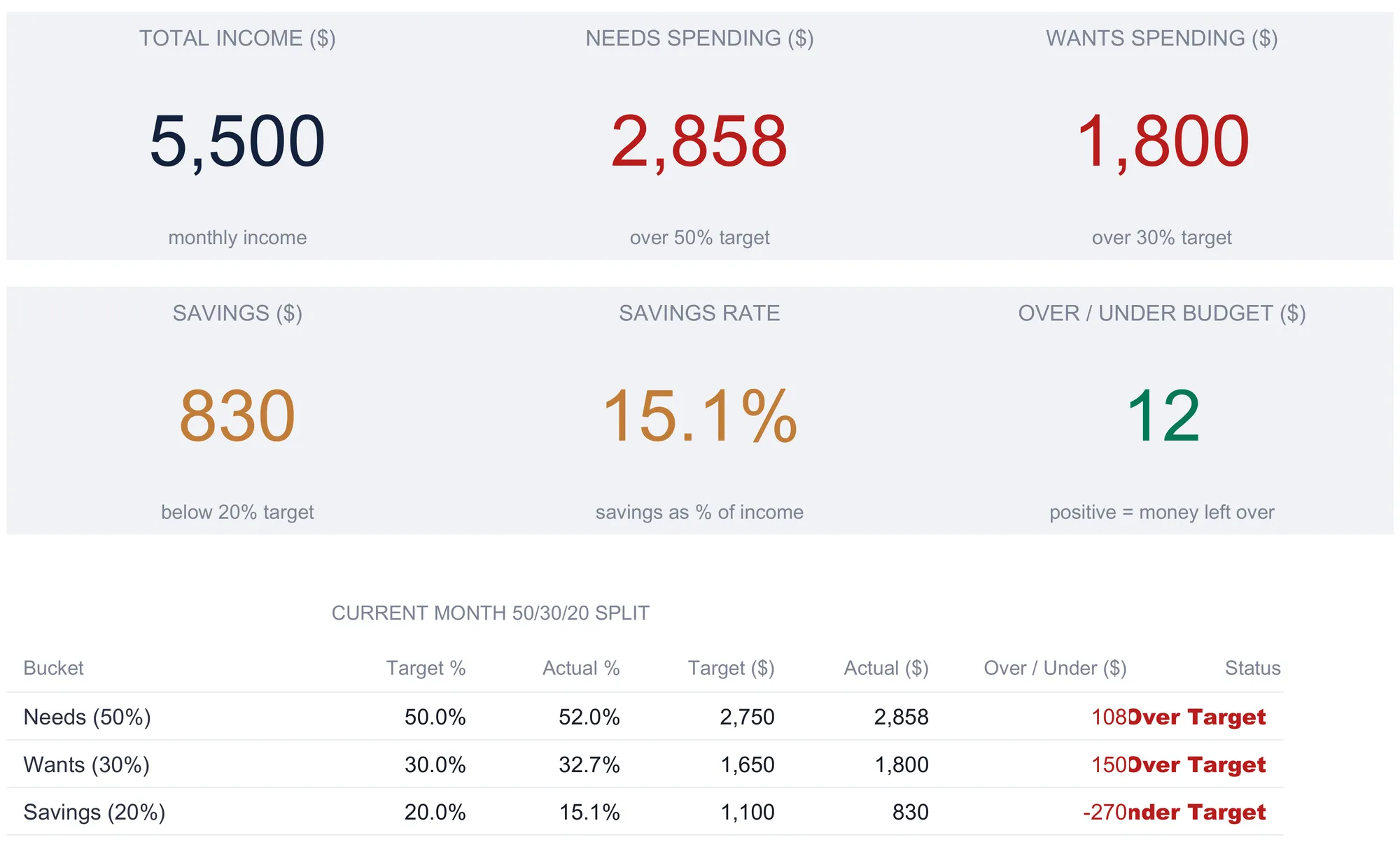
With the income sheet and three category sheets filled, the Dashboard assembles the current-month verdict without any typing of its own. Six KPI cards sit across the top. The first three report Total Income of $5,500, Needs Spending of $2,858, and Wants Spending of $1,800, with the needs and wants cards carrying a plain-language status line reading over 50 percent target and over 30 percent target. The second three show Savings of $830 flagged below 20 percent target, a Savings Rate of 15.1 percent described as savings as a percent of income, and an Over / Under Budget figure of $12 labeled positive means money left over.
That $12 is the most instructive number on the sheet. It is total income minus the three actual buckets combined, so $5,500 less the $5,488 that went to needs, wants, and savings. The household in the sample spent almost exactly what it earned, coming out $12 ahead, and yet none of the three buckets hit its target: needs and wants both ran over while savings ran short. A person watching only their bank balance would see a month that broke even and conclude everything was fine. The 50/30/20 view shows the same month as one where the money went to the wrong places. Making that distinction visible is the entire argument for a proportional budget over a running balance.
Above the cards, a status headline restates the whole plan in one line, reading 50 percent needs, 30 percent wants, 20 percent savings, and then reminding the reader to stay on target every month. It is a small touch, but it keeps the target split in view on the same screen as the score, so the three percentages are never more than a glance away from the numbers being measured against them.
Below the cards, a Current Month 50/30/20 Split table lays out all three buckets in one grid, each with its target percentage, actual percentage, target dollars, actual dollars, an over or under amount, and a status word. Needs read 50.0 percent target against 52.0 percent actual and an Over Target status, wants 30.0 percent against 32.7 percent and Over Target, and savings 20.0 percent against 15.1 percent and Under Target. Two charts finish the sheet, a bar chart comparing target dollars against actual spending for each bucket, and a pie chart showing how actual spending divided across the three. The savings rate deserves a plain definition, since it is the number many people watch when they save and invest: it is savings divided by income, and at $830 on $5,500 it comes to 15.1 percent, well short of the 20 percent the rule aims for.
Excel or Google Sheets for a 50/30/20 budget
The workbook is a plain .xlsx built on standard functions, with no macros, no VBA, and no array formulas, so it behaves the same in Microsoft Excel, in Google Sheets after an upload, and in LibreOffice Calc. Google Sheets suits anyone who wants the budget on their phone and synced across devices, while Excel suits those who prefer a local file. The one constraint that applies in every program is that the cross-sheet references depend on the existing tab names, so renaming the Income & Targets or category sheets breaks the links that feed the Dashboard. Renaming a category row inside a sheet is fine and expected; renaming a sheet is the thing to leave alone.
A currency selector on the Dashboard relabels every money column and KPI across the workbook when changed. It changes the symbol shown and nothing else, with no conversion of the underlying numbers, so it suits a non-dollar household budgeting in its own currency rather than anyone converting between two.
A worked month, start to finish
Following the sample all the way through shows how one income figure becomes a scored budget. Income of $5,500 sets targets of $2,750, $1,650, and $1,100. Needs come in at $2,858, which is $108 over the ceiling and 52.0 percent of income. Wants come in at $1,800, which is $150 over and 32.7 percent. Savings come in at $830, which is $270 under and 15.1 percent. The three actuals add to $5,488, leaving $12 of the month’s income unspent. The Dashboard scores every bucket off target in the same direction the category sheets predicted, and the 12-Month Tracking sheet places this month, matching its March column, inside a year-long arc where savings is steadily climbing toward its 20 percent floor. Every one of those numbers traces back to the four income cells and the planned-versus-actual entries on three sheets. Nothing else was typed.
That traceability is the practical case for building a percentage budget in a spreadsheet rather than a banking app. Every target, every variance, and every status word is a formula you can click into and follow back to its source, and every percentage can be changed to match a situation the standard rule does not quite fit. The cost is that nothing arrives on its own. A banking app pulls transactions and guesses a category for each one; this workbook expects the planned and actual figures to be entered by hand. That manual step is the trade for numbers nobody else has sorted for you and a file that stays on your own machine, which is why an app tends to suit people who want the data to categorize itself and a spreadsheet suits people who want to see and change every calculation.
It is also why the same file can serve two different reading styles. Someone who wants only the headline can open the Dashboard, read six cards and a split table, and close the file in under a minute. Someone who wants to understand a miss can drop into the relevant category sheet, find the one row that moved, and see the dollar and percentage variance beside it. The 12-Month Tracking sheet then answers the longer question of whether that miss was a one-off or a pattern. The workbook reports all of this and prescribes none of it; the numbers describe where the money went, and every decision about what to change with them stays with the person reading.
How this fits the rest of the budgeting tools
- 50/30/20 Budget Ultimate Spreadsheet Template ($29) is the workbook this walkthrough follows: the income and targets sheet, three category sheets, the 12-month tracking sheet, and the six-card dashboard, ready to use in Excel or Google Sheets. The same template comes in a free version with a single budget sheet for anyone who wants to try the split before committing, and an Essentials version ($19) that sits between the two.
- If assigning fixed percentages feels too loose and you would rather give every dollar a job by name, the Zero Based Budget Ultimate Spreadsheet Template ($29) uses a different method, allocating income down to zero across categories you define rather than three fixed buckets. The comparison of 50/30/20 against zero-based budgeting lays out which approach tends to suit which situation.
Related
- 50/30/20 Budgeting in a Spreadsheet: Complete Guide - the rule itself, its origins, and how to set it up from scratch
- 50/30/20 Budget vs Zero-Based Budgeting: Which Method Works for You? - how the proportional method compares to assigning every dollar
Frequently asked questions
What does the 50/30/20 rule actually split - gross or take-home pay?
The rule works on after-tax income, the money that actually lands in your account. In the template you enter each income source on the Income & Targets sheet, and the 50, 30, and 20 percent targets calculate from that total. The sample uses $5,500 of monthly income, so the targets come out to $2,750 for needs, $1,650 for wants, and $1,100 for savings.
Can I change the percentages if 50/30/20 does not fit my situation?
Yes. The Allocation % cells on the Income & Targets sheet are ordinary editable inputs, and every downstream target, dashboard tile, and adherence check reads from them. Change 50/30/20 to 60/20/20 or 50/20/30 and the whole workbook follows. The three category sheets keep their names, but the dollar targets they compare against move with the percentages you set.
Why is the savings variance colored the opposite way from needs and wants?
On the Needs and Wants sheets, spending more than planned is the unwanted direction, so a positive variance shows red. On the Savings sheet the logic flips: saving more than planned is the wanted direction, so more shows green and less shows red. The sample savings actual of $830 against an $1,100 target lands as a red shortfall of $270.
Does the current-month view connect to the 12-month tracking sheet?
They are separate layers that happen to agree in the sample. The category sheets hold one detailed month, and the 12-Month Tracking sheet holds one summary row per bucket for each of the twelve months. In the sample the current month matches the March column, with needs at $2,858, wants at $1,800, and savings at $830, so the detailed month and the tracked month tell the same story.
Does this run in Google Sheets or only Excel?
Both. The file is a standard .xlsx with no macros and no array formulas, so it opens in Microsoft Excel, uploads to Google Sheets, and also works in LibreOffice Calc. The cross-sheet references depend on the existing tab names, so the one thing to leave alone is the sheet names themselves.
Sources
- Budgeting: How to create a budget and stick with it - Consumer Financial Protection Bureau
- Save and Invest - U.S. Securities and Exchange Commission (Investor.gov)
About this article
Sheets, inputs, formulas, sample figures, and charts re-checked on 2026-09-10 against the shipped 50/30/20 Budget Ultimate workbook (Dashboard, Income & Targets, Needs (50%), Wants (30%), Savings (20%), 12-Month Tracking, How to Use). Consumer Financial Protection Bureau and Investor.gov references checked against the live pages at writing time. Last reviewed September 2026.