A subscription tracking spreadsheet keeps every recurring service in one log and derives everything else from it: monthly and annual totals, a category breakdown, a 12-month projection, a price-history log, and the savings already booked from cancellations. This walkthrough follows the real workbook using a sample of 18 services, 14 of them active, that run $225.90 a month and $2,710.80 a year. Our Subscription Tracker Ultimate ($29) ships the whole structure ready-made for Excel and Google Sheets, with room for up to 50 subscriptions.
A single household can carry a surprising amount of recurring spending, spread across two or three cards and an app-store account, and almost none of it shows up as one number. Each charge is small enough to ignore on its own. The streaming service kept for one show, the cloud storage that quietly upgraded a tier, the trial that converted to a paid plan while nobody was looking: individually they read as rounding errors. Collectively they are a real line in the budget. The gap between “I pay for a few subscriptions” and “I pay $2,710.80 a year across fourteen active services” is structure, and a spreadsheet is well suited to it.
That structure is one log and a set of views built on top of it. You type each service once, and the workbook derives the monthly total, the annual total, a breakdown by category, a 12-month projection, a record of price increases, and a tally of what canceling has already saved. The examples below come from our Subscription Tracker Ultimate Spreadsheet Template ($29), which ships the whole thing ready-made for Excel and Google Sheets. Every layout here is reproducible by hand if you would rather build your own, and the point of the walkthrough is to show what each sheet is for, not just what it contains.
What a subscription tracker has to hold
Strip away the individual billing emails and there are only a few kinds of data:
- Per-service records. The name, category, monthly cost, billing cycle, next renewal date, and status of every subscription. This is the raw material for everything else.
- Grouping. The category each service belongs to, so streaming can be compared with software and the totals can be read by type rather than as one long list.
- Time. A projection across the year and a log of what each service used to cost, so a creeping price increase is visible rather than absorbed.
- Derived metrics. Monthly and annual totals, the average per service, the largest single charge, and the savings booked from cancellations. These are calculations, not entries; nothing here is ever typed.
The Ultimate tracker gives each of these its own tab. Subscriptions, Category Breakdown, Annual Projections, Price History, and Cancellation ROI each get a sheet, with a Dashboard on top and a How to Use sheet carrying the instructions. The order matters less than the direction: data flows one way, out of the Subscriptions log and into everything else, so there is only ever one place to type and nowhere for two figures to disagree.
Log each service once: the Subscriptions sheet
The Subscriptions sheet is the only place a service is ever typed, and everything downstream reads from it. Each row has a Service Name, a Category, a Monthly Cost, a Billing Cycle, a Next Renewal date, a Status, and a free Notes field. Category and Status are dropdowns, which keeps the values consistent so the totals stay accurate; Billing Cycle is a dropdown too, but it is only a record of how the charge arrives. The single computed column is Annual Cost, which is Monthly Cost times 12 for every row, regardless of the billing cycle shown.
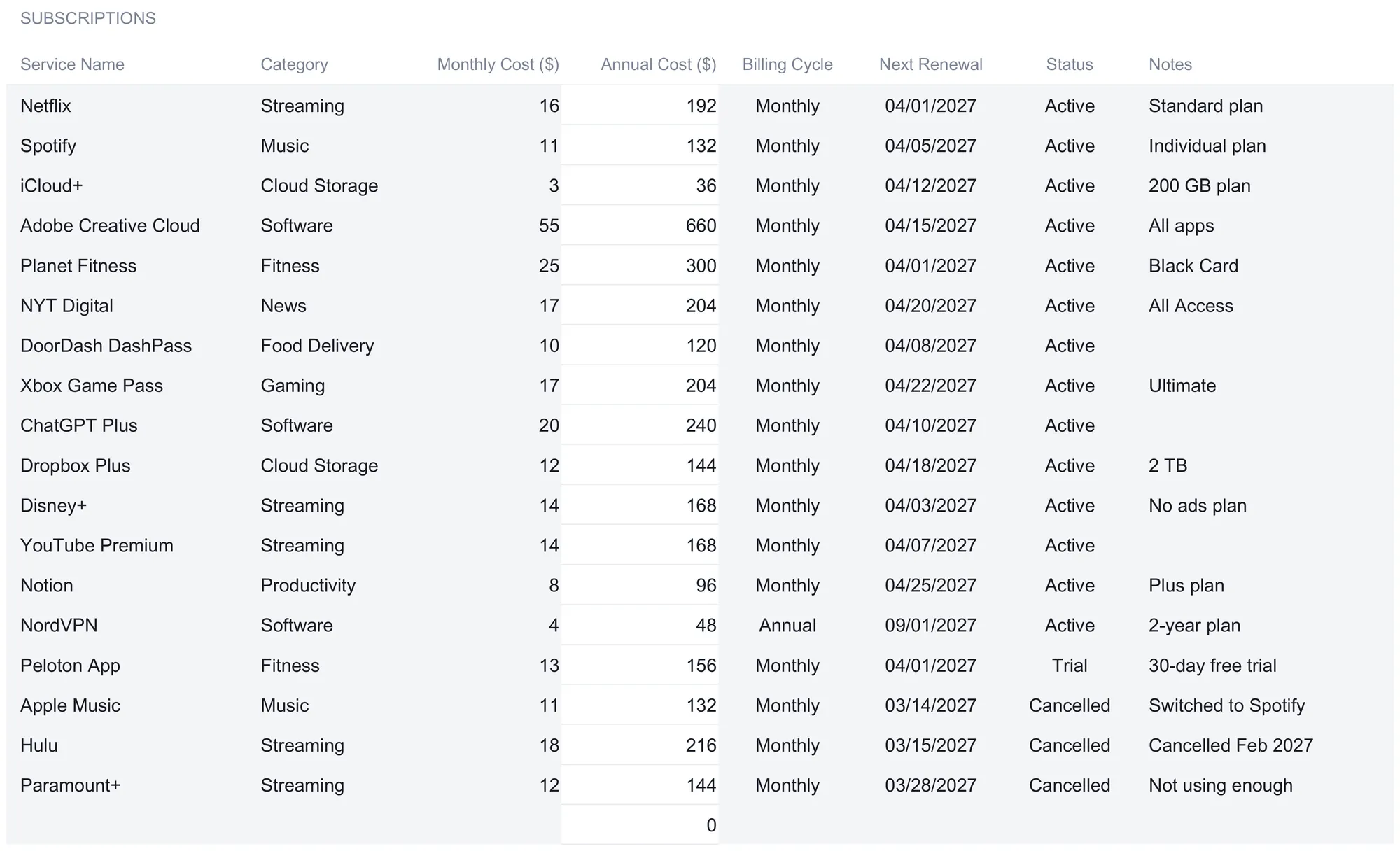
The sample fills 18 rows, and reading a few of them shows the shape of the data. Netflix is $15.99 a month on the Standard plan, tagged Streaming. Adobe Creative Cloud is $54.99 for all apps, tagged Software. iCloud+ is $2.99 for the 200 GB plan, Dropbox Plus is $11.99 for 2 TB, and both sit under Cloud Storage. Notion is $8 on the Plus plan under Productivity, DoorDash DashPass is $9.99 under Food Delivery, and Xbox Game Pass Ultimate is $16.99 under Gaming. The categories are not decoration; they are what the next sheet groups on, so a consistent Category value on every row is what makes the breakdown add up correctly.
The Annual Cost column does its arithmetic the same way on every row. Netflix at $15.99 a month shows $191.88 a year, Adobe at $54.99 shows $659.88, Notion at $8 shows $96. The formula is a short conditional that returns zero for an empty row and otherwise multiplies the monthly figure by twelve, which is why a half-filled sheet never throws an error and never inflates a total with a blank.
Four of the eighteen rows step outside the everyday, and they are the ones that make the Status field matter. Fourteen services are marked Active. Peloton App carries a Status of Trial, sitting on a 30-day free trial. Apple Music, Hulu, and Paramount+ are marked Cancelled, each with a note explaining why, reading “Switched to Spotify”, “Cancelled Feb 2027”, and “Not using enough”. That Status column is the pivot the whole workbook turns on, because every total is filtered to Active, so a service on Trial or marked Cancelled drops out of the running cost automatically. The four status options the dropdown offers are Active, Cancelled, Trial, and Paused, and each is color-coded so a glance down the column sorts the live services from the rest.
A few design details are worth copying into any hand-built version:
Spare rows are pre-wired. The Ultimate sheet supports up to 50 subscriptions, and the blank rows below the sample already carry the Annual Cost formula and already sit inside every total. The next service goes on the first free row and the workbook updates; there is nothing to drag down and no range to extend. This is the detail most home-built trackers miss, and it is exactly where they break, when a new row lands outside the range a summary was summing.
Marking beats deleting. When a service ends, the habit the template encourages is to switch its Status to Cancelled rather than delete the row. The active totals drop it immediately, and the row keeps feeding the savings tally on the Cancellation ROI sheet. Delete it and that history is gone. Keeping a cancelled row is how the workbook remembers what you used to pay.
One thing the sheet does not do is fill itself. There is no bank feed and no app-store import, so each service is a handful of typed cells taken from your statements and settings. That is the deliberate trade against an automated tracking app. A connected tool suits people who want charges to arrive on their own; a spreadsheet suits people who want every formula visible, every number editable, and the file on their own machine. For a list that changes a few times a year, the entry cost is a couple of minutes, and in exchange nothing about the calculation is hidden.
Read spending by type: the Category Breakdown
The Category Breakdown sheet groups the active subscriptions by category and totals each one. It carries ten rows, the nine categories the sample uses plus an Other row that sits at zero until something is filed there. Nothing on it is typed; SUMPRODUCT formulas add up the active services in each category from the Subscriptions sheet and count how many there are, and the share column divides that category’s monthly total by the grand total.
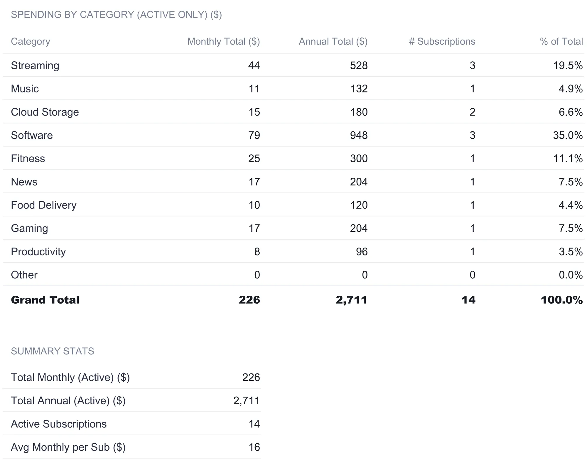
The picture that falls out of the sample is that software, not streaming, is the biggest line:
| Category | Monthly ($) | Annual ($) | Subs | % of total |
|---|---|---|---|---|
| Streaming | 43.97 | 527.64 | 3 | 19.5% |
| Music | 10.99 | 131.88 | 1 | 4.9% |
| Cloud Storage | 14.98 | 179.76 | 2 | 6.6% |
| Software | 78.98 | 947.76 | 3 | 35.0% |
| Fitness | 25.00 | 300.00 | 1 | 11.1% |
| News | 17.00 | 204.00 | 1 | 7.5% |
| Food Delivery | 9.99 | 119.88 | 1 | 4.4% |
| Gaming | 16.99 | 203.88 | 1 | 7.5% |
| Productivity | 8.00 | 96.00 | 1 | 3.5% |
| Grand Total | 225.90 | 2,710.80 | 14 | 100% |
Software runs $78.98 a month, 35 percent of the total, more than the three streaming services combined. That is the kind of thing a flat list hides and a category view surfaces: the mental image of subscription spending is usually streaming, but here it is Adobe Creative Cloud, ChatGPT Plus, and NordVPN doing the heavy lifting. Streaming is second at $43.97 across Netflix, Disney+, and YouTube Premium, then fitness at $25 for a single Planet Fitness membership, which a per-service list would have buried in the middle of the rows. The count column matters as much as the dollars, because it separates a category that is expensive because it holds many small services from one that is expensive because it holds a single large one.
A summary block at the bottom repeats the grand totals and adds the average monthly cost per active service, which the sample puts at $16.14. That average is a useful sanity check against the Largest tile on the dashboard: the average is $16.14 while the largest single charge is $54.99, so one service costs more than three times the typical one, which is the sort of spread worth knowing before reading any single number as representative. Because everything on the sheet is keyed to the Active status, the moment a service is marked Cancelled its category loses that amount, the grand total drops, and the percentages re-weight themselves without a single manual edit.
Project the year: the Annual Projections sheet
The Annual Projections sheet lays the category totals across twelve months, January through December, and sums them to a year. Seeded from the current active costs, every month starts at the same $225.90, and the year total comes to $2,710.80.
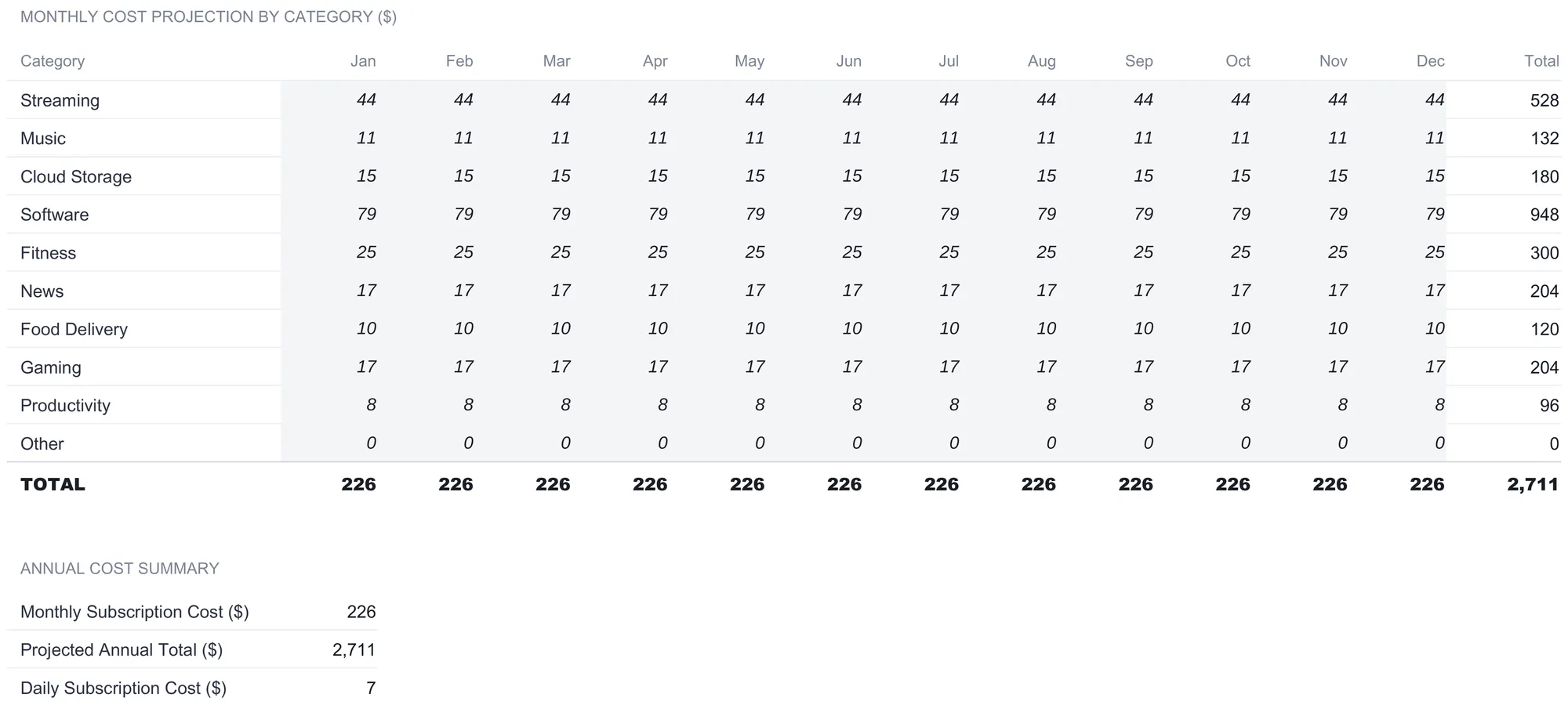
A flat projection sounds trivial until you notice that the month cells are yours to edit. The sheet’s own note frames the point: the projection assumes no changes, so the value of the grid is what you do to it. Say you know Adobe Creative Cloud is being dropped in September. Taking $54.99 off the Software row from September onward drops those four months by that amount each and pulls the annual total down accordingly, and the change shows in the total row and the annual summary as you type. Or model a rise you already know is coming: if a plan goes up in June, bump the June-through-December cells to the new figure and read the new year total straight off. The grid turns “what will subscriptions cost me this year, given the changes I already know about” into an editable model rather than a guess.
The annual summary below the grid restates the monthly cost and the projected annual total, then adds a third figure the other sheets do not show: a daily subscription cost, the projected total divided by 365, which comes to $7.43 in the sample. It is the same $2,710.80 expressed at a different scale, and $7.43 a day is a number that lands differently from a once-a-year lump. None of these figures is a recommendation about what the spending ought to be; they are three views of the same total, sized by day, month, and year so the one that registers is available.
Watch the prices creep: the Price History sheet
Subscriptions rarely get cheaper, and the Price History sheet is where the increases are logged. You enter a service, its old price, its new price, and the date; the Increase % column computes itself, and any rise above 15 percent is highlighted so the sharp jumps stand out.
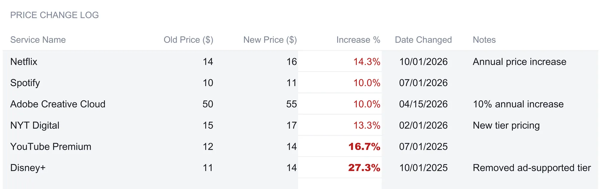
The sample logs six increases:
| Service | Old ($) | New ($) | Increase | Date |
|---|---|---|---|---|
| Netflix | 13.99 | 15.99 | 14.3% | 10/01/2026 |
| Spotify | 9.99 | 10.99 | 10.0% | 07/01/2026 |
| Adobe Creative Cloud | 49.99 | 54.99 | 10.0% | 04/15/2026 |
| NYT Digital | 15.00 | 17.00 | 13.3% | 02/01/2026 |
| YouTube Premium | 11.99 | 13.99 | 16.7% | 07/01/2025 |
| Disney+ | 10.99 | 13.99 | 27.3% | 10/01/2025 |
YouTube Premium at 16.7 percent and Disney+ at 27.3 percent are the two that clear the 15 percent line and pick up the highlight. The rest are the familiar single-digit-to-low-teens creep that individually reads as nothing and compounds. Consider Netflix on its own: the $2 increase from $13.99 to $15.99 is 14.3 percent, and over a year it is $24 more than the old plan cost. Stack the six logged increases together and the drift is a meaningful share of the annual bill, none of it announced by anything louder than a one-line email. A log that keeps the old number next to the new one is what makes that pattern visible, because the comparison a single statement can never show is the one against last year.
Below the change log, the sheet carries a year-over-year section that compares the annual cost of each category across three years, 2025, 2026, and 2027, with the percentage change between each pair. It reads the drift at the category level rather than the service level, so a category that has crept up steadily stands out even when no single service jumped. The latest of the three columns pulls straight from the Category Breakdown, so as the live subscriptions change, that year updates itself while the two before it stay as the fixed record you entered.
See what canceling has saved: the Cancellation ROI sheet
The Cancellation ROI sheet answers a question the other sheets set up. Anything marked Cancelled on the Subscriptions sheet is counted here, with no separate list to keep in step. It totals the monthly and annual amount those cancellations have taken off the bill, counts how many services are gone and how many are on a trial, and tracks progress against a set of built-in milestones.
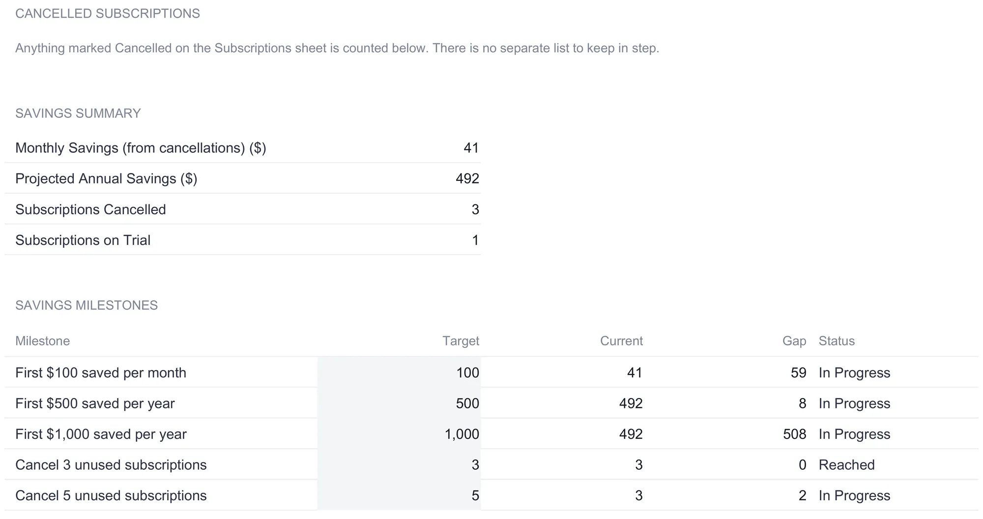
In the sample, the three Cancelled services, Apple Music, Hulu, and Paramount+, add up to $40.97 a month, which the sheet projects to $491.64 a year. The count line records three cancellations and one service still on a trial, which flags that a trial is running before it converts to a charge. Below the summary, a milestones table measures the savings against fixed targets the template ships with: “First $100 saved per month”, “First $500 saved per year”, “First $1,000 saved per year”, “Cancel 3 unused subscriptions”, and “Cancel 5 unused subscriptions”. Each shows the target, the current value, the gap, and a status. The sample has reached the three-cancellation milestone, marked Reached at 3 of 3, and sits $8.36 short of the $500-a-year mark, still In Progress, with $508.36 to go before the $1,000 line. It is a plain way to see the running result of trimming the list, expressed as a number rather than a feeling. Nothing here decides what to cut; it simply reports what marking a row Cancelled has already done to the total.
This is also the sheet that ties back to a practical point about how recurring charges stop. Switching a status to Cancelled in the spreadsheet records a decision, but it does not stop the money leaving your account, which takes canceling with the service, and sometimes with your bank as well. The Consumer Financial Protection Bureau notes that you can revoke authorization for automatic payments by telling the company and then notifying your bank, and it points out that stopping the payment does not by itself cancel the underlying service or erase what you already owe. The tracker is the record; the cancellation itself happens with the provider, and the sheet is where you note the date it took effect.
The dashboard: six numbers and a chart
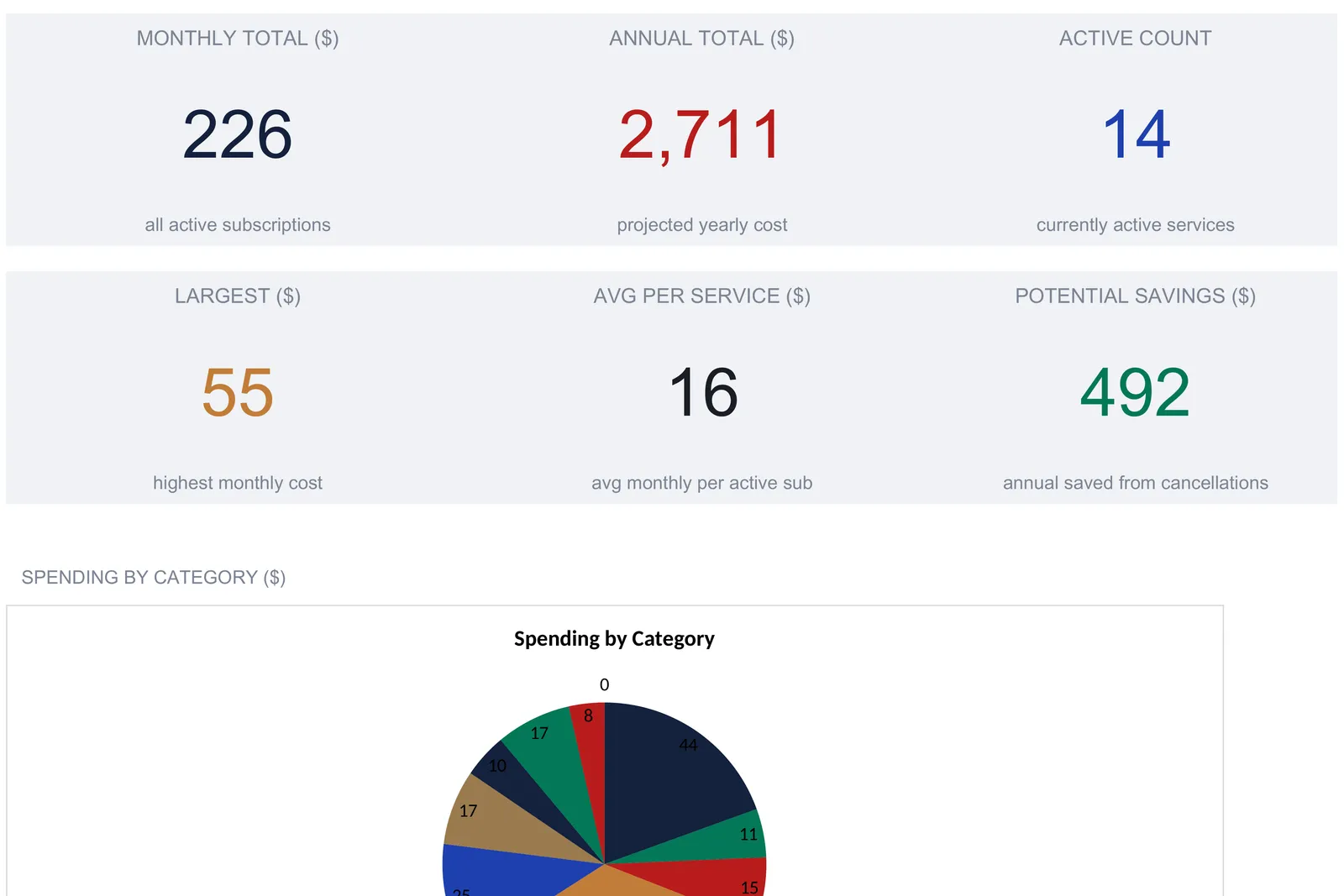
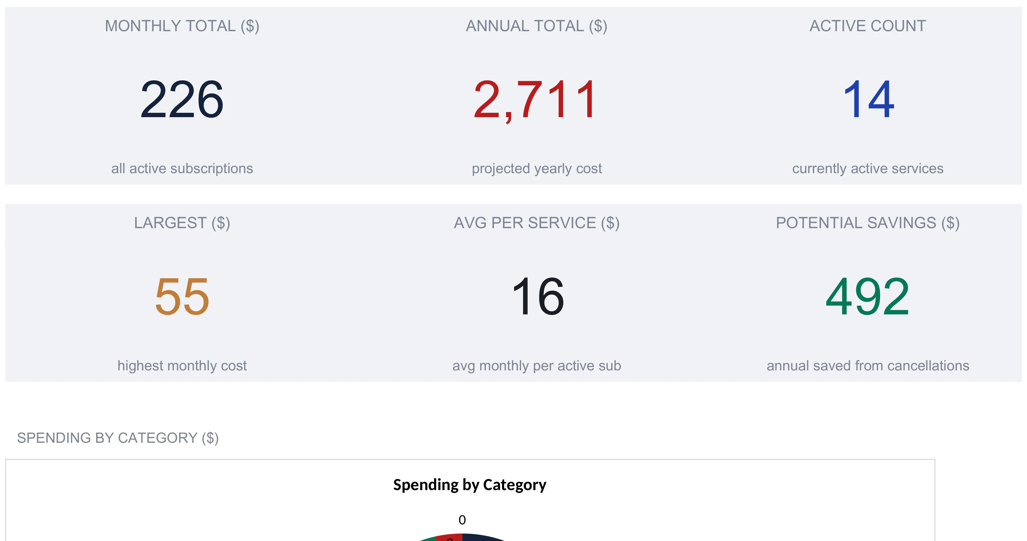
With the Subscriptions sheet filled, the Dashboard reads the whole workbook into six KPI tiles and a pair of charts. None of it is typed.
| Metric | Sample value | How it is derived |
|---|---|---|
| Monthly Total | $225.90 | Sum of every active service’s monthly cost |
| Annual Total | $2,710.80 | Monthly total times 12 |
| Active Count | 14 | Count of services marked Active |
| Largest | $54.99 | Highest single active monthly cost (Adobe) |
| Avg Per Service | $16.14 | Monthly total divided by active count |
| Potential Savings | $491.64 | Annual amount already saved from cancellations |
The tiles round to whole dollars on screen, so the Monthly Total reads as 226 and the Annual Total as 2,711, while the underlying figures are $225.90 and $2,710.80. Each tile is a one-line answer to a question the raw list cannot give at a glance: what am I spending a month, what does that annualize to, how many live services is that spread across, which single one is biggest, what is typical, and how much have I already taken off by canceling. The Largest tile is worth a second look, because it names the number most worth being sure about, and here it is Adobe Creative Cloud at $54.99, nearly a quarter of the monthly total in one service.
Below the tiles, a pie chart plots spending by category and a second chart compares each category’s monthly figure with its annualized one, which is where the software-heavy shape of this particular sample becomes visible without reading down a column. The charts read from the same category totals as the breakdown sheet, so they move the instant a status changes.
The number worth pausing on is the annual total. No single billing email adds up the year, and the whole reason to keep a tracker is to put $2,710.80 and $225.90 on the same screen as the fourteen services that produce them. Seeing the year and the month together, next to the largest charge and the savings already booked, is most of the point of tracking any of this. A dashboard cannot make a decision, but it can make sure the decision is made against the real number rather than a guess.
Excel or Google Sheets for a subscription tracker
The tracker is an .xlsx file built on standard formulas, SUMPRODUCT, COUNTIF, MAX, and simple arithmetic, with no macros, no VBA, and no add-ins. That means it opens and calculates identically in Microsoft Excel, in Google Sheets after an upload, and in LibreOffice Calc. Google Sheets suits anyone who wants to log a new charge from a phone the moment they spot it on a statement; Excel suits those who prefer a local file. The dropdowns, the conditional highlighting on large price increases, and the currency relabeling all carry across, so the choice of app is a matter of preference rather than capability.
The currency selector is worth understanding before it surprises anyone. A dropdown next to the Dashboard title switches the symbol shown on every money header and KPI, offering dozens of options from the dollar and euro through to less common symbols. What it changes is only the label. It does not convert the numbers, so a figure entered as 15.99 stays 15.99 whether the sheet shows a dollar sign or a euro sign in front of it. That keeps the workbook honest for anyone tracking charges in a single currency, and it is the behavior to remember rather than expecting an exchange rate to appear. The structure described here is equally buildable from scratch in either Excel or Sheets, and the ready-made file simply saves the afternoon it would take to wire up the formulas and the dropdowns.
Which subscription tracker fits
- Subscription Tracker Ultimate Spreadsheet Template ($29) is the workbook this walkthrough follows: the Subscriptions log, the category breakdown, the 12-month projection, the price-history log, the cancellation savings sheet, and the six-metric dashboard, with room for up to 50 subscriptions.
- The free Subscription Tracker is one working sheet: the log, an annualized cost on each row, and a monthly and annual total above it. The Essentials version ($19) adds a dashboard with six KPI tiles and a pair of charts on top of that log.
- Bill Tracker Ultimate Spreadsheet Template ($29) is the companion for the other half of recurring spending: the fixed bills that arrive on a schedule, with a 12-month view, a payment history, and a late-fee tracker rather than a category-and-cancellation model.
Related
- How to Track Subscriptions and Recurring Expenses - the version that folds subscriptions into an overall monthly budget rather than a dedicated file
- Subscription Tracker Spreadsheet (Excel Template, Annualized Costs) - the tier comparison and a 10-minute audit for building the columns from scratch
Frequently asked questions
How does the tracker handle a plan billed once a year instead of monthly?
Two ways. The Annual Cost column is always Monthly Cost times 12, so for an annually billed plan you can enter its monthly equivalent and let the column do the rest. Or type the actual yearly amount straight into the Annual Cost cell; the sheet warns before it lets a formula be replaced. The Billing Cycle field itself is only a record of how the charge arrives, since the Active totals and the dashboard all read the Monthly Cost figure.
Do the Trial and Paused statuses count toward my totals?
No. Every total on the workbook is filtered to Status = Active. In the sample, Peloton App sits on a 30-day Trial and is left out of the $225.90 monthly total and the category breakdown, and a service marked Paused is treated the same way. Only Cancelled rows feed the separate savings figures on the Cancellation ROI sheet.
Does switching the currency convert the amounts?
No. The Currency dropdown next to the Dashboard title relabels every money column header and KPI, so a euro user sees the euro symbol instead of the dollar sign, but the underlying numbers do not change. It is a label, not an exchange-rate conversion, so figures entered in one currency stay at their entered value.
How many subscriptions can the Ultimate version hold?
Up to 50 rows on the Subscriptions sheet, more than the free log or the Essentials tier. The sample fills 18 of them. The blank rows already carry the Annual Cost formula and already sit inside every total, so the next service goes on the first free row and the whole workbook updates.
Does the spreadsheet connect to my bank or app stores to import charges?
No. There is no bank feed and no import, so each service is typed in once from your statements and app-store settings. That is the trade against an automated tracking app: the spreadsheet keeps every formula visible and the file on your own machine, at the cost of one manual entry per service.
Sources
- How do I stop automatic payments from my bank account? - Consumer Financial Protection Bureau
About this article
Sheets, inputs, formulas and sample figures checked on 2026-09-10 against the shipped Subscription Tracker Ultimate workbook (Dashboard, Subscriptions, Category Breakdown, Annual Projections, Price History, Cancellation ROI, How to Use), plus the free and Essentials Subscription Tracker workbooks for the tier comparison. The dashboard tiles round to whole dollars on screen; the exact cached values from the workbook are used in the text. The CFPB guidance on revoking automatic-payment authorization was checked against the live page at writing time. Last reviewed September 2026.